Review – Pilot Easytouch Pro

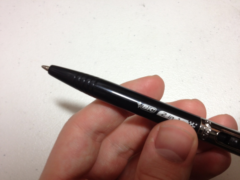
While not necessarily an art supply, the Pilot EasyTouch Pro claims to use a hybrid ink formula to make a smooth writing, quick drying, waterproof ink, which sounds super handy. Let’s see what it’s all about.

20140516-011941.jpg

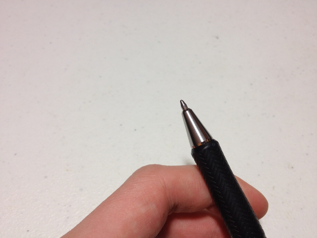
First the body of the pen features a “modern design”. The tip is a metal cone similar to most click pens. The grip is nicely tapered and flares out at the end. The barrel is fairly straight, but with a little engraving and minimal information. The clip is simple, and tight, with a “modern design”. At the end is a click button and a strange cutoff design. The click mechanism works well but has a grating sound.

20140516-011947.jpg

The ink itself is a slightly dark black, but really more of a grey. The tip is medium and there are no options. It does flow quite easily, with very little pressure on the paper. It isn’t as smooth as a fountain pen, or even a gel pen. It does offer some line variation when one presses harder, and it becomes considerably blacker when one does so. It dries fairly fast, though not the fastest. All of this is quite nice until at some points when one is writing (especially when one has just started) a large blob of ink spills out of the point and bleeds though the paper. This is not really unusual for a ballpoint, but the amount and the bleed through make it quite a problem. It’a not really a problem when writing, but a problem when doing anything else.

So overall, this is not a drawing pen, but a writing pen, and not a long writing pen either, because of blobbing, but if one merely wants to sign a paper, or write one page it is quite a smooth-writing fine instrument.

Review – Pentel Finito Porous Point Pen

Looking for a porous-point pen, and none of the standard ones are doing it for you? Maybe you might want to look at the Pentel Finito porous-point extra fine pen.

20140409-014922.jpg

The cap is all plastic, with a clip molded into it that does the job, but isn’t spectacular in any way. Inside is a small piece of plastic that covers the tip and is held in place by a spring, keeping a tight seal on the tip. This is visible through the clear plastic of the cap. The barrel is a black-covered plastic and has all necessary info on it. The grip section is clear and through it one can see the fins of the feed and a small bit of the ink reservoir. The grip section is very smooth and can easily become slippery. After a small bit of metal tapering, there is an extra-fine porous point at the end.

20140409-014928.jpg

The ink is fairly black, and fairly standard, not really permanent or fade-proof. The point does spew a lot of ink out: in fact, I would tend to call this pen a fine rather than an extra fine point due to the sheer amount of ink it leaves on the page. This makes the line considerably wider than just the point of the pen. This gushing also leads to points of bleed-through that are not seen in higher-quality porous point pens like Sharpies or Microns.

Overall I’d say the Finito is a mediocre pen that has no purpose as an art supply. There are many pens out there that do what this pen does better, and for the same price. If you want a pen that gushes, or will not dry out for long periods of time this pen may be worth a look, but I’d try something else first.


Review – Papermate Flair Part 2 Red

A while back I reviewed the Papermate Flair pen, and I was going to say that this was a review of the red version of the same pen; but really I intend this as a continuation of the last review after some more use, and as a review of the red color for the pen.

20140402-022340.jpg


I can confirm that the inner cap will keep the tip dry for extended periods of time. The clip is very difficult to use and is easy to get bent out of shape. And while the black pen has a problem with the color rubbing off, the red has no such problem.

The red color itself is more of a pinkish, and it’s kinda washed out. The line for the medium is spread out enough that it is very noticeable as a not-quite red. It isn’t very aggressive, so if one was grading papers and such and wanting to use something that didn’t offend the viewer, this would work. However, as far as I can see there are no other practical applications. Perhaps marking on technical drawings, but again there are easier and better solutions. Using the pen on a very absorbent paper will make a much deeper color, so that is an option.

Overall the Flair is still a great pen, but I wouldn’t recommend the red color as it is not a very strong red, or a good covering color.


Review – Pilot P-500 Rollerball Pen

When I was a kid I loved the stationery section, and office supply stores were like candy stores to me. One day at one of these stores (Office Depot?) my parents bought me a pack of pilot P-700s which I loved and used for almost all of middle school and some of high school until they all got lost or dried up. I liked them so much I only did personal work with them and not any regular school work. Recently I found a P-500 (one size smaller) in a store and decided to see of they were really as good as I remembered.

20140326-015133.jpg

The cap of the pen is clear, with a little black bit in the top.There is a visible small black bit inside to keep it dry. The clip is metal and very tight, it’s got a ball on the end and very easy to slip into a pocket. It has a 0.5 printed on it to denote the size. The barrel has all necessary information printed on it (extra fine). There is a granite texture covering it with a clear end ball. The grip section is ribbed and very grippy for how slick the plastic is. There is a gradual slope to a very thin metal rollerball point. The section is clear making the ink supply visible.

20140326-015140.jpg

The line is an extra fine (0.5mm I’m guessing) and is advertised as being precise, which I have a hard time believing with any gel ink pen. Maybe it’s just my hand, but when writing or drawing with a gel or liquid ink pen everything just slides all over the place. This pen is no exception, though I will say that it puts ink where you tell it to put ink and nowhere else, and does it very consistently.

The inks color is black, almost the same as the pilot G2 black but a little warmer and a little lighter. It is a very good black for almost all writing and drawing purposes. It doesn’t cover well, but who uses an extra fine pen to cover anyway? The ink is very consistent and really nothing special in any of its properties otherwise. It flows as well or better than one would expect from a pen of this price-point.

Overall, these are great pens, both for writing and drawing, but they are not technical pens and cannot replace them for a finished product. They are comfortable to hold and smooth writing. Just better enough than other pens to justify their price. They are a good in-between or starting pen, but not to be used for a finished product.


Review – Manuscript Calligraphy Scroll 4 Nib

So this week I’ll be doing a quick review of the Scroll 4 calligraphy nib by the Manuscript Pen Company.

20140314-094350.jpg

The scroll nib concept is simple enough: it splits a regular italic nib with a second slit and a notch out of the middle, thus creating two lines when applied to the paper. The Manuscript scroll 4 has this simple design, with “No.4 Scroll England” stamped into it as well.

Writing is much easier than with a standard calligraphy fountain pen nib. The feed seems designed to keep up very well with all kinds of calligraphy nibs. Very little pressure is required to write and may even hinder performance at times. Each line is about a millimeter wide with one being slightly smaller than the other. To write with this nib, one must adjust their calligraphy a little bit but not very much, it is a very easy nib to use, though even with gentle use the small tines get misaligned every now and then, causing them to pop and either momentarily spit a small glob of ink or skip.

Overall this is a fairly nice nib that is well suited to its purpose of calligraphy, and while it doesn’t have many other (if any other) uses, it is still quite fun to play around with sometime, and this particular one doesn’t cost much.

Review – Papermate Inkjoy Green, Pink, Orange, and Light Blue

In a previous entry I looked at the more standard Papermate Inkjoy colors, now it’s time for the less standard colors, like light blue, pink, orange, and green.

inkjoy tests 2

The light blue is a sky-colored blue. It is the hardest to read of any of the Inkjoy colors, though it is still fairly visible when not cluttered. It has a very natural feel and is very sky-like. It is very neutral anyway. It doesn’t look like a color that takes a stance, if that makes any sense. It’d make a nice color for both drawing and work.

Next pink, which thankfully isn’t a very aggressive pink. It’s definitely not hot, it’s more of a magenta color, but not quite. It is not a very natural color, though, as it doesn’t look like a rock or a flower. Might be good for a personal thing, or some corrections or something similar.

Third is orange, which I must say looks almost exactly like Pilot G-2 Orange, which I have previously reviewed. Subtle, but not very useful, perhaps flowers or the fruit, but it could be work-friendly, if you’re in a less formal office setting.

Finally green, which is a quite deep, more forest color. A very natural and neutral color. Again a fine informal office color, and a nice forest or swamp color. Though very limited in its natural colors. One of the least useful, but most usable, colors in the set.

Overall these four colors are unintrusive and subtle, with various office and home applications, but very little artistic applications save a few specific places.

Review – Bic Tech Ballpoint and Stylus

Well, sometimes now-a-days art isn’t always done on a physical medium. Tablets, smart phones, and touch-screen devices are becoming more prevalent these days and for artistic purposes your finger isn’t the most precise thing in the world. Fortunately, Bic has a solution for both mediums (maybe) the Bic Tech pen and stylus.

20140206-232018.jpg

The barrel of the pen is a fairly standard Bic barrel with a slightly grippy (grip) section, a hole for the ballpoint and a logo. Halfway up the pen is where things get interesting. The top half of the pen is a chrome-colored plastic which I personally don’t like but doesn’t look terrible. Just above another Bic logo in the center is the click mechanism, which is unique in its side mounting. The lever protrudes out to the side sightly, but not enough to really get caught or accidentally pulled. It has a slight curve to it, making it a great finger place and making for easy disengagement of the fingers or caught objects (again preventing accidental usage). I would say my only problem with it is it gets scratches from fingernails far too easily. The clip is absolutely nothing special, in fact it doesn’t even clip, it more just hangs on a pocket or something so that’s cheap. At the top is the stylus which I’ll talk about in just a second.

20140206-232024.jpg

The pen itself is nothing remarkable. It does appear to be smoother than a normal Bic ballpoint. But it is almost the exact same shade of unimpressive grey-black as every Bic pen.

20140206-232030.jpg

Now on to the stylus, which is the standard stylus end that has been popping up all over the place recently. It works. It is obviously not the most expensive or precise thing but it gets the job done. It is better than a finger, I can tell you that much. I can’t attest to the durability of such things, but I can say that it feels likely to break, though the pen isn’t expensive and by that time you’ve probably gotten your money’s worth out of it.

So what is the Bic Teach pen like overall? Mediocre. It does an alright job at being both a stylus and a pen, but does neither fantastically. But for the money it really shouldn’t. If you’re looking into the prospect of such a device or are on a very slim budget (or possibly don’t care) this might work for you, otherwise I’d suggest looking elsewhere.

Review – Sheaffer Maxi Kit Calligraphy Nibs

Now, for the second part of the Sheaffer Maxi Calligraphy Kit review. This one might be a bit short as I’m going to be looking at the three included nib sizes: Fine (1mm), Medium (1.5 mm), and Broad (2 mm).

20140128-234823.jpg

The nibs themselves are Italic, meaning that they are flattened and straight at the tip, thus producing a wide up-and-down stroke and a thin left-to-right stroke. They are true Italics, with no tipping material, and sharp edges that may cut into the paper if one isn’t careful, but they are a bit more rounded off than a dip pen Italic would be. Because there is no tipping material, the stainless steel of the nib is easier to wear away and damage from rough use. Although this doesn’t happen often as steel is still a very robust material, it is worth noting.

20140129-001212.jpg

Each nib has almost the same left-to-right width, but the up-and-down stroke width is equal to the size of the nib stated above (1mm,1.5 mm,2 mm). The fine nib can be used for regular cursive writing, but the medium and broad nibs should not be used for cursive writing as the size necessary would render writing impractical or illegible. Although the corners of the sharp nibs can cut into the paper, they aren’t quite sharp enough to make the sharpest of line turns. To most eyes, the angles appear spot on, especially when compared to the round corners of regular fountain pens, but when compared to a dip nib they are a bit lacking. Overall, the nibs a very functional and useful in a variety of situations (at least calligraphy situations). They provide enough variation to not be bored with inking up three pens, and even without a tipping material will last through quite some use.

Review – Sheaffer Maxi Kit Viewpoint Pen Body

I have talked a lot about specialty pens and the like. Now it’s time to talk about another one, this one specifically for calligraphy. In this several part review I’ll be talking about the Sheaffer Calligraphy Maxi-kit. In this first part I’ll talk about the included pens, the Sheaffer Viewpoint.

20140122-004518.jpg

The cap of the Viewpoint is a cylinder with a slanted top. This slant has Sheaffer written on it as well as the size of the nib meant to go with the pen (in this kit at least). The bottom of the cap has a chrome band with Sheaffer written on it. The clip is simple, but functional, having a small ball at the end, up near the top is also the white dot that signifies a lifetime Sheaffer warranty (possibly).

20140122-004528.jpg

The barrel of the pen is also a simple cylinder, except it has a rather large hole cut in two sides to create a viewing area for the cartridge or converter (get it). The barrel’s end is also rounded so it won’t stand up.

The (grip) section is made of dimpled rubber and is sufficiently grippy and un-intrusive. Just after the grip is a small piece of plastic (color matching the barrel) and then the nib directly. There is a rather steep step to nib from the section, making the nib look perhaps a bit small. The feed is well hidden and works fine for the purpose, but on some pens can be finicky.

Overall the Sheaffer Viewpoint body is a sturdy, and functional design, even if it’s not the most comfortable. Its real purpose is to get a nib to the paper and it does the job quite well. Though it is a bit weaker than previous Sheaffer models due to the hole.

Review – Pilot G2 Teal, Hunter Green, Navy, Periwinkle, and Caramel

This week I’m gonna take a look at some of the weirder colors of Pilot’s G2 pens. Let’s dive right in.

third pilot pen comparison

First up is teal, which is a deep, bluish-green, almost like an aquatic plant. It’s very subdued and seems almost workplace-friendly (sort of like a blue-black, but with green). It goes on the page a bit thick and is a bit of a hard start when it’s not been written with for a while. A very soothing color overall.

Next up is hunter green, which is a deep, swampy green. It looks like a camouflage color, which I guess it’s supposed to. It isn’t the most pleasant of colors to stare at, but it is quite subtle. This color is probably the thickest ink and has the most problems with startup and skipping of the bunch.

Third is navy, which is a blue-black. It doesn’t really remind me of any previous navy colors I’ve seen, it is simply a very dark blue, but not a deep blue. It looks just like a combination of blue and black. Very work-friendly, I would say, but has no real art application save for maybe a night ocean.

Fourth is periwinkle, which is a light, sky blue. This is one of the lightest and easiest to read light blues I’ve seen. It isn’t quite as light as possible, but that makes it readable. It has a bit of shading (inconsistent color) but not too much. This is likely the most versatile ink color of the bunch, being a close to work-friendly “happy” color, and a realistic color that could be found in both water and skies.

And finally is caramel. Caramel is a light, almost hard-to-read brown. Again it is subdued enough to not hurt one’s eyes, but is very light and not particularly pretty. It does flow well, and really looks like caramel, so if you need a caramel colored ink, this is the ink for you.

That concludes my look at the Pilot G2 pen color types. I hope these were useful, they really do cover the gamut and provide ink colors for a variety of different uses. Unfortunately, I believe they only come in a large, expensive pack, so I would recommend having uses for a few of these pens before purchasing them.  They are great reliable writers with most of the ink colors, especially the more common ones (which are available individually) and can be used almost anywhere.