Review – Copic Ciao Markers

Copic Markers are a professional artist’s staple and set quite a high bar in terms of how a marker performs. I personally don’t have the skill to utilize them effectively, but I have seen the wondrous products of many who swear by them. Getting to that level takes practice, and while one can learn with other markers, it’s never too soon to get attuned to the markers you intend to be using for a long time. That’s where the high price-point of Copic markers really starts to become a problem. To build up a library of the markers would cost hundreds of dollars, and when starting out one doesn’t know what tints and shades they need or prefer (the markers are refillable, thankfully, but that doesn’t change the upfront cost, just the upkeep). There is a budget option, the Copic Ciao, which at $4 are a dollar and change less expensive than their bigger brothers, but that price is still up there. Are they worth it?

photo 1-78

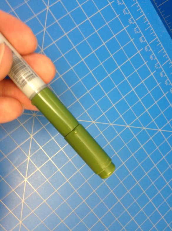
The markers are roughly cylindrical with a ⅜” diameter. There is the smallest of bulges in the center for the purposes (I assume) of aiding grip and disincentivising rolling. On either end there is an inch-and-a-quarter long color-coded cap with a quarter-inch step down on the end that allows either cap to be posted on the other. Near the base of each of these caps there is a small nub that makes it easier to remove and also helps prevent the marker from rolling. Each tip has a butte-esque taper leading from the body to the felt “brush”. The chisel tip is molded in the same plastic as the body, while the brush tip (the one you’ll most often be using) is a darker plastic that extends to an easily visible band underneath the cap. Which ends are which, what color the ink is (both descriptive and in code), and every other needed piece of information is nicely printed on the sides, and it appears underneath a shiny finish to prevent wearing with use (after all, these markers can be refilled).

photo 5-26photo 3-70

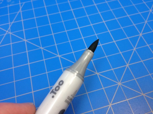
I’m not an expert when it comes to actually using these (or any) markers, but a quick search online of what people are able to create speaks for itself. What I can say is that the tips are well-made and hard-wearing (and they’re also replaceable, decreasing future expense). The chisel is sturdy and unyielding while the brush easily bends to create lines ranging from 1/32 to ¼ inch. The ink is alcohol-based and goes right through absorbent papers, feathering and drying quite quickly. It’ll still bleed through fairly heavy and high quality papers, but it doesn’t dry as quickly, allowing it to be blended more easily either with other colors or the colorless blender (which, as far as I can tell, just contains alcohol). Once down, the ink is essentially impervious to water and alcohol-based attacks, but they are sensitive to sunlight (as per their website) and, being solvent-based, aren’t the most “archival quality” things in the world.

photo 4-61

In my opinion, even forgoing the financial difference, the size and shape of these smaller Ciao markers is just more comfortable and easier to use. And they allow an artist to build up a collection of various colors in a much more consolidated space if they are willing to lose the color labels on the end. But they’re still expensive, and getting them won’t make you a better artist or a blending magician (as I can attest to). If you’re unsure if you want them or can utilize them I’d recommend starting out with only a few (greys would work best in this scenario) and getting more as you need them or improve your skills (the sets are quite expensive, especially if you end up not using them). But the bodies will last forever and the refills/replacement(s) (felt tips) are fairly easily available and extend the life of the marker significantly. This is a fine (and for some superior) version of a marker that is trusted by professional illustrators around the world.

Advertisement

Review – Rhodia 3×4.75(5) Staple Bound Pocket Notebook

Pocket notebooks are something that, it seems to me, are becoming more of a “thing” again. Whether or not it was just me being unable to find them early in the 2000s, or them not existing in large quantities at the time, I don’t know. Still, I seem to find newer, and possibly better, pocket notebooks all the time, like the Rhodia 3×5 48-page 80g notebook I stumbled across at my local bookstore.

20150203-231111.jpg

The color of my notebook is black (it can be orange), with orange lettering printed on, making it look like the Rhodia premium pads, but it contains regular, stark white, 80g Rhodia paper. My particular book is a graph ruling in a light purple that is customary for the brand. I quite like it, but prefer a light blue for graphs. The 3×5″ size makes the book small and convenient to put in any pocket. Being a half-inch shorter on either side to a field notes book, I was surprised at the places this book could go that the latter couldn’t. The 48 pages are quite sufficient for making lists, a few sketches, or even a few stories, and about the right length to prevent the destruction of the book by the time it is completed.

20150203-231121.jpg

The cover quality is nice. It is thicker than the paper without being cumbersome, and seems tear- and crease-resistant, though I wouldn’t push it. The ink used to print the logo and info on the back is much more heavy-duty than what is used on the pads and holds up without smearing, chipping, or fading for quite some time. The staple binding is a weakness in some cases, being a bending point, but overall causes little damage since the size is so small. And the paper is typical wonderful Rhodia. It is thick and smooth, taking everything from pencils to fountain pens with no problem. It is an absolute pleasure to write on, though with some liquid inks taking time to dry, one has to be careful. If they are looking for speed, a non-liquid pen should be looked into, but even ballpoints feel great on the paper. Bleed-through and feathering are minimal. Show-through is unfortunately common, and tearing is unlikely but possible if the book is going out on an adventure.

Overall, these little notebooks are a great addition to the pocket notebook collection. They are heavy lifters for their size, and the black ones are fairly covert and classic looking. And, of course, they all but disappear in a pocket. A great little book to look into especially if you think Field Notes are just slightly too large.

Review – Zig Millennium 005 Technical Pen

There are a lot of technical pens out there, and I’ve only looked at a few. Today I’m going to try and remedy that a little bit by doing a review of the Zig Millennium technical pen, specifically the black 005 version.

20141216-235803.jpg

The pen body is a bit odd. The bottom is a small, rounded piece of plastic. The barrel is silver and covered in writing. All necessary information is printed in several languages. The cap is nothing really special either: the top is flat with the tip size on what looks like a black plastic cutaway; the clip is simple, with a rounded end similar to a Pilot Precise or Uni-ball Vision. Interestingly enough, it says to keep the pen horizontal, but gives one a pocket clip. It’s the section of the pen that’s strange: it’s very small and nubby, it rounds off quite quickly and the ridges used to keep the cap in place are quite noticeable. It terminates rather abruptly into a metal end that leads to the tip. I’m not sure if one is supposed to hold the slightly uncomfortable section when writing or move back on the pen and place the fingers over the written portions of the pen, which I can feel the ink is raised up on, and will likely rub off quickly.

20141216-235811.jpg

On to the tip. It produces a very thin line, around the same width, but perhaps a bit wider than other brands of the same size, though that may just be the paper being used. The ink is archival quality (haven’t tested) and waterproof (have tested, is quite!) though that is to be expected from a pigmented ink. The black is quite black, and a cool black, which is nice, as many blacks tend to be warm. Writing is smooth and there are no skips or bumps with a good tip, though it will wear out after some time.

Overall it’s a good little pen, and quite comparable to the other technical pens in terms of both quality and price. I can’t speak for whether or not the rest of the line is wider than its counterparts from other brands, but that might be something to consider when purchasing. Otherwise, I’d say it’s almost entirely an æsthetic and comfort choice for the user.

Review – Prismacolor Kneaded Rubber Eraser

Recently, my erasers started running out of eraser juice, and I started having trouble with them. So I went to the art supply store looking for a replacement. I found almost my exact eraser, and one that was a bit cheaper, so I decided to try the cheaper one, the Prismacolor Kneaded Rubber eraser, out.

20140917-043500.jpg

Kneaded rubber erasers are cool. They can stretch and bend to get into small, difficult spots as well as wider spots. They can “clean” themselves, and generally don’t leave any eraser shavings. And while this is a good eraser, it isn’t as good as the ones I have used previously. It just doesn’t erase quite as well. Pencil is harder to remove, and stays bolder in indented lines. The eraser also rubs off quite a bit. There are still fewer shavings than one would get with a solid eraser, but more shavings than one should get with a rubber one.

So, if you’re just looking for an eraser that is better than standard or even high-quality solid erasers, I would recommend this one. It’s definitely good and gets the job done. But it certainly isn’t the best rubber eraser out there.

Review – Palomino Blackwing Pencil

So I’ve reviewed some pencils, and I believe it is time in my pencil-reviewing career to take a look at the reproduction of the “greatest” pencil of all time: The Palomino Blackwing.

20140507-013813.jpg

The body of the pencil is unique, which really is something to say about a pencil. The main body is a fairly standard hexagon shape, but painted in a nice, less-standard matte black. The Palomino Blackwing name and logo is printed in gold, with a gold band around the back. No indication of hardness is presented. The eraser holder starts off normal, but flares out into a rectangular shape with a metal insert that holds the eraser and makes it replaceable. This eraser holder is fairly smoothly finished, which is also unconventional. The erasers themselves are fine, they get the job done but they aren’t perfect, especially if they have to deal with the amount of lead this pencil puts on the paper.

20140507-013820.jpg

Now to what really matters: the lead of the pencil. It is fairly soft, but not the softest. From what I can gather it’s about a 3 or 4B (a few bits softer than a no.1 or no. 2 pencil) and boy does it glide. It’s likely one of the best flowing pencils I’ve ever used. Even for this hardness it is noticeably smoother than others in the same area. But it does sacrifice its point for this. The pencil just never stays sharp, and it can go from a fine (almost) line to a very broad line very fast. The softness also makes sharpening harder as the end never gets quite as sharp as I’d like it to be as it keeps breaking off. I suspect that the Blacking will be reduced to a stump in short order because of this, and the eraser likely never be used to its fullest.

20140507-013829.jpg

Overall I’d say that the Blackwing is a superb pencil, but just not my type. It is well constructed, has convenient ideas and is super smooth. But I prefer more precision in my writing and drawing and need a finer point for that. I’m also no a fan of the darkness that softer pencils provide. I like being a little more in control and a little bit lighter. That said, the shading is amazing and the tonal range is phenomenal. It wouldn’t be my greatest pencil of all time, but I can see how it would easily be someone’s.

Review – General’s Woodless Graphite Pencil Comparison with Cretacolor Monolith

So, last week I reviewed the Cretacolor Monolith all-graphite pencil. This week I was going to review the General’s Woodless pencil, but I realized how similar they are, so I will simply be talking about the differences in the two.

20140430-033722.jpg

The General’s pencil had (I have an older one) an inferior set of markings on the side that wore off quickly and easily. If the newer versions have a similar ink I’d say this is a downside as you can’t see what you’re using. The outer coating is a darker color, which has no real effect except aesthetics. And the back end is a bit more flat.

Is the quality the same? I can’t tell for sure, as they both seem the same, but if I must hazard a guess I’d say that the General’s pencil is a bit more fragile. But for all I know they could be made by the same company.

All in all I’d have to say that if you were going to pick between the two it might not even matter. Whether or not your local store (or where you shop most) carries them, and the color are the two biggest factors I can think of. Really it’s just a toss up. (But don’t actually do that: the pencils might break!)

Review – Cretacolor Monolith 9B All Graphite Pencil

There are always new things to be done with old inventions. They could just be a novelty, or improve the invention quite a bit. And when searching around for pencils, one may come across the all-graphite pencils that have been around. Today I’ll be looking at one type of these, the Cretacolor Monolith.

20140423-011236.jpg

Well, the body of that pencil is nothing to talk about, really. It is all graphite with a thin finish and white text giving standard supply information. There is also a bar code. Really, there is nothing to talk about as all of the pencil is the same material.

20140423-011242.jpg

It isn’t particularly fair to say that I’m just reviewing the pencil in this case, as the pencils will vary highly based on the grade of graphite used. I believe they all have the same hard graphite and finished outer shell. But my particular pencil here is a 9B which is very very soft indeed and means that this particular pencil has trouble keeping a point and wears down very quickly. On the other hand, it can be used to create a magnificent array of shading effects. I have had no problems with snapping, even with the points, but I wouldn’t expect to drop it and have a complete pencil come out of it. They do feel quite fragile. There is also the waste factor from sharpening the pencil, especially when it has been well used, will lose a lot of graphite (I’m not sure what this means when compared to all of the wood lost in standard pencils but I thought it worth mentioning) This can be avoided by sharpening the pencil by using it on its side as a shader. Using the pencil in this way also creates a marking area that is larger than almost any other art supply until one gets to brushes.

Overall a graphite pencil has its special uses, most notably with coverage, but is also fragile and not entirely unique. It’s like a charcoal stick that is much more well-behaved. So I would say it is worth a shot to try one and see if you like it. If you’re prone to using only the point of a very sharp pencil this might not be for you. But if you want flexibility in line width and color (especially with a softer pencil), then this might do some amazing things for you.

Review – Pigma Graphic 1

So you like to draw things a bit larger, and technical pens just don’t get big enough. You don’t want to use a brush or something similar. You may want to try the Pigma Graphic in size 1.

20131002-000542.jpg

The body is identical to a Micron body. It’s tan and smooth, with most necessary information printed on it. It has a place on the back for the cap to fit that is color coded. The cap is nice and has a metal clip. On the top it says 1 to indicate the size. The top can rub off, though, with some rough treatment. The grip section is easy, kinda small but easy to hold onto due to it being textured.

20131002-000548.jpg

The tip is felt. It comes to a point that is about 1mm. It flows nicely, laying down a nice line with no inconsistencies. The point doesn’t have much flexibility, making the line very constant with could be a plus or a minus. The ink is the same black that all Pigma pens have. It is fade and smear resistant, with some waterproofness to it. It is also acid-free, making it archival quality. In other words: it’ll last as long as your paper does. The ink is also a very nice, true, dark black. The writing experience is smooth and easy.

To sum up, the Graphic 1 is basically a larger tip Micron. It does have a different type of tip, on which the point can be more easily damaged, but the base is more secure. If you like Microns and need something bigger this is a good choice. And if you like felt-tip pens and want a higher quality one this is certainly the pen for you.

Review – Le Pen 003 Technical Pen Black

How thin do you need your lines to be? Do you need them consistent as well? Are the conventional technical pens just not thin enough for you? Then you may want to try out the Le Pen technical pen in a mind-bogglingly small 003 tip.

20130918-004443.jpg

The body of the pen is white. All necessary information is printed in several languages on the side in black, it is raised which makes me thing it will rub off with a lot of use, but this hasn’t happened yet. It also has the size on top for easy reference during storage. The clip is a very flexible plastic covered with a metal strip, making it durable and flexible at the same time, though it is quite strange and bulky. The cap lines up flush with the body and almost flush with the end when it is posted. The body proper is flat, and slightly tapered to the front, with some grip from the raised writing. It is a bit fat which makes it uncomfortable for smaller hands or for long periods of time. The grip and point though are almost identical in size to the Micron.

20130918-004454.jpg

The nib however is very small, it feels entirely destroyable every time it is placed on paper. The ink is as resilient as micron ink. And I would say as black but the size of the nib makes it seem much grayer so I can’t tell. I almost think I’m writing with a pencil sometimes. Though because of it’s size the line isn’t the most consistent in the world, but it is the most consistent at this size. It does write incredibly smooth and remarkably comfortable for a short period of time.

So overall this is a great pen. It writes smooth, puts down ink well, and is one of the few pens you can get in this size. It is slightly less comfortable than a Micron in my opinion, and I would be tempted to say the ink is not as good. But it’s still a great value and a handy pen for some of those more detailed lines.

Review – Micron Orange, Yellow, and Fresh Green Colors

It’s that time again, the time I review Micron colors. The three I have this time are the bright colors: orange, yellow, and fresh green.

Starting with the orange: It’s a very bright color, brighter than the fruit of the same name. It’s also a little bit on the light side, looking a bit washed out on the paper. It’s less pleasant than most of the other Micron colors. The pigment does apply evenly and there is no doubt it is orange, though.

On to the yellow, which is super saturated. It’s almost illegible on white paper, on off-white it’s not much better, even though it is still rather subdued and looks quite like the yellows presented in nature. In large patches it loses its illegibility and actually looks quite pleasant. It’s probably the closest to a natural yellow you’ll find in a pen.

Now the fresh green. This one looks like lime green. It is also super bright, and comes the closest to hurting my eyes of the bunch. The pigment tends to pool, creating some shading when drawing. This can be both advantageous and disadvantageous depending on the effect you’re going for. It is the most likely to bleed of any of the colors, but with this selection that isn’t too bad. I would also say this is the least realistic and useful of the bunch.

micron colors 3

Overall, these three bright colors have some issues, but are fairly good. They write well and are entirely servicable, but finding jobs for them seems difficult to me. I’m not sure if they are the must-haves of the other Microns, but they are quite good.