Review – Hot Concepts Illumix 4 in 1 Stylus

Every once in a while you run into a gimmicky, cheap product that’s still a bit of fun. For instance, I wanted a laser pointer (for me and my cat) and was in Walmart one day. On that day I found the “Hot Concepts Illumix 4 in 1 Stylus”. It’s a funky little pen with a light, laser, and touch-screen stylus. And it’s only a couple bucks! Let’s see how it works:

20150224-232410.jpg
The light is really just a white LED that’s stuck in the end of the pen. There’s no focus, so it dissipates rather quickly. You could get an idea about the shape of a small room, find a key, or perhaps locate something stuck behind some furniture, but that’s about it. Nothing far away can be seen, and nothing in great detail. But it still works alright. Interestingly enough, both the light and laser can be turned on at the same time. The laser is dimmed significantly by this, but the light seems unaffected.

20150224-232415.jpg

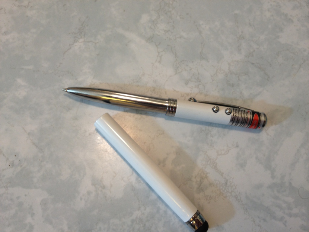
The laser pointer works fine. It’s one of the standard cheap ones that can be found almost anywhere. It will hurt your eyes, but isn’t very bright on anything else. It isn’t very well focused and will spread out over long distances. But inside a regular sized room, it is very functional as both a people and cat toy.

20150224-232420.jpg

The stylus works with modern touch screens, and it’s fine. It’s so easy to make a stylus that works with these screens now it’s unremarkable. It’s a bit cheaper than the norm and seems like it might wear out, but I’d say the worst thing about it is that you have to watch out and not hit the buttons and blind yourself when using it.

Finally, the pen part. It works, actually quite well. The tip is very fine, but despite that, it writes quite smoothly with little pressure. The inks a standard, almost-black ballpoint ink that’s water-resistant. The cartridge can’t be replaced as far as I can tell, though the batteries can be. So when you run out of ink you’re out and just left with the other features. That would seem to indicate the pen is not a primary function. The sleeve with the stylus has to be removed to access the pen, and this is not held on very well. It slips and can come off with a bit of a shake. There’s also nowhere to put the sleeve when using the pen, meaning it’s a two-handed operation.

A couple of other things: the clip works well, there’s a warning under the laser but otherwise no information printed on the pen, and the white smooth color with “chrome” trim looks nice, but not very professional, and it’s quite slippery.

Overall, every action it performs is done passably, but not well. It’s a fun device to mess around with or have if you want any or all of the 4 uses, but won’t use any of them that much. The batteries don’t last that long, the ink cartridge is small and not replaceable, and the overall tolerances aren’t very tight. The metal construction is nice, but the product seems to be made with disposability in mind. It’s fun, and good for the money. Just don’t expect much out of it.

Review – Papermate Eagle

All pen companies have a simple, cheap round pen. Bic has the round Stic, Staples has its… pen, and Paper:mate has its Eagle. And it’s the Eagle I’ll be looking at today.

20150218-000755.jpg

The body of the Eagle is nothing spectacular.  It’s simply a semi-transparent cylinder which tapers down slightly just after the section to a tip/refill insert that can technically be removed, but which shouldn’t be because replacing it would be as expensive as replacing the pen. The cap is a standard friction fitting affair, which covers the tip so ink doesn’t get everywhere, and has a clip that’ll keep it in your pocket for a little bit, though I wouldn’t trust it. The information printed on the side of the barrel is minimal but works.

20150218-000802.jpg

The writing is surprisingly smooth for a ballpoint, at least for the red one I’m using. I guess they’re just getting better over the years. The ink is the same color as in the Paper:mate Write Bros pens. It’s fairly dark and unaggressive as far as reds go. And it’s waterproof almost instantly, though I wouldn’t wager on it being fade resistant. Writing comfort is minimal, as one still has to push down a considerable amount when compared to liquid or gel pens, and there is no grip other than the plastic of the barrel. But it’s still quite tolerable and causes no excess discomfort when writing.

Overall it’s a fine office pen.  It works, and it’s cheap. It’s sturdy and fairly reliable. Is it great? No. But they’re fine for what they are, and virtually indistinguishable from similar Bic pens. If you lose a lot of pens, or need to get some for students or coworkers, these should do just fine.

Review – Scripto Oops

Sometimes, when going through life, you find some amazing idea that you can’t believe has been discontinued. I mean, how could they not be making money on that? Of course, there are many reasons for something to disappear, and in the case of what I’m reviewing today, the Scripto Oops, there are plenty of long erasers to take its place. But this one was the first I ran across, and I think it deserves at least a short review.

20150127-223939.jpg

The Oops is a pen-like item, with an uncapped cylinder as a push button on the back, and a functional, but not very useful, clip. One the side of the eraser is printed the relevant information for the company and item being used. At the section, the eraser becomes more “triangular” and ridges are added for grip in the facets.
Pushing the button moves plastic claws at the front of the eraser that push forward and then lock in the main eraser part. This mechanism is fairly sturdy, but does break over time. The eraser itself is better than a standard pink eraser, but not as good as gum erasers. In general, it falls well into the white eraser category.

20150127-223934.jpg

Overall, I love the thing, and use it when I remember it’s around (and not lost in my pen cup). For art, I do tend to use higher-quality erasers, but for everyday use this is a great one and it fills all the roles needed with minimal streaking and removes enough pencil. It’s just a shame they don’t make them anymore.


Review – Bic Cristal Bold

Bic makes a lot of pens, and the Cristal is one that everyone knows about. It’s a staple of the modern world: an admittedly cheap pen that can be, and is, used by everyone. But most of the time you find the medium version (or a fine if you’re either lucky or unlucky). And those have many of the problems we associate with ballpoints. And when one is running a business or doing art, sometimes it’s more important that the pen write on the first try, and write smoothly, than have a thin line. That’s where the Bic Cristal Bold 1.6mm pen that we’re looking at today comes in.

20141230-230245.jpg

The body is a simple as can be: a translucent piece of hexagonal plastic with key info on the side. The base of the ball point is plastic, while the tip itself is metal. The cap is a single piece with an integrated clip that works, but isn’t the best. The cap’s only real function is to prevent the pen from marking things when set down.

20141230-230252.jpg

But the real thing here is the tip, which is much wider than usual Bic ballpoint tips. Bic says that it is an “easy glide” pen. And I’d agree that that is the case. The ink is super smooth, and requires very little pressure once it gets going. After pushing down for a little bit, the pen, in my experience, will be writing perfectly a quarter of the way into the first letter, so not perfect startup, but good for a ball pen. After that it’s smooth enough to write cursive easily. There are a few points where the ink breaks up, and those are unsightly, but with a little hand control they can be covered up nicely. Like most ballpoints it’s suitably waterproof. And while the pen and packaging say it’s 1.6mm, Id’ be much more tempted to say it’s simply 1mm.

Really, it’s a great little pen, and not very expensive. If you’re looking for a cheap way to get a smoother (and partially less globby) writing experience, I’d say this is the direction to go first. They don’t match liquid ink pens of any type, but they certainly do work quite well and are convenient, having replaced most of my other ballpoints right now.

Review – Pilot BP-S Medium

For quite some time, pen companies have been trying to come out with the “superior” ink. And many succeed in varying ways. Every ink has its benefits and faults. The Pilot BP-S (which I can only assume stands for “better pen” as it uses the “better” refill) claims to have a “revolutionary” ink (perhaps when it was first made) that is very smooth and writes the first time. But all my quotation marks just make me a skeptic. Let’s look at the pen.

20141224-010739.jpg

The body of the pen looks like a hyped-up Bic Cristal. It’s got a similar hexagonal shape, with a black end cap that screws off for easy refilling (with the Pilot better refills). The body is clear with a minor amount of information physically molded into it. It’s enough to tell you what you’re using. The grip is series of tiny ridges that lead all the way to the metal cone tip, and are surprisingly grippy compared to the rest of the pen. The refill in this model is medium, and it comes out a ways beyond the cone. The cap is nothing to write home about, though it does have a flat surface for easy removal, which is nice.

20141224-010745.jpg

On to the writing. I can tell you for a fact that no pen that isn’t liquid ink will write the first time every time, but this one comes close. It does take some pressure to start, usually, and a more constant pressure to continue writing than a regular ballpoint, but the overall experience is smoother. With the right amount of pressure, the ink comes out in a consistent line, and with a little let up, a serviceable one with a few gaps. Neither of these options are more strain on the hand than a regular ballpoint. The ink is black, most of the time. Sometimes it’s more of a cool dark grey. And that’s fine for any office setting, though not really for art. It is also smudge-resistant and water-resistant, like most ballpoints, so it will survive a spill as long as the paper does.

Overall it’s a good pen. Perhaps it was better comparatively when it was first introduced. It is nothing terribly special, but it is superior to standard ballpoint offerings from most major companies. Again, just slightly. If a ballpoint is the perfect writing or art utensil for you, but it just isn’t quite smooth enough, these are probably worth a look. They certainly don’t cross over into the realm of feeling or acting like another type of pen, which unfortunately tends to happen with these “smooth” inks.

Review – Pentel Handy-Line S Permanent Marker

I personally don’t have much use for permanent markers, but quite a few people do, especially for the “fine” tipped ones like Sharpies. But regular permanent markers are kinda boring. Today I won’t be looking at one of those, but at a more interesting Pentel Handy Line S.

20141210-000538.jpg

The pen body is kinda ugly. It’s a very straight-cut tube in black, with lots of logos and text on it (though I have seen worse text on many items). The overall design is boxy. Up near the top is a very positive clicking mechanism that feels quite robust. The click it gives off is super satisfying, as well. The clip is nothing really special. It is a bit sharp and might tear cloth, but it won’t break. Interestingly enough, there is a mechanism underneath the clip that will disengage the clicking mechanism when the clip is moved away from the barrel, meaning that if you do put it in a pocket it will automatically retract, which would hopefully save one from some of the mess that would cause. The rest of the barrel is straight and black, with some writing. There is a slight curve before the retractable point, which has a nice cover that blends in with the pen to keep the marker tip from drying out.

20141210-000547.jpg

The writing is quite black: I’d say slightly warm but not to noticeably so. The pen is a bit dry when it is just beginning to write, but that is quickly worked through. I will admit that I haven’t given it the most rigorous testing possible, but the ink is suitably permanent. It doesn’t smear or feather when exposed to water, and writes on many different surfaces. The ink also has a very peculiar smell that is like no other marker I’ve used, though I probably shouldn’t sniff it regularly. The body of the pen says it’s refillable as well, though I can’t for the life of me figure out how that would work, but it’s cheap enough to replace.

Overall, for a retractable permanent marker, I’d say this one hits the nail on the head. It works well in all places and has no glaring flaws. It isn’t that expensive and can be used for all sorts of things. Whether or not the features make it worth tracking one down is up to you.

Review – Papermate Mirado Black Warrior

There are a lot of pencils out there, and it seems there are even more cheap pencils (that isn’t possible, I realize, but it made sense when I was typing it). How good can some of these pencils be? Today I’ll be taking a look at the Paper:mate Mirado Black Warrior Pencil.

20141105-010555.jpg

The pencil body is simple and round, which is surprisingly not a standard pencil shape. I always had round pencils at school (a set of leftovers from my father), and people always liked the way they felt when I loaned them out (which is why I lost so many). The shape is quite comfortable, and just that little bit better than a hexagonal pencil. The set of pencils that I received have a satiny finish that make them fairly grippy even with sweaty hands (from what I understand, they used to be more shiny and slippery). The rest of the body is a plain black with “Mirado Black Warrior” in gold on it in a poorly chosen font, as well as HB 2 and the Papermate logo, the hearts of which take away from the “warrior”-ness.

20141105-010601.jpg

The back of the pencil has a standard pink eraser, which does its job and hasn’t dried out in the time I’ve had it. I’d guess it isn’t the best quality and if you always want to erase what you wrote I’d recommend getting a dedicated eraser, but these work fine for most of us. The lead is HB, but feels much softer than most HBs I’ve used. Perhaps that is just me, but I’d say it is at least a little softer and it covers smoothly and well. A good pencil for filling in scantrons or shadows. Because it is so soft it is not too great at holding a point, though.
Is it a good pencil? Definitely, and for the money it’s really just a matter of preference.

There are loads of good pencils in this price range, so if one that is round (make sure your desk isn’t slanted) and has a slightly softer lead sounds good to you; or maybe you just like the “stealth” idea of an all-black pencil, this one is at least worth looking at. And like I said, for the price almost anyone could afford to pick up a box to compare to any other pencil they happen to be using.


Review – Zebra Sarasa Colors – Hunter, Fuchsia, Cobalt, Light Green, and Violet

After the first five colors in the ten-color pack of Zebra Sarasa pens, the colors get a bit less conventional and a bit more extreme. Let’s look at the Zebra colors Hunter, Fuchsia, Cobalt, Light Green, and Violet.

zebra sarasa colors 2

First Hunter, which is a dark bluish-green, a bit more blue than usual hunter greens, which seem a bit warmer. The color is very deep, and in some places could easily be work-friendly. It is a very natural color and could easily fit an artist’s needs for a deep green. It lifts the most when exposed to water, but like the rest of the colors here, it doesn’t really budge to smear once it dries.

Next Fuchsia, which I’d call rose, but that’s just me. It sits on the fence for me between a deep pink and a light purple. I can’t really tell which it is. As far as either one goes, though, it is a very appealing color that, unlike other pinks or light purples, doesn’t hurt the eyes. It’s more of a flower color than anything else.

Third is Cobalt, which is a very grey blue, though I’m almost tempted to say it’s the other way around. It’s a dark and dim color that gives off a wintery feeling. Artists could find a use for it in many winter themes and its color is just subdued enough that it would likely be a good office companion and still let you stick out.

Fourth Light Green, which is almost lime. It hurts the eyes a little, but it isn’t terrible. I’ve certainly seen worse. It doesn’t look very natural, and it’s slightly hard to read. It might make a good color for marking mistakes, but otherwise its uses are limited.

And finally, Violet, which is bright and indisputably purple. It’s a flowery purple and that’s the only really natural parallel that I can think of. It also might not be work-appropriate because of its brightness. But it is superb in readability, not dark enough to blend in in low light, and not light enough to disappear on the paper. For casual writing, this one would be a keeper.

And that’s it for the ten pack of Zebra Sarasa Gel pens, I think they’re great little things, with an interesting color set in which some aren’t often seen, let alone this common. They’re nice inks, and I’d go for them if you like the pen.

Review – Zebra Sarasa Colors Black, Blue, Red, Navy, Mahogany

I’ve talked about the Zebra Sarasa before, and it’s an alright gel pen. The saving grace of many gel pens is that most come in a variety of colors at least partially unique to them, and the Sarasa is no exception there. Let’s take a look at a few of the colors.

The colors are always a bit off in the digital space

The colors are always a bit off in the digital space

First, Black. It’s a cool black that covers well. It works in an office setting and generally doesn’t get lighter even with minimal pressure. I’d say it’s black almost as soon as it gets on the page. The drying time is moderate and it’s water smudge-able.

Next, Blue.  The blue is quite dark, darker than most office-type blue colors. This makes it easier to read and more professional. It’s also natural looking, more like a deep sea-blue than an in-between blue that doesn’t really exist in nature. It’s the least smudge-prone of the bunch, but that won’t entirely stop it from lifting off the page.

Third, Red. It is a bland red, with no real pop to it. Though it is brighter than some of the competition, it isn’t really eye hurting. It’s quite noticeable and quite red but has no character — and no real flaws, either. It’s the color that fades the most when exposed to water.

Now, Navy.  Navy is a very deep, dark blue. It’s really almost black. You’d need a good light on to tell which one is which, though you could tell that black and navy are different colors with minimal light. It’s a wonderful dark color that is almost soothing and quite free flowing.

Finally (for this set), Mahogany.  It is really more like maroon. It’s a slightly purplish red which is also very dark and quite nice. It is much more noticeable than the navy, and still quite natural, giving an almost brown appearance from far away. It’s probably my favorite of the five, though the one with the fewest applications, and while you might get away with it at the office, it could be a hard sell. Unless you work for Texas A&M University.

That’s the five colors for this week. Next time I’ll be looking at the other five colors in the standard ten color pack.

Review – Pilot G-2 and G-2 Mini

There are some pens that everyone knows about, standby pens that we all recognize and know the performance of. These are pens that even pen snobs would use in a pinch. The Pilot G-2 and G-2 Mini perhaps are such pens. But do they really hold up to their reputation? Let’s take a look.

20140930-230411.jpg

I’m not sure I really need to describe one of the most well-known pens ever, but I’ll start at the click button. It is simple and elongated, and there is nothing really special about it. Below it is a small section of colored plastic where the clip attaches. The clip has the basic pen info on it, though not much. It does its job well. It might be a bit loose, though the absence of a catch on it makes replacing it in and retrieving it from a pocket much easier. Down from this is a smooth, transparent, circular barrel. There is nothing exciting here, but I should note that the only differences between the regular and the mini are the cartridge size and the length of this barrel here. All other aspects of the pens are identical, which means the mini is a bit thick for its size. After the barrel comes a fairly distinctive grip with a small recessed and grooved area where ones fingers go. The grip style is good but the rubber is slick, so the net effect for me is that the grip is unnecessary. Below that there is a small plastic cone that leads to the retractable point on the pen.

20140930-230416.jpg

Now, I’ve talked about as many Pilot G-2 ink colors as I could get my hands on in the past, so I’m not going to cover that here, but I will go over the overall writing experience. The pens are gel pens and are quite a bit smoother that standard ball points, though the smoothest of ballpoints will almost rival the cheaper gel pens like the G-2. The G-2 has quite a bit of feedback, which is something I do like when writing. Sometimes, though, it doesn’t feel like you’re putting down any ink and instead just scratching the paper. There are generally no blobs unless you’re looking at the more outlandish colors, but on cheaper paper the ink absorbs very fast and will quickly create dots anywhere you decided to stop. Really, there are very few problems if one just sticks to standard black. All other colors do tend to have unique effects to them. Long drying time is a problem with all of them, I’m afraid.

20140930-230421.jpg

Overall I’d say the pen is still quite a good regular pen. Despite the many little flaws that it may have, it works, and it does the job of being a pen well. It isn’t the best pen, but it’s not very expensive and it’s far from the worst. It’s a pen everyone can use, but if you’re not a satisfied pen user and you’re looking for the best for you personally, you might want to try somewhere else.