Review – Zebra SL-F1 Collapsible Pen

Earlier this year, my Fischer Space Pen Stowaway finally had the accident I was worried it might all along (the two halves of the pen became separated, and now I only have a cap). So, I needed to acquire some new small, daily carry pen. The choice wasn’t particularly difficult, my go-to ballpoint pen company, Zebra, has been making a collapsible pocket pen for some time and previously I simply never had an excuse to buy it. But, now that it’s in my hands, does it actually hold up?

IMG_0037

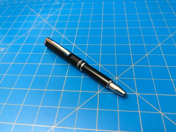
When retracted the pen is absolutely tiny at just over 3¼ inches long. The rear part of the pen is a cylinder 7mm in diameter and just under 2 inches long. At the top of this tube is a flat chrome finial with a simple chrome clip extending just beneath it. At the other end of the tube is a slight polished step-down that leads to a smaller tube, at the end of that is a similar step-down leading to a polished metal cone. Grabbing the smaller tube and pulling forward slides it out from the larger tube about an inch. This action also retreats the cone a quarter inch into the pen and pushes the point of the pen out of the end (leaving you with an overall length of 4¼ inches). Both of these cylinders are constructed of metal with a matte black finish applied, and the only markings are the word “zebra” written in silver near the bottom of the larger barrel.

IMG_0039IMG_0040

The retraction and extension method is a bit clunky and sticky, but it is very solid feeling and doesn’t show signs of failing anytime soon. The only potential problem I can see is that you need to be holding the tube that extends in order to write or the whole thing collapses back up again. The fine, .7mm ballpoint tip is, like all of Zebras refills incredibly smooth for a ballpoint while still having minimal skipping issues and providing a consistent and dark line (it writes almost identically to their standard refills for the “F” ballpoint series, but is a smaller, specialty refill). The extension of the pen is just enough to place it in the crook of most hands, allowing for it to be supported when writing, but the barrel/grip section, even for a lover of thin pens like myself, is small enough that your hand will cramp up over longer writing sessions (but this pen obviously wasn’t meant for that).

img_0042.jpg

If you’re looking for a pen that maximizes space while still being rugged and usable, this is a definite winner. The metal construction is hardy, while the extending feature is handy. It is easy to refill by screwing out the front cone (preferably when collapsed) but remains safely in one piece throughout normal use. The clip is very grippy and sturdy while not being sharp or prone to rip fabric, and its situations so near the top allows for deep carry with very little sticking out above to get caught or seen (though this is actually a problem for where I use it, as I have a hell of a time getting it out of the loop I’ve stored it in on my belt pouch. Something like that shouldn’t be an issue for most people). The writing is very nice and smooth with a permanence suitable to most people even though it can’t write upside down or underwater. And the price, while certainly higher than most ballpoint pens, is not going to break the bank.

Advertisement

Review – Speedball Elegant Writer Calligraphy Pens

It has been some time since I really practiced my calligraphy (and I only know how to do “gothic” because it’s the coolest-looking one). I really got into it for a moment a few years back, but for whatever reason I never really kept up. I write an alphabet or a quick note every now and then, but refilling fountain pens or cleaning up dip pens is such a hassle. Somewhere along the line, I picked up a set of Speedball Elegant Writer pens, which are more of a learning tool than anything else, but they do provide quick and easy access to calligraphy by removing the cleanup (and some of the drying-out problems). Does that make picking up a set worth it?

photo 1-77

The bodies of the pens are a very bland-looking, vaguely-pearlescent plastic cylinder that tapers out toward the cap. The top and bottom have little rings of black plastic and the cap has a cheap-feeling molded-in clip. Printed blockily on the side is all the information one would need to reorder or look the pen up. The grip section has a noticeably sharp step-down from where the cap covers it, and then a few more step-downs in front of the fingers leading to a small felt-tip nib (the size of which is marked on the side; my set contained two 2mm pens, a 2.5mm, and a 3mm).

photo 2-75

The nibs are a bit scratchy when writing, and lack that sharp edge you really want when calligraphing. They do a fine job for the material they’re made out of, but they certainly aren’t professional quality. It’s worth noting that the pen is super light, and posting the cap doesn’t affect the balance at all; whether or not that’s a problem depends on what kind of user you are (but it does make them feel cheap). The ink is black enough, but on closer inspection has noticeable shading. Most people won’t think anything of it, but again, it isn’t professional quality. On the page it behaves well, with minimal feathering and bleed-through even on copier paper, but it has no fortitude and easily washes down to a purple smear when exposed to water (I suspect no better results in the sun). It just isn’t meant to stick around for too long.

photo 3-69

Really, the worst thing I can say about these is that I think they’re over-priced. If you’re just learning letterforms or want to practice and remember them, these pens are more than adequate. They’re cheaply made with a non-permanent ink, but the tip is well-crafted and the plastic can actually absorb some shock. I keep them kicking around to keep my hand able to sculpt the correct letterforms (though they are just this side of larger than I prefer) and I’m not unhappy with them; they are entirely serviceable.

Review – Kuretake No.14 Brush Pen

I think an ideal gift is one where you receive something that is useful or interesting to you, but from a direction you would have never looked yourself. Such was my case with the Kuretake brush pen number 14. For personal use, I’ve basically settled on my brush pens, and wasn’t really on the lookout for another, but I was still quite glad to receive one of these little guys as a present. Let’s see how it performs.

photo 1-76

The body of the pen is a black-flecked maroon, slightly-soft plastic that looks and feels a bit like ebonite. The cap is uniformly thicker than the barrel with a black cylinder protruding through a diagonal cutout for the top quarter-inch. From this comes a simple but functional spring-steel pocket clip. The barrel has no decoration save gold-imprinted Japanese lettering (that I can’t read) and an Arabic numeral “14”. The butt end is a similarly simple black convex disk. The section is made of the same piece as the barrel, and aside from a sealing ring for the cap, has only a single small step-down before a black plastic cone leads to the incredibly small “nib”.

photo 5-25

The little felt tip is only two millimeters long. And, despite many of the online references I found referring to this pen as “hard”, the line produced easily moves from half a millimeter to three millimeters. The ink is fairly black but not particularly dark, and it has a tendency to fade or split during long or fast strokes. It also bleeds/separates/fades when exposed to water. It’s not super runny but most work will still look ruined (it plays nice with alcohol, though). The feel of the grip section is nothing special but I have no real problems with it, and with the cap posted it is quite well balanced (the cap does feel like it might have a cracking problem with prolonged use, but the pen is disposable). Unfortunately, despite this, I just can’t seem to shake the feeling when using the pen that I’m not in control. Brush pens don’t play well with my style at the best of times and this guy can really get all over the place quickly.

photo 3-68

I’m not sure this pen would be useful as a serious artists’ tool: its ink doesn’t take traditional washes, the ink flow is sub-par, and the tip is imprecise. But as a portable sketcher it has a resilient body, a good clip and a wide range of possible expressions. It isn’t inexpensive, but it isn’t egregiously costed. This isn’t the be-all end-all of disposable brush pens, but id does make for a fine introductory pen or a “backpack beater” as it were.


Review – Tombow 2558 Pencil

The Tombow 2558 pencil was introduced to me as a “favorite” pencil, so obviously I had to pick one up. Still, when you first look at it, it’s a pretty unassuming thing. It looks like your standard yellow pencil, with something a little… “off”. So how is it different?

photo 1-71

The body of the pencil is very similar to your average yellow (orangish) pencil. It is basically the same length: 7½” including the eraser attached by copper-colored ferrule. Like most, it’s hexagonal with the information stamped and printed on opposing facets. This information, rendered in a pleasant reddish-brown, is more than enough, giving you: the company (Tombow), the purpose (for General Writing), and the hardness (HB). But there is something to make the body of the pencil stand out: it is slightly thicker than your average pencil, about a millimeter more in diameter. Just enough that one can tell it’s different, but if they aren’t side by side you’ll scratch your head.

photo 2-69

photo 3-63
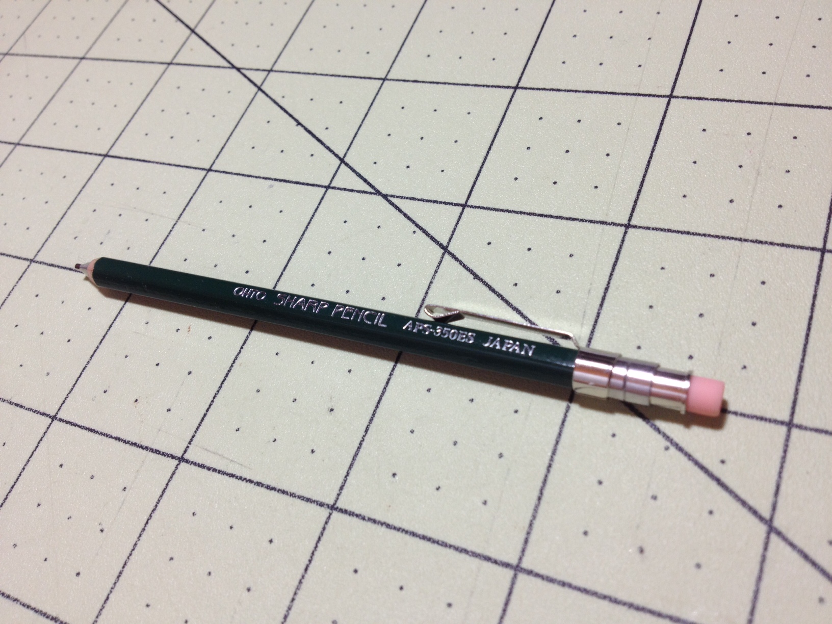
In practice this makes the pencil more comfortable to hold (more material means less hand cramping), and with its super smooth HB lead it really is a pleasure to write/sketch with. And this lead does feel a bit softer than I usually expect an HB to feel. It produces darker lines with seemingly the same pressure (and surprising ease), but that certainly improves the ease of writing with it. And the eraser functions well; it doesn’t remove everything, but it doesn’t vanish either.

photo 4-57

This is, as advertised, a very nice pencil for writing. And everything about it is well-done. The finish is nice and evenly applied, the wood is sturdy as is the lead, and the ferrule is nicely fitted on a step-down so that it doesn’t catch and is unblemished by its crimping. If you’re a wood pencil person (I’m not as much) and are looking for something high quality but still standard looking, this is a nice option. It might not be a smooth as a Blackwing, but it’s surprisingly close, and if I’m ever using a wood pencil, it’ll probably be the one I reach for.


Review – Staedtler Mars Lumograph Pencil (F)

“I use these specifically, because I like the nice blue,” is a bit of a paraphrase from a former instructor of mine when discussing what pencils to get for sketching or other artistic purposes. The main gist of this discussion was that it really comes down to personal preference, since there are so many different pencil brands that all make quality products. Aesthetics are important, and Staedtler is known for their deep blue coloring (as well as their quality craftsmanship), and that’s part of what makes the Mars Lumograph iconic, but is it what you should be using (specifically in “F” hardness because I like my pencils a little bit on the hard side)?

photo 1-69

The body is a standard hexagonal shape, with a similar size to your average writing pencil. A deep blue covers almost the entire pencil, save an end cap that is black and a white band just beneath it. On the end cap the hardness is stamped in a silver ink on all 6 facets, and the main product information is rendered in the same color on the back two thirds of the blue area. Opposite this facet a product number and bar code are printed in white.

photo 3-62photo 4-56

This pencil doesn’t really have any fancy features; like most sketching pencils, it doesn’t even have an eraser. But what it does have functions superbly. The wood is light but sturdy (no splintering) and the lead well centered (no weird angles or breaking because of sharpener issues). The lead itself is wonderfully smooth, even with my preference for firmer feedback.

photo 5-23

And that really just affirms the idea that started this off. The Lumograph is a good pencil, it can take a beating and keep on sketching. The materials are good, and the assembly is what you would want. But, aside from it being good quality and easy-to-find, there isn’t a real reason to recommend this over another drawing pencil. If you like the blue, definitely go for them. If you think blue is better than the other choices (black or green in most cases), also take a look. If you’ve been with the brand forever or just find there’s something about the feel that you really enjoy, there’s no reason to turn away.

Review – Zebra DelGuard (0.5)

At first glance, the Zebra DelGuard looks like the popular Uni Kuru Toga and offers a similar lead-break-reducing feature (though without the point protection). The clear plastic section is molded with a similar grip and the body is black-ish and slightly thicker than the average mechanical pencil. Inside, though, is what appears to be a much simpler spring-mechanism that promises to keep your lead from snapping. Does it really do enough?

photo 2-61photo 5-18

The body is a simple, matte-black tube with a small logo just before the center-band. On the back is an attached clip with some printed information, and a chrome click-button cover that easily slips off to reveal a thin, white eraser that easily pulls out to reveal the lead tube. The (grip) section is a black, translucent, and slightly slippery-feeling plastic with some ridges for grip and a slight slope down to a small metal lead pipe.

photo 4-50photo 3-56

Performance of the main features of (mechanical) pencils is good but not outstanding. The clip holds well and doesn’t rip fabric; the eraser removes marks handily with minimal shavings (and a little bit of smear); and the lead is average verging on soft (it is fairly smooth and I like the .5 size). The actual DelGuard system is a bit more dubious to me, though. It’s basically a few springs that allow for a huge range of vertical motion for both the lead and the lead pipe. This means that if the user bears down vertically on up to a few clicks-worth of lead it will simply retreat into the pencil and not break, even with a considerable amount of force. Unfortunately, I write/draw at an angle, and that is apparently extreme enough to mean the lead will snap with an amount of pressure I usually associate with a lead snapping, since the system only relieves pressure vertically. This isn’t really an issue for me; I write/draw softly enough that lead breaking isn’t something I worry about. But it has the same problem for me that the Kuru Toga has; that is, with my writing style, the system doesn’t work, making it completely pointless. This pencil could not have its cushioning springs and be exactly the same experience for me.

photo-275photo 1-62

So, as a pencil, it’s a good writer that might be moderately overpriced (it’s more expensive than the Kuru Toga). I’ve gotten other pencils with a similar writing experience for a similar price, but this is nothing special and I personally wouldn’t get it over less-expensive Zebra models, especially since the grip doesn’t feel too good in my hands; I haven’t had it actually slip, but it just feels slippery. If you really have a serious problem with your leads breaking, this might be worth looking into, otherwise it’s just a tossup with similar models.


Review – Pilot FriXion Highlighter

While I have reviewed highlighters before, it is a fairly rare occurrence, mostly because we all know what a highlighter is and how it works. For the most part, what brand of highlighter you buy doesn’t even matter; they all do the same thing. The companies producing these products know that, so occasionally they find a new gimmick to get you to buy their specific product. Most of these gimmicks are pretty silly, but some, like adapting the Pilot FriXion pen system to highlighter form, might actually be useful if they work.

photo 1

The body of the pen is a bit ugly-looking. On top of the back end of the barrel there is a tattoo-esque design that doesn’t quite look right with the words “remove by friction” in n boring font, all in miniscule. On the very back end is a dome of frosted hard-rubber that serves as the “eraser.” The cap is a translucent plastic, matching the ink color with an integrated clip that slopes off a flattened tip. Popping it off reveals a slick black section ending in a chisel-point porous tip. The “Pilot” and “FriXion” logos are the only real information included.

photo 2photo 1 copy

My particular three-pack came in orange, pink, and yellow. The colors are about what you’d expect but when compared side-by-side are noticeably paler than your standard highlighter. They are still bright and easy to see, while allowing text to be seen through them, and keeping smudging to a minimum. The real interesting thing about the FriXion line, though, is that when friction is applied (or it’s, you know, heated) the ink is “erased.” There’s definitely still something there, but whatever was underneath shows through, so the ink becomes transparent. This actually works surprisingly well; you’ll never fully get the ink to go away without a trace, but it looks much nicer than a bright highlighted mistake staring you in the face (the originals were ballpoint pens, which are nifty but kinda defeat the purpose). Now this obviously has archive-ability problems, I was able to use a flame to make the ink disappear and I don’t think heat or sunlight will do it well, but for something like highlighting I’m not sure that’s a very big deal.

photo 2 copy

photo 3 copy

Wet ink will smudge when writing, inkjet printer ink will smudge when erasing.

photo 4 copyphoto 5 copy

I’ve had a really good time using these pens they’ll probably end up somewhere in my system. I’m not a big highlighter person (I’ve never used them in books, for instance, and I don’t plan to in the future) but I’ve turned to them for marking off items on to-do lists because they have a cleaner look than “crossing out.” And for that, these little guys work perfectly. I never have to worry about making a mistake (and I can draw silly little pictures or whatever).

Review – Faber-Castell Trilux 031 (Black, Blue, and Red)

Some time ago I reviewed the Faber-Castell Lux (034), an inexpensive Peruvian pen comparable to cheap Bics or Paper:Mates. They were pretty decent pens but they had small, round bodies that could easily become uncomfortable (I personally don’t have much of a problem with the size, but I can see how some people might not like it). Their bigger brothers, the Trilux (031 in this case), have larger, triangular bodies, in an attempt to remedy this problem and provide a more ergonomic experience while still being inexpensive. But are they actually more comfortable?

photo 1-5

“Probably” is the answer. The body is a very rounded triangular shape (in green for the 031, the back of the package indicated different numbers are different color barrels) with a cylindrical cap in the back and the slightest of step-downs in the front third, followed by a quick tapering to a point. The step down and end cap are just for the single-piece cap-with-clip to be able to grip since it’s still round for some reason. Both the cap and end-cap (finial?) are color-coded to match the ink color of the pen. Printed/embossed in black on the side is enough information to identify the pen.

photo 2-3

The section is comfortable to hold: the triangular shape fits well in the hand (with a standard 3-finger grip), the plastic is easy to hold, being slightly less polished after the step down, and said step down isn’t an issue at all, barely being noticeable. The cap is post-able (I only mention that because with the triangular shape and round cap they had to go out of their way to make that so) and the integrated clip does a fine job but I would suspect it’s easy to snap off.

photo 3-3

The inks seem to be the same as those used in the Lux, which are fairly comparable to any other set of inexpensive ballpoint inks, with the red being on the darker rather than the lighter side, the blue being quite dark, and the black feeling warm and grey-ish. My set in particular is fine-tipped, and writes fairly smoothly, but with more blobs than I would like. When I first opened the package the red and blue pens worked while the black was dried up. Warm water and/or rubbing alcohol didn’t unclog it and I finally had to resort to using a lighter, which I wouldn’t recommend, but it did work and was likely the only way to get it to write as it is “non-disassemble-able” (unless you want to destructively disassemble it).

photo 4-3

In the end they’re a solid pen, and a comfort upgrade with their thicker section and triangular design. They’re not the perfect office pen, but they feel well made (even if the plastic feels ever so slightly less flexible and/or solid when compared to some other similar pens), they write, they’re comfortable, and are inexpensive. I wouldn’t be seeking them out, and with them being “Producto Peruano”, finding a steady supply in the ‘States would be hard, but they are an increase in comfort to an already well-performing pen for the price.

Review- Ritepoint Chromatic

Every once in a while I like to take a look at something vintage and see how well it stacks up. Plus I’ve got a soft-spot for slim, fine (line) writing pens. Now I’m not entirely sure as to the status of the Chromatic (or Ritepoint, or whoever) but it does seem these pens (and refills) are discontinued, but easy to find online. Is it worth it to snag one?

photo 2 ritepoint

The pen body is very slim and stylish, reminiscent of the Cross Century. It’s a smooth cylinder, with a gold-banded break for the twist mechanism and tapers at the back and front. At the fron,t a third of the taper is in the form of a gold-colored metal cone, from which the point extends when the mechanism is engaged. The back taper terminates more abruptly and affixed to it is a fairly solid, basically flat clip that runs almost the length of the back section.

photo 3-1

The action of the pen is strange enough that I’m not sure it’s working properly. Turning the back half of the pen clockwise a quarter turn will extend the ballpoint and lock it into place. From there twisting will do nothing until enough force is applied counter-clockwise and the pen “clicks” at which point the tip will slowly retract completely. It’s an interesting compromise system and it works quite well. It’s just that everything feels a bit still and awkward. I can’t quite tell if it needs oil, is broken, or that’s just how it’s supposed to be.

photo 5

As for the writing, it’s quite good. My pen has a blue “microtip” cartridge installed. The ink is smooth enough coming out that I can write in cursive, though the lines themselves have some start-up and shading problems (oddly reminiscent of fountain pens). The line width is equivalent to, or slightly thinner than, most “fine” points and the ink properties are fairly standard. The only other function; the clip is better than average but nothing to write home about.

It’s a decent little interesting piece of history, but I wouldn’t say it’s essential for any collectors. And the impracticality of having to hunt down new-old-stock or second-hand refills or fashion your own out of whatever might fit makes it not a good choice for the regular user. If it sounds interesting to you I’d say go for it, but it’s nothing to run out and hunt down.

Review – OHTO Sharp Pencil APS-350ES

I like tiny, pocket-sized things. Especially writing utensils, like the Fisher Space Pen Stowaway, the cheap touch screen styluses, and now the subject of this review, the OHTO mini Sharp Pencil. All of these happen to be the same size. So the OHTO is cool both in that it matches many other small items you can buy, but it also might be the smallest mechanical pencil I have ever seen, being a little over 4 inches long and less than 3/16ths of an inch in diameter. But at that size will it still work well? Let’s take a look.

photo-162

The design is meant to mimic a wooden pencil. The outside of the pencil is actually made of wood and has a hexagonal design. Mine is in green, with silver printed information on one facet. The tip is sharpened like a wood pencil until about halfway when it is replaced by a metal cone that leads to a very short lead pipe. On the back there is a clip that is a separate piece of metal bent around and friction fit. Beyond that is the click mechanism that is really only usable when the eraser holder is installed. The eraser holder is quite a simple piece of metal that keeps the lead in the feeder, depresses the click mechanism, and holds a very small eraser. The wire-thin piece of metal attaching this piece to the body seems rather flimsy and easy to remove, but I have had no problems with it shaking loose: it simply doesn’t have enough mass. Likewise I have encountered no problems with the quality of any of the components.

photo-163

The lead seems to be HB. I don’t have the package (which is rather understated and nice by the way) with me so I don’t know what it is exactly, but I have no complaints. It writes well, and can be sufficiently dark. The eraser also works surprisingly well for its size, with very little being used to rub away quite a bit, but I wouldn’t say it’s a great eraser. The click mechanism is satisfying and the lead is held very securely in place when one is using the pencil. The clip is also very good for the size, easily holding it in place while not damaging anything.

In the end, for on-the-go sketching or writing I would certainly recommend this product. I also wouldn’t recommend it at all for stationary or desk-related activities. It is very small, and while that makes it portable, it isn’t the most comfortable of writing implements. It will hold up very well in a bag or a pocket, and it looks quite neat in my opinion. I’d just say be careful of the back end being knocked loose and stock up on some extra erasers and lead (it only comes with one of each) as one will likely run through them pretty quickly.