Review – Crayola Twistables Crayons

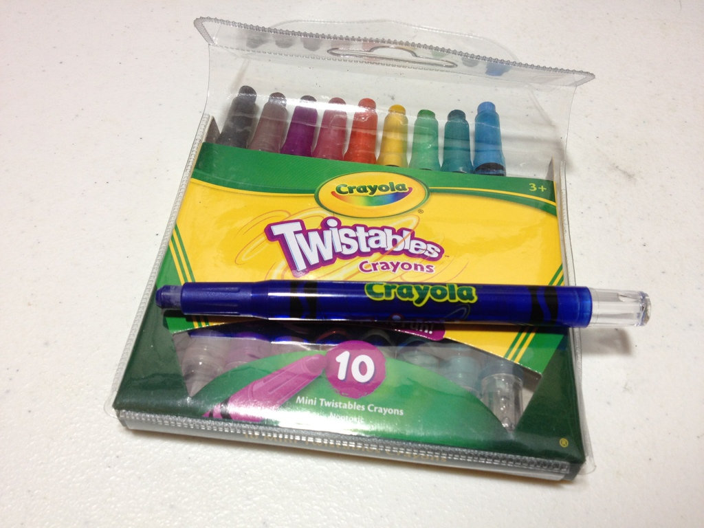
Now, crayons are impractical for most art types, usually because they are fragile and fiddly. What if these two problems were fixed, and crayons were easy to take and use anywhere? What would their value be? Well, Crayola has a set of twistable crayons which have plastic bodies with a twist action, so let’s take a look.

20140521-003833.jpg
First off, the crayons come in a quite nice plastic-and-card-stock carrying case, which, while handy, seems like it would fall apart rather quickly. And, just for me personally, I would want to store these somewhere else, but have a problem throwing plastic things away so I keep them in it.

20140521-003839.jpg
The crayon barrels are made of plastic and have Crayola and Twistables written on each one, with no indication as to color, though the body is see-through so the color is fairly apparent. Near the tips is a tapered and grippy section which works quite well, especially since the rest of the body is very slick. At the other end is a twisting knob which operates easily and can be used to both push the crayon out and retract it.

20140521-003845.jpg
That’s almost all there is to say. The crayons themselves are nothing special, they’re just kept in place by a plastic tube and screw. They are, of course, for kids so they are bright and not very natural. They are also non-toxic, which is a bonus. They stay alright on the paper, but not as well as more “professional” crayon and oil pastels.

So, overall they are better crayons, but they don’t change what Crayola crayons really are. Which is good for the people who use Crayola crayons. They aren’t particularly serious art supplies, and that’s fine. For more advanced things I’d recommend picking up one of the larger cases with more colors rather than the standard 10 pack I got. Past that there really isn’t anything special about them.

Review – Pilot Easytouch Pro

While not necessarily an art supply, the Pilot EasyTouch Pro claims to use a hybrid ink formula to make a smooth writing, quick drying, waterproof ink, which sounds super handy. Let’s see what it’s all about.

20140516-011941.jpg

First the body of the pen features a “modern design”. The tip is a metal cone similar to most click pens. The grip is nicely tapered and flares out at the end. The barrel is fairly straight, but with a little engraving and minimal information. The clip is simple, and tight, with a “modern design”. At the end is a click button and a strange cutoff design. The click mechanism works well but has a grating sound.

20140516-011947.jpg

The ink itself is a slightly dark black, but really more of a grey. The tip is medium and there are no options. It does flow quite easily, with very little pressure on the paper. It isn’t as smooth as a fountain pen, or even a gel pen. It does offer some line variation when one presses harder, and it becomes considerably blacker when one does so. It dries fairly fast, though not the fastest. All of this is quite nice until at some points when one is writing (especially when one has just started) a large blob of ink spills out of the point and bleeds though the paper. This is not really unusual for a ballpoint, but the amount and the bleed through make it quite a problem. It’a not really a problem when writing, but a problem when doing anything else.

So overall, this is not a drawing pen, but a writing pen, and not a long writing pen either, because of blobbing, but if one merely wants to sign a paper, or write one page it is quite a smooth-writing fine instrument.

Review – Pentel Finito Porous Point Pen

Looking for a porous-point pen, and none of the standard ones are doing it for you? Maybe you might want to look at the Pentel Finito porous-point extra fine pen.

20140409-014922.jpg

The cap is all plastic, with a clip molded into it that does the job, but isn’t spectacular in any way. Inside is a small piece of plastic that covers the tip and is held in place by a spring, keeping a tight seal on the tip. This is visible through the clear plastic of the cap. The barrel is a black-covered plastic and has all necessary info on it. The grip section is clear and through it one can see the fins of the feed and a small bit of the ink reservoir. The grip section is very smooth and can easily become slippery. After a small bit of metal tapering, there is an extra-fine porous point at the end.

20140409-014928.jpg

The ink is fairly black, and fairly standard, not really permanent or fade-proof. The point does spew a lot of ink out: in fact, I would tend to call this pen a fine rather than an extra fine point due to the sheer amount of ink it leaves on the page. This makes the line considerably wider than just the point of the pen. This gushing also leads to points of bleed-through that are not seen in higher-quality porous point pens like Sharpies or Microns.

Overall I’d say the Finito is a mediocre pen that has no purpose as an art supply. There are many pens out there that do what this pen does better, and for the same price. If you want a pen that gushes, or will not dry out for long periods of time this pen may be worth a look, but I’d try something else first.


Review – Papermate Inkjoy Green, Pink, Orange, and Light Blue

In a previous entry I looked at the more standard Papermate Inkjoy colors, now it’s time for the less standard colors, like light blue, pink, orange, and green.

inkjoy tests 2

The light blue is a sky-colored blue. It is the hardest to read of any of the Inkjoy colors, though it is still fairly visible when not cluttered. It has a very natural feel and is very sky-like. It is very neutral anyway. It doesn’t look like a color that takes a stance, if that makes any sense. It’d make a nice color for both drawing and work.

Next pink, which thankfully isn’t a very aggressive pink. It’s definitely not hot, it’s more of a magenta color, but not quite. It is not a very natural color, though, as it doesn’t look like a rock or a flower. Might be good for a personal thing, or some corrections or something similar.

Third is orange, which I must say looks almost exactly like Pilot G-2 Orange, which I have previously reviewed. Subtle, but not very useful, perhaps flowers or the fruit, but it could be work-friendly, if you’re in a less formal office setting.

Finally green, which is a quite deep, more forest color. A very natural and neutral color. Again a fine informal office color, and a nice forest or swamp color. Though very limited in its natural colors. One of the least useful, but most usable, colors in the set.

Overall these four colors are unintrusive and subtle, with various office and home applications, but very little artistic applications save a few specific places.

Review – Papermate Inkjoy Black, Red, Blue, and Purple

In my tradition (now) of taking a look at the uses of standard office supplies in art, I’ll be looking at the Papermate Inkjoy pens and their different colors. Today will be the standard colors of black, red, blue, and purple.

inkjoy inks 2

Not Entirely Representative

Papermate tends to make standard colors, and their black is no exception. One of the deeper Papermate blacks, the Inkjoy black is nice and constant, though is a bit blue-greyish. Not quite black, but very good for a ballpoint pen.

The red is also fairly standard. It’s light, but not light enough to say it’s pinkish. It is very subdued and pleasant, not as aggressive as most reds, making it a bit more natural.

The blue is very deep, but not very saturated. In low light it still looks blue, but one wouldn’t mistake it for a sky blue. Again, like the red, the low saturation makes it look less aggressive than some other hues. It’s got a very nice, watery feel to it.

And finally the purple, which again is deep but not saturated. It is unmistakably purple but not very aggressive. Unlike the others, though, this leads to a less natural look as most natural purples are deep and aggressive or light and flowery. This one is in between, which means it would be at home on your papers but not in artwork.

Overall, Papermate did a good job with these colors for the workplace. They definitely weren’t designed for art, though they could be worked in. Not superb but good enough. We’ll see what the next four have in store.

Review – Bic Tech Ballpoint and Stylus

Well, sometimes now-a-days art isn’t always done on a physical medium. Tablets, smart phones, and touch-screen devices are becoming more prevalent these days and for artistic purposes your finger isn’t the most precise thing in the world. Fortunately, Bic has a solution for both mediums (maybe) the Bic Tech pen and stylus.

20140206-232018.jpg

The barrel of the pen is a fairly standard Bic barrel with a slightly grippy (grip) section, a hole for the ballpoint and a logo. Halfway up the pen is where things get interesting. The top half of the pen is a chrome-colored plastic which I personally don’t like but doesn’t look terrible. Just above another Bic logo in the center is the click mechanism, which is unique in its side mounting. The lever protrudes out to the side sightly, but not enough to really get caught or accidentally pulled. It has a slight curve to it, making it a great finger place and making for easy disengagement of the fingers or caught objects (again preventing accidental usage). I would say my only problem with it is it gets scratches from fingernails far too easily. The clip is absolutely nothing special, in fact it doesn’t even clip, it more just hangs on a pocket or something so that’s cheap. At the top is the stylus which I’ll talk about in just a second.

20140206-232024.jpg

The pen itself is nothing remarkable. It does appear to be smoother than a normal Bic ballpoint. But it is almost the exact same shade of unimpressive grey-black as every Bic pen.

20140206-232030.jpg

Now on to the stylus, which is the standard stylus end that has been popping up all over the place recently. It works. It is obviously not the most expensive or precise thing but it gets the job done. It is better than a finger, I can tell you that much. I can’t attest to the durability of such things, but I can say that it feels likely to break, though the pen isn’t expensive and by that time you’ve probably gotten your money’s worth out of it.

So what is the Bic Teach pen like overall? Mediocre. It does an alright job at being both a stylus and a pen, but does neither fantastically. But for the money it really shouldn’t. If you’re looking into the prospect of such a device or are on a very slim budget (or possibly don’t care) this might work for you, otherwise I’d suggest looking elsewhere.

Review – Sheaffer Maxi Kit Calligraphy Nibs

Now, for the second part of the Sheaffer Maxi Calligraphy Kit review. This one might be a bit short as I’m going to be looking at the three included nib sizes: Fine (1mm), Medium (1.5 mm), and Broad (2 mm).

20140128-234823.jpg

The nibs themselves are Italic, meaning that they are flattened and straight at the tip, thus producing a wide up-and-down stroke and a thin left-to-right stroke. They are true Italics, with no tipping material, and sharp edges that may cut into the paper if one isn’t careful, but they are a bit more rounded off than a dip pen Italic would be. Because there is no tipping material, the stainless steel of the nib is easier to wear away and damage from rough use. Although this doesn’t happen often as steel is still a very robust material, it is worth noting.

20140129-001212.jpg

Each nib has almost the same left-to-right width, but the up-and-down stroke width is equal to the size of the nib stated above (1mm,1.5 mm,2 mm). The fine nib can be used for regular cursive writing, but the medium and broad nibs should not be used for cursive writing as the size necessary would render writing impractical or illegible. Although the corners of the sharp nibs can cut into the paper, they aren’t quite sharp enough to make the sharpest of line turns. To most eyes, the angles appear spot on, especially when compared to the round corners of regular fountain pens, but when compared to a dip nib they are a bit lacking. Overall, the nibs a very functional and useful in a variety of situations (at least calligraphy situations). They provide enough variation to not be bored with inking up three pens, and even without a tipping material will last through quite some use.

Review – Pilot G2 Teal, Hunter Green, Navy, Periwinkle, and Caramel

This week I’m gonna take a look at some of the weirder colors of Pilot’s G2 pens. Let’s dive right in.

third pilot pen comparison

First up is teal, which is a deep, bluish-green, almost like an aquatic plant. It’s very subdued and seems almost workplace-friendly (sort of like a blue-black, but with green). It goes on the page a bit thick and is a bit of a hard start when it’s not been written with for a while. A very soothing color overall.

Next up is hunter green, which is a deep, swampy green. It looks like a camouflage color, which I guess it’s supposed to. It isn’t the most pleasant of colors to stare at, but it is quite subtle. This color is probably the thickest ink and has the most problems with startup and skipping of the bunch.

Third is navy, which is a blue-black. It doesn’t really remind me of any previous navy colors I’ve seen, it is simply a very dark blue, but not a deep blue. It looks just like a combination of blue and black. Very work-friendly, I would say, but has no real art application save for maybe a night ocean.

Fourth is periwinkle, which is a light, sky blue. This is one of the lightest and easiest to read light blues I’ve seen. It isn’t quite as light as possible, but that makes it readable. It has a bit of shading (inconsistent color) but not too much. This is likely the most versatile ink color of the bunch, being a close to work-friendly “happy” color, and a realistic color that could be found in both water and skies.

And finally is caramel. Caramel is a light, almost hard-to-read brown. Again it is subdued enough to not hurt one’s eyes, but is very light and not particularly pretty. It does flow well, and really looks like caramel, so if you need a caramel colored ink, this is the ink for you.

That concludes my look at the Pilot G2 pen color types. I hope these were useful, they really do cover the gamut and provide ink colors for a variety of different uses. Unfortunately, I believe they only come in a large, expensive pack, so I would recommend having uses for a few of these pens before purchasing them.  They are great reliable writers with most of the ink colors, especially the more common ones (which are available individually) and can be used almost anywhere.

Review – Pink, Orange, Turquoise, Burgundy, and Lime

And now for five more Pilot G2 colors! These are the the more “regular” colors, but just a bit different, so let’s go.

pilot pen comparison

The first is pink, which is very pink. It’s probably the brightest and most visible color in the set, though it fortunately isn’t an eye-searing hot-pink. It runs fairly thick and as pinks go, is quite deep, closer to red than to rose.

The second is orange, which is fairly bright, the second hardest to read of the bunch. It is plainly orange though, and will be a stark contrast to any other color in the set. Like most of the other colors, though, it is done well, and is not painful to look at or too difficult to read.

Next we have turquoise, which is a greenish-blue color. Honestly, it just looks like turquoise, which is a very pleasant color. It’s appealing and subdued, it almost looks like sky or clear “caribbean” sea. It’s a fantastic color, especially if you want a bluish color, but a bit lighter and happier.

Fourth is burgundy, which is a deep, purplish red. It’s almost like a red-black. It is very readable on the page, but gives writing a bit of flair not seen in a red, black, or purple ink that would be close. The ink is a bit thick though, and has some starting problems, but that just means it should be used more often.

And lastly for this set is lime, which is obviously a very light green. It actually looks nothing like a lime (like most colors called lime). It is the hardest to read of the bunch, but still isn’t quite offensive to the eye, though I wouldn’t write with it. I think it’s still the worst here, though, as it doesn’t match the nice qualities of the rest of these inks, and it’s a bit dry on the page.

Next up are the more uncommon colors.

Review – Pilot G2 Colors – Black, Blue, Red, Green, and Purple

I don’t believe I have talked about G2 Pilot gel-pens before, I will do a full review later, but first I want to talk about most of the different colors that they come in. I have collected 15, and will split them into three groups, the first of which is the “normal” colors of black, blue, red, green, and purple.

ink tests

Starting with the black: it’s black, there is literally nothing special about it. It is a bit of a warm black, and it goes on smooth. It doesn’t have any magnificent qualities, it is just an all-around black.

Now for the blue, which is a fairly dark but basically standard blue, very similar to the black. It is probably one of the darkest standard blue pens available, and it is a fairly cool blue, like a deep lake. Again, though, it has nothing particularly special to offer.

The red is a medium red, which is a bit different. Most companies go for either an eye-bleedingly light red, or a deep red that is much more pleasant. As far as reds go this is in the middle, but it certainly isn’t neutral. It has no tint of pink, and is most definitively, starkly, red.

The green is surprisingly dark for a standard green. It’s almost a grassy color, and not the light, lime-ish color most other companies associate with green (it’s like the cherry flavor of pens). It is definitely green, but is unoffensive and pleasant. It sticks out, though, making it seem like one of those “replace red because it hurts people’s feelings on grades” pens (I’m no psychologist, so I know nothing about whether that is good or bad, it’s just what I thought of). I think it’s nice.

And finally the purple, which is the black sheep of the normal colors. It is a light, almost violet or deep rose color. It is warm and goes on a bit less smoothly than the other colors here. I really don’t like it, it’s just far too light, and it doesn’t go with the deep other colors at all. It really won’t stick out on a paper either, so it’s just kind of there, it has no natural color akin to it, so it has limited art utility as well.

Overall these are a very good set of office colors, and if you’re just looking for some smooth-writing different colors that aren’t too wacky, I’d look here first. But they do all have limited art potential, so you may want to delve further to get just the right color in that case.