Review – Zebra Sarasa Colors Black, Blue, Red, Navy, Mahogany

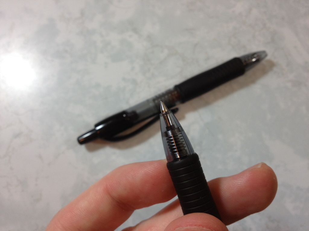
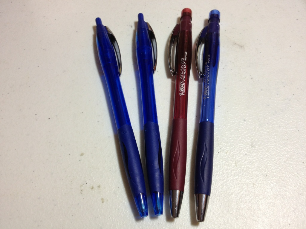
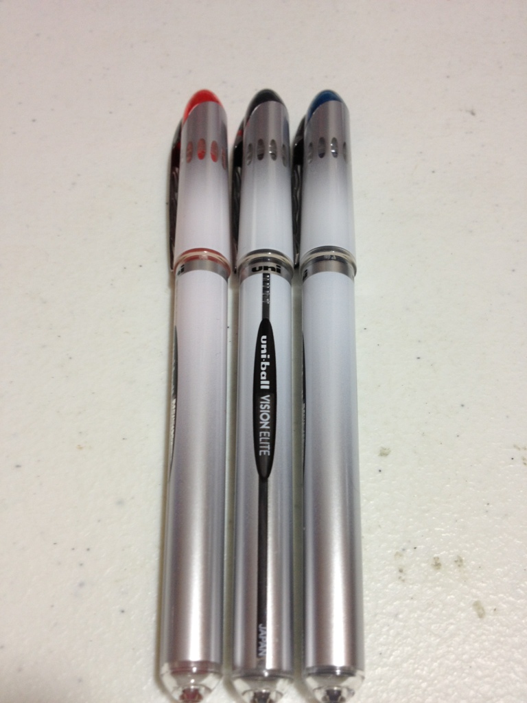
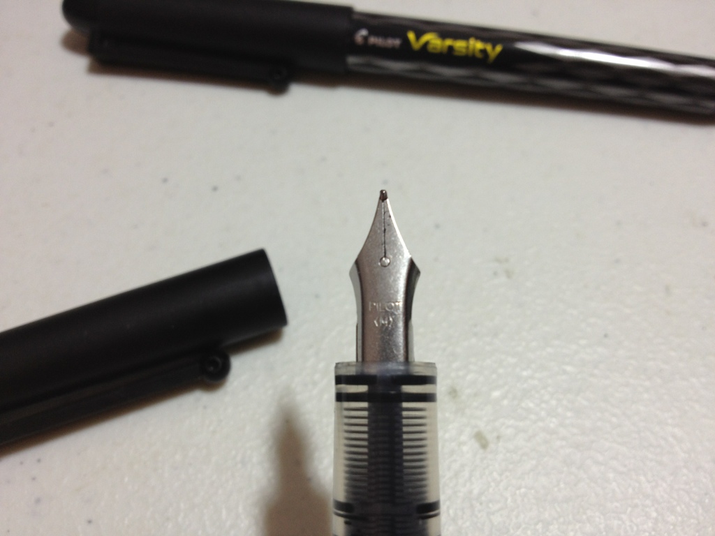
I’ve talked about the Zebra Sarasa before, and it’s an alright gel pen. The saving grace of many gel pens is that most come in a variety of colors at least partially unique to them, and the Sarasa is no exception there. Let’s take a look at a few of the colors.

The colors are always a bit off in the digital space

The colors are always a bit off in the digital space

First, Black. It’s a cool black that covers well. It works in an office setting and generally doesn’t get lighter even with minimal pressure. I’d say it’s black almost as soon as it gets on the page. The drying time is moderate and it’s water smudge-able.

Next, Blue.  The blue is quite dark, darker than most office-type blue colors. This makes it easier to read and more professional. It’s also natural looking, more like a deep sea-blue than an in-between blue that doesn’t really exist in nature. It’s the least smudge-prone of the bunch, but that won’t entirely stop it from lifting off the page.

Third, Red. It is a bland red, with no real pop to it. Though it is brighter than some of the competition, it isn’t really eye hurting. It’s quite noticeable and quite red but has no character — and no real flaws, either. It’s the color that fades the most when exposed to water.

Now, Navy.  Navy is a very deep, dark blue. It’s really almost black. You’d need a good light on to tell which one is which, though you could tell that black and navy are different colors with minimal light. It’s a wonderful dark color that is almost soothing and quite free flowing.

Finally (for this set), Mahogany.  It is really more like maroon. It’s a slightly purplish red which is also very dark and quite nice. It is much more noticeable than the navy, and still quite natural, giving an almost brown appearance from far away. It’s probably my favorite of the five, though the one with the fewest applications, and while you might get away with it at the office, it could be a hard sell. Unless you work for Texas A&M University.

That’s the five colors for this week. Next time I’ll be looking at the other five colors in the standard ten color pack.

Review – Pilot G-2 and G-2 Mini

There are some pens that everyone knows about, standby pens that we all recognize and know the performance of. These are pens that even pen snobs would use in a pinch. The Pilot G-2 and G-2 Mini perhaps are such pens. But do they really hold up to their reputation? Let’s take a look.

20140930-230411.jpg

I’m not sure I really need to describe one of the most well-known pens ever, but I’ll start at the click button. It is simple and elongated, and there is nothing really special about it. Below it is a small section of colored plastic where the clip attaches. The clip has the basic pen info on it, though not much. It does its job well. It might be a bit loose, though the absence of a catch on it makes replacing it in and retrieving it from a pocket much easier. Down from this is a smooth, transparent, circular barrel. There is nothing exciting here, but I should note that the only differences between the regular and the mini are the cartridge size and the length of this barrel here. All other aspects of the pens are identical, which means the mini is a bit thick for its size. After the barrel comes a fairly distinctive grip with a small recessed and grooved area where ones fingers go. The grip style is good but the rubber is slick, so the net effect for me is that the grip is unnecessary. Below that there is a small plastic cone that leads to the retractable point on the pen.

20140930-230416.jpg

Now, I’ve talked about as many Pilot G-2 ink colors as I could get my hands on in the past, so I’m not going to cover that here, but I will go over the overall writing experience. The pens are gel pens and are quite a bit smoother that standard ball points, though the smoothest of ballpoints will almost rival the cheaper gel pens like the G-2. The G-2 has quite a bit of feedback, which is something I do like when writing. Sometimes, though, it doesn’t feel like you’re putting down any ink and instead just scratching the paper. There are generally no blobs unless you’re looking at the more outlandish colors, but on cheaper paper the ink absorbs very fast and will quickly create dots anywhere you decided to stop. Really, there are very few problems if one just sticks to standard black. All other colors do tend to have unique effects to them. Long drying time is a problem with all of them, I’m afraid.

20140930-230421.jpg

Overall I’d say the pen is still quite a good regular pen. Despite the many little flaws that it may have, it works, and it does the job of being a pen well. It isn’t the best pen, but it’s not very expensive and it’s far from the worst. It’s a pen everyone can use, but if you’re not a satisfied pen user and you’re looking for the best for you personally, you might want to try somewhere else.

Review – Bic Stic Colors Pink, Purple, Lime, and Light Blue

The Bic Round Stic is an iconic pen. Not so much as the Bic Cristal, but still quite well known. It is a fairly robust pen, but usually one of few colors. The pen usually comes in the four standard colors: black and RGB. With some hunting, though, one can find more exotic colors, like the ones I will be talking about today: the pink, lime, purple, and sky blue colors.

20140924-022123.jpg

First up is the pink, which is a nice color. It certainly isn’t hot pink, which I despise. It covers well and writes smoothly. It’s fairly dark but still quite pink, though not a very natural pink. It’s the kind that could really only be seen from an ink like this and not anywhere else.

Next is the light (sky) blue, which writes smoothly, but has many little imperfections in the line. It just doesn’t cover well. The color is fantastic, though. It can be a bit hard to see at times but it’s quite pleasant to look at and not particularly eye straining. It is most like the colors at the edges of a clear body of water or the sky closer to the sun, so rare, but not unheard of in nature.

A bit altered in editing

A bit altered in editing, but a good representation

On to the lime, which is by far the hardest to read of the group. And it has some startup and writing problems, though when you get it working it does write smoothly. On the paper, the green is so light as to be unreadable in many cases and can cause eye strain. Though I call it lime, it really is much lighter and closer to… well, nothing that I can think of.

And finally, the purple, which is the best in terms of pen quality. It has no startup issues, writes smoothly, and covers well. It is darker than the blue but not by much, and still would require a second glance to read from far away. That being said, it is a very pleasant color to look at and is great for use when a more standard office color is not necessary. The color would be a rare one to find in the wild, though.

Overall, for writing these pens are hit and miss, and for art they are also hit and miss. The purple and blue are the best. I wouldn’t even try to use the lime. If you’re looking for some way to make your writing more unique, there are other Bic sets out there for that (like an entire box of the purple) and the same goes for any type of art that you might be making, unless it requires some very specific colors

Review – Pentel EnerGel X Retractable Gel Pen 0.5 Red

Some brands can have very confusing product lines. And in the world of writing instruments, Pentel is great with product and poor with names. Today I’ll be taking a look at the Pentel EnerGel X 0.5 Retractable pen in Red. This is not to be confused with any other pen in the EnerGel line, because they all have completely different bodies, though you’d likely be able to expect the same performance.

20140903-000555.jpg

There really isn’t much to say about the body of the pen: it’s a transparent cylinder. The grip kinda works, but it isn’t the best. It’s much more slippery than some other grips. The clip is a bit plastic-y but does its job, although I wouldn’t trust it too much. The click mechanism is nice, solid and loud, nothing wimpy about it. And, strangely enough, the pen unscrews from the top to refill and not around the section.

20140903-000600.jpg

The tip of the pen is quite thin. There is a cone, but it stops a ways from the actual point. Writing is quite smooth. Occasionally there is a skip but there are no burps or blobs. The line is quite consistent as well. The red color is quite bright, but manages to not be an eyesore. It isn’t really useful for anything but marking errors or as a distinguishing color, but it does look nice. It is water-resistant, but does smear (though it’s still readable) and I suspect that it would wash almost entirely off after major water exposure.

All in all, I’d say that this is a decent pen. They cost a bit more than similar gel pens, and the writing is a bit better. I’d say it’s definitely a step up writing-wise from a Pilot G-2 but a step down in ergonomics. It’s consistent and smooth line makes it a joy, and if that’s what you want I’d say give it a shot.

Review – Zebra Sarasa Gel Pen

Every pen brand has its own main gel pen model, and Zebra is no exception. The Zebra Sarasa is Zebra’s main gel pen, and likely their most-recognized pen behind their steel line. How do they hold up? Let’s see.

20140820-004547.jpg

The Sarasa starts with a very classic push button. Below that is a unique clip that holds tightly but is easy enough to get out of your pocket without a problem. Some information about the pen is printed on the clip, and nowhere else on the pen. The barrel is clear and round, down to the grip. The grip section is rubber and hard. It has a slight hourglass taper so that your fingers want to rest in the middle, and it’s harder for them to slip off. It also has several quite annoying stripes that don’t aid your grip, but instead simply make your fingers feel uncomfortable. After that is a transparent cone leading the the metal tip of the roller-ball. It’s a fairly simple and standard design, but effective.

20140820-004554.jpg

The ink goes on the paper nicely and smoothly. It is not particularly quick to dry and can smudge easily. It is advertised as archival quality and acid-free, which I believe but haven’t tested. And while it certainly isn’t water-proof, it is water resistant. The line is medium (0.7) and the black color is quite black, and a cold black, very nice. It does absorb a bit more into cheaper paper making it harder to write in a way that looks nice, but it does preform well.

Overall, the Zebra Sarasa is an alright pen. It works well, but not as well as some other brands. If you really don’t like the grip on the Pilot G-2, or the expense of some better gel pens, then you might want to try this one out. The pocket clip is notably better, but not so much better that it’s worth getting the rest of the pen. Fortunately, it does come in a variety of colors that some other brands might not have and may come in handy.

Review – Kikkerland Retro Ballpoint and Stylus

A while ago, I reviewed the Bic Tech Ballpoint and Stylus pen. That was one of the first pen/stylus combinations I encountered that were actually purchasable for me (I live in the middle of nowhere). Recently another of the same type of pen was given to me: the Kikkerland Retro Ballpoint and Stylus. And I like these types of pens, so let’s see how this one preforms.

20140729-234916.jpg

The style of the pen is “retro” and it comes in three color combinations, two of which I wouldn’t consider using, while I think the third, red and grey, looks quite nice. The pen is fairly torpedo shaped, with both ends tapering down and the widest point being in the center, where there is a small center ring that divides the two body colors and metal sections. There is an almost unusably tight clip that says Kikkerland near the top, followed by a small ring with the smallish stylus point on top. Beyond that, there is no information or other markings on the pen. The paint is plain and smooth, slick enough that it almost slides out of the hand at times, but durable.

20140729-234922.jpg

The mechanism is a twist one. It is quite smooth, almost too smooth, as pushing too hard on the pen may reverse the action. The default refill is a Cross type in medium, I’d likely buy Cross refills myself. The pen writes rather smoothly and has little in the way of startup problems, but a bit in the way of blobbing problems. It is good for short notes, but for longer writing likes to smudge and blob. It is, like most ballpoint inks, fairly water resistant.

20140729-234927.jpg

Flipping the pen around gets you to the stylus which is a bit smaller and more precise than the Bic one mentioned earlier. It is still slightly mushy and I think these smaller styluses need work before I will thoroughly enjoy using one, but this is the most responsive one I’ve tried. Again, there are a few problems, but I have no difficulties using this to operate my phone, and carrying it around to jot down ideas in Adobe Ideas.

Overall, the pen is on par and the stylus is slightly above-average. I’d make sure the colors and styles work for you before getting it, and replace the cartridge with a Cross refill. After that, it should easily serve well. The metal in the body is sturdy and the paint resists chipping, though it does chip near the tip. It isn’t the greatest pen ever, and it won’t last forever, but it is certainly better than much of the competition for not a bad price.

Review – Bic Atlantis Ballpoint and 0.7mm Pencil

Bic is one of the most prominent manufacturers of cheap pens and pencils (and other necessary cheap plastic things). They have several lines of pens and pencils, some as expensive as a dime and some a bit more. The Bic Atlantis is a set of pencils and pens in various colors, which happen to be called the same thing. Today I’ll be taking a look at the Blue ballpoint and the 0.7mm mechanical pencil.

20140716-000746.jpg

Despite sharing a name, the pen and pencil don’t share bodies. They do have similar styling that can be described in the same way, with the pencil being slightly thicker and a bit longer. Starting from the tip, there is a small cone, metal on the pencil, plastic on the pen. This is followed by a thin, hard rubber grip which is all right, but might as well not be there, in my opinion. Within the grip it is a clear plastic wave in the pen, while the wave is impressed into the grip of the pencil. The barrel is relatively smooth and has all necessary information. Neither have a way to twist open the barrel, but around the clip both can be opened and the insides removed (the pen is glued). Above that is the clip, which is quite different on each. The pen is a very firm, stiff piece of metal, while the pencil is much more loose and is wrapped over into the plastic body. On the top is a clicking mechanism. The pen is surprisingly quiet and unsatisfying. You’d never know it clicked if you closed your eyes, but it works well. The pencil has an eraser and a cap on it, the eraser can be removed to allow the pencil to be refilled, and the clicking works well. So both are quite different, but they are similar enough to be in the same category.

20140716-000752.jpg

The pen gives a very fine line, which is quite smooth. However like most “smooth” ballpoints it tends to blob often and pick up paper fibers. The color is also, like most ballpoints, quite waterproof, meaning it won’t run without being completely and utterly soaked. The pens can technically be refilled, but they aren’t supposed to be. The pencil is standard 0.7 and HB, meaning it is smooth but not too smooth. They also have a retractable metal tip to prevent the inside of pockets and bags from being torn, and there is a spring which prevents the lead from breaking due to excessive pressure. I honestly think that HB (#2) is a bit too soft, but for most writing and sketching purposes it does quite well.

20140716-000800.jpg

Overall the Bic Atlantis set is very lopsided. The pen is standard fare and not really worth much. It doesn’t do anything better than anything else in the price range, though they are quite cheap. The pencils are twice as expensive, at least, but are much more worth it. They come with extra lead and erasers, and the spring and cover mechanisms for saving the eraser and lead are almost unique for the price. It’s a great little thing that I quite enjoy using. And it might become a sketching mainstay.

Review – Uni-Ball Vision Elite Bold Black, Blue, and Red

When looking at the Pilot Precise two weeks ago, it occurred to me that there might be people who don’t have Pilot pens available, or don’t like them, so I looked into a different set of pens that have similar features. And I found the Uni-Ball Vision Elite Bold, in Black, Red, and Blue.

20140618-005609.jpg

The body and cap are simple and smooth, with a nice white-to-grey fade, a conical top, and a rounded bottom. The clip is metal with a few divots and is very tight. The top of the cap has the color of the ink and there are a few windows below to allow you to see the feed. On the barrel, the brand is stated twice and the model once, but there is no size information. Removing the cap exposes a transparent yet grip-covered feed, and the conical tip to a standard metal roller-ball point.

20140618-005616.jpg

The three inks aren’t too special in properties. The black is a thick, nice color. It is a warm black, fairly formal, etc. The bold line on all of these pens is enough to bleed through on cheaper copier paper, but the ink dries surprisingly fast. The blue is a dark blue, again fairly formal. It’s almost a navy or a blue-black color and it works well in most situations. I’d say it’d even work well for some artistic endeavors. The red is fairly bright and red, but it isn’t eye-hurting. It is a very deep, nice color, but it could still be considered aggressive. It is also good enough to have some artistic potential.

20140618-005621.jpg

The point is nice, and it writes smoothly, especially in the bold I have here. There is a lot of line variation, though, meaning drawing is a bit harder (or easier, depending on how you look at it). Like I said, there is some bleed-through, but not much. The writing is dry almost instantly from when I pick up the pen, which is amazing and leads to a much smoother writing experience.

Overall, the Uni-Ball Vision Elite is a great little roller-ball with quite a few office applications. The colors are nice without being overbearing, and the writing experience is fast and clean. Artistically they are limited, having little line consistency, but on the color side they have potential. They’re a nice set of pens.


Comparison – Pilot Varsity Old vs New

If you’re looking for a fountain pen but don’t want to purchase something expensive or something you have to fiddle with, then a disposable fountain pen might be the way for you to go. And If you’ve tried before with the most common disposable fountain pen, the Pilot Varsity, and are looking to get another one, you may have seen the slight changes they’ve made to the design. Are these changes that big a deal? Well, let’s find out.

20140613-003203.jpg

The Pilot Varsity has a simple cylindrical barrel and cap, with nice, simply rounded finials. Printed on the barrel is “Pilot Varsity” and a design, but no further information. Both pens have this printed on them. While the old design is straight lines on a tasteful silver with a tiny ink window, the newer version features a multi-tone diamond pattern with a worked in, barley visible, ink window. The cap has a cheap plastic clip with a ball on the end that does tolerably, but is far from the best. Just don’t turn yourself upside down with this pen in your pocket. Taking off the cap reveals the clear section and the plastic feed. One can see if there is ink in the feed, but not in the barrel except through quasi-ink-windows printed in the design. The feed is simple, and has a wick, which allows for better ink flow, but would not be ideal for cleaning (which you wouldn’t be doing anyway if you were just going to throw it away.)

20140613-003210.jpg

The nib at the end of the pen is again simple. It is stamped “Pilot <M>” (medium) and has no further ornamentation, not even a breather hole. It is stainless steel, and offers no flexibility in the tines. Now, one might think that since they’re both stamped medium, that both pens would have roughly the same line width; and this would strangely be wrong. At least on the example I have, the older Varsity has a line more akin to a fat medium, or a particularly skinny broad, while the newer example is more of a fat fine, or a sorta skinny medium. If this is indeed a purposeful change that was made, I’m guessing it was for the American market to prevent bleed-through on the extra-crappy paper here, which it does do. This size difference definitely doesn’t affect the nib performance, though. Both nibs are buttery smooth, have no startup issues, and write under no pressure. The ink is the standard Pilot black, and there is nothing different between the two pens that I can discern (and neither are at all waterproof).

So, which one should you get? Well, it really doesn’t matter. If you really want a fat medium nib disposable (well, kinda, you can look up how to refill it online) you can hunt down some of the old ones, which I personally like better due to purely aesthetic reasons. The new one is a bit more loud and silly, and a bit finer in line, but you’d be really hard-pressed to tell that unless you were looking like I was.

Review – Pilot Precise v5 Black, Blue, and Red

Times are tough if one wants to write smoothly and precisely on a budget. Technical pens wear out fast, and fountain pens cost money and time to maintain. I use both, but sometimes I just want to write easily and precisely without all of the maintenance and hassle. This is where the Pilot Precise series of pens come in. Today I’ll be looking at the v5 set in black, red, and blue.

20140603-232945.jpg

The cap and barrel are simple and straight. The cap has nothing on it but a simple metal clip that does its job well but can bend easily. The barrel has the necessary info about the product and an ink window so that if ink starts to run low you can get a general idea. Removing the cap shows a transparent section and feed system, which is more for being cool looking than any sort of functionality regarding ink level. At the end of the section is a series of plastic step downs that lead to a metal rolling ball tip. At the bottom of the section is a small clear plastic window that allows one to easily see if there is little or no ink left in the pen. The transparent section and barrel are both a slick plastic, but provide enough surface area that slipping off or letting go of the pen is not an issue.

20140603-232950.jpg

The tips of the pens write fairly smoothly. Older ones get a bit stiffer, but even on the extra-fine v5 they are never scratchy. The rolling ball delivers a nice “precise” line to the paper. Although it does have more variation than a technical pen in width, it has less than a standard ballpoint does, and it doesn’t blob. Like I said, writing is smooth: almost as smooth as a fountain pen, but not quite there. I’d say they are wonderful for writing (especially if ballpoints cramp one’s hands) but are not as good for drawing. Still better than a ballpoint, though.

20140603-232940.jpg

The three colors I have are Black, Blue, and Red: fairly standard colors with a fairly standard execution. The black is a warm black (this is an older pen, and Pilot may have changed formulas. The other two are brand new.) and noticeably less saturated than the thicker v7. The blue is quite dark, darker than most other Pilot inks, and quite work-appropriate. It’s almost a deep water blue, but not quite as dark as, say, Bic blue. The red is bright, bright to the point of being aggressive. Don’t grade papers with it unless you really want to say they’re wrong. It shows up almost from across the room and is quite a contrast to the deep red body of the pen. I’d say it has the fewest practical applications of the bunch. All of these inks are liquid-based and soak into the paper, meaning that they take a bit of moisture to run, but when they do they never stop. The red is the worst in this case.

In the end I’d say simply that these pens are great for writing, and all right for drawing. They aren’t the best but are great and ubiquitous for what they are.