Review – Sheaffer Calligraphy Maxi Kit Part 3 – Ink – Blue, Black, Purple, and Turquoise

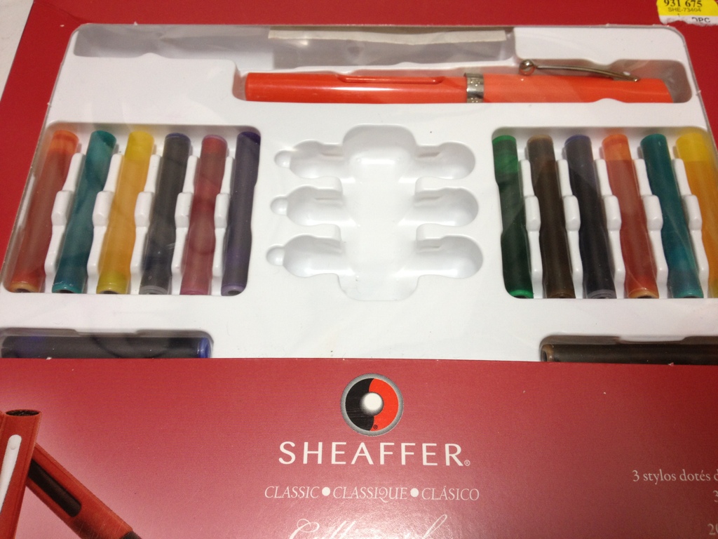
Now onto the Sheaffer inks in the Sheaffer Calligraphy set, which I will do in batches as I get around to trying them out. I’ll be starting off with black, purple, blue, and turquoise.

Surprisingly Accurate Photo

Surprisingly Accurate Photo

First black, which is a plain black, really there is nothing special. It’s a cool black that is very dark, but is not as saturated as one would want a black to be most of the time. For calligraphy and drawing it is good for the most part (being non-waterproof) but I wouldn’t go painting a picture with it.

Second purple, a color that has no place in a calligraphy set (something that can be said about every color that isn’t black, in my opinion). The purple is a nice deep purple with lots of shading in wider lines, though the shading doesn’t offer a great amount of variation. I personally wouldn’t use this for calligraphy and would have a hard time finding a use for it. But it is very pleasant.

The blue, Sheaffer blue, like all pen maker blues is very simple: a dark blue without much shading that does well with writing and okay with calligraphy. It is a fairly standard blue, non-waterproof and it almost looks like a ballpoint pen. Like I said, though, it is a bit darker than some others, so you might want to look into it if you want a darker blue.

Finally turquoise, which again I don’t understand being in this set. It is a very bright, nice color. It has some shading (which I’m not too fond of) but overall is fairly bland. A nice sky or Caribbean sea color, but not one for calligraphy but for daily writing in my opinion. You wouldn’t want to color a turquoise rock with it either.

That’s it for this time, It may take a few weeks, but I’ll look at the rest of the colors sometime in the future.

Review – Papermate Inkjoy Green, Pink, Orange, and Light Blue

In a previous entry I looked at the more standard Papermate Inkjoy colors, now it’s time for the less standard colors, like light blue, pink, orange, and green.

inkjoy tests 2

The light blue is a sky-colored blue. It is the hardest to read of any of the Inkjoy colors, though it is still fairly visible when not cluttered. It has a very natural feel and is very sky-like. It is very neutral anyway. It doesn’t look like a color that takes a stance, if that makes any sense. It’d make a nice color for both drawing and work.

Next pink, which thankfully isn’t a very aggressive pink. It’s definitely not hot, it’s more of a magenta color, but not quite. It is not a very natural color, though, as it doesn’t look like a rock or a flower. Might be good for a personal thing, or some corrections or something similar.

Third is orange, which I must say looks almost exactly like Pilot G-2 Orange, which I have previously reviewed. Subtle, but not very useful, perhaps flowers or the fruit, but it could be work-friendly, if you’re in a less formal office setting.

Finally green, which is a quite deep, more forest color. A very natural and neutral color. Again a fine informal office color, and a nice forest or swamp color. Though very limited in its natural colors. One of the least useful, but most usable, colors in the set.

Overall these four colors are unintrusive and subtle, with various office and home applications, but very little artistic applications save a few specific places.

Review – Monsieur Notebook A5 Blank “Fountain Pen” Paper

One way to make your notebook stand out in this new notebook market is to have high-quality components that are durable and look good. Monsieur Notebook has tried to do that, with their new leather notebook competitor to Moleskine.

20140220-232132.jpg

First a little story. Monsieur Notebook has been available in Europe for a little while now, using production from India, if I’m not mistaken. They recently had an Indiegogo campaign to distribute in the U.S. and get more local production (for them in the U.K.). I pledged (purchased) on Indiegogo for two notebooks and got laser engraving thrown in to review.  My notebooks were however caught up somewhere in the delivery process and ended up taking quite some time to get here. During this process I discovered that the customer service is very nice and expedient for being across an ocean from me. Anyway, some time later I have an extra notebook for my troubles and am getting on the review track. I should note that these books were sent to me directly and not through a distributor, so they did get a bit damaged in the post because they were not in a box, this will not happen if you simply order a book from them.

20140220-232137.jpg

The notebooks are a nice A5 size, a bit wider than a Moleskine. With 100 sheets of “royal executive bond” (100gsm) paper (that’s what the watermark says anyway). The cover is leather, and comes quite dry, so it will need some maintenance to make it more supple. The cover is completely plain (unless laser engraved) save for a tiny logo on the back in the right bottom corner. The cover sticks out from the pages just a bit to provide them some protection. There is an elastic band on the back that is loose when not in use like a Moleskine but tightly closes the book when necessary. The cover is glued to some heavy cardstock and opening the front reveals another logo with a website and a contents page with a place for a name and other information. There are no other features, this includes the conspicuous absence of a back pocket common to these types of books.

20140220-232143.jpg

Now to the paper, which in mine is blank, and meant for fountain pens. The promise of being fountain pen-friendly is a bold one, and one that is almost thoroughly lived up to. The paper is a very stark, almost perfect, white (with a watermark as previously mentioned). It has a bit of a grain to it, so it provides some feedback when writing, but it isn’t unpleasant. It is a bonded paper, so some paper fibers may come up and clog nibs on fountain pens after extended use, but that is only a fountain pen concern. As for writing, it’s smooth, with some feedback. There are very few inconsistant places that would cause hang ups, or strange ink behaviors. Bleed-through for liquid inks is minimal, but it is there, the paper seems to take wide spaces of ink in stride (like calligraphy) and has little to no bleed-through. But a pen that is quite wet with a finer line will make points of bleed-through. A similar phenomenon can be noted with feathering, as finer lines tend to feather more on this paper than broader lines. Which is a strange property indeed. But the overall experience is pleasant. The ink dries friarly fast, with some notable exceptions (Noodler’s red)

20140220-232148.jpg

So a few more things to note. The spine is good leather and doesn’t seem to take structural damage but does easily take cosmetic. The Laser engraving is awesome but it really depends on your image. The elastic strap could cosmetically damage the cover by pulling it. And occasionally the signatures seem to be pulling away from each other, but not the spine.

So overall I think this is a great notebook. It is made of high quality materials, if not high production quality. The materials seem to be good enough to make up for the shoddy construction and make a stable book that will work quite well for an extended amount of time. It is one of the best fountain pen paper notebooks, but not the best. I’d say the paper is worse, but the book itself is better than a Rhodia book. So it all depends on what you want. This book might not look very good, but it should last at least as long if not longer than any other notebook on the market. And it’s the same price as a Moleskine. So If you want a good “beat-up notebook”, try one of these.

Review – Papermate Inkjoy Black, Red, Blue, and Purple

In my tradition (now) of taking a look at the uses of standard office supplies in art, I’ll be looking at the Papermate Inkjoy pens and their different colors. Today will be the standard colors of black, red, blue, and purple.

inkjoy inks 2

Not Entirely Representative

Papermate tends to make standard colors, and their black is no exception. One of the deeper Papermate blacks, the Inkjoy black is nice and constant, though is a bit blue-greyish. Not quite black, but very good for a ballpoint pen.

The red is also fairly standard. It’s light, but not light enough to say it’s pinkish. It is very subdued and pleasant, not as aggressive as most reds, making it a bit more natural.

The blue is very deep, but not very saturated. In low light it still looks blue, but one wouldn’t mistake it for a sky blue. Again, like the red, the low saturation makes it look less aggressive than some other hues. It’s got a very nice, watery feel to it.

And finally the purple, which again is deep but not saturated. It is unmistakably purple but not very aggressive. Unlike the others, though, this leads to a less natural look as most natural purples are deep and aggressive or light and flowery. This one is in between, which means it would be at home on your papers but not in artwork.

Overall, Papermate did a good job with these colors for the workplace. They definitely weren’t designed for art, though they could be worked in. Not superb but good enough. We’ll see what the next four have in store.

Review – Bic Tech Ballpoint and Stylus

Well, sometimes now-a-days art isn’t always done on a physical medium. Tablets, smart phones, and touch-screen devices are becoming more prevalent these days and for artistic purposes your finger isn’t the most precise thing in the world. Fortunately, Bic has a solution for both mediums (maybe) the Bic Tech pen and stylus.

20140206-232018.jpg

The barrel of the pen is a fairly standard Bic barrel with a slightly grippy (grip) section, a hole for the ballpoint and a logo. Halfway up the pen is where things get interesting. The top half of the pen is a chrome-colored plastic which I personally don’t like but doesn’t look terrible. Just above another Bic logo in the center is the click mechanism, which is unique in its side mounting. The lever protrudes out to the side sightly, but not enough to really get caught or accidentally pulled. It has a slight curve to it, making it a great finger place and making for easy disengagement of the fingers or caught objects (again preventing accidental usage). I would say my only problem with it is it gets scratches from fingernails far too easily. The clip is absolutely nothing special, in fact it doesn’t even clip, it more just hangs on a pocket or something so that’s cheap. At the top is the stylus which I’ll talk about in just a second.

20140206-232024.jpg

The pen itself is nothing remarkable. It does appear to be smoother than a normal Bic ballpoint. But it is almost the exact same shade of unimpressive grey-black as every Bic pen.

20140206-232030.jpg

Now on to the stylus, which is the standard stylus end that has been popping up all over the place recently. It works. It is obviously not the most expensive or precise thing but it gets the job done. It is better than a finger, I can tell you that much. I can’t attest to the durability of such things, but I can say that it feels likely to break, though the pen isn’t expensive and by that time you’ve probably gotten your money’s worth out of it.

So what is the Bic Teach pen like overall? Mediocre. It does an alright job at being both a stylus and a pen, but does neither fantastically. But for the money it really shouldn’t. If you’re looking into the prospect of such a device or are on a very slim budget (or possibly don’t care) this might work for you, otherwise I’d suggest looking elsewhere.

Review – Sheaffer Maxi Kit Calligraphy Nibs

Now, for the second part of the Sheaffer Maxi Calligraphy Kit review. This one might be a bit short as I’m going to be looking at the three included nib sizes: Fine (1mm), Medium (1.5 mm), and Broad (2 mm).

20140128-234823.jpg

The nibs themselves are Italic, meaning that they are flattened and straight at the tip, thus producing a wide up-and-down stroke and a thin left-to-right stroke. They are true Italics, with no tipping material, and sharp edges that may cut into the paper if one isn’t careful, but they are a bit more rounded off than a dip pen Italic would be. Because there is no tipping material, the stainless steel of the nib is easier to wear away and damage from rough use. Although this doesn’t happen often as steel is still a very robust material, it is worth noting.

20140129-001212.jpg

Each nib has almost the same left-to-right width, but the up-and-down stroke width is equal to the size of the nib stated above (1mm,1.5 mm,2 mm). The fine nib can be used for regular cursive writing, but the medium and broad nibs should not be used for cursive writing as the size necessary would render writing impractical or illegible. Although the corners of the sharp nibs can cut into the paper, they aren’t quite sharp enough to make the sharpest of line turns. To most eyes, the angles appear spot on, especially when compared to the round corners of regular fountain pens, but when compared to a dip nib they are a bit lacking. Overall, the nibs a very functional and useful in a variety of situations (at least calligraphy situations). They provide enough variation to not be bored with inking up three pens, and even without a tipping material will last through quite some use.

Review – Sheaffer Maxi Kit Viewpoint Pen Body

I have talked a lot about specialty pens and the like. Now it’s time to talk about another one, this one specifically for calligraphy. In this several part review I’ll be talking about the Sheaffer Calligraphy Maxi-kit. In this first part I’ll talk about the included pens, the Sheaffer Viewpoint.

20140122-004518.jpg

The cap of the Viewpoint is a cylinder with a slanted top. This slant has Sheaffer written on it as well as the size of the nib meant to go with the pen (in this kit at least). The bottom of the cap has a chrome band with Sheaffer written on it. The clip is simple, but functional, having a small ball at the end, up near the top is also the white dot that signifies a lifetime Sheaffer warranty (possibly).

20140122-004528.jpg

The barrel of the pen is also a simple cylinder, except it has a rather large hole cut in two sides to create a viewing area for the cartridge or converter (get it). The barrel’s end is also rounded so it won’t stand up.

The (grip) section is made of dimpled rubber and is sufficiently grippy and un-intrusive. Just after the grip is a small piece of plastic (color matching the barrel) and then the nib directly. There is a rather steep step to nib from the section, making the nib look perhaps a bit small. The feed is well hidden and works fine for the purpose, but on some pens can be finicky.

Overall the Sheaffer Viewpoint body is a sturdy, and functional design, even if it’s not the most comfortable. Its real purpose is to get a nib to the paper and it does the job quite well. Though it is a bit weaker than previous Sheaffer models due to the hole.

Review – Pilot G2 Teal, Hunter Green, Navy, Periwinkle, and Caramel

This week I’m gonna take a look at some of the weirder colors of Pilot’s G2 pens. Let’s dive right in.

third pilot pen comparison

First up is teal, which is a deep, bluish-green, almost like an aquatic plant. It’s very subdued and seems almost workplace-friendly (sort of like a blue-black, but with green). It goes on the page a bit thick and is a bit of a hard start when it’s not been written with for a while. A very soothing color overall.

Next up is hunter green, which is a deep, swampy green. It looks like a camouflage color, which I guess it’s supposed to. It isn’t the most pleasant of colors to stare at, but it is quite subtle. This color is probably the thickest ink and has the most problems with startup and skipping of the bunch.

Third is navy, which is a blue-black. It doesn’t really remind me of any previous navy colors I’ve seen, it is simply a very dark blue, but not a deep blue. It looks just like a combination of blue and black. Very work-friendly, I would say, but has no real art application save for maybe a night ocean.

Fourth is periwinkle, which is a light, sky blue. This is one of the lightest and easiest to read light blues I’ve seen. It isn’t quite as light as possible, but that makes it readable. It has a bit of shading (inconsistent color) but not too much. This is likely the most versatile ink color of the bunch, being a close to work-friendly “happy” color, and a realistic color that could be found in both water and skies.

And finally is caramel. Caramel is a light, almost hard-to-read brown. Again it is subdued enough to not hurt one’s eyes, but is very light and not particularly pretty. It does flow well, and really looks like caramel, so if you need a caramel colored ink, this is the ink for you.

That concludes my look at the Pilot G2 pen color types. I hope these were useful, they really do cover the gamut and provide ink colors for a variety of different uses. Unfortunately, I believe they only come in a large, expensive pack, so I would recommend having uses for a few of these pens before purchasing them.  They are great reliable writers with most of the ink colors, especially the more common ones (which are available individually) and can be used almost anywhere.

Review – Pink, Orange, Turquoise, Burgundy, and Lime

And now for five more Pilot G2 colors! These are the the more “regular” colors, but just a bit different, so let’s go.

pilot pen comparison

The first is pink, which is very pink. It’s probably the brightest and most visible color in the set, though it fortunately isn’t an eye-searing hot-pink. It runs fairly thick and as pinks go, is quite deep, closer to red than to rose.

The second is orange, which is fairly bright, the second hardest to read of the bunch. It is plainly orange though, and will be a stark contrast to any other color in the set. Like most of the other colors, though, it is done well, and is not painful to look at or too difficult to read.

Next we have turquoise, which is a greenish-blue color. Honestly, it just looks like turquoise, which is a very pleasant color. It’s appealing and subdued, it almost looks like sky or clear “caribbean” sea. It’s a fantastic color, especially if you want a bluish color, but a bit lighter and happier.

Fourth is burgundy, which is a deep, purplish red. It’s almost like a red-black. It is very readable on the page, but gives writing a bit of flair not seen in a red, black, or purple ink that would be close. The ink is a bit thick though, and has some starting problems, but that just means it should be used more often.

And lastly for this set is lime, which is obviously a very light green. It actually looks nothing like a lime (like most colors called lime). It is the hardest to read of the bunch, but still isn’t quite offensive to the eye, though I wouldn’t write with it. I think it’s still the worst here, though, as it doesn’t match the nice qualities of the rest of these inks, and it’s a bit dry on the page.

Next up are the more uncommon colors.

Review – Pilot G2 Colors – Black, Blue, Red, Green, and Purple

I don’t believe I have talked about G2 Pilot gel-pens before, I will do a full review later, but first I want to talk about most of the different colors that they come in. I have collected 15, and will split them into three groups, the first of which is the “normal” colors of black, blue, red, green, and purple.

ink tests

Starting with the black: it’s black, there is literally nothing special about it. It is a bit of a warm black, and it goes on smooth. It doesn’t have any magnificent qualities, it is just an all-around black.

Now for the blue, which is a fairly dark but basically standard blue, very similar to the black. It is probably one of the darkest standard blue pens available, and it is a fairly cool blue, like a deep lake. Again, though, it has nothing particularly special to offer.

The red is a medium red, which is a bit different. Most companies go for either an eye-bleedingly light red, or a deep red that is much more pleasant. As far as reds go this is in the middle, but it certainly isn’t neutral. It has no tint of pink, and is most definitively, starkly, red.

The green is surprisingly dark for a standard green. It’s almost a grassy color, and not the light, lime-ish color most other companies associate with green (it’s like the cherry flavor of pens). It is definitely green, but is unoffensive and pleasant. It sticks out, though, making it seem like one of those “replace red because it hurts people’s feelings on grades” pens (I’m no psychologist, so I know nothing about whether that is good or bad, it’s just what I thought of). I think it’s nice.

And finally the purple, which is the black sheep of the normal colors. It is a light, almost violet or deep rose color. It is warm and goes on a bit less smoothly than the other colors here. I really don’t like it, it’s just far too light, and it doesn’t go with the deep other colors at all. It really won’t stick out on a paper either, so it’s just kind of there, it has no natural color akin to it, so it has limited art utility as well.

Overall these are a very good set of office colors, and if you’re just looking for some smooth-writing different colors that aren’t too wacky, I’d look here first. But they do all have limited art potential, so you may want to delve further to get just the right color in that case.