Review – Muji Bunkobon Notebooks (Thin/Regular)

I’ve had a couple Muji notebooks in the queue to review for quite some time now, and ironically it’s the product that I have most recently purchased that’s making its way to my metaphorical “review table” first. Muji has a reputation of being both minimalist and high quality, and Japan in general is often seen as being more focused on a good writing experience, but do Muji’s inexpensive Bunkobon notebooks live up to the expectations?

photo 1-73

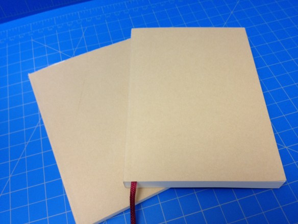
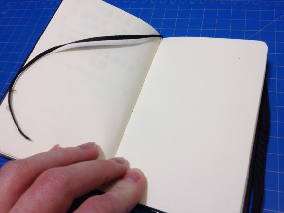
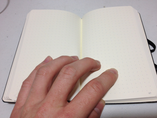
When looking at aesthetics, the exterior is about as minimal as one can get: a brown “craft” paper cover with a smooth (not glossy, but definitely coated) finish wraps the whole book, only interrupted by a barcode sticker on the back. Inside, the pages are blank with no additional features (no name page or back pocket) save a red ribbon bookmark.

photo 5-24

The paper is a pleasant off-white with a very smooth texture. For how thin it is, it does a very good job of holding up. Almost any mark you make has “show through” where it can be seen from the other side of the paper, and with pens this quickly renders the reverse side unusable (I never use it anyway), but in most cases this doesn’t result in “bleedthrough” where marks appear on the next page. Gel and fountain pens work fine, but Sharpies and calligraphic pens are too much for it to bear (though only barely, it seems). The actual experience of writing on the paper is also quite pleasant, it’s got just a little bit of tooth to remind you that you are indeed writing, but most pens just glide across. For me personally, it sometimes feels a bit slippy or like I’m losing control, however, I have the same problem with the gel pens that everyone else in the world loves.

photo 2-71

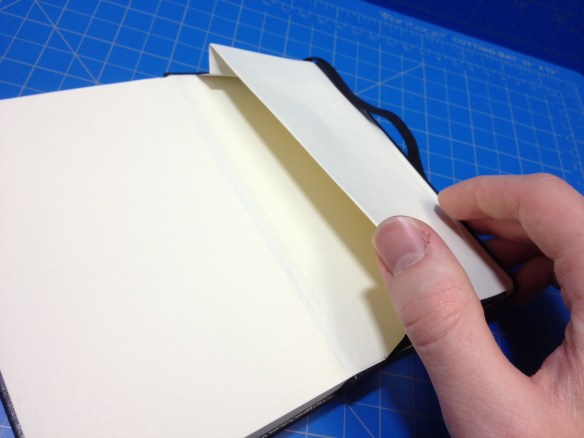
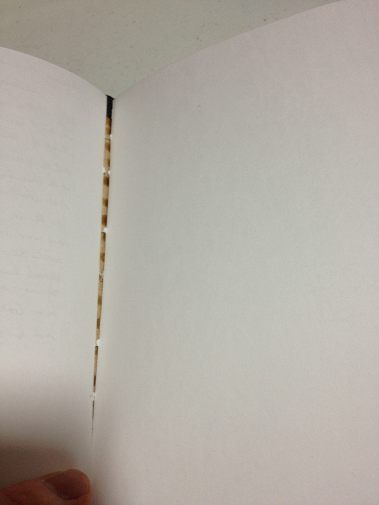
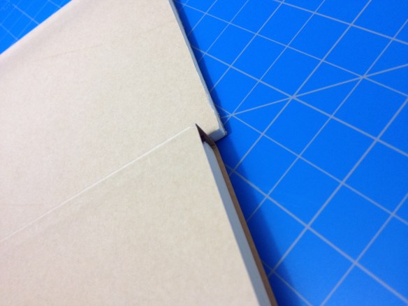
The book comes in two (very reasonably {but not proportionally} priced) sizes, regular with 144 sheets, and slim with 50. And the larger size would excite me more if I didn’t have a few issues with durability. These 4 1/8 x 5 ¾ book’s covers are only a piece of slightly thicker paper, and on the top this overhangs a sixteenth of an inch beyond the one side of the book with a deckled edge. This quickly creates bent corners and a curled-in top area (I unsuccessfully tried cutting this excess off my slim, and it now looks like I’d imagine it would after a little while of constant use), which might be overlooked if the cover itself wasn’t so fragile and easily bent. Even I, a man who is very careful with all of his possessions (because he doesn’t like them to look worn) bent and tore the cover while the bookmark unraveled itself. While the binding is very solid I don’t feel like the cover of this book will adequately protect it over a longer period of time or through rigorous use (so it’s out for frequent traveling), and I think that this problem will get worse with the larger size.

photo 4-59

For the price of a couple dollars this is a very good notebook to write in. While there are some problems with cover and bookmark it makes a fine office or school notebook, or, if you aren’t a stickler for aesthetics, it’s a nice convenient size to carry around (though larger than that average pocket). If you’re looking for an inexpensive notebook upgrade or are just tired of people putting words or logos on your writing area these are nice, minimal and well crafted books.

Advertisement

Review – Daler-Rowney Simply Pocket Sketchbook (3.5×5.5) Hardback

Every time I have the time, I foolishly look in the notebook section at Walmart (both the office and/or crafts). I don’t know why, I always know that the notebooks won’t be great but I’ll be swayed to buy one anyway. In this case it was a hardback pocket sketchbook that I thought was only a dollar (it’s about 5 times that). The book basically has the same dimensions and look as a Moleskine Pocket notebook, but with 72 sheets of 100 gsm (65lb) “sketch” paper (heavier than the Moleskine notebook, lighter than their sketchbook, and with fewer sheets than either) at a discounted price. But is it a worthy “replacement”?

photo 2-42

The cover is very Moleskine reminiscent, being a black sort-of faux leather wrapped around cardboard, but in this case much more shiny and plastic-y. There are visible creases on both the front and back because the spine has been stiffened to remain flat, meaning the covers more or less “hinge” open. There is an elastic band attached to the back cover that does its job of holding the book together when wrapped around and warps the covers a little bit. Also on the back cover, stamped slightly off-center is the Daler-Rowney logo.

photo 1-44

Inside there is no strict “this book belongs to:” or logo page before getting right into the 72 sheets of “ivory” sketching paper, augmented by a very cheap looking/feeling black ribbon bookmark. Inside the back cover is a page-size pocket with cloth folds for strength, and I never use these so I can’t tell you much more than that.

photo 3-40

The paper itself is good. It is indeed fairly thick and heavy, with a grain that is smoother than most sketchbooks I’ve encountered but more toothy than any “notebooks” I’ve used. Aside from telling you that it’s “acid free”, the sticker on the front cover also has a picture of a pencil and a nib (I assume standing in for all ink pens) and it handles these two quite well. If you use pencil, there is a little bit of show-through if you go looking for it, but you could easily use all 144 “pages” of the book. The show-through becomes much more prominent with ink, especially from felt tip, brush, or fountain pens. There is also some minimal bleed-through with the more intense ink pens, but I never got it to actually mark on the next sheet. Still, it reduces the usable space of the sketchbook to 72 pages when using inks. Feathering is also a bit of an issue. There isn’t much of it, but when it happens (mostly with fountain pens) there are long thin lines of ink stretching away from your mark that almost look like little hairs. They’re pretty hard to see from far away, but when you notice them it’s hard to un-see.

photo 4-37

For the price it’s a nice little sketchbook (even if it cost more than I thought). It’s held up to a few months of moderate use from me with virtually no battle-damage, and while I suspect it to be less durable than a Leuchtturm or Moleskine it is short enough that it’ll probably last until you finish with it. The paper is good quality and pleasant to write on, and the handy pocket is there with an elastic band closure to keep every thing tidy. It’s a pretty good, if unrefined, option if you want a black pocket sketchbook.

Review – Rhodia Pads

I’ve been using Rhodia products for years now, and the way that I was introduced to them was their famous pad-style books. I got one as a gift and used it almost every day in school (only almost because I wasn’t taking notes with it but writing down ideas). And I’ve had a few around ever since. Let’s take a look at what made them so widely used and praised.

photo-104

The pads themselves are simple, and have very few differences between the sizes. They are an orange rectangle, with one or two heavy-duty staples in the top and 3 creases on the cover to allow it to be folded over the spine easily and cleanly. Both the front and back have the Rhodia tree logo, with the back one being smaller and above some of the book’s specifications (in metric and imperial) and usually a price tag/bar code. Inside there are perforations on the top of each page, and with the thickness of the paper and the quality of the perforations, tearing out pages is easy, but they do not tend to fall out with hard use.

photo-105

The size of the paper in each book varies, and it comes in line or graph versions (dot in the premium editions, and unfortunately no blank). The ink used is a light blue-ish purple that doesn’t interfere with ink or pencil, the line paper is a bit darker. The paper is vellum and very ink resistant, meaning long dry times but little feathering, bleed through, and page crinkling. Show through can still be a problem, but most ballpoints and fountain pens write very well on the paper with almost no side effects. Paints and markers such as Sharpies are where the paper starts to not hold up as well, but the minimal crinkling, and the lack of bleed-through is still a very good performance. The coating on the paper also allows for very smooth writing, but one might have to press down hard with less wet pens.

photo-106

I might have already given away my opinion of the books in the first paragraph, but they are lovely. The writing experience is super smooth and pleasant; the worry that one might have with other papers when writing with liquid ink pens in non-existent. The binding is hardy and the cover wears very well with minimal things to be problematic. I’m generally not a fan of covers that fold over the top of the book, but I make an exception here. They make great traveling journals, school notebooks, coffee shop list makers, etc. And they can survive both fountain pens and being tossed around in a backpack. If the styling was a bit more my speed I would carry one around all the time. Still they are very versatile, and for the smaller ones, fairly inexpensive.

Review – Monsieur Notebook A5 Blank “Fountain Pen” Paper

One way to make your notebook stand out in this new notebook market is to have high-quality components that are durable and look good. Monsieur Notebook has tried to do that, with their new leather notebook competitor to Moleskine.

20140220-232132.jpg

First a little story. Monsieur Notebook has been available in Europe for a little while now, using production from India, if I’m not mistaken. They recently had an Indiegogo campaign to distribute in the U.S. and get more local production (for them in the U.K.). I pledged (purchased) on Indiegogo for two notebooks and got laser engraving thrown in to review.  My notebooks were however caught up somewhere in the delivery process and ended up taking quite some time to get here. During this process I discovered that the customer service is very nice and expedient for being across an ocean from me. Anyway, some time later I have an extra notebook for my troubles and am getting on the review track. I should note that these books were sent to me directly and not through a distributor, so they did get a bit damaged in the post because they were not in a box, this will not happen if you simply order a book from them.

20140220-232137.jpg

The notebooks are a nice A5 size, a bit wider than a Moleskine. With 100 sheets of “royal executive bond” (100gsm) paper (that’s what the watermark says anyway). The cover is leather, and comes quite dry, so it will need some maintenance to make it more supple. The cover is completely plain (unless laser engraved) save for a tiny logo on the back in the right bottom corner. The cover sticks out from the pages just a bit to provide them some protection. There is an elastic band on the back that is loose when not in use like a Moleskine but tightly closes the book when necessary. The cover is glued to some heavy cardstock and opening the front reveals another logo with a website and a contents page with a place for a name and other information. There are no other features, this includes the conspicuous absence of a back pocket common to these types of books.

20140220-232143.jpg

Now to the paper, which in mine is blank, and meant for fountain pens. The promise of being fountain pen-friendly is a bold one, and one that is almost thoroughly lived up to. The paper is a very stark, almost perfect, white (with a watermark as previously mentioned). It has a bit of a grain to it, so it provides some feedback when writing, but it isn’t unpleasant. It is a bonded paper, so some paper fibers may come up and clog nibs on fountain pens after extended use, but that is only a fountain pen concern. As for writing, it’s smooth, with some feedback. There are very few inconsistant places that would cause hang ups, or strange ink behaviors. Bleed-through for liquid inks is minimal, but it is there, the paper seems to take wide spaces of ink in stride (like calligraphy) and has little to no bleed-through. But a pen that is quite wet with a finer line will make points of bleed-through. A similar phenomenon can be noted with feathering, as finer lines tend to feather more on this paper than broader lines. Which is a strange property indeed. But the overall experience is pleasant. The ink dries friarly fast, with some notable exceptions (Noodler’s red)

20140220-232148.jpg

So a few more things to note. The spine is good leather and doesn’t seem to take structural damage but does easily take cosmetic. The Laser engraving is awesome but it really depends on your image. The elastic strap could cosmetically damage the cover by pulling it. And occasionally the signatures seem to be pulling away from each other, but not the spine.

So overall I think this is a great notebook. It is made of high quality materials, if not high production quality. The materials seem to be good enough to make up for the shoddy construction and make a stable book that will work quite well for an extended amount of time. It is one of the best fountain pen paper notebooks, but not the best. I’d say the paper is worse, but the book itself is better than a Rhodia book. So it all depends on what you want. This book might not look very good, but it should last at least as long if not longer than any other notebook on the market. And it’s the same price as a Moleskine. So If you want a good “beat-up notebook”, try one of these.

Comparison – Wite Out Vs. Liquid Paper

Sometimes you make mistakes, and sometimes those mistakes need to be corrected. There are a few ways to do this, and a few brands of correction fluids to buy. Today we’ll be comparing Liquid Paper and Wite Out.

20131113-004433.jpg

What do they have in common? They both have similar size bottles (~20ml) and a stick with a sponge-wedge applicator. They are about the same size in application. Those are the only cosmetic similarities. The bottles themselves are very different. The Liquid Paper one is a bit larger with grooves on the side for grippyness, while Wite Out is just in a slim, standard-looking bottle. The Liquid Paper bottle has ridges on the cap that are supposed to make it easy to open, but instead they are slippery and difficult. They also get in the way when applying. The ridges on the Wite Out are much easier and less intrusive.

But now on to the substance itself. And there is no noticeable difference in the application process, as they have about the same viscosity and go on smooth. The brush on the liquid paper feels a bit stiffer. When dry the best I can say is Wite Out is a warm white, and Liquid Paper is a cool white. The are both undeniably white, but neither are true white. You couldn’t say they have tints, they are just warm and cool. After drying the Wite Out is easier to write on, so that is the only other consideration.

It really depends on what paper you have when using these, warm or cool paper. Yellowish will prefer warm. And though Wite Out is easier afterwards, it isn’t too much easier. So it comes down to price if neither of those things matter, as I can say that they both work quite well at what they’re designed for.

Review – Leuchtturm 1917 Pocket Notebook

Notebooks again. Is Moleskine your style but you find the paper a little lacking? Well Leuchtturm claims to have you covered with the 1917 line of notebooks. Specifically I’m reviewing the black pocket (dot) hardcover version.

tumblr_mqsc926InY1rrdkoco1_500

Starting with the outside, the dimensions are nearly the same width- and thickness-wise as the Molsekine, but about half an inch taller. As the Field Notes and Clairefontaine pocket books are the same size (lacking thickness) you could compare it to them as well. The cover is in the black Moleskine style and is almost indistinguishable. It is also fairly flexible, something entirely absent in the Moleskine. It has an elastic band that feels slightly cheaper, but nonetheless works well. The most disappointing thing is the spine, which constantly creases, cracks and groans. The problems appears the be that the cover on the joints is separate from the binding. The binding does feel solid, so I don’t believe it will fail, but the spine will definitely encounter cosmetic damage with prolonged use.

Inside there is a standard back pocket, an address and name blank, and several table of contents pages, helpful little things if I do say so. Also the last few (six) sheets can be torn out and are as such perforated. Each page is numbered and of course there’s a bookmark ribbon. It has about the same sheet count, and same page color as the Moleskine, but with better paper. The Leuchtturm has 80 gram paper that is supposedly ink resistant. I can say it is, I didn’t even get bleed-through with a flex pen. That being said, everything shows through to the point of being annoying, even a ballpoint pen. Only pencil makes for a clean, two-sided drawing experience. Though the paper, unfortunately, is not very smooth at all, especially not as much so as the Molsekine or Clairefontaine books. You’ll get a lot of feedback on this one. The rulings are all standard and nothing to write home about.

tumblr_mqsc9pB2EJ1rrdkoco1_500

So, how does the Leuchtturm perform? Well. It performs well. It’s cheaper than the completion and better in some ways. Most of these things are up to personal preference. I would say the binding is a little weak on this one, but other than that it’s up to par.

Review – Clairefontaine Staple Bound Pocket 3.5″ x 5.5″

There is a new contender in the pocket notebook category. Well, not new, but new to me. The Clairefontaine staple bound 9 X 14 cm pocket book. This is not really very comparable to the other two pocket books I’ve reviewed as it is much thicker, but it is still around the same size, so here we go. The book is twice as thick as a Field Notes book and about a millimeter wider, and the rounding on the corners is about the same.

20130709-235523.jpg

The cover is a fairly thick but flimsy card stock. There is a website URL, paper weight, dimensions, and page count listed on the back cover, and no other information save the logo. The inside cover is a simple white, while the outside is the standard Clairefontaine cover, which I consider to be fairly ugly. The cover also has a blank space which I assume is a subject line or a name space.

20130709-235529.jpg

Inside is 48 sheets of 90 gram Clairefontaine paper, which is superb. This is one of the few notebooks where the page count, rather than the sheet count, matters, as you can write on both sides, even with a fountain pen. The paper is lined with a 7mm ruling, a small margin at the top, and an infinitesimal margin at the bottom. The lines are a very pale purple and not at all intrusive. As far as I know they only come in a lined version at this size. Writing-wise, the paper is buttery smooth. Very easy to write on, but ink resistant enough to have little to no bleed through, except for the nano-liner which can bleed through tables it seems. The paper is also heavy, it takes effort to bend it along the spine to write with it, and once you have bent it, it stays there.

20130709-235534.jpg

Finally the binding: it’s bent over and squared with two staples each about a quarter of the way in. It seems far from the sturdiest binding, but it can take a fair amount of flex before buckling. Though with no support at the edges they do tend to get a little banged up. Because of its interesting folding style and large page count, the binding does seem a bit weak, in mine the staples aren’t even fully stapled, so pulling this book apart intentionally would be easy. But unintentionally it seems to hold up fine, more due to the paper than the binding. It will buckle and get bunged up at the edges, though. I’m skeptical about it’s ability to take some hard wear and tear for all 96 of its pages to be used.

20130709-235539.jpg

Overall this is a great little pocket book. I personally won’t use them as much as some other books because of the terrible, intrusive cover designs and its thickness. But for writing or drawing with fountain pens, dip pens, or ink brushes, this thing can’t be beat. It’s a great, sturdy little notebook with especially good paper.


Notebook Showdown – Moleskine Cahier Vs Field Notes

So another notebook competition today, huh? This time I’ll be comparing the higher end of the pocket book spectrum. It’s time for Field Notes to go head to head with Moleskine Cahiers.

20130628-000028.jpg

Starting with the covers the Moleskine is a very heavy, single color, piece of cardboard with an imprinted logo on the back. It’s got a flap on the back that folds in and serves as the famous Moleskine pocket. This pocket is not very well secured by the glue and tears out easily, it also causes the back to be prone to creasing rather than flexing. The Field Notes book has a thin “packing brown wrap” cover with a logo on the front and some identifiers. It also has a little on the back, but on the inside is where it really shines. It’s got name, coordinents, date, and return to blanks right in the front, and the back contains may useful reference items, including a list of uses, and all the materials used in the book. It’s still fairly flimsy, though, and when it bends it stays bent rather than easily popping back into place.

20130628-000040.jpg

Size-wise, both books are almost identical, despite the Moleskine having 12 more sheets. The rounding on the corners is also a bit less on the Moleskine. The paper inside the Moleskine is the standard archival quality, but fairly weak, off-white paper the comes with all Moleskines. In the Field Notes is a smooth, bright white paper. The actual type of paper is listed both on the website and in the book for easy reference. Both books come in: blank, ruled, and squared or graphed paper. But some special edition Field Notes have all sorts of different rulings. There is little variation in the ruling size wise, the only major ones being the Field Notes have a wide top margin and slightly lighter lines for the ruling. They’re brownish compared to Moleskine’s grey. One feature of the Moleskine that the Field Notes lack is that the latter half of the pages are perforated for easy removal, meaning you can tear them out without destroying the binding.

20130628-000049.jpg

Speaking of the binding, that’s where the really major difference between these books kicks in. The Field Notes are saddle stitched with three staples. The Moleskines however are stitched with 21 signatures. I believe they are also hand bound though I could be wrong on that. The Moleskine binding and cover makes it (like other Moleskines) like a rock. It is much harder to bend, but bends and creases terribly when it does so. The Field notes is a bit more lenient, bending more, but the staples provide great pivot points for bending and creasing as well. The Field Notes binding, while sturdy, can have the book come apart on it, though this rarely happens because of their limited page count. The binding on the Moleskine is much more likely to come undone itself and leave the book behind, though again this rarely happens.

20130628-000106.jpg

Really it all depends on what you want. They’re both about the same price so do you want: a better cover, more pages, perforation, and a pocket, or: better paper, better binding, and some useful information? In the end that’s what it comes done to. Also the looks a little bit. Personally I prefer the look of the Moleskine, but the quality of the Field Notes, so I use both. Try ’em and find out for yourself, it’s only like twenty dollars for three of each (at the time of writing).

Review – large Blank Moleskine

A little while ago I reviewed the Moleskine blank pocket book. Now in the same notebook direction I’ll take a quick look at the Moleskine blank large book. Will the classic renowned Moleskine hold up to closer scrutiny? We’ll see.

20130430-230325.jpg

The cover is cardboard wrapped in faux-leather. It’s fairly sturdy, though it does begin to wear at the corners with continuous use. Though if you find a notebook that doesn’t I’ll be amazed. The binding is rounded, flexible and lies flat. It does have a tendency to crease when opened for too long. It also tears eventually, and if the book is really old it even begins to split down the back. This only happens toward the end of the book’s life (the last twenty pages or so). Around the cover is an elastic band which does a good job holding everything together but will eventually bend the cover in.

The pages are super thin. There are 240 of them in this half-inch book. They are of okay stock. Anything heavier than a ballpoint pen bleeds through but not usually onto the next page, it can just be seen through the page. The paper is smooth and writes well, the fine texture is just enough to prevent slips of the hand.

20130430-230332.jpg

The first and last pages are attached to the binding, rendering them mostly useless. In the back is the standard pocket, which contains the story of Moleskine (and a quality control number which is actually quite useful). In the front is a ‘who owns this’ page with a reward blank. I don’t find those particularly useful but they are there.

So are they worth it? Like all notebooks it depends on what you’re looking for (unless they just fall apart, those are useless no matter what). They are great for free range writing with sketches to enhance the look. As a sketchbook they work best with pencil as most anything else will bleed through. They are very solid in construction, the front cover especially can take a severe beating. They have very few organizational features, which some may find liberating and some infuriating. Like I said, best as a free range writing/sketch book. Alright as a travel log or such. They’re decent, and the ones I use all the time.

Review – Office Depot 20-Pound Copy Paper

By: Austin Smith

When one is starting to review art supplies, it’s difficult to find a starting place. So I picked the thing all art is put on; paper. More specifically I’m starting with Office Depot, 20-pound copy paper. The kind of thing that everyone has access to. And the kind of thing you’re most likely to start making art on. (or at least preliminary designs)

20-pound paper isn’t that thick, take it off the table and you can see right through it (not clearly, but you can). It obviously won’t hold much and buckles almost instantly in moisture. Thus it won’t be useful for anything more then pencil or light ink. Although it being copy paper and 8.5″ X 11″ it probably won’t be what your finished piece is on.


The paper is slick, mostly, it’s got enough grip and texture to not feel glossy and go sliding around on you. It takes both ink and pencil very well. When using a good eraser, pencil almost completely disappears. The ink shows through the paper, the pencil does not. And the texture is fine enough that it is barely noticeable to the naked eye. Which is something good if you’re planning on creating a workable draft of something and not just sketching.

The fact that this type of paper is almost universal and its small size make it great for sketches and drafts. Its main limitation is that, aside from copy paper, its dimensions are almost never used. Most printed and official online “art” documents use different aspect ratios from copy paper, making it almost exclusively for drafts and amateur art projects (in the art world).

It’s always good to have some around, to sketch or to find out how things fit together, and it can always be scanned and posted on a Blog with ease. It’s obviously a starting material, but one that never really leaves the desks of experts.

It’s also really cheap, which is a bonus.