Blog 7-10-16 – July Update

Hello everyone, Austin Smith here, and it is July 10th, also known as the absolute last day one could possibly consider in the first week of July. Though I must admit I believe I did fail when I said I was going to have an update up during the first week. I did spend some extra time making sure the two posts I put up as tokens of proof that I am still going to update this site were a little more polished. The update is: I have not reached the point yet where I am in a position to fully restart my posting schedule. But I have said all of the things before about how I’ve seen Internet projects disappear, and how not getting things done snowballs. So I won’t go over them again, instead I’ll tell you about some of the things I did that are holding up the content but were still great to do. I’ll post another update by the first week of September.

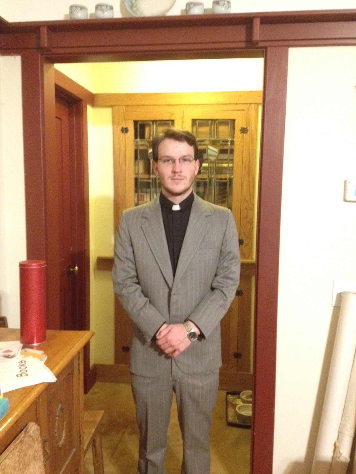
The first really exciting thing that I did was go out to California and administrate a wedding for a family member. Unfortunately for me right now the photos haven’t come in, and all of the others that have me in them aren’t great (but I wasn’t who people were there to see) so I don’t have a photo from the ceremony right now. So instead here is one of me in Texas in the same outfit that looks like the Lord is shining down upon me.

photo-178

I’m also still moving, and here are ‘before’ and ‘after’ photos of what a literal ton of books (as in actually 2000 pounds) looks like boxed up and on the shelf.

photo-179photo-176

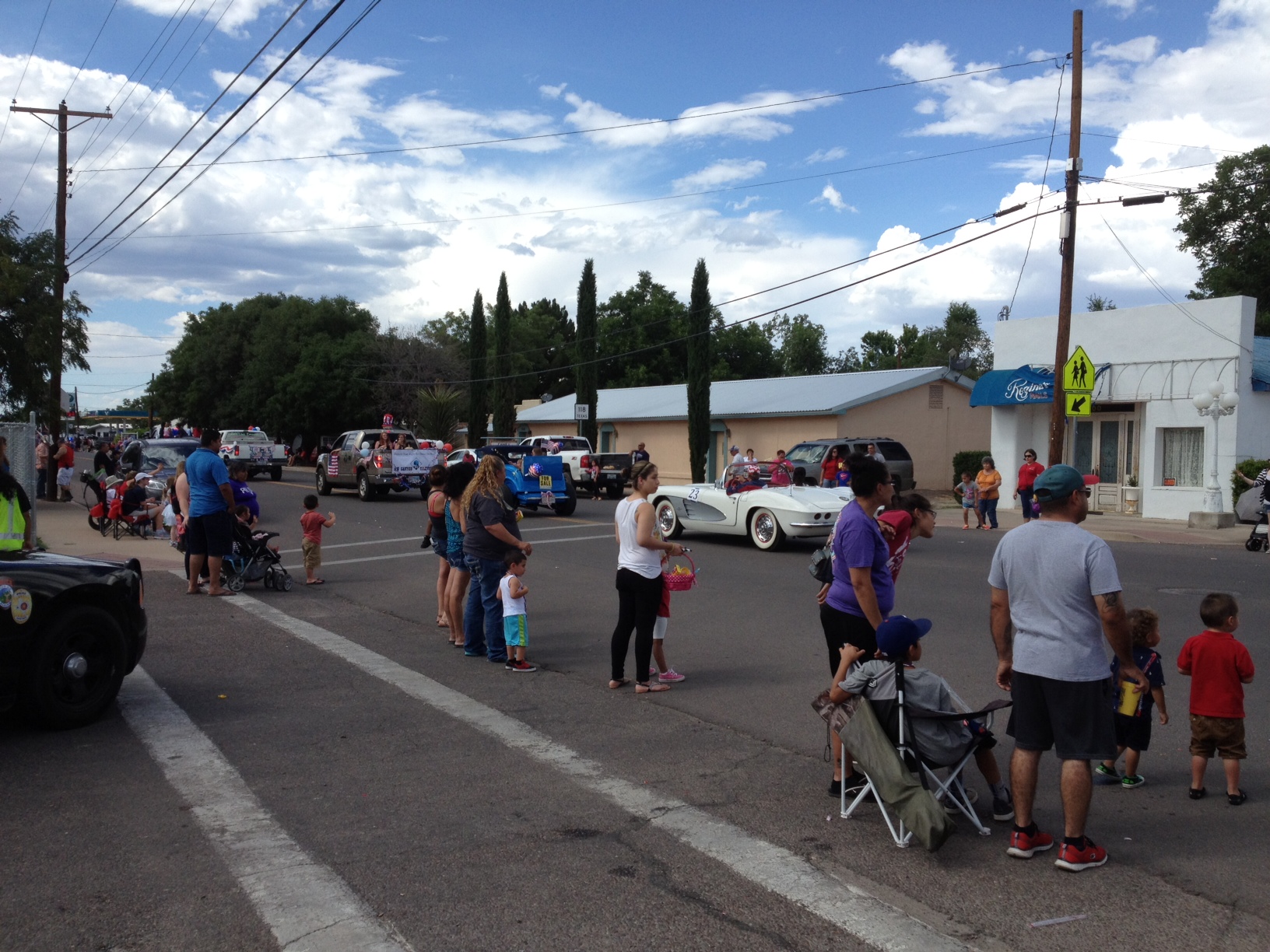
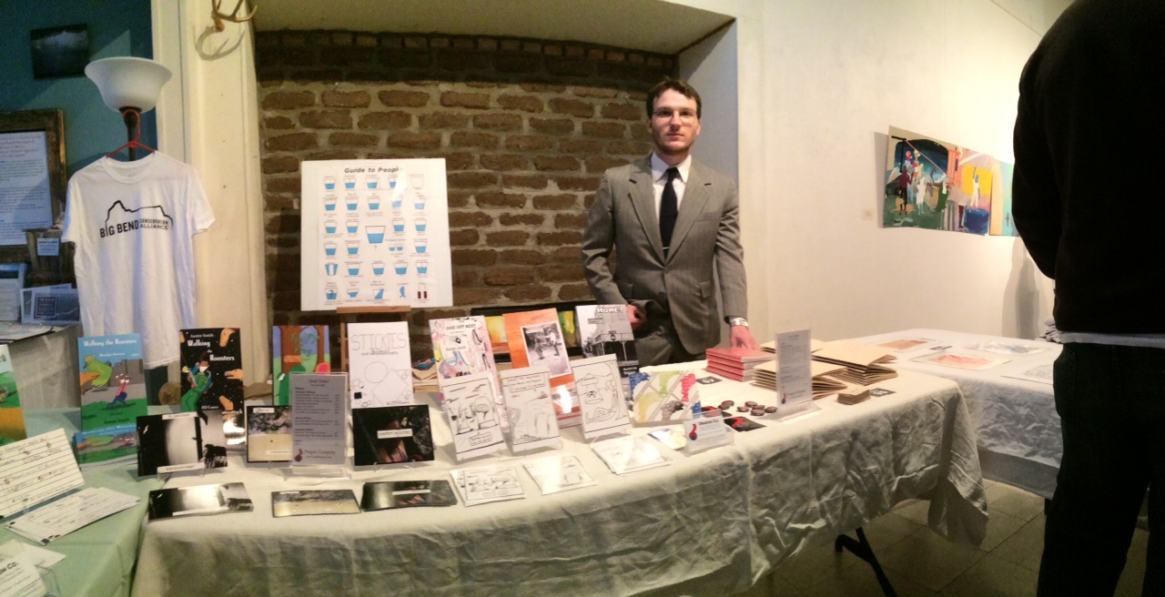
Most recently I went to both of my local 4th of July festivities, in Alpine Texas. The first one, Fiesta del Barrio, I attended as a vendor selling some of my books. But I’m bad at taking pictures so I only got one of the parade, and one of a horned lizard. I also missed the second parade and only got one picture of it as well.

photo-183photo-180photo-181

And here is a panorama someone took of me from the Reds show I was featured in in early April.

photo-177

Anyway, hopefully those photos and my posts from yesterday sufficiently prove that I am alive and dedicated to these blogs. Thank you for your patience.

-Austin

Dragoncompany.org    Dragonfunnies.com   Artsupplycritic.com

Advertisement

Review – Field Notes Bic Pen

Field Notes is a company that makes great notebooks, and they’ve always added a bit of a more personal touch to things. One of the ways they did that was by having branded pens and rubber bands readily available (I believe at some point in their orders, single pens and rubber bands were thrown in for free, but they can be purchased in larger packs easily.) The pens aren’t very expensive and fit very well with the brand’s style just on looks, but do they perform as well as the paper?

photo-120

The pen is actually just a branded Bic Clic pen, which isn’t a bad thing really. The entire design is a pleasant taper from the middle, where a ring separates the two halves of the pen. On the top there is a chrome-ish simple clip with Bic’s information on it, and a similarly-colored thin clicking mechanism (which give a very satisfying “click” when used). On the front of the pen, the ballpoint protrudes when the mechanism is depressed and the Field Notes information is printed on the barrel. The only colors of the pen are black, silver, and white, making the whole thing quite understated but also very nice.

photo-121

The writing is standard Bic writing. It is smooth enough, black enough, and steady enough to be serviceable in the vast majority of scenarios. It is a medium point, which is usually too broad for me, but definitely is unspectacular and fits with what most people are comfortable with. The ink is, of course, essentially waterproof once dry, with minimal skipping or blotting. I’m not particularly impressed by the writing, but I’m certainly not disappointed.

I’m sure the Field Notes Company did a bunch of research to find both a good enough and inexpensive enough pen for their brand that they wouldn’t have to try to make in-house. And I think they succeeded. The pens are dependable enough, sturdy enough, and simple enough to be almost entirely unremarkable (in both a good and a bad way). They fit the utilitarian image of the company, and are worth having at least as a backup pen.

Notebook Showdown – Moleskine Cahier Vs Field Notes

So another notebook competition today, huh? This time I’ll be comparing the higher end of the pocket book spectrum. It’s time for Field Notes to go head to head with Moleskine Cahiers.

20130628-000028.jpg

Starting with the covers the Moleskine is a very heavy, single color, piece of cardboard with an imprinted logo on the back. It’s got a flap on the back that folds in and serves as the famous Moleskine pocket. This pocket is not very well secured by the glue and tears out easily, it also causes the back to be prone to creasing rather than flexing. The Field Notes book has a thin “packing brown wrap” cover with a logo on the front and some identifiers. It also has a little on the back, but on the inside is where it really shines. It’s got name, coordinents, date, and return to blanks right in the front, and the back contains may useful reference items, including a list of uses, and all the materials used in the book. It’s still fairly flimsy, though, and when it bends it stays bent rather than easily popping back into place.

20130628-000040.jpg

Size-wise, both books are almost identical, despite the Moleskine having 12 more sheets. The rounding on the corners is also a bit less on the Moleskine. The paper inside the Moleskine is the standard archival quality, but fairly weak, off-white paper the comes with all Moleskines. In the Field Notes is a smooth, bright white paper. The actual type of paper is listed both on the website and in the book for easy reference. Both books come in: blank, ruled, and squared or graphed paper. But some special edition Field Notes have all sorts of different rulings. There is little variation in the ruling size wise, the only major ones being the Field Notes have a wide top margin and slightly lighter lines for the ruling. They’re brownish compared to Moleskine’s grey. One feature of the Moleskine that the Field Notes lack is that the latter half of the pages are perforated for easy removal, meaning you can tear them out without destroying the binding.

20130628-000049.jpg

Speaking of the binding, that’s where the really major difference between these books kicks in. The Field Notes are saddle stitched with three staples. The Moleskines however are stitched with 21 signatures. I believe they are also hand bound though I could be wrong on that. The Moleskine binding and cover makes it (like other Moleskines) like a rock. It is much harder to bend, but bends and creases terribly when it does so. The Field notes is a bit more lenient, bending more, but the staples provide great pivot points for bending and creasing as well. The Field Notes binding, while sturdy, can have the book come apart on it, though this rarely happens because of their limited page count. The binding on the Moleskine is much more likely to come undone itself and leave the book behind, though again this rarely happens.

20130628-000106.jpg

Really it all depends on what you want. They’re both about the same price so do you want: a better cover, more pages, perforation, and a pocket, or: better paper, better binding, and some useful information? In the end that’s what it comes done to. Also the looks a little bit. Personally I prefer the look of the Moleskine, but the quality of the Field Notes, so I use both. Try ’em and find out for yourself, it’s only like twenty dollars for three of each (at the time of writing).

Review – Limn Books

I am always on the lookout for new sketch/notebooks. I have hundreds already, but am hopelessly obsessed with paper. I have loads of different styles of notebooks. And when I found these fairly unique notebooks I had to have a look at them. (Disclaimer – They are made by my brother so I may be a little biased.)

20121207-001113.jpg

Limn Books come from Austin Texas. At the moment they come in two flavors of 5.5x 8.5. The flavors really only mean that one has red lettering and the other has blue. The only lettering is Limn on the cover and a contact email on the back. They contain 20 sheets of plain paper (no lines) covered by green cover stock. They are hand-sewn, single signature bound then covered with a binding strip.

20121207-001119.jpg

The covers are quite nice at protecting the books and looking nice, but they are not stiff enough to write on, so writing will require a table. The paper is almost butter, smooth but with enough grit to hold ink on the page well. Ink bleed is not much of a problem, especially if one is just writing and not drawing. They are comparable to Moleskine books in both paper and cover quality, but lack the elastic and are quite bit cheaper.20121207-001124.jpg

They are nice, inexpensive little books. They write well, are extremely portable, and are generally handy. They are good books for keeping notes, lists, and ideas. They have no real specific purpose in my mind, and are good at anything one wants to do in them, but are not necessarily the best at anything.