Review – HŌM (Home Essence) Black Linen Journal (Pocket book)

Sometimes, my weakness for inexpensive notebooks does actually lead me to a bad one. In this case, I was aware starting off that the HŌM Linen Pocket Notebook was only a serviceable notebook, and just barely above the many unusable notebooks that one can find on the shelves at Wal-Mart. But maybe I’m a little harsh sometimes. How bad could it be?

photo 1-67

It’s a standard little black book: 3½ x5½, with 100 sheets. Most of the “luxurious” features are omitted (no pocket), but there is an elastic band attached via a grommet on the back cover. The cover has a slick “linen” finish that is easy to scratch but hides it well. It’s a soft cover with straight corners that get dinged easily. The whole thing is nice and springy, but the finish quickly starts separating from its cardstock backing with use. The whole edge is “gilded” in a neon color (mine’s green) that matches the elastic band.photo 2-66
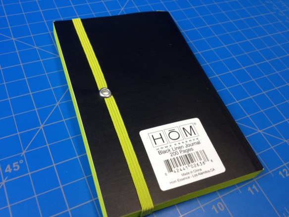
photo 3-60

The paper is an off white and ruled at close to ⅓rd inch (which is way too big). The ruling doesn’t go all the way to the edge of the page (which I really dislike), and the margin is wider at the top and less wide at the bottom (which I don’t really care about). The paper feels quite thick, and the grain is pretty boring (it’s not slick, it’s not rough, it’s just… weird feeling). It performs fine with ballpoints and pencils (minimal showthrough), and it does better with fountain pens than one might expect, but bleedthrough is still present. Smaller felt-tip pens do fine, but, not surprising to anyone, it can’t handle Sharpies.

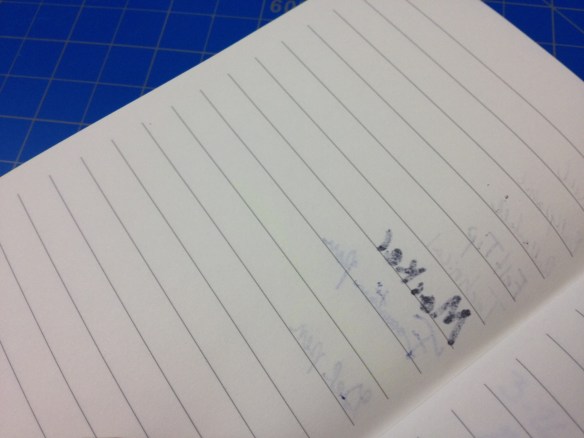
photo 4-54photo 5-21

This notebook strikes a few bad chords with me: poor (neon) color choice, easy to damage softcover binding, and wide ruling (I didn’t expect it to play nice with fountain pens, but it didn’t impress me). And the rest of the features don’t really make up any ground. It’s far from the worst notebook you can find on the shelves of your local department store, but it’s not really worth looking at.

Advertisement

Review – Field Notes Pitch Black (Focused on Large)

Field Notes are pretty much my go-to notebook brand. I carry an Expedition Edition with me every day (throughout my life that constantly reaffirms I don’t need a notebook that hardcore), and I have many of their regular books set up for individual projects. But I always find pocket books slightly too small for really working with, and “full-sized” books are just a bit large and cumbersome. When Field Notes announced they were making a larger book with their “Arts and Sciences” edition I snatched a set up, but I’m always reluctant to use limited editions, and I was a bit late to the party when they released an updated version of their “Pitch Black” book in the same larger size. Does it fill the position I was hoping for?

photo 1-63photo 2-62

The book is a nicely hand-sized 4¾ x 7½, with a simple black cover containing the minimum of necessary information. Inside that cover they improved on their previous Pitch Black design by adding a craft-paper layer to print on so the user can actually read it. As always, this inside cover has space for one to put their contact information, and a lot of interesting and/or funny information (mostly related to black or nighttime in this case).

photo 5-19photo 3-57

64 pages are saddle stitched inside with a single signature (as is typically the case when one staples something together). Both the paper and the cover are quite durable, and I haven’t had any problem with wear (on the spine or at the {thankfully rounded} corners), but they are just paper and cardstock, so you can’t be too rough with it. It’s all thick enough to feel like a “proper” notebook (and maybe provide some support when in the field) while still being super thin (less than a quarter inch). It’ll fit in almost any bag and still provide ample writing real estate. I always felt like it was hard to do more than write a list in pocket-sized notebook, but with the room to stretch out here I can get almost 300 words on a page, and with the dot-grid (which is the version I chose and what I believe to be the superior page-ruling) I can easily incorporate diagrams or sketches. The paper is a stark white and the dots an un-intrusive grey. Standard pencils, ballpoints, and highlighters all work great on the fairly smooth but mildly toothy paper and the it’s thick enough that I use both sides (which is rare for me {it also has something to do with the book’s thickness}); wetter pens like markers, rollerballs, and fountain pens do start to show/bleed-through though.

photo 4-51photo-276

For someone like me this book is basically all I could ask for, and I plan to use them more frequently in the future as I change around my main notebooks. It’s a little bit harder to carry around than a pocket book, yet the added space more than makes up for it in my mind, and it stops just short of being bulky (and it just shy of the page-count where the cardstock cover would start looking ratty before one finished it). Even the paper’s a little bit of an upgrade. It’s just a winner all-round for me, and if you’re feeling a little cramped by your pocket book, or that sketchbook is weighing you down, it might be a winner for you too.

Review – Field Notes Bic Pen

Field Notes is a company that makes great notebooks, and they’ve always added a bit of a more personal touch to things. One of the ways they did that was by having branded pens and rubber bands readily available (I believe at some point in their orders, single pens and rubber bands were thrown in for free, but they can be purchased in larger packs easily.) The pens aren’t very expensive and fit very well with the brand’s style just on looks, but do they perform as well as the paper?

photo-120

The pen is actually just a branded Bic Clic pen, which isn’t a bad thing really. The entire design is a pleasant taper from the middle, where a ring separates the two halves of the pen. On the top there is a chrome-ish simple clip with Bic’s information on it, and a similarly-colored thin clicking mechanism (which give a very satisfying “click” when used). On the front of the pen, the ballpoint protrudes when the mechanism is depressed and the Field Notes information is printed on the barrel. The only colors of the pen are black, silver, and white, making the whole thing quite understated but also very nice.

photo-121

The writing is standard Bic writing. It is smooth enough, black enough, and steady enough to be serviceable in the vast majority of scenarios. It is a medium point, which is usually too broad for me, but definitely is unspectacular and fits with what most people are comfortable with. The ink is, of course, essentially waterproof once dry, with minimal skipping or blotting. I’m not particularly impressed by the writing, but I’m certainly not disappointed.

I’m sure the Field Notes Company did a bunch of research to find both a good enough and inexpensive enough pen for their brand that they wouldn’t have to try to make in-house. And I think they succeeded. The pens are dependable enough, sturdy enough, and simple enough to be almost entirely unremarkable (in both a good and a bad way). They fit the utilitarian image of the company, and are worth having at least as a backup pen.

Review – Slant Collections Mini Journals Preppy Stripe

I’m not exactly the type of person to be found in Tuesday Morning (the store) but I did find myself in there one day, and there was quite a bit of interesting stuff. And being someone who has been drawn to the stationery aisle since I was little I found myself in the stationery section, where I found a set of Slant Collections mini journals, this particular set in the discontinued “preppy stripe” (it was Tuesday Morning, after all). Let’s take a look.

photo-107

The books themselves are 3¼ x 5¼ inches, just smaller than a Moleskine pocket book. The cover feels like plastic-coated cardboard and in this version has a very simple design that comes in 3 colors. It is a single piece bent around and stitch-bound onto the 70 inside pages. These pages are lined with a thin 7mm ruling that is the same color as the main cover color, printed on a very white background.

photo-108

The paper itself is quite thick and a medium roughness. It is very bleed-and feathering-resistant despite this. Fountain and other liquid ink pens are handled well, and with most other writing utensils both sides of the paper can be used, though at this size I wouldn’t recommend that. The cover and binding are very well done and hold up (the stitching looks very slightly unsightly at times) and the corners are nicely rounded to prevent the corner bending that some books get. On the table the book lies adequately flat and while the cover does bend out of shape it bends back just as easily.

In the end I have been surprised by these little notebooks. They are hardy, easy to carry, great writing things. It has taken me some time to review them as they weren’t good enough to replace any of the books in my normal rotation (but that’s more because I prize consistency, a book would have to be head and shoulders above to get met to move something out of my rotation). I enjoyed using them very much (even the pink one) and if all of the Slant collection journals are as good as these were I’d consider more in the future.

Review – Moleskine Pocket Softcover Notebook

I’ve already reviewed the Moleskine pocket notebook in hardback, but I’ve also used the softback version, and since there are a few key differences besides the obvious, I though I’d highlight them. So this is only half a review, if you want to know about the paper you can look up my other Moleskine pocket review.

20131030-010203.jpg

So the cover is obviously soft. It is a lot thinner and as such you can see the binding through it, especially on the back where you can see the attachment points for the elastic band. They are a bit intrusive and noticeable. The cover is blank aside from the name Moleskine stamped rather deeply into the back cover. The look is a bit like the regular Moleskine, but the pages are cut the the same length as the cover, and it looks a bit more shiny. The front cover can roll up on itself and then bounce back, but it never fully regains its former shape. The back is much less flexible due to the back pocket that comes Moleskine standard. The cover also feels almost moist and rubbery, and any minor scratches and such simply bounce out unlike the Rhodia Webnotebook. The softness does mean that the elastic band leaves very noticeable marks on the cover and sometimes the paper. The spine in contrast to the hardcover feels much more durable and able to stand up to long, continued use.

20131030-010210.jpg

Which style of cover is better is a decision you have to make. This one is flexible, easily fits in a pocket, and is harder the permanently damage than the hard cover, but it offers less page protection and stability for writing, so it’s give and take.

Review – Layflat Dot Grid Composition

Sometimes lines don’t look right on drawings and grids are too intrusive. Dots can be easier to draw around and can give the general guidance that is necessary. If you want the added bonus of having a book that lays flat on your table or lap you might want to try out the Layflat Sketchbook Dot Grid Composition notebook.

20131023-014028.jpg

The cover has a static looking black and white style and and a black spine. There is a space to write a name and subject as well. The cover is very thin cardboard, the inside being plain white with a plastic coating on the outside. It is rather thin, and has a problem with the pointy corners getting dinged up easily. The spine does lay flat with a little prodding, though not as flat as a saddle-stitched binding, but flatter than any other types of composition books, and most other note books.

20131023-014034.jpg

The pages are thin as well, white with tiny grey dots at regular intervals. There are quite a few of the dots on a single page, though I don’t know how many. The paper shows through with almost every ink, though it does take a heavy amount to bleed through. Even a few fountain pens work. The corners get dinged up like the cover, and the individual pages are a lot easier to damage. The grid they form is easier to write with than many others and is fairly straight. Though many of the pages are not printed the same, so the dots are inconsistent. Each dot is made of several small dots so they are un-intrusive.

Overall it’s a good notebook for designs and sketches requiring general guidance. It doesn’t work well with larger fountain or brush pens, or heavier liquid ink pens. It can get dinged up easily, but it does lay flat. In the end it is a cheap and nice notebook. Though it has faults, it is reliable and of good quality. It’s good for students or casual designers.

Mini Composition Showdown

A while back I reviewed the Dolgen Inspira mini composition book. I have quite a few books like this and instead of reviewing them all I decided to just compare them all together. So here’s the mini composition showdown. Mead vs. Inspira vs. Top Flight.

First off, covers and binding. All the covers are the standard composition marble pattern, with the Inspira being the most crowded followed by the Mead and then the Top Flight. The binding on the Top Flight is a sturdy fold stitch with eight signatures, while the Mead and Inspira are weak, simple glue binding. All notebooks lie flay fairly well, though the Top Flight takes more breaking in. Cover durability again goes to the Top Flight with the other two tied. The cover corners are straight on some of the Mead, clipped on the Top Flight, and rounded on the Inspira, meaning the Mead with the square corners will most likely tear up quickest. Other Mead notebooks have rounded corners.  If you want color the Mead and the Top Flight are the way to go.

20130614-235313.jpg

Their dimensions are about the same, with Inspira being slightly taller and Mead being slightly wider. The Mead and Top Flight both have eighty pages, while the thinner Inspira has sixty. The smoothest paper belongs to the Mead, the roughest to the Inspira, and the Top Flight is very akin to newsprint, unfortunately, not very high quality. All are not archival quality paper and fade rather quickly on the shelf, though they are bright white out of the package. None are very good at holding ink, but the Inspira is best without bleeding, followed by Mead and Top Flight.

What will really make or break these books, though, is their large price difference. The Inspira are three for one dollar (U.S.) the Top Flight are five for three dollars, and the Mead are one to two apiece.

So if you can organize all that and determine the best for you you’ll end up with a very nice pocket book. Each one is suited subtly to a different task so the main challenge is finding out what is best for you. They are certainly not the best memo books by any means, but they’ll certainly work, especially in a pinch.

Review – Bienfang NoteSketch Book

One of the worst things about different types of notebooks is that they vary in the page setup. Some have lines, some graphs, others are blank. Even the lined ones vary in the ruling between the lines. And what if you want to make a note on a sketch? Sure, you can just write it somewhere on the page, but it never really looks right, does it? Likewise with drawing on lined paper. Or what if you want to draw a diagram with a description. It will never go in any space you have left on the page, especially if it’s a long one.

20121007-000204.jpg

Well, Bienfang appears to have those people covered with the NoteSketch Book (all in different fonts so you remember it better). But we have to start with the covers first. The front cover is a nice card stock, heavy and not likely to rip out. It can take a mild beating, regular use is easily handled, but abuse isn’t. The back is cardboard and quite nice. It is light but strong, and will support drawing on ones lap or holding it in front of a subject. The paper inside is a little over half blank with the rest being roughly college ruled lines. It’s nice, but as thin as printer paper. It will only take pencil or technical pens before bleeding and wrinkling. Of course, for its intended use this is no problem. This also helps keep the book slim and it easily fits into most bags. They come in a variety of page sizes but those are all virtually identical, with the page size you like being the only deciding factor.

20121007-000211.jpg

Personally I can’t go anywhere without one of these. I don’t use them much at home, but on the road or just outside they are perfect. I don’t know about anyone else, but I only bring a pencil and a pen when I’m out, so any drawbacks from thin paper are negligible. And the ability to write notes and have space for it fits what I do. I love having a set aside space to put my thoughts or the story behind a drawing. If thats what you like to do, or you like to draft or draw diagrams that require explanation, this is the book for you. If thats not your thing, then this may just not interest you.