Review – Scotch Plastic Tape

Sometimes you don’t want clear tape, whether it’s to obscure, or to label by color, or the transparency just doesn’t matter to you. Scotch has also got you covered in that area with its plastic tapes, so called because they are made out of plastic. The roll I have happens to be red, but they come in all sorts of colors.

20150106-225631.jpg

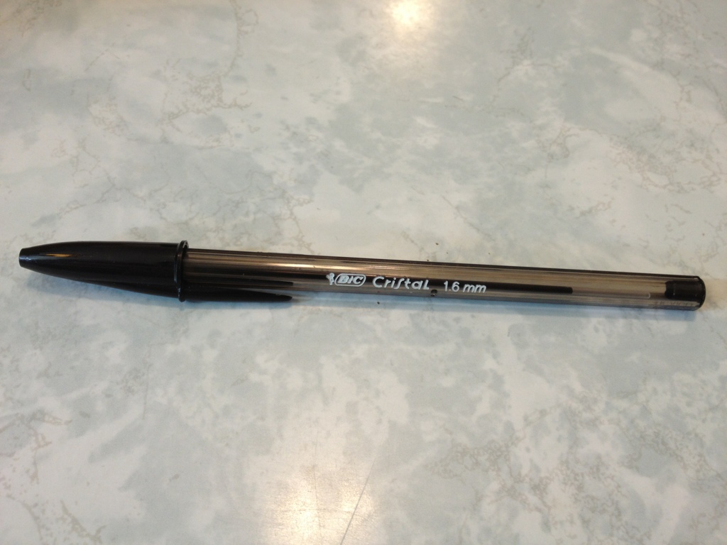
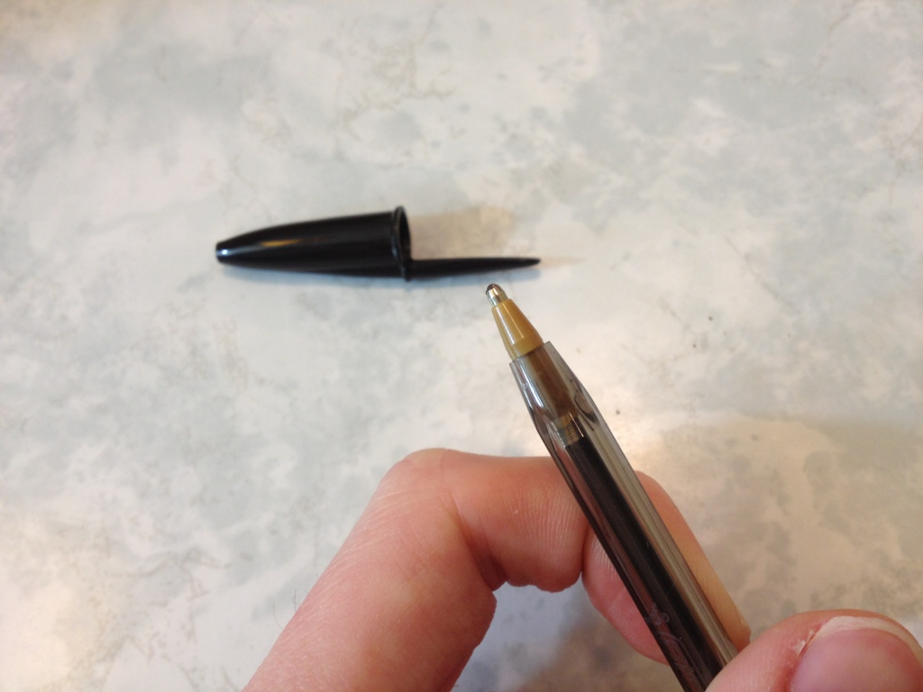
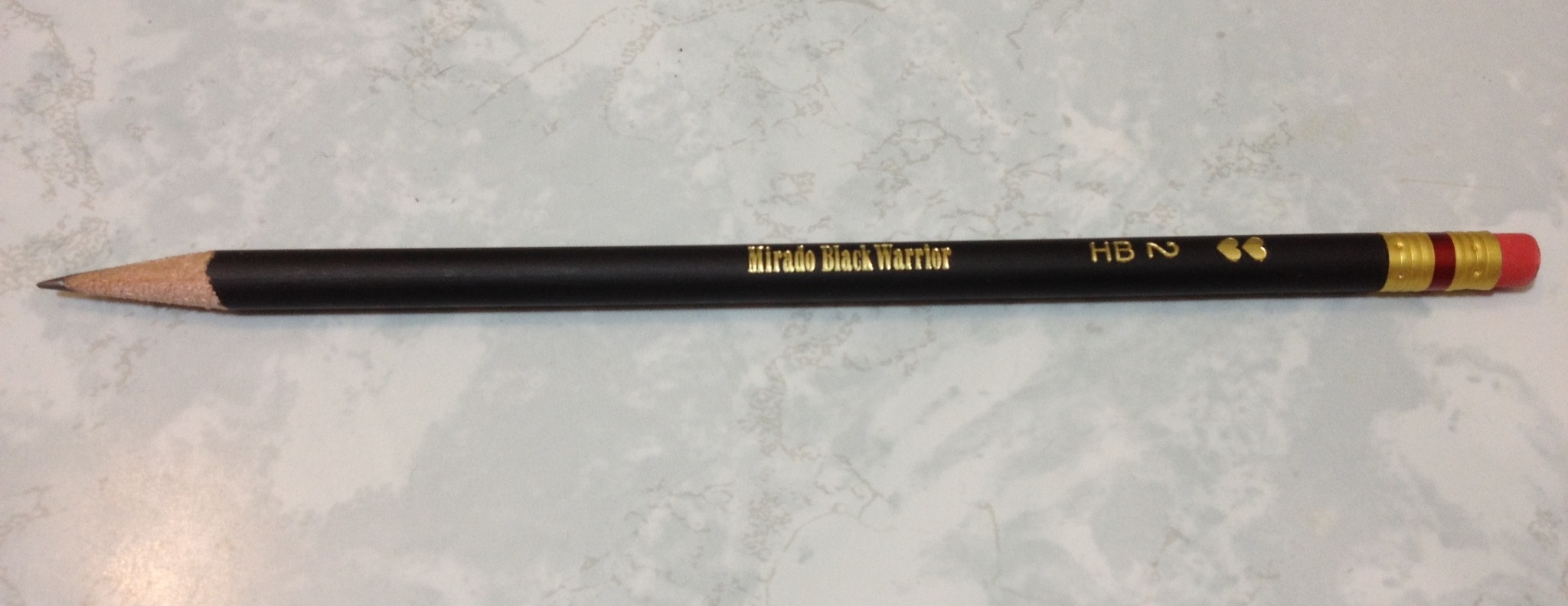
Really this can just be rated by its stickiness, and as such this review will be short. It is suitably sticky, if you have something that needs to be stuck temporarily or is quite light it will get the job done. It is as strong, but less adhesive than, the average electrical tape, though it’s possible it could serve that purpose. What it’s really great for is labeling things. It sticks quite nicely by itself and can be used as a color code or is easily written on with most writing utensils, though it could smear easily. When it comes off it leaves little to no residue, and can potentially be reused, though only a few times.

20150106-225637.jpg

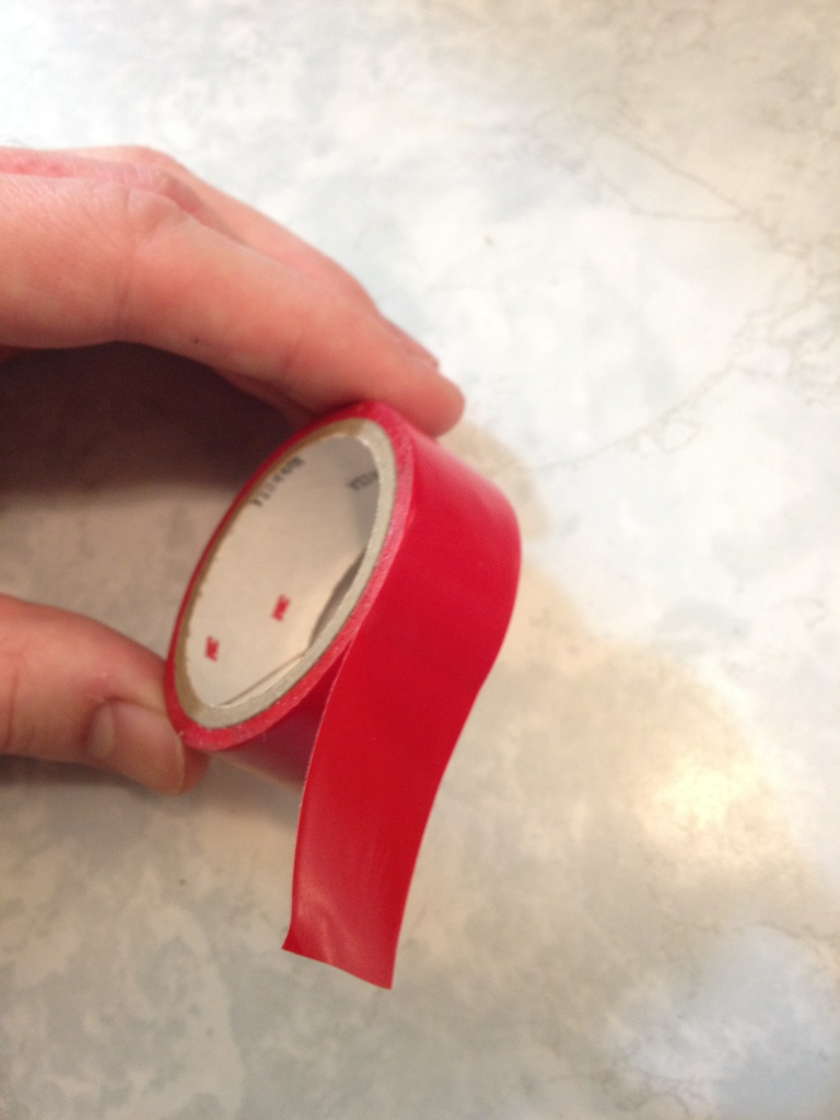
It’s a good tape, not a life-depending tape. It does the job of the regular transparent tapes while being less see-through and easier to pull off.

Review – Bic Cristal Bold

Bic makes a lot of pens, and the Cristal is one that everyone knows about. It’s a staple of the modern world: an admittedly cheap pen that can be, and is, used by everyone. But most of the time you find the medium version (or a fine if you’re either lucky or unlucky). And those have many of the problems we associate with ballpoints. And when one is running a business or doing art, sometimes it’s more important that the pen write on the first try, and write smoothly, than have a thin line. That’s where the Bic Cristal Bold 1.6mm pen that we’re looking at today comes in.

20141230-230245.jpg

The body is a simple as can be: a translucent piece of hexagonal plastic with key info on the side. The base of the ball point is plastic, while the tip itself is metal. The cap is a single piece with an integrated clip that works, but isn’t the best. The cap’s only real function is to prevent the pen from marking things when set down.

20141230-230252.jpg

But the real thing here is the tip, which is much wider than usual Bic ballpoint tips. Bic says that it is an “easy glide” pen. And I’d agree that that is the case. The ink is super smooth, and requires very little pressure once it gets going. After pushing down for a little bit, the pen, in my experience, will be writing perfectly a quarter of the way into the first letter, so not perfect startup, but good for a ball pen. After that it’s smooth enough to write cursive easily. There are a few points where the ink breaks up, and those are unsightly, but with a little hand control they can be covered up nicely. Like most ballpoints it’s suitably waterproof. And while the pen and packaging say it’s 1.6mm, Id’ be much more tempted to say it’s simply 1mm.

Really, it’s a great little pen, and not very expensive. If you’re looking for a cheap way to get a smoother (and partially less globby) writing experience, I’d say this is the direction to go first. They don’t match liquid ink pens of any type, but they certainly do work quite well and are convenient, having replaced most of my other ballpoints right now.

Review – Pilot BP-S Medium

For quite some time, pen companies have been trying to come out with the “superior” ink. And many succeed in varying ways. Every ink has its benefits and faults. The Pilot BP-S (which I can only assume stands for “better pen” as it uses the “better” refill) claims to have a “revolutionary” ink (perhaps when it was first made) that is very smooth and writes the first time. But all my quotation marks just make me a skeptic. Let’s look at the pen.

20141224-010739.jpg

The body of the pen looks like a hyped-up Bic Cristal. It’s got a similar hexagonal shape, with a black end cap that screws off for easy refilling (with the Pilot better refills). The body is clear with a minor amount of information physically molded into it. It’s enough to tell you what you’re using. The grip is series of tiny ridges that lead all the way to the metal cone tip, and are surprisingly grippy compared to the rest of the pen. The refill in this model is medium, and it comes out a ways beyond the cone. The cap is nothing to write home about, though it does have a flat surface for easy removal, which is nice.

20141224-010745.jpg

On to the writing. I can tell you for a fact that no pen that isn’t liquid ink will write the first time every time, but this one comes close. It does take some pressure to start, usually, and a more constant pressure to continue writing than a regular ballpoint, but the overall experience is smoother. With the right amount of pressure, the ink comes out in a consistent line, and with a little let up, a serviceable one with a few gaps. Neither of these options are more strain on the hand than a regular ballpoint. The ink is black, most of the time. Sometimes it’s more of a cool dark grey. And that’s fine for any office setting, though not really for art. It is also smudge-resistant and water-resistant, like most ballpoints, so it will survive a spill as long as the paper does.

Overall it’s a good pen. Perhaps it was better comparatively when it was first introduced. It is nothing terribly special, but it is superior to standard ballpoint offerings from most major companies. Again, just slightly. If a ballpoint is the perfect writing or art utensil for you, but it just isn’t quite smooth enough, these are probably worth a look. They certainly don’t cross over into the realm of feeling or acting like another type of pen, which unfortunately tends to happen with these “smooth” inks.

Review – Pentel Handy-Line S Permanent Marker

I personally don’t have much use for permanent markers, but quite a few people do, especially for the “fine” tipped ones like Sharpies. But regular permanent markers are kinda boring. Today I won’t be looking at one of those, but at a more interesting Pentel Handy Line S.

20141210-000538.jpg

The pen body is kinda ugly. It’s a very straight-cut tube in black, with lots of logos and text on it (though I have seen worse text on many items). The overall design is boxy. Up near the top is a very positive clicking mechanism that feels quite robust. The click it gives off is super satisfying, as well. The clip is nothing really special. It is a bit sharp and might tear cloth, but it won’t break. Interestingly enough, there is a mechanism underneath the clip that will disengage the clicking mechanism when the clip is moved away from the barrel, meaning that if you do put it in a pocket it will automatically retract, which would hopefully save one from some of the mess that would cause. The rest of the barrel is straight and black, with some writing. There is a slight curve before the retractable point, which has a nice cover that blends in with the pen to keep the marker tip from drying out.

20141210-000547.jpg

The writing is quite black: I’d say slightly warm but not to noticeably so. The pen is a bit dry when it is just beginning to write, but that is quickly worked through. I will admit that I haven’t given it the most rigorous testing possible, but the ink is suitably permanent. It doesn’t smear or feather when exposed to water, and writes on many different surfaces. The ink also has a very peculiar smell that is like no other marker I’ve used, though I probably shouldn’t sniff it regularly. The body of the pen says it’s refillable as well, though I can’t for the life of me figure out how that would work, but it’s cheap enough to replace.

Overall, for a retractable permanent marker, I’d say this one hits the nail on the head. It works well in all places and has no glaring flaws. It isn’t that expensive and can be used for all sorts of things. Whether or not the features make it worth tracking one down is up to you.

Review – Up&Up Double-Sided Tape

Well, you can call me out of ideas again (but not Shirley). I’m going to be looking at tape. This time it’s the type of tape you never realize how much you need until you get some, and that’s double-sided tape. Specifically, from the brand Up&Up.

20141203-000355.jpg

The container is nothing special, it’s thin and plastic-y, but still flexible. The teeth are solid, and do a good job of cutting the tape. Everything is cheap but everything works on it. The tape can also be taken out and used in a different dispenser, though it is slightly thinner than regular Scotch tape and one must be careful to have it not stick to the inside of the dispenser.

The tape itself is good. The sides both stick strongly, and equally so. The tape itself is stronger than the adhesive, so it will come off before breaking. It is fairly pliable but it loses its adherence fast, so nothing that moves a lot, or will be handled, will be stuck for very long with the stuff. But really it’s for posters and scrapbooking, and for that it works superbly. It is quite transparent, but that only really matters if the things you’ll be sticking on both sides are transparent as well.

In the end, it’s good tape. It might be slightly below Scotch tape (in my opinion), but really not enough to tell. For any of its main uses it will serve well, and double-stick tape is really useful.

Review – Uni-Ball Kuru Toga Mechanical Pencil

When talking about mechanical pencils, as with many things, it’s hard to get away from the idea that there must be some way to improve upon past designs, and that the standard design we use today has enough flaws in it that seem easily fixable that they should be promptly corrected. The Uni-Ball Kuru Toga is a mechanical pencil that is designed to fix one of the long-standing problems with pencils: unevenness of the tip due to use. Let’s see how it works out.

20141126-005210.jpg

The body of the Kuru Toga is quite simple. The barrel is almost entirely featureless until getting close to the point, where there are a few ridges for “grip”, and then a small metal step-down to the lead point. Interestingly enough, unlike most mechanical pencils, this metal step-down is not integral to the design and the pencil will function fine without it. At the top is a small click-advance system, with a transparent eraser cover that is the accent color. The eraser is small, but works quite well, and most packs come with a few replacements. The cover makes a satisfying clicking noise as it moves into place. The clip has all the info you’ll get about the pencil, which is just enough, though not very much. The clip itself is functional, but not the best. The barrel is semi-transparent with a logo, giving the pencil overall a very interesting look.

20141126-005215.jpg

The lead is HB, and, according to the package, diamond-infused. It is harder than most other HB’s I’ve used, and I haven’t had a lead break on me yet, though that’s more because of the lead advance, which tends to give less instead of more, meaning I have less lead available to break. Overall, the lead is smooth enough and doesn’t write very bold or dark. The real feature of this pencil is the turning point, which acts with the pressure of writing and supposedly turns the lead to prevent breakage and to create a more even tip. I’m not sure if it works, or even if it is working, as I’ve never felt it when using the pencil, but I have also never had the lead break, so there’s that. I wouldn’t say it improves the writing experience by creating a sharper point, but it certainly doesn’t make it worse. Perhaps this feature for me is unnoticed since I naturally rotate the pencil around in my hand willy-nilly. That’s just how I write.

So overall, how well does this pencil do? Pretty good, I guess. I’m not a fan of the overall design, and the lack of any grip on the smooth plastic can make it hard to hold. Like I said, I can’t even tell if the feature is working, but I’ll go ahead and say that, at least through a combination of factors that went into the design of the pencil and lead, it is much less prone to breakage than other models. So if you have a problem with breaking your leads, I’d certainly have a look, but if you value the comfort in hand more than the lead quality, I might look elsewhere.


Review – Scotch Transparent Tape

If reviewing Scotch Tape means I’m out of ideas, then call me out of ideas (I do have plenty more things to look at, though). But really, who doesn’t have a use for tape? And when buying that tape, couldn’t shaving off several pennies save quite a bit of money over time? Is the brand name really worth it (It’s pretty generic-sounding, now, isn’t it)? Let’s see.

20141111-234203.jpg

First thing, the container: Scotch Tape comes with a clear plastic, simple, but quite durable dispenser. The roll of tape is clicked into place on the wheel and at the front are several teeth for separating the tape into strips. Is any of this the best quality? No, but it gets the job done, and very cheaply. If one has a tape dispenser that they like, individual rolls can be bought, so I’d say that this works quite well.

Now onto the tape itself, which certainly isn’t “magic” or “invisible”. The stuff I’m looking at is just labeled “transparent”, and that it is. The tape is easy to see through and sufficiently sticky that it will hold most documents together without a problem in either holding or reading. In fact, the tape itself is very strong, and the adhesive is more likely to break than the tape itself (or perhaps what it’s taped to). Given that it does have a certain rigidness to it, though, it isn’t a tape for repairing any item that, like a tool, will be used, or will move. It is surprisingly strong, but really only good for paper products.

Now, is it worth it to buy Scotch Tape and not some other tape? Given how inexpensive Scotch Tape is already, I’d say yes. And if it isn’t right where you’re shopping, I’d even hunt around for it. The two rolls that come in a pack for around a dollar will last for quite some time. And I’ve seen other brands for around the same price that cease to be sticky once they came off the roll. In short, there’s a reason we say “Scotch Tape” and not “transparent adhesive tape”.

Review – Papermate Mirado Black Warrior

There are a lot of pencils out there, and it seems there are even more cheap pencils (that isn’t possible, I realize, but it made sense when I was typing it). How good can some of these pencils be? Today I’ll be taking a look at the Paper:mate Mirado Black Warrior Pencil.

20141105-010555.jpg

The pencil body is simple and round, which is surprisingly not a standard pencil shape. I always had round pencils at school (a set of leftovers from my father), and people always liked the way they felt when I loaned them out (which is why I lost so many). The shape is quite comfortable, and just that little bit better than a hexagonal pencil. The set of pencils that I received have a satiny finish that make them fairly grippy even with sweaty hands (from what I understand, they used to be more shiny and slippery). The rest of the body is a plain black with “Mirado Black Warrior” in gold on it in a poorly chosen font, as well as HB 2 and the Papermate logo, the hearts of which take away from the “warrior”-ness.

20141105-010601.jpg

The back of the pencil has a standard pink eraser, which does its job and hasn’t dried out in the time I’ve had it. I’d guess it isn’t the best quality and if you always want to erase what you wrote I’d recommend getting a dedicated eraser, but these work fine for most of us. The lead is HB, but feels much softer than most HBs I’ve used. Perhaps that is just me, but I’d say it is at least a little softer and it covers smoothly and well. A good pencil for filling in scantrons or shadows. Because it is so soft it is not too great at holding a point, though.
Is it a good pencil? Definitely, and for the money it’s really just a matter of preference.

There are loads of good pencils in this price range, so if one that is round (make sure your desk isn’t slanted) and has a slightly softer lead sounds good to you; or maybe you just like the “stealth” idea of an all-black pencil, this one is at least worth looking at. And like I said, for the price almost anyone could afford to pick up a box to compare to any other pencil they happen to be using.


Review – Zebra Sarasa Colors – Hunter, Fuchsia, Cobalt, Light Green, and Violet

After the first five colors in the ten-color pack of Zebra Sarasa pens, the colors get a bit less conventional and a bit more extreme. Let’s look at the Zebra colors Hunter, Fuchsia, Cobalt, Light Green, and Violet.

zebra sarasa colors 2

First Hunter, which is a dark bluish-green, a bit more blue than usual hunter greens, which seem a bit warmer. The color is very deep, and in some places could easily be work-friendly. It is a very natural color and could easily fit an artist’s needs for a deep green. It lifts the most when exposed to water, but like the rest of the colors here, it doesn’t really budge to smear once it dries.

Next Fuchsia, which I’d call rose, but that’s just me. It sits on the fence for me between a deep pink and a light purple. I can’t really tell which it is. As far as either one goes, though, it is a very appealing color that, unlike other pinks or light purples, doesn’t hurt the eyes. It’s more of a flower color than anything else.

Third is Cobalt, which is a very grey blue, though I’m almost tempted to say it’s the other way around. It’s a dark and dim color that gives off a wintery feeling. Artists could find a use for it in many winter themes and its color is just subdued enough that it would likely be a good office companion and still let you stick out.

Fourth Light Green, which is almost lime. It hurts the eyes a little, but it isn’t terrible. I’ve certainly seen worse. It doesn’t look very natural, and it’s slightly hard to read. It might make a good color for marking mistakes, but otherwise its uses are limited.

And finally, Violet, which is bright and indisputably purple. It’s a flowery purple and that’s the only really natural parallel that I can think of. It also might not be work-appropriate because of its brightness. But it is superb in readability, not dark enough to blend in in low light, and not light enough to disappear on the paper. For casual writing, this one would be a keeper.

And that’s it for the ten pack of Zebra Sarasa Gel pens, I think they’re great little things, with an interesting color set in which some aren’t often seen, let alone this common. They’re nice inks, and I’d go for them if you like the pen.

Review – Zebra Sarasa Colors Black, Blue, Red, Navy, Mahogany

I’ve talked about the Zebra Sarasa before, and it’s an alright gel pen. The saving grace of many gel pens is that most come in a variety of colors at least partially unique to them, and the Sarasa is no exception there. Let’s take a look at a few of the colors.

The colors are always a bit off in the digital space

The colors are always a bit off in the digital space

First, Black. It’s a cool black that covers well. It works in an office setting and generally doesn’t get lighter even with minimal pressure. I’d say it’s black almost as soon as it gets on the page. The drying time is moderate and it’s water smudge-able.

Next, Blue.  The blue is quite dark, darker than most office-type blue colors. This makes it easier to read and more professional. It’s also natural looking, more like a deep sea-blue than an in-between blue that doesn’t really exist in nature. It’s the least smudge-prone of the bunch, but that won’t entirely stop it from lifting off the page.

Third, Red. It is a bland red, with no real pop to it. Though it is brighter than some of the competition, it isn’t really eye hurting. It’s quite noticeable and quite red but has no character — and no real flaws, either. It’s the color that fades the most when exposed to water.

Now, Navy.  Navy is a very deep, dark blue. It’s really almost black. You’d need a good light on to tell which one is which, though you could tell that black and navy are different colors with minimal light. It’s a wonderful dark color that is almost soothing and quite free flowing.

Finally (for this set), Mahogany.  It is really more like maroon. It’s a slightly purplish red which is also very dark and quite nice. It is much more noticeable than the navy, and still quite natural, giving an almost brown appearance from far away. It’s probably my favorite of the five, though the one with the fewest applications, and while you might get away with it at the office, it could be a hard sell. Unless you work for Texas A&M University.

That’s the five colors for this week. Next time I’ll be looking at the other five colors in the standard ten color pack.