Review – Uni-Ball Vision Elite Bold Black, Blue, and Red

When looking at the Pilot Precise two weeks ago, it occurred to me that there might be people who don’t have Pilot pens available, or don’t like them, so I looked into a different set of pens that have similar features. And I found the Uni-Ball Vision Elite Bold, in Black, Red, and Blue.

20140618-005609.jpg

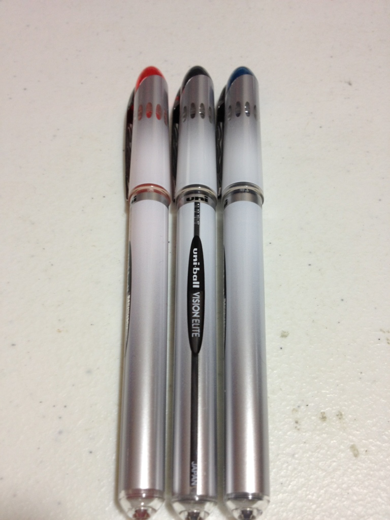
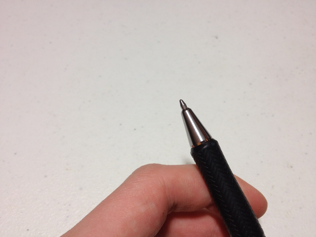
The body and cap are simple and smooth, with a nice white-to-grey fade, a conical top, and a rounded bottom. The clip is metal with a few divots and is very tight. The top of the cap has the color of the ink and there are a few windows below to allow you to see the feed. On the barrel, the brand is stated twice and the model once, but there is no size information. Removing the cap exposes a transparent yet grip-covered feed, and the conical tip to a standard metal roller-ball point.

20140618-005616.jpg

The three inks aren’t too special in properties. The black is a thick, nice color. It is a warm black, fairly formal, etc. The bold line on all of these pens is enough to bleed through on cheaper copier paper, but the ink dries surprisingly fast. The blue is a dark blue, again fairly formal. It’s almost a navy or a blue-black color and it works well in most situations. I’d say it’d even work well for some artistic endeavors. The red is fairly bright and red, but it isn’t eye-hurting. It is a very deep, nice color, but it could still be considered aggressive. It is also good enough to have some artistic potential.

20140618-005621.jpg

The point is nice, and it writes smoothly, especially in the bold I have here. There is a lot of line variation, though, meaning drawing is a bit harder (or easier, depending on how you look at it). Like I said, there is some bleed-through, but not much. The writing is dry almost instantly from when I pick up the pen, which is amazing and leads to a much smoother writing experience.

Overall, the Uni-Ball Vision Elite is a great little roller-ball with quite a few office applications. The colors are nice without being overbearing, and the writing experience is fast and clean. Artistically they are limited, having little line consistency, but on the color side they have potential. They’re a nice set of pens.


Comparison – Pilot Varsity Old vs New

If you’re looking for a fountain pen but don’t want to purchase something expensive or something you have to fiddle with, then a disposable fountain pen might be the way for you to go. And If you’ve tried before with the most common disposable fountain pen, the Pilot Varsity, and are looking to get another one, you may have seen the slight changes they’ve made to the design. Are these changes that big a deal? Well, let’s find out.

20140613-003203.jpg

The Pilot Varsity has a simple cylindrical barrel and cap, with nice, simply rounded finials. Printed on the barrel is “Pilot Varsity” and a design, but no further information. Both pens have this printed on them. While the old design is straight lines on a tasteful silver with a tiny ink window, the newer version features a multi-tone diamond pattern with a worked in, barley visible, ink window. The cap has a cheap plastic clip with a ball on the end that does tolerably, but is far from the best. Just don’t turn yourself upside down with this pen in your pocket. Taking off the cap reveals the clear section and the plastic feed. One can see if there is ink in the feed, but not in the barrel except through quasi-ink-windows printed in the design. The feed is simple, and has a wick, which allows for better ink flow, but would not be ideal for cleaning (which you wouldn’t be doing anyway if you were just going to throw it away.)

20140613-003210.jpg

The nib at the end of the pen is again simple. It is stamped “Pilot <M>” (medium) and has no further ornamentation, not even a breather hole. It is stainless steel, and offers no flexibility in the tines. Now, one might think that since they’re both stamped medium, that both pens would have roughly the same line width; and this would strangely be wrong. At least on the example I have, the older Varsity has a line more akin to a fat medium, or a particularly skinny broad, while the newer example is more of a fat fine, or a sorta skinny medium. If this is indeed a purposeful change that was made, I’m guessing it was for the American market to prevent bleed-through on the extra-crappy paper here, which it does do. This size difference definitely doesn’t affect the nib performance, though. Both nibs are buttery smooth, have no startup issues, and write under no pressure. The ink is the standard Pilot black, and there is nothing different between the two pens that I can discern (and neither are at all waterproof).

So, which one should you get? Well, it really doesn’t matter. If you really want a fat medium nib disposable (well, kinda, you can look up how to refill it online) you can hunt down some of the old ones, which I personally like better due to purely aesthetic reasons. The new one is a bit more loud and silly, and a bit finer in line, but you’d be really hard-pressed to tell that unless you were looking like I was.

Review – Pilot Precise v5 Black, Blue, and Red

Times are tough if one wants to write smoothly and precisely on a budget. Technical pens wear out fast, and fountain pens cost money and time to maintain. I use both, but sometimes I just want to write easily and precisely without all of the maintenance and hassle. This is where the Pilot Precise series of pens come in. Today I’ll be looking at the v5 set in black, red, and blue.

20140603-232945.jpg

The cap and barrel are simple and straight. The cap has nothing on it but a simple metal clip that does its job well but can bend easily. The barrel has the necessary info about the product and an ink window so that if ink starts to run low you can get a general idea. Removing the cap shows a transparent section and feed system, which is more for being cool looking than any sort of functionality regarding ink level. At the end of the section is a series of plastic step downs that lead to a metal rolling ball tip. At the bottom of the section is a small clear plastic window that allows one to easily see if there is little or no ink left in the pen. The transparent section and barrel are both a slick plastic, but provide enough surface area that slipping off or letting go of the pen is not an issue.

20140603-232950.jpg

The tips of the pens write fairly smoothly. Older ones get a bit stiffer, but even on the extra-fine v5 they are never scratchy. The rolling ball delivers a nice “precise” line to the paper. Although it does have more variation than a technical pen in width, it has less than a standard ballpoint does, and it doesn’t blob. Like I said, writing is smooth: almost as smooth as a fountain pen, but not quite there. I’d say they are wonderful for writing (especially if ballpoints cramp one’s hands) but are not as good for drawing. Still better than a ballpoint, though.

20140603-232940.jpg

The three colors I have are Black, Blue, and Red: fairly standard colors with a fairly standard execution. The black is a warm black (this is an older pen, and Pilot may have changed formulas. The other two are brand new.) and noticeably less saturated than the thicker v7. The blue is quite dark, darker than most other Pilot inks, and quite work-appropriate. It’s almost a deep water blue, but not quite as dark as, say, Bic blue. The red is bright, bright to the point of being aggressive. Don’t grade papers with it unless you really want to say they’re wrong. It shows up almost from across the room and is quite a contrast to the deep red body of the pen. I’d say it has the fewest practical applications of the bunch. All of these inks are liquid-based and soak into the paper, meaning that they take a bit of moisture to run, but when they do they never stop. The red is the worst in this case.

In the end I’d say simply that these pens are great for writing, and all right for drawing. They aren’t the best but are great and ubiquitous for what they are.


Review – Plaid 10 Detail Brush Set

Well, while perusing my archives, I found a review of Testor’s plastic cement. And that is when I realized I have a whole set of Modeling stuff that I would count as art supplies. So today I’ll be looking at some of those, starting with one of the cheapest and most universal things, a Plaid 10-piece detail brush set.

20140527-232159.jpg
This will be general and cover only the quality of the brushes and not the individual brushes themselves, which might be covered in future installments. First off, the bodies are made of cheap wood that is poorly painted with quite good lettering telling you what everything is. There is a brass-colored section near the end, and some very ugly orange bristles pointing out of it. The section and body are quite sturdy for their thickness and not at all slippery, but not too nice in the hand either.

20140527-232204.jpg
The bristles themselves are all right. As previously stated, they are an ugly orange, which doesn’t really matter too much. They are synthetic and have a bit of pop to them, which I like, but others might not. At first they are quite soft and strong, but they may easily become frayed and bent. This is more of a problem with individual bristles and not the brush as a whole. This makes it difficult to get a good edge when you paint, until you cut the offending bristle out of the brush. The brush’s life is likely shorter than most brushes (considering they are sold in Wal-Mart), but, honestly, for the price they work very well. They get floppy pretty quick (which some people might prefer) and they do wear out shortly after that. But they have a lifespan the I’d expect for the price, and getting a 10-brush set this cheap is incredible. They’re even relatively hard to stain.

Overall, if you need only limited detailing done on paintings, or are looking to start painting models and miniatures, this is a great starter brush set. One might want to upgrade to a well-know brush brand later, or even to hair brushes, but for a starter set these are excellent.

Review – Crayola Twistables Crayons

Now, crayons are impractical for most art types, usually because they are fragile and fiddly. What if these two problems were fixed, and crayons were easy to take and use anywhere? What would their value be? Well, Crayola has a set of twistable crayons which have plastic bodies with a twist action, so let’s take a look.

20140521-003833.jpg
First off, the crayons come in a quite nice plastic-and-card-stock carrying case, which, while handy, seems like it would fall apart rather quickly. And, just for me personally, I would want to store these somewhere else, but have a problem throwing plastic things away so I keep them in it.

20140521-003839.jpg
The crayon barrels are made of plastic and have Crayola and Twistables written on each one, with no indication as to color, though the body is see-through so the color is fairly apparent. Near the tips is a tapered and grippy section which works quite well, especially since the rest of the body is very slick. At the other end is a twisting knob which operates easily and can be used to both push the crayon out and retract it.

20140521-003845.jpg
That’s almost all there is to say. The crayons themselves are nothing special, they’re just kept in place by a plastic tube and screw. They are, of course, for kids so they are bright and not very natural. They are also non-toxic, which is a bonus. They stay alright on the paper, but not as well as more “professional” crayon and oil pastels.

So, overall they are better crayons, but they don’t change what Crayola crayons really are. Which is good for the people who use Crayola crayons. They aren’t particularly serious art supplies, and that’s fine. For more advanced things I’d recommend picking up one of the larger cases with more colors rather than the standard 10 pack I got. Past that there really isn’t anything special about them.

Review – Pilot Easytouch Pro

While not necessarily an art supply, the Pilot EasyTouch Pro claims to use a hybrid ink formula to make a smooth writing, quick drying, waterproof ink, which sounds super handy. Let’s see what it’s all about.

20140516-011941.jpg

First the body of the pen features a “modern design”. The tip is a metal cone similar to most click pens. The grip is nicely tapered and flares out at the end. The barrel is fairly straight, but with a little engraving and minimal information. The clip is simple, and tight, with a “modern design”. At the end is a click button and a strange cutoff design. The click mechanism works well but has a grating sound.

20140516-011947.jpg

The ink itself is a slightly dark black, but really more of a grey. The tip is medium and there are no options. It does flow quite easily, with very little pressure on the paper. It isn’t as smooth as a fountain pen, or even a gel pen. It does offer some line variation when one presses harder, and it becomes considerably blacker when one does so. It dries fairly fast, though not the fastest. All of this is quite nice until at some points when one is writing (especially when one has just started) a large blob of ink spills out of the point and bleeds though the paper. This is not really unusual for a ballpoint, but the amount and the bleed through make it quite a problem. It’a not really a problem when writing, but a problem when doing anything else.

So overall, this is not a drawing pen, but a writing pen, and not a long writing pen either, because of blobbing, but if one merely wants to sign a paper, or write one page it is quite a smooth-writing fine instrument.

Review – Palomino Blackwing Pencil

So I’ve reviewed some pencils, and I believe it is time in my pencil-reviewing career to take a look at the reproduction of the “greatest” pencil of all time: The Palomino Blackwing.

20140507-013813.jpg

The body of the pencil is unique, which really is something to say about a pencil. The main body is a fairly standard hexagon shape, but painted in a nice, less-standard matte black. The Palomino Blackwing name and logo is printed in gold, with a gold band around the back. No indication of hardness is presented. The eraser holder starts off normal, but flares out into a rectangular shape with a metal insert that holds the eraser and makes it replaceable. This eraser holder is fairly smoothly finished, which is also unconventional. The erasers themselves are fine, they get the job done but they aren’t perfect, especially if they have to deal with the amount of lead this pencil puts on the paper.

20140507-013820.jpg

Now to what really matters: the lead of the pencil. It is fairly soft, but not the softest. From what I can gather it’s about a 3 or 4B (a few bits softer than a no.1 or no. 2 pencil) and boy does it glide. It’s likely one of the best flowing pencils I’ve ever used. Even for this hardness it is noticeably smoother than others in the same area. But it does sacrifice its point for this. The pencil just never stays sharp, and it can go from a fine (almost) line to a very broad line very fast. The softness also makes sharpening harder as the end never gets quite as sharp as I’d like it to be as it keeps breaking off. I suspect that the Blacking will be reduced to a stump in short order because of this, and the eraser likely never be used to its fullest.

20140507-013829.jpg

Overall I’d say that the Blackwing is a superb pencil, but just not my type. It is well constructed, has convenient ideas and is super smooth. But I prefer more precision in my writing and drawing and need a finer point for that. I’m also no a fan of the darkness that softer pencils provide. I like being a little more in control and a little bit lighter. That said, the shading is amazing and the tonal range is phenomenal. It wouldn’t be my greatest pencil of all time, but I can see how it would easily be someone’s.

Review – General’s Woodless Graphite Pencil Comparison with Cretacolor Monolith

So, last week I reviewed the Cretacolor Monolith all-graphite pencil. This week I was going to review the General’s Woodless pencil, but I realized how similar they are, so I will simply be talking about the differences in the two.

20140430-033722.jpg

The General’s pencil had (I have an older one) an inferior set of markings on the side that wore off quickly and easily. If the newer versions have a similar ink I’d say this is a downside as you can’t see what you’re using. The outer coating is a darker color, which has no real effect except aesthetics. And the back end is a bit more flat.

Is the quality the same? I can’t tell for sure, as they both seem the same, but if I must hazard a guess I’d say that the General’s pencil is a bit more fragile. But for all I know they could be made by the same company.

All in all I’d have to say that if you were going to pick between the two it might not even matter. Whether or not your local store (or where you shop most) carries them, and the color are the two biggest factors I can think of. Really it’s just a toss up. (But don’t actually do that: the pencils might break!)

Review – Cretacolor Monolith 9B All Graphite Pencil

There are always new things to be done with old inventions. They could just be a novelty, or improve the invention quite a bit. And when searching around for pencils, one may come across the all-graphite pencils that have been around. Today I’ll be looking at one type of these, the Cretacolor Monolith.

20140423-011236.jpg

Well, the body of that pencil is nothing to talk about, really. It is all graphite with a thin finish and white text giving standard supply information. There is also a bar code. Really, there is nothing to talk about as all of the pencil is the same material.

20140423-011242.jpg

It isn’t particularly fair to say that I’m just reviewing the pencil in this case, as the pencils will vary highly based on the grade of graphite used. I believe they all have the same hard graphite and finished outer shell. But my particular pencil here is a 9B which is very very soft indeed and means that this particular pencil has trouble keeping a point and wears down very quickly. On the other hand, it can be used to create a magnificent array of shading effects. I have had no problems with snapping, even with the points, but I wouldn’t expect to drop it and have a complete pencil come out of it. They do feel quite fragile. There is also the waste factor from sharpening the pencil, especially when it has been well used, will lose a lot of graphite (I’m not sure what this means when compared to all of the wood lost in standard pencils but I thought it worth mentioning) This can be avoided by sharpening the pencil by using it on its side as a shader. Using the pencil in this way also creates a marking area that is larger than almost any other art supply until one gets to brushes.

Overall a graphite pencil has its special uses, most notably with coverage, but is also fragile and not entirely unique. It’s like a charcoal stick that is much more well-behaved. So I would say it is worth a shot to try one and see if you like it. If you’re prone to using only the point of a very sharp pencil this might not be for you. But if you want flexibility in line width and color (especially with a softer pencil), then this might do some amazing things for you.

Review – Faber Castell Black Velvet Pencil

If you’re at a second hand place, or a garage sale, etc, and looking for art supplies, you might wonder wether or not a discontinued item you find is a good thing to pick up or not. This might be the case with the Faber Castell Velvet pencils, of which I am covering the black ones here.

20140418-021135.jpg

The body of the pencil is nice and round. Its a fairly solid piece of wood with a wonderful grippy, but unintrusive coating. There is a simple eraser on the end, which, if it has been stored poorly or even suboptimally, will quickly become useless. The size of the body is slightly thicker than many other pencils, making it easier to handle and more comfortable to write with. On the side, over the black all information is stamped into the side, with some covered in gold.

20140418-021140.jpg

The lead itself is a soft number 2. It shades well, and writes smoothly. Really, it is a very middle-of-the-road lead. It has nothing particularly special. It is of average diameter and isn’t prone to breaking. It is quite good for sketching, but might require several other supplemental pencils.

Overall I’d say that if you’re looking for a decent all-around pencil and can find these cheaply, they’ll do the trick. They aren’t up to the super-high-quality standards of modern Faber Castell products but they do work very well. They are more comfortable than most other inexpensive, school-like pencils and can do just a little bit more. Check them out if they seem reasonable.