Review – Pentel Finito Porous Point Pen

Looking for a porous-point pen, and none of the standard ones are doing it for you? Maybe you might want to look at the Pentel Finito porous-point extra fine pen.

20140409-014922.jpg

The cap is all plastic, with a clip molded into it that does the job, but isn’t spectacular in any way. Inside is a small piece of plastic that covers the tip and is held in place by a spring, keeping a tight seal on the tip. This is visible through the clear plastic of the cap. The barrel is a black-covered plastic and has all necessary info on it. The grip section is clear and through it one can see the fins of the feed and a small bit of the ink reservoir. The grip section is very smooth and can easily become slippery. After a small bit of metal tapering, there is an extra-fine porous point at the end.

20140409-014928.jpg

The ink is fairly black, and fairly standard, not really permanent or fade-proof. The point does spew a lot of ink out: in fact, I would tend to call this pen a fine rather than an extra fine point due to the sheer amount of ink it leaves on the page. This makes the line considerably wider than just the point of the pen. This gushing also leads to points of bleed-through that are not seen in higher-quality porous point pens like Sharpies or Microns.

Overall I’d say the Finito is a mediocre pen that has no purpose as an art supply. There are many pens out there that do what this pen does better, and for the same price. If you want a pen that gushes, or will not dry out for long periods of time this pen may be worth a look, but I’d try something else first.


Review – Papermate Flair Part 2 Red

A while back I reviewed the Papermate Flair pen, and I was going to say that this was a review of the red version of the same pen; but really I intend this as a continuation of the last review after some more use, and as a review of the red color for the pen.

20140402-022340.jpg


I can confirm that the inner cap will keep the tip dry for extended periods of time. The clip is very difficult to use and is easy to get bent out of shape. And while the black pen has a problem with the color rubbing off, the red has no such problem.

The red color itself is more of a pinkish, and it’s kinda washed out. The line for the medium is spread out enough that it is very noticeable as a not-quite red. It isn’t very aggressive, so if one was grading papers and such and wanting to use something that didn’t offend the viewer, this would work. However, as far as I can see there are no other practical applications. Perhaps marking on technical drawings, but again there are easier and better solutions. Using the pen on a very absorbent paper will make a much deeper color, so that is an option.

Overall the Flair is still a great pen, but I wouldn’t recommend the red color as it is not a very strong red, or a good covering color.


Review – Pilot P-500 Rollerball Pen

When I was a kid I loved the stationery section, and office supply stores were like candy stores to me. One day at one of these stores (Office Depot?) my parents bought me a pack of pilot P-700s which I loved and used for almost all of middle school and some of high school until they all got lost or dried up. I liked them so much I only did personal work with them and not any regular school work. Recently I found a P-500 (one size smaller) in a store and decided to see of they were really as good as I remembered.

20140326-015133.jpg

The cap of the pen is clear, with a little black bit in the top.There is a visible small black bit inside to keep it dry. The clip is metal and very tight, it’s got a ball on the end and very easy to slip into a pocket. It has a 0.5 printed on it to denote the size. The barrel has all necessary information printed on it (extra fine). There is a granite texture covering it with a clear end ball. The grip section is ribbed and very grippy for how slick the plastic is. There is a gradual slope to a very thin metal rollerball point. The section is clear making the ink supply visible.

20140326-015140.jpg

The line is an extra fine (0.5mm I’m guessing) and is advertised as being precise, which I have a hard time believing with any gel ink pen. Maybe it’s just my hand, but when writing or drawing with a gel or liquid ink pen everything just slides all over the place. This pen is no exception, though I will say that it puts ink where you tell it to put ink and nowhere else, and does it very consistently.

The inks color is black, almost the same as the pilot G2 black but a little warmer and a little lighter. It is a very good black for almost all writing and drawing purposes. It doesn’t cover well, but who uses an extra fine pen to cover anyway? The ink is very consistent and really nothing special in any of its properties otherwise. It flows as well or better than one would expect from a pen of this price-point.

Overall, these are great pens, both for writing and drawing, but they are not technical pens and cannot replace them for a finished product. They are comfortable to hold and smooth writing. Just better enough than other pens to justify their price. They are a good in-between or starting pen, but not to be used for a finished product.


Little Update

Hey, sorry no review for this week, there should be one next week, and I feel like I should say that this blog only has a few updates left in her. For continued viewing you can click this link and go to my full website. There will be future reviews there and you can follow on the “about” page. I’m sorry to be doing this but I must consolidate my internet posting places to allow me to create more content. Thank you for viewing.

Review – Manuscript Calligraphy Scroll 4 Nib

So this week I’ll be doing a quick review of the Scroll 4 calligraphy nib by the Manuscript Pen Company.

20140314-094350.jpg

The scroll nib concept is simple enough: it splits a regular italic nib with a second slit and a notch out of the middle, thus creating two lines when applied to the paper. The Manuscript scroll 4 has this simple design, with “No.4 Scroll England” stamped into it as well.

Writing is much easier than with a standard calligraphy fountain pen nib. The feed seems designed to keep up very well with all kinds of calligraphy nibs. Very little pressure is required to write and may even hinder performance at times. Each line is about a millimeter wide with one being slightly smaller than the other. To write with this nib, one must adjust their calligraphy a little bit but not very much, it is a very easy nib to use, though even with gentle use the small tines get misaligned every now and then, causing them to pop and either momentarily spit a small glob of ink or skip.

Overall this is a fairly nice nib that is well suited to its purpose of calligraphy, and while it doesn’t have many other (if any other) uses, it is still quite fun to play around with sometime, and this particular one doesn’t cost much.

Review – Sheaffer Calligraphy Maxi Kit Part 3 – Ink – Blue, Black, Purple, and Turquoise

Now onto the Sheaffer inks in the Sheaffer Calligraphy set, which I will do in batches as I get around to trying them out. I’ll be starting off with black, purple, blue, and turquoise.

Surprisingly Accurate Photo

Surprisingly Accurate Photo

First black, which is a plain black, really there is nothing special. It’s a cool black that is very dark, but is not as saturated as one would want a black to be most of the time. For calligraphy and drawing it is good for the most part (being non-waterproof) but I wouldn’t go painting a picture with it.

Second purple, a color that has no place in a calligraphy set (something that can be said about every color that isn’t black, in my opinion). The purple is a nice deep purple with lots of shading in wider lines, though the shading doesn’t offer a great amount of variation. I personally wouldn’t use this for calligraphy and would have a hard time finding a use for it. But it is very pleasant.

The blue, Sheaffer blue, like all pen maker blues is very simple: a dark blue without much shading that does well with writing and okay with calligraphy. It is a fairly standard blue, non-waterproof and it almost looks like a ballpoint pen. Like I said, though, it is a bit darker than some others, so you might want to look into it if you want a darker blue.

Finally turquoise, which again I don’t understand being in this set. It is a very bright, nice color. It has some shading (which I’m not too fond of) but overall is fairly bland. A nice sky or Caribbean sea color, but not one for calligraphy but for daily writing in my opinion. You wouldn’t want to color a turquoise rock with it either.

That’s it for this time, It may take a few weeks, but I’ll look at the rest of the colors sometime in the future.

Review – Papermate Inkjoy Green, Pink, Orange, and Light Blue

In a previous entry I looked at the more standard Papermate Inkjoy colors, now it’s time for the less standard colors, like light blue, pink, orange, and green.

inkjoy tests 2

The light blue is a sky-colored blue. It is the hardest to read of any of the Inkjoy colors, though it is still fairly visible when not cluttered. It has a very natural feel and is very sky-like. It is very neutral anyway. It doesn’t look like a color that takes a stance, if that makes any sense. It’d make a nice color for both drawing and work.

Next pink, which thankfully isn’t a very aggressive pink. It’s definitely not hot, it’s more of a magenta color, but not quite. It is not a very natural color, though, as it doesn’t look like a rock or a flower. Might be good for a personal thing, or some corrections or something similar.

Third is orange, which I must say looks almost exactly like Pilot G-2 Orange, which I have previously reviewed. Subtle, but not very useful, perhaps flowers or the fruit, but it could be work-friendly, if you’re in a less formal office setting.

Finally green, which is a quite deep, more forest color. A very natural and neutral color. Again a fine informal office color, and a nice forest or swamp color. Though very limited in its natural colors. One of the least useful, but most usable, colors in the set.

Overall these four colors are unintrusive and subtle, with various office and home applications, but very little artistic applications save a few specific places.

Review – Monsieur Notebook A5 Blank “Fountain Pen” Paper

One way to make your notebook stand out in this new notebook market is to have high-quality components that are durable and look good. Monsieur Notebook has tried to do that, with their new leather notebook competitor to Moleskine.

20140220-232132.jpg

First a little story. Monsieur Notebook has been available in Europe for a little while now, using production from India, if I’m not mistaken. They recently had an Indiegogo campaign to distribute in the U.S. and get more local production (for them in the U.K.). I pledged (purchased) on Indiegogo for two notebooks and got laser engraving thrown in to review.  My notebooks were however caught up somewhere in the delivery process and ended up taking quite some time to get here. During this process I discovered that the customer service is very nice and expedient for being across an ocean from me. Anyway, some time later I have an extra notebook for my troubles and am getting on the review track. I should note that these books were sent to me directly and not through a distributor, so they did get a bit damaged in the post because they were not in a box, this will not happen if you simply order a book from them.

20140220-232137.jpg

The notebooks are a nice A5 size, a bit wider than a Moleskine. With 100 sheets of “royal executive bond” (100gsm) paper (that’s what the watermark says anyway). The cover is leather, and comes quite dry, so it will need some maintenance to make it more supple. The cover is completely plain (unless laser engraved) save for a tiny logo on the back in the right bottom corner. The cover sticks out from the pages just a bit to provide them some protection. There is an elastic band on the back that is loose when not in use like a Moleskine but tightly closes the book when necessary. The cover is glued to some heavy cardstock and opening the front reveals another logo with a website and a contents page with a place for a name and other information. There are no other features, this includes the conspicuous absence of a back pocket common to these types of books.

20140220-232143.jpg

Now to the paper, which in mine is blank, and meant for fountain pens. The promise of being fountain pen-friendly is a bold one, and one that is almost thoroughly lived up to. The paper is a very stark, almost perfect, white (with a watermark as previously mentioned). It has a bit of a grain to it, so it provides some feedback when writing, but it isn’t unpleasant. It is a bonded paper, so some paper fibers may come up and clog nibs on fountain pens after extended use, but that is only a fountain pen concern. As for writing, it’s smooth, with some feedback. There are very few inconsistant places that would cause hang ups, or strange ink behaviors. Bleed-through for liquid inks is minimal, but it is there, the paper seems to take wide spaces of ink in stride (like calligraphy) and has little to no bleed-through. But a pen that is quite wet with a finer line will make points of bleed-through. A similar phenomenon can be noted with feathering, as finer lines tend to feather more on this paper than broader lines. Which is a strange property indeed. But the overall experience is pleasant. The ink dries friarly fast, with some notable exceptions (Noodler’s red)

20140220-232148.jpg

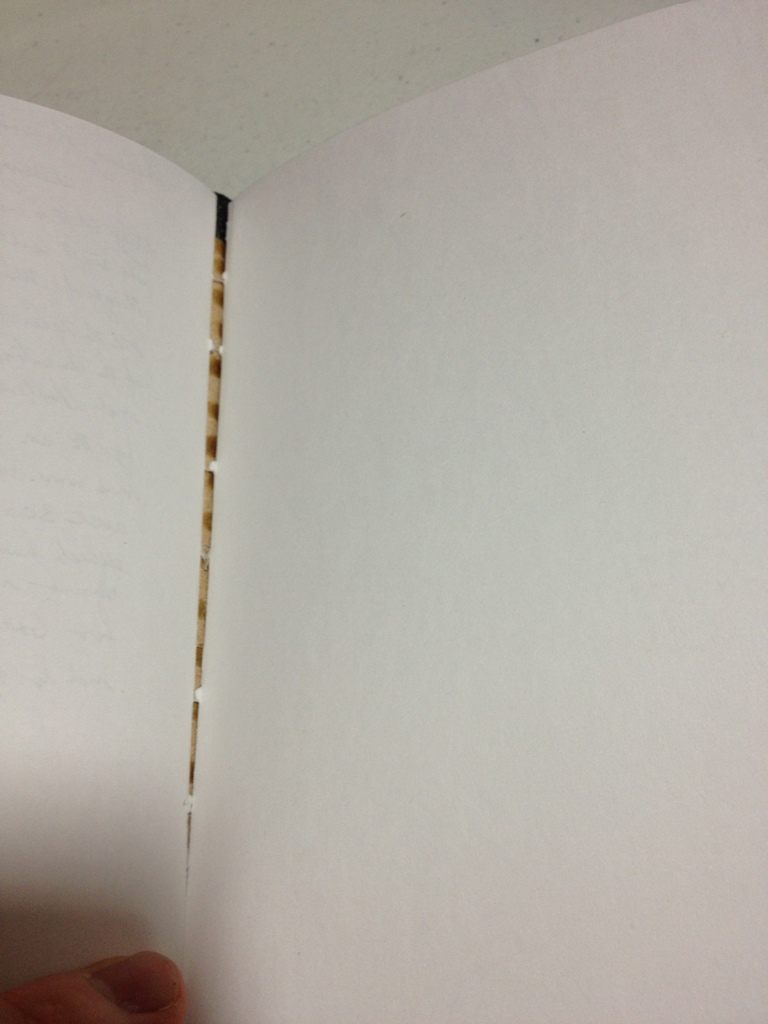
So a few more things to note. The spine is good leather and doesn’t seem to take structural damage but does easily take cosmetic. The Laser engraving is awesome but it really depends on your image. The elastic strap could cosmetically damage the cover by pulling it. And occasionally the signatures seem to be pulling away from each other, but not the spine.

So overall I think this is a great notebook. It is made of high quality materials, if not high production quality. The materials seem to be good enough to make up for the shoddy construction and make a stable book that will work quite well for an extended amount of time. It is one of the best fountain pen paper notebooks, but not the best. I’d say the paper is worse, but the book itself is better than a Rhodia book. So it all depends on what you want. This book might not look very good, but it should last at least as long if not longer than any other notebook on the market. And it’s the same price as a Moleskine. So If you want a good “beat-up notebook”, try one of these.

Review – Papermate Inkjoy Black, Red, Blue, and Purple

In my tradition (now) of taking a look at the uses of standard office supplies in art, I’ll be looking at the Papermate Inkjoy pens and their different colors. Today will be the standard colors of black, red, blue, and purple.

inkjoy inks 2

Not Entirely Representative

Papermate tends to make standard colors, and their black is no exception. One of the deeper Papermate blacks, the Inkjoy black is nice and constant, though is a bit blue-greyish. Not quite black, but very good for a ballpoint pen.

The red is also fairly standard. It’s light, but not light enough to say it’s pinkish. It is very subdued and pleasant, not as aggressive as most reds, making it a bit more natural.

The blue is very deep, but not very saturated. In low light it still looks blue, but one wouldn’t mistake it for a sky blue. Again, like the red, the low saturation makes it look less aggressive than some other hues. It’s got a very nice, watery feel to it.

And finally the purple, which again is deep but not saturated. It is unmistakably purple but not very aggressive. Unlike the others, though, this leads to a less natural look as most natural purples are deep and aggressive or light and flowery. This one is in between, which means it would be at home on your papers but not in artwork.

Overall, Papermate did a good job with these colors for the workplace. They definitely weren’t designed for art, though they could be worked in. Not superb but good enough. We’ll see what the next four have in store.

Review – Bic Tech Ballpoint and Stylus

Well, sometimes now-a-days art isn’t always done on a physical medium. Tablets, smart phones, and touch-screen devices are becoming more prevalent these days and for artistic purposes your finger isn’t the most precise thing in the world. Fortunately, Bic has a solution for both mediums (maybe) the Bic Tech pen and stylus.

20140206-232018.jpg

The barrel of the pen is a fairly standard Bic barrel with a slightly grippy (grip) section, a hole for the ballpoint and a logo. Halfway up the pen is where things get interesting. The top half of the pen is a chrome-colored plastic which I personally don’t like but doesn’t look terrible. Just above another Bic logo in the center is the click mechanism, which is unique in its side mounting. The lever protrudes out to the side sightly, but not enough to really get caught or accidentally pulled. It has a slight curve to it, making it a great finger place and making for easy disengagement of the fingers or caught objects (again preventing accidental usage). I would say my only problem with it is it gets scratches from fingernails far too easily. The clip is absolutely nothing special, in fact it doesn’t even clip, it more just hangs on a pocket or something so that’s cheap. At the top is the stylus which I’ll talk about in just a second.

20140206-232024.jpg

The pen itself is nothing remarkable. It does appear to be smoother than a normal Bic ballpoint. But it is almost the exact same shade of unimpressive grey-black as every Bic pen.

20140206-232030.jpg

Now on to the stylus, which is the standard stylus end that has been popping up all over the place recently. It works. It is obviously not the most expensive or precise thing but it gets the job done. It is better than a finger, I can tell you that much. I can’t attest to the durability of such things, but I can say that it feels likely to break, though the pen isn’t expensive and by that time you’ve probably gotten your money’s worth out of it.

So what is the Bic Teach pen like overall? Mediocre. It does an alright job at being both a stylus and a pen, but does neither fantastically. But for the money it really shouldn’t. If you’re looking into the prospect of such a device or are on a very slim budget (or possibly don’t care) this might work for you, otherwise I’d suggest looking elsewhere.