Review – Sheaffer Maxi Kit Calligraphy Nibs

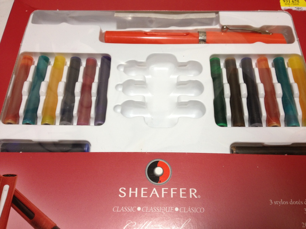
Now, for the second part of the Sheaffer Maxi Calligraphy Kit review. This one might be a bit short as I’m going to be looking at the three included nib sizes: Fine (1mm), Medium (1.5 mm), and Broad (2 mm).

20140128-234823.jpg

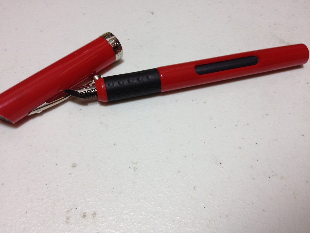
The nibs themselves are Italic, meaning that they are flattened and straight at the tip, thus producing a wide up-and-down stroke and a thin left-to-right stroke. They are true Italics, with no tipping material, and sharp edges that may cut into the paper if one isn’t careful, but they are a bit more rounded off than a dip pen Italic would be. Because there is no tipping material, the stainless steel of the nib is easier to wear away and damage from rough use. Although this doesn’t happen often as steel is still a very robust material, it is worth noting.

20140129-001212.jpg

Each nib has almost the same left-to-right width, but the up-and-down stroke width is equal to the size of the nib stated above (1mm,1.5 mm,2 mm). The fine nib can be used for regular cursive writing, but the medium and broad nibs should not be used for cursive writing as the size necessary would render writing impractical or illegible. Although the corners of the sharp nibs can cut into the paper, they aren’t quite sharp enough to make the sharpest of line turns. To most eyes, the angles appear spot on, especially when compared to the round corners of regular fountain pens, but when compared to a dip nib they are a bit lacking. Overall, the nibs a very functional and useful in a variety of situations (at least calligraphy situations). They provide enough variation to not be bored with inking up three pens, and even without a tipping material will last through quite some use.

Review – Sheaffer Maxi Kit Viewpoint Pen Body

I have talked a lot about specialty pens and the like. Now it’s time to talk about another one, this one specifically for calligraphy. In this several part review I’ll be talking about the Sheaffer Calligraphy Maxi-kit. In this first part I’ll talk about the included pens, the Sheaffer Viewpoint.

20140122-004518.jpg

The cap of the Viewpoint is a cylinder with a slanted top. This slant has Sheaffer written on it as well as the size of the nib meant to go with the pen (in this kit at least). The bottom of the cap has a chrome band with Sheaffer written on it. The clip is simple, but functional, having a small ball at the end, up near the top is also the white dot that signifies a lifetime Sheaffer warranty (possibly).

20140122-004528.jpg

The barrel of the pen is also a simple cylinder, except it has a rather large hole cut in two sides to create a viewing area for the cartridge or converter (get it). The barrel’s end is also rounded so it won’t stand up.

The (grip) section is made of dimpled rubber and is sufficiently grippy and un-intrusive. Just after the grip is a small piece of plastic (color matching the barrel) and then the nib directly. There is a rather steep step to nib from the section, making the nib look perhaps a bit small. The feed is well hidden and works fine for the purpose, but on some pens can be finicky.

Overall the Sheaffer Viewpoint body is a sturdy, and functional design, even if it’s not the most comfortable. Its real purpose is to get a nib to the paper and it does the job quite well. Though it is a bit weaker than previous Sheaffer models due to the hole.

Review – Pilot G2 Teal, Hunter Green, Navy, Periwinkle, and Caramel

This week I’m gonna take a look at some of the weirder colors of Pilot’s G2 pens. Let’s dive right in.

third pilot pen comparison

First up is teal, which is a deep, bluish-green, almost like an aquatic plant. It’s very subdued and seems almost workplace-friendly (sort of like a blue-black, but with green). It goes on the page a bit thick and is a bit of a hard start when it’s not been written with for a while. A very soothing color overall.

Next up is hunter green, which is a deep, swampy green. It looks like a camouflage color, which I guess it’s supposed to. It isn’t the most pleasant of colors to stare at, but it is quite subtle. This color is probably the thickest ink and has the most problems with startup and skipping of the bunch.

Third is navy, which is a blue-black. It doesn’t really remind me of any previous navy colors I’ve seen, it is simply a very dark blue, but not a deep blue. It looks just like a combination of blue and black. Very work-friendly, I would say, but has no real art application save for maybe a night ocean.

Fourth is periwinkle, which is a light, sky blue. This is one of the lightest and easiest to read light blues I’ve seen. It isn’t quite as light as possible, but that makes it readable. It has a bit of shading (inconsistent color) but not too much. This is likely the most versatile ink color of the bunch, being a close to work-friendly “happy” color, and a realistic color that could be found in both water and skies.

And finally is caramel. Caramel is a light, almost hard-to-read brown. Again it is subdued enough to not hurt one’s eyes, but is very light and not particularly pretty. It does flow well, and really looks like caramel, so if you need a caramel colored ink, this is the ink for you.

That concludes my look at the Pilot G2 pen color types. I hope these were useful, they really do cover the gamut and provide ink colors for a variety of different uses. Unfortunately, I believe they only come in a large, expensive pack, so I would recommend having uses for a few of these pens before purchasing them.  They are great reliable writers with most of the ink colors, especially the more common ones (which are available individually) and can be used almost anywhere.

Review – Pink, Orange, Turquoise, Burgundy, and Lime

And now for five more Pilot G2 colors! These are the the more “regular” colors, but just a bit different, so let’s go.

pilot pen comparison

The first is pink, which is very pink. It’s probably the brightest and most visible color in the set, though it fortunately isn’t an eye-searing hot-pink. It runs fairly thick and as pinks go, is quite deep, closer to red than to rose.

The second is orange, which is fairly bright, the second hardest to read of the bunch. It is plainly orange though, and will be a stark contrast to any other color in the set. Like most of the other colors, though, it is done well, and is not painful to look at or too difficult to read.

Next we have turquoise, which is a greenish-blue color. Honestly, it just looks like turquoise, which is a very pleasant color. It’s appealing and subdued, it almost looks like sky or clear “caribbean” sea. It’s a fantastic color, especially if you want a bluish color, but a bit lighter and happier.

Fourth is burgundy, which is a deep, purplish red. It’s almost like a red-black. It is very readable on the page, but gives writing a bit of flair not seen in a red, black, or purple ink that would be close. The ink is a bit thick though, and has some starting problems, but that just means it should be used more often.

And lastly for this set is lime, which is obviously a very light green. It actually looks nothing like a lime (like most colors called lime). It is the hardest to read of the bunch, but still isn’t quite offensive to the eye, though I wouldn’t write with it. I think it’s still the worst here, though, as it doesn’t match the nice qualities of the rest of these inks, and it’s a bit dry on the page.

Next up are the more uncommon colors.

Review – Pilot G2 Colors – Black, Blue, Red, Green, and Purple

I don’t believe I have talked about G2 Pilot gel-pens before, I will do a full review later, but first I want to talk about most of the different colors that they come in. I have collected 15, and will split them into three groups, the first of which is the “normal” colors of black, blue, red, green, and purple.

ink tests

Starting with the black: it’s black, there is literally nothing special about it. It is a bit of a warm black, and it goes on smooth. It doesn’t have any magnificent qualities, it is just an all-around black.

Now for the blue, which is a fairly dark but basically standard blue, very similar to the black. It is probably one of the darkest standard blue pens available, and it is a fairly cool blue, like a deep lake. Again, though, it has nothing particularly special to offer.

The red is a medium red, which is a bit different. Most companies go for either an eye-bleedingly light red, or a deep red that is much more pleasant. As far as reds go this is in the middle, but it certainly isn’t neutral. It has no tint of pink, and is most definitively, starkly, red.

The green is surprisingly dark for a standard green. It’s almost a grassy color, and not the light, lime-ish color most other companies associate with green (it’s like the cherry flavor of pens). It is definitely green, but is unoffensive and pleasant. It sticks out, though, making it seem like one of those “replace red because it hurts people’s feelings on grades” pens (I’m no psychologist, so I know nothing about whether that is good or bad, it’s just what I thought of). I think it’s nice.

And finally the purple, which is the black sheep of the normal colors. It is a light, almost violet or deep rose color. It is warm and goes on a bit less smoothly than the other colors here. I really don’t like it, it’s just far too light, and it doesn’t go with the deep other colors at all. It really won’t stick out on a paper either, so it’s just kind of there, it has no natural color akin to it, so it has limited art utility as well.

Overall these are a very good set of office colors, and if you’re just looking for some smooth-writing different colors that aren’t too wacky, I’d look here first. But they do all have limited art potential, so you may want to delve further to get just the right color in that case.


Review – Sharpie Pen Colors

I have reviewed the Sharpie pen before. And the ink in that pen was a bit of a muted black. Now it’s time to look at some more of the Sharpie pen color palette: the blue, red, green, purple, and orange pens.

pen comparison sharpie 2

Colors not exact representations.

Starting off with the blue, which is a typical blue, if a bit washed-out looking. It is a subdued blue that would be appropriate in most work environments. They say that all of the colors are water-proof and smear resistant. I will say that is mostly true unless under extreme circumstances, but don’t expect them to be as all-around useful as their marker cousins. They also dry fairly fast and are supposed to be non-toxic, but I’m not checking that.

Now to the red, which is the most disappointing of the bunch. It is faded and looks almost pinkish. It’s hard to tell it’s really a red and it certainly lacks the intensity most look for in a red ink. That being said, it is subdued and will work better in a work or school environment where one would want a less aggressive color.

The green is, say it with me, subdued. It is undeniably green, and being as laid back as it is almost intensifies it. It’s the hardest to read out of the bunch and is almost eye hurting after a while. Strangely it is almost identical to Micron green.

The purple is flat, but deep. It is easily the darkest and most readable of the bunch. It is also fairly close to a Micron purple and provides a nice, neutral color, that is still quite different.

Now finally the orange. The orange is the only intense color out of the bunch, and even then for orange it is fairly flat. It does jump off the page and provide the kick one would expect from a nice orange. I’d say it’s probably the best color of the bunch.

So there are a few colors. Aside from looking almost identical to Micron colors I’d say they’re good. I haven’t the foggiest as to why that is but it is a bonus in my book. Anyway, if you like Sharpie pens, and want some nice, pleasant colors for work or some such, I’d take a closer look at these. And due to their subtlety they also look much more natural in drawings than standard, intense colors.

Review – Sharpie Liquid Pencil Black

Want the bold line of a pen, but the correct-ability of a pencil? Well, good for you! Erasable pens have moved up leaps and bounds, and Sharpie has one, called the erasable pencil.

20131218-000613.jpg

The barrel of the pen is a clear plastic with the branding on it. The grip is a light rubber, but it is more smooth than grippy. The tip is a cone that leads to the tip which is retraceable with a click mechanism. The entire back third of the pen(cil) is the click mechanism, with an eraser and flimsily little clip. Sharpie is written on the clip, but small and indented. The mechanism is cheap, it simply sits on the back and doesn’t fit into place on the back, it wobbles and bounces while one is writing. It makes the pen feel unnecessarily cheap and plastic-y.

20131218-000619.jpg

The ink is black, but it is a bit thin and grey, though not nearly as grey as say, a pencil. There is nothing else particularly spectacular about it. It is fairly permanent, but it is less fade- and water-resistant than most inks, because of course it can be erased. And it can be erased. Depending on the thickness of the line it goes away completely, or to such a faint line that it is unnoticeable. It is truly a liquid pencil.

So it doesn’t exactly have the boldness of a pen, but it is more bold than a pencil, and it is erasable like one too. So if you were looking for a happy medium between the two, then look no farther. But if cheap-feeling construction and not-so-bold lines put you off, then I’d suggest looking elsewhere.

Review – Zebra F-301 Ballpoint

Sometimes even the most pretentious artists or religious fountain pen users have to use a ballpoint pen. Now they could just use a ballpoint insert in a more expensive pen, but they might not want to do that. They also might not want to use a Bic ballpoint. So now we enter the level of not entirely expensive or cheap ballpoint pens. The first being the Zebra F-301 ballpoint pen.

20131211-002403.jpg

The pen is made of stainless steel with a round barrel with the model number on it. The (grip) section is a checkered plastic that is grippy and between comfortable and uncomfortable. It really does nothing for me. The cone near the tip is nothing spectacular. The clips is a simple stainless steel, with a plastic back and a metal button. The button does not lock down when depressed so it does shake when one is writing. Otherwise, the body is very study and light. Denting is hard; scratching is fairly easy, though.

20131211-002409.jpg

The point is very fine. It writes smoothly and the ink is standard ballpoint black. It is slightly grey and skippy unless one pushes down hard. It is not waterproof, but it doesn’t smudge after drying. I will say that the pen I have used is more prone to globs of ink off the tip than almost any other pen I’ve used.

So overall the additional expense of this pen (which isn’t very much, but still…) over a regular ballpoint is obviously its design. It will hold up better and is much more pleasant to hold than any other cheap ballpoint. The writing experience is about the same, which, to be fair, doesn’t get much better with the more expensive pens. It really is just a matter of taste and how much you want to spend on this one.

Review – Bic Disposable Fountain Pen Black

If you’re an artist or would like to become one you’ve probably heard that ballpoints are not a good art instrument. While this is not the case, there certainly are better ones. Fountain pens are generally accepted to give a better writing performance than ballpoints. And the Bic disposable fountain pen seeks to combine the smoothness of one with the convenience of the other.

20131204-001320.jpg

The body of the pen is a smooth torpedo in the classic fountain pen shape, though a little smaller. The cap has an easy-to-use clip attached solidly to the top that is both sturdy and tight. There is a partial ink window and logos along the otherwise silver-colored barrel, nothing else. Taking off the cap and looking at the (grip) section, the feed(er) is viewable though a clear tube. The section is much thicker than a ballpoint and easy to grip, though it may become slippery and has no lip at the end. The nib (tip) is steel and ground to a medium point. It is unspectacular looking.

20131204-001340.jpg

As for writing, it is very good. Most of the money you pay likely went into the nib and it shows. The pen writes smooth and effortlessly for the most part, but can be prone to feedback. The flow of the ink is good and it keeps up well. Speaking of the ink, it is surprisingly black, and unsurprisingly not waterproof. This ink will feather easily and take a moment to dry. I also don’t recommend using cheap paper, as the ink will bleed thorough, though not as bad as many bottled inks. There is a massive supply of the ink, though, so you won’t have to worry about this pen breaking your wallet particularly.

For a cheap pen ($2-4 a pen), this is a very nice one with a lot of okay ink. It writes well and draws the same. If you’re looking to experiment with fountain pens in your art or writing, and would prefer a slightly larger pen, this is certainly one to look up.

Review – Speedball Super Black Ink

Let’s get to inks. If you’re drawing you might want to try out some India inks. I’ve already taken a look at Higgins India inks, but today I’ll be looking at Speedball Super Black. The ink comes in a plastic half-cone container, that is fine for dipping as it is very wide. It is very full though and can be easily spilled at first, so be careful. The cap has a foil lining that isn’t very good and ink gets on the rim and underneath it constantly, so be careful when opening and closing as there may be ink where it isn’t supposed to be.

20131129-004435.jpg

Now on to the ink itself. It is black, and when I say black I mean black. It has virtually no greying even when applied in the finest or broadest of nibs or brushes. It goes on black, and it dries black. Though it is a warm black with a hint of yellow brown when applied very thin. It does dry fairly quickly, though not the fastest, and it doesn’t feather on any paper I’ve used, even in large amounts. It doesn’t bleed through the page, but it does have some show through and page buckling in larger dollops, so it should only be applied in one coat. It is quite water-proof as in it doesn’t even move when water is applied to it, though that is because it contains shellac which can clog up pens and brushes if not washed out properly. They recommend ammonia for that but soapy water applied right after use should do the trick if nothing else. It can also be diluted for washes etc, but because it is heavily pigmented this is not the optimal ink for the purpose as it could go bad quickly.

20131129-004443.jpg

Overall if you want a BLACK drawing ink and can handle the problems pigmented ink presents this is a fairly cheap ink that may just be exactly what you’re looking for.