Comparison – Wite Out Vs. Liquid Paper

Sometimes you make mistakes, and sometimes those mistakes need to be corrected. There are a few ways to do this, and a few brands of correction fluids to buy. Today we’ll be comparing Liquid Paper and Wite Out.

20131113-004433.jpg

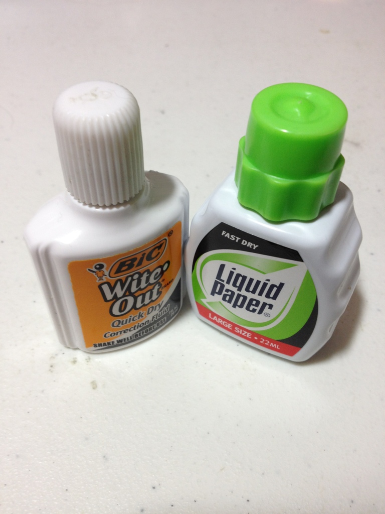
What do they have in common? They both have similar size bottles (~20ml) and a stick with a sponge-wedge applicator. They are about the same size in application. Those are the only cosmetic similarities. The bottles themselves are very different. The Liquid Paper one is a bit larger with grooves on the side for grippyness, while Wite Out is just in a slim, standard-looking bottle. The Liquid Paper bottle has ridges on the cap that are supposed to make it easy to open, but instead they are slippery and difficult. They also get in the way when applying. The ridges on the Wite Out are much easier and less intrusive.

But now on to the substance itself. And there is no noticeable difference in the application process, as they have about the same viscosity and go on smooth. The brush on the liquid paper feels a bit stiffer. When dry the best I can say is Wite Out is a warm white, and Liquid Paper is a cool white. The are both undeniably white, but neither are true white. You couldn’t say they have tints, they are just warm and cool. After drying the Wite Out is easier to write on, so that is the only other consideration.

It really depends on what paper you have when using these, warm or cool paper. Yellowish will prefer warm. And though Wite Out is easier afterwards, it isn’t too much easier. So it comes down to price if neither of those things matter, as I can say that they both work quite well at what they’re designed for.

Review – Signo Angelic White

Some colors of pens are rare, and white even more so. So if you need to highlight something in your art or maybe need a white-out pen that isn’t a white out pen you can try the Uni-ball Signo Angelic white gel pen.

20131108-000441.jpg

Starting with the pen itself: the barrel is octagonal near the back and becomes a weird grip shape near the front, though it is quite comfortable. The cap has a plastic clip that works I guess and securely clicks into place on both the front and back of the pen. A metal cone holds the tip and cartridge in place and can be easily unscrewed for refilling.

20131108-000447.jpg

The ink is white. Though not as white as one might hope, being a gel ink it is slightly transparent, and on darker colors would require several coats to cover completely. That being said it highlights very well and is very visible on colored paper, though it looks a bit grey on black paper. The ball is also very fine, leading to a line that can be very faint sometimes.

So overall it is good at highlighting and some writing, but if you’re looking for a pen that can precisely cover marks and don’t have the patience to use multiple coats you might not want to look at the Uniball Signo Angelic White.

Review – Moleskine Pocket Softcover Notebook

I’ve already reviewed the Moleskine pocket notebook in hardback, but I’ve also used the softback version, and since there are a few key differences besides the obvious, I though I’d highlight them. So this is only half a review, if you want to know about the paper you can look up my other Moleskine pocket review.

20131030-010203.jpg

So the cover is obviously soft. It is a lot thinner and as such you can see the binding through it, especially on the back where you can see the attachment points for the elastic band. They are a bit intrusive and noticeable. The cover is blank aside from the name Moleskine stamped rather deeply into the back cover. The look is a bit like the regular Moleskine, but the pages are cut the the same length as the cover, and it looks a bit more shiny. The front cover can roll up on itself and then bounce back, but it never fully regains its former shape. The back is much less flexible due to the back pocket that comes Moleskine standard. The cover also feels almost moist and rubbery, and any minor scratches and such simply bounce out unlike the Rhodia Webnotebook. The softness does mean that the elastic band leaves very noticeable marks on the cover and sometimes the paper. The spine in contrast to the hardcover feels much more durable and able to stand up to long, continued use.

20131030-010210.jpg

Which style of cover is better is a decision you have to make. This one is flexible, easily fits in a pocket, and is harder the permanently damage than the hard cover, but it offers less page protection and stability for writing, so it’s give and take.

Review – Layflat Dot Grid Composition

Sometimes lines don’t look right on drawings and grids are too intrusive. Dots can be easier to draw around and can give the general guidance that is necessary. If you want the added bonus of having a book that lays flat on your table or lap you might want to try out the Layflat Sketchbook Dot Grid Composition notebook.

20131023-014028.jpg

The cover has a static looking black and white style and and a black spine. There is a space to write a name and subject as well. The cover is very thin cardboard, the inside being plain white with a plastic coating on the outside. It is rather thin, and has a problem with the pointy corners getting dinged up easily. The spine does lay flat with a little prodding, though not as flat as a saddle-stitched binding, but flatter than any other types of composition books, and most other note books.

20131023-014034.jpg

The pages are thin as well, white with tiny grey dots at regular intervals. There are quite a few of the dots on a single page, though I don’t know how many. The paper shows through with almost every ink, though it does take a heavy amount to bleed through. Even a few fountain pens work. The corners get dinged up like the cover, and the individual pages are a lot easier to damage. The grid they form is easier to write with than many others and is fairly straight. Though many of the pages are not printed the same, so the dots are inconsistent. Each dot is made of several small dots so they are un-intrusive.

Overall it’s a good notebook for designs and sketches requiring general guidance. It doesn’t work well with larger fountain or brush pens, or heavier liquid ink pens. It can get dinged up easily, but it does lay flat. In the end it is a cheap and nice notebook. Though it has faults, it is reliable and of good quality. It’s good for students or casual designers.

Review – Pentel Sign Pen

A felt tip marker can be a useful art supply. If you want to use a high quality marker pen from a well established brand, and don’t need a particularly thick line, the Pentel Sign Pen may be the thing you’re looking for.

20131018-003651.jpg

The pen itself is black, fairly flat, combining the worst of matte and shiny blacks. The base has a small tan disk. It’s got a slightly hexagonal design, and both ends taper down to a cylinder. The cap is in the same design. The clip is a long piece of plastic, and it ends in a slightly sharp, shirt tearing, tip. The grip section tapers down to a metal holder and a thin felt tip.

20131018-003657.jpg

The ink is a nice black, and it is very black. The tip doesn’t seem to have much line variation. It looks about the same no matter the pressure. Using enough pressure to give variation would damage the tip. Tilting the tip can cause some variation. The ink is mildly waterproof. It does turn grey and does smudge heavily, though it doesn’t fully disappear and can in most cases be read.

So if you need a fine-to-medium point, water-resistant black marker, which sounds specific but really isn’t, this could be the pen for you. In my opinion it is more comfortable than a sharpie, and is a bit smaller, which is nice. It is a very good pen for line art especially on larger works.

Ultimate Pocket Notebook Showdown – Moleskine, Rhodia, Leuchtturm, Gibson, Wal Mart

Okay, enough with separate reviews, they have their place, but it’s time for an ultimate black pocket-sized notebook show down. We’ve got a couple slots for easy comparisons and five different books to do today.

Rhodia Webnotebook

Paper: Great, smooth, thick, fountain pen resistant, archival quality.

Cover: Faux leather, smooth, easily damaged but solid.

Spine: Hardy, doesn’t crease, folds tightly.

Other: Bookmark and back pocket, well put together. Elastic strap.

Size: 3.5 X 5.5

Notes: Has some minor bleed though issues, really dark yellow papers.

Price: $20

20131009-011234.jpg

20131009-011241.jpg


Moleskine pocket 

Paper: Thin, bleeds easily, archival quality.

Cover: Pleather, hard cover, like a rock.

Spine: Nice, creaseable, starts to wear near the end of the books life.

Other: Book mark and back pocket. Elastic strap.

Size: 3.5 X 5.5

Notes: Yellowed pages.

Price: $15

20131009-011118.jpg

20131009-011128.jpg


Leuchtturm 1917

Paper: Medium thickness, bleed resistant, but shows through a lot, rough paper.

Cover: Thin, a little flexible, but sturdy.

Spine: Creases easily, but is sturdy, paper could peel off.

Other: Back pocket, bookmark, elastic strap.

Size: 3.5 X 6

Notes: Numbered pages, table of contents, perforated pages.

Price: $12

20131009-011208.jpg

20131009-011223.jpg


Gibson Markings

Paper: Dark yellow, little bleeding, some show through.

Cover: Thick, damageable, bends easily, has stitches around the sides.

Spine: Works well, but creases, is fragile, and can break.

Other: Back pocket, elastic strap, bookmark.

Size: 3.5 X 5.5

Notes: Not very smooth paper.

Price: $5

20131009-011247.jpg

20131009-011252.jpg

Wal Mart Leatherette Journal 

Paper: White, shows through really badly, but doesn’t bleed easily. Not the smoothest.

Cover: Thick, ridged, but flexible, with stitching around the outside.

Spine: Alright, but could crack and fall off.

Other: Back pocket, elastic strap, bookmark.

Size: 3.5 X 5.5

Notes: Elastic strap came off after limited use. Cheap construction. Ink for lines was run off on some pages.

Price: $3

20131009-011257.jpg


20131009-011302.jpg

Review – Pigma Graphic 1

So you like to draw things a bit larger, and technical pens just don’t get big enough. You don’t want to use a brush or something similar. You may want to try the Pigma Graphic in size 1.

20131002-000542.jpg

The body is identical to a Micron body. It’s tan and smooth, with most necessary information printed on it. It has a place on the back for the cap to fit that is color coded. The cap is nice and has a metal clip. On the top it says 1 to indicate the size. The top can rub off, though, with some rough treatment. The grip section is easy, kinda small but easy to hold onto due to it being textured.

20131002-000548.jpg

The tip is felt. It comes to a point that is about 1mm. It flows nicely, laying down a nice line with no inconsistencies. The point doesn’t have much flexibility, making the line very constant with could be a plus or a minus. The ink is the same black that all Pigma pens have. It is fade and smear resistant, with some waterproofness to it. It is also acid-free, making it archival quality. In other words: it’ll last as long as your paper does. The ink is also a very nice, true, dark black. The writing experience is smooth and easy.

To sum up, the Graphic 1 is basically a larger tip Micron. It does have a different type of tip, on which the point can be more easily damaged, but the base is more secure. If you like Microns and need something bigger this is a good choice. And if you like felt-tip pens and want a higher quality one this is certainly the pen for you.

Review – Prismacolor Premiere 4 Pen Black Set

Some people don’t like Microns, or they just can’t get them. There are alternative technical pens for those, fortunately. There is a set that is even sold in WalMart: The Prismacolor Premier 4 pen set.

20130925-003926.jpg

The body of the pens aren’t particularly nice. They are black with an abundance of text. The cap is short with a thin metal clip. The cap is hard to grip and kind of ugly, as it fits on tightly but is hard to remove. The cap can be posted, but is also hard to remove there as well. The section of the barrel that is covered by the cap is short and hard to grip but not uncomfortable. It is slick.

20130925-003932.jpg

This set has 005, 05, chisel, and brush tips. They lay down a nice black line. They are archival quality, so they are fade-resistant and acid free. The ink flows smoothly, with the occasional hiccup that happens in all technical pens. The 005 and 05 have a similar size and tip feel to Microns. The chisel is a nice tip, but it is a bit weak and seems like it won’t take much abuse. The brush seems more like a long marker than a brush, and it is not very flexible. It does have quite a bit of line variation, though, when you really push it hard. It’s just more difficult to use.

20130925-003938.jpg


20130925-003944.jpg

Overall this set is a nice one, and it’s cheaper than most other technical pens. They are a bit uncomfortable, and the ink is a bit worse than some of the competitors, though they are quite nice. For the price of a little bit less, they offer just a little bit less. They work great and will serve admirably at their purpose. They just aren’t the best on the market.


Review – Le Pen 003 Technical Pen Black

How thin do you need your lines to be? Do you need them consistent as well? Are the conventional technical pens just not thin enough for you? Then you may want to try out the Le Pen technical pen in a mind-bogglingly small 003 tip.

20130918-004443.jpg

The body of the pen is white. All necessary information is printed in several languages on the side in black, it is raised which makes me thing it will rub off with a lot of use, but this hasn’t happened yet. It also has the size on top for easy reference during storage. The clip is a very flexible plastic covered with a metal strip, making it durable and flexible at the same time, though it is quite strange and bulky. The cap lines up flush with the body and almost flush with the end when it is posted. The body proper is flat, and slightly tapered to the front, with some grip from the raised writing. It is a bit fat which makes it uncomfortable for smaller hands or for long periods of time. The grip and point though are almost identical in size to the Micron.

20130918-004454.jpg

The nib however is very small, it feels entirely destroyable every time it is placed on paper. The ink is as resilient as micron ink. And I would say as black but the size of the nib makes it seem much grayer so I can’t tell. I almost think I’m writing with a pencil sometimes. Though because of it’s size the line isn’t the most consistent in the world, but it is the most consistent at this size. It does write incredibly smooth and remarkably comfortable for a short period of time.

So overall this is a great pen. It writes smooth, puts down ink well, and is one of the few pens you can get in this size. It is slightly less comfortable than a Micron in my opinion, and I would be tempted to say the ink is not as good. But it’s still a great value and a handy pen for some of those more detailed lines.

Review – Rhodia Web Notebook Pocket

Well, it’s that time again, time to talk about a little black book. This one’s particularly good for fountain pens. It’s the Rhodia Web-notebook pocket black version.

20130911-014436.jpg

The dimensions are almost exactly the same as the Moleskine, with the exception of it being slightly thicker. The cover is a strange, and easily warped, faux-leather. It is quite pleasant to hold, and the spine sustains much less damage than with stiffer cover books. Not to say the cover is flexible, it is definitely hard, though the Moleskine still holds the record for notebook most like a rock, the Rhodia does have a little give in it. Also on the front cover is a stamped Rhodia logo and an elastic band holds it all together. The standard pocket in the back tops it all off.

20130911-014444.jpg

Inside there are the same number of pages as the Moleskine. The pages are thicker though, the first page is unusable and gives you their specks. They are slightly off white with a bit of an orangish tint. This version has them lines with thin grey lines and a slight margin on top. The paper is insanely smooth, as in the smoothest paper I’ve ever written on, right there with Clairefontaine, being made by the same company that makes sense though. It takes ink well, and it even dries relatively fast on there, though there are some problems with bleed through on broader nibs or wetter inks. It should be noted that the paper is different from the larger notebook paper.

So overall, if you have a fountain pen and need a notebook, this is a better choice for you than almost any other notebook on the market. Though if you’re drawing with flex pens or thick brushes be aware that you’ll still only be able to use half the pages in the book. Though bleeding onto the next sheet is something I haven’t seen. Are these the best pocket notebooks? It depends on what type of pen you’re using, and how much you care about the feel of your notebook, because this one does feel quite different.