Review – Black Papermate Flair Medium

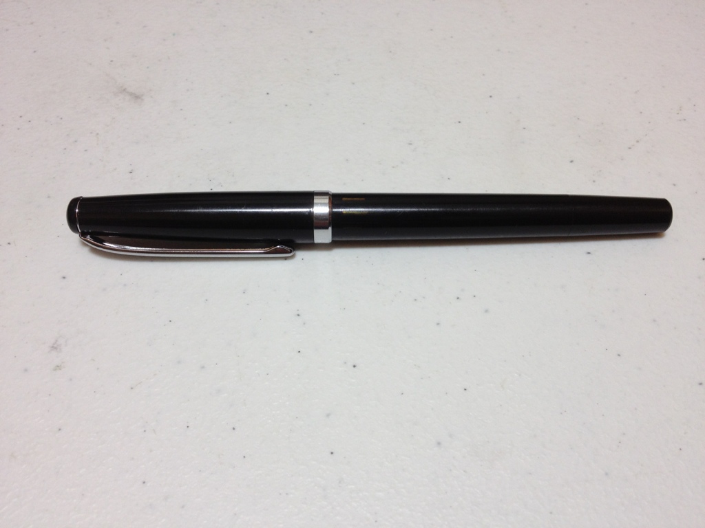
Okay, so you want to ink a drawing, or maybe just sketch with a nice bold line, but you don’t have a technical pen. Either you can’t afford them or they aren’t available in the shops you have. Well, maybe you could try the Papermate Flair. The one I’ll be reviewing is the black, medium version.

20130904-011849.jpg

The body of the pen is a simple matte black. Sometimes this wears off and reveals a smooth body underneath. The ends are tapered, with a bulge in the middle. The name and size of the pen are printed in fairly high quality on the side. The clip is metal, works fine, but a bit tight, and has two hearts as decoration. On the top of the cap there’s a white breather hole. Removing the cap reveals a slick, tapered grip section. Despite this it is pleasant to hold because it flares out at the end, giving your fingers a place to rest.

20130904-011855.jpg

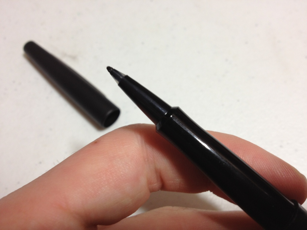
The tip is a nice felt tip. The medium is a fair bit wide, but is almost uncomfortable far from the grip. It writes well but sometimes has so much feedback that it seems to drag on the paper. Its ink is a nice black, though sometimes it can fade to a deep grey. It applies easily and consistently, having very little line variation, which is good if you’re inking something. The nib does feel like it can get bent out of shape fairly easily though, so be careful.

So really, if you want an impromptu inking pen, or something to sketch or make technical drawings with, but don’t have a technical pen, this is a fairly nice replacement. It isn’t as high a quality so it won’t last as long, but it it still a superb writing instrument and a very cheap alternative, even if it doesn’t have all the same quality features.

Review – Micron Orange, Yellow, and Fresh Green Colors

It’s that time again, the time I review Micron colors. The three I have this time are the bright colors: orange, yellow, and fresh green.

Starting with the orange: It’s a very bright color, brighter than the fruit of the same name. It’s also a little bit on the light side, looking a bit washed out on the paper. It’s less pleasant than most of the other Micron colors. The pigment does apply evenly and there is no doubt it is orange, though.

On to the yellow, which is super saturated. It’s almost illegible on white paper, on off-white it’s not much better, even though it is still rather subdued and looks quite like the yellows presented in nature. In large patches it loses its illegibility and actually looks quite pleasant. It’s probably the closest to a natural yellow you’ll find in a pen.

Now the fresh green. This one looks like lime green. It is also super bright, and comes the closest to hurting my eyes of the bunch. The pigment tends to pool, creating some shading when drawing. This can be both advantageous and disadvantageous depending on the effect you’re going for. It is the most likely to bleed of any of the colors, but with this selection that isn’t too bad. I would also say this is the least realistic and useful of the bunch.

micron colors 3

Overall, these three bright colors have some issues, but are fairly good. They write well and are entirely servicable, but finding jobs for them seems difficult to me. I’m not sure if they are the must-haves of the other Microns, but they are quite good.

Review – General’s Jumbo Kneaded Rubber Eraser

So what’s something every artist needs but no one talks about? If you answered eraser, congratulations! You get a digital cookie. Now then, let’s talk about a good eraser, a General’s Jumbo Kneaded Rubber eraser.

20130814-192301.jpg

Kneaded rubber erasers are really cool. They bend and twist into any shape you like, they don’t leave any shavings behind, and they can be used for a long time. They “clean” themselves a little when you knead them, allowing you to use them more regularly, and without smearing. They are rubber, so they come apart and back together. This particular brand comes in a nice square and works perfectly.

20130814-192309.jpg

All-in-all, even though there’s little to say about them, they are amazingly handy tools to have around, and much superior to any other eraser you’ll find, though much more expensive.

Review – Pilot Precise v7 Black

Smooth writing is something quite a few people desire, for both writing and sketching. Fountain pens are some of the smoothest writers available, but they have some convenience issues. And regular ballpoints require too much force for some people to write smoothly. Pilot’s Precise line of liquid ink roller balls are meant to fill this gap in the pen market. This is the V7 black version.

20130814-004318.jpg

The pen body itself is straight, nice on the fingers, not slippery, but polished. All necessary info is printed on a label on the side, along with an ink window so you can view your supply, of which there is a lot. There is quite an interesting, fountain-pen-like feed which is clearly visible under the grip. It keeps up well with the writing. From there, there are some strange ribs leading up to an extended point with a rolling ball.

The cap is simple: straight with a nice clip that works well and says “Pilot”, Though it does have some strange indents, it posts well.

20130814-004325.jpg

The V7 point is 7mm, which is shocking, I know. It is very smooth. It dispenses ink handily and never skips unless it is dry from not putting the cap on. I also find it is less prone to get away from you as some of the other rollerball pens with fine points I’ve used are. The ink itself is quite black. It dries quickly but not immediately. It does get grey after some wetting or smearing, but this isn’t much of an issue.

So overall this is a great “take everywhere” pen, for both artists and writers. Though I would recommend it more to artists because of the nature of the tip and liquid ink. I find that in sketching it pays to move fast, while in writing it doesn’t. Either way it’s a comfortable pen that writes super smooth and lays down a nice line of fairly black ink. It’s worth a look at least.

Review – Sharpie Black Retractable Pen

So you want to ink a drawing you did, but you can’t find Microns, or any other technical pen. You certainly don’t want to use a ballpoint. What do you do? Well, the Sharpie retractable pen may be an answer. The black version, to be precise.

20130808-234009.jpg

The pen itself is a shiny black that gets finger prints on it constantly, though it cleans easily. The body of the pen starts out wide and tapers toward the rear of the pen. Near the front is a rubberized grip section with some grippiness to it. Sharpie pen is written on the back near the clip in silver. The pen looks like it can be taken apart in several places, but it can’t.

20130808-234019.jpg

The clip is metal, it’s rather stiff and doesn’t easily go into or out of a shirt pocket. The click mechanism in the back for retracting the pen feels solid, but the plunger is loose and feels a little flimsy.

20130808-234014.jpg

As for the most important part: the tip. It’s a fine tip, with the standard very black Sharpie color. It puts down a fairly smooth line. I would compare it to a Micron 01 or that range, but it’s really slightly smaller. The tipping material is very stiff and doesn’t like to bend, which leads to less line variation but a longer usable life. It’s not a permanent pen, or at least permanent like the markers. It writes and sticks on most surfaces, but not on all, but it is very black on everything.

Overall is it going to replace a good technical pen? No, but it is very good for inking in a pinch or if you want a less-used line width in your art. It writes well, it looks good. The main problems for me stem from the fatness of the pen and the cheap-feeling mechanisms. Is it for you? Maybe. I’d recommend trying it out and maybe keeping a few around just in case.

Review – Leuchtturm 1917 Pocket Notebook

Notebooks again. Is Moleskine your style but you find the paper a little lacking? Well Leuchtturm claims to have you covered with the 1917 line of notebooks. Specifically I’m reviewing the black pocket (dot) hardcover version.

tumblr_mqsc926InY1rrdkoco1_500

Starting with the outside, the dimensions are nearly the same width- and thickness-wise as the Molsekine, but about half an inch taller. As the Field Notes and Clairefontaine pocket books are the same size (lacking thickness) you could compare it to them as well. The cover is in the black Moleskine style and is almost indistinguishable. It is also fairly flexible, something entirely absent in the Moleskine. It has an elastic band that feels slightly cheaper, but nonetheless works well. The most disappointing thing is the spine, which constantly creases, cracks and groans. The problems appears the be that the cover on the joints is separate from the binding. The binding does feel solid, so I don’t believe it will fail, but the spine will definitely encounter cosmetic damage with prolonged use.

Inside there is a standard back pocket, an address and name blank, and several table of contents pages, helpful little things if I do say so. Also the last few (six) sheets can be torn out and are as such perforated. Each page is numbered and of course there’s a bookmark ribbon. It has about the same sheet count, and same page color as the Moleskine, but with better paper. The Leuchtturm has 80 gram paper that is supposedly ink resistant. I can say it is, I didn’t even get bleed-through with a flex pen. That being said, everything shows through to the point of being annoying, even a ballpoint pen. Only pencil makes for a clean, two-sided drawing experience. Though the paper, unfortunately, is not very smooth at all, especially not as much so as the Molsekine or Clairefontaine books. You’ll get a lot of feedback on this one. The rulings are all standard and nothing to write home about.

tumblr_mqsc9pB2EJ1rrdkoco1_500

So, how does the Leuchtturm perform? Well. It performs well. It’s cheaper than the completion and better in some ways. Most of these things are up to personal preference. I would say the binding is a little weak on this one, but other than that it’s up to par.

Review – Micron Rose, Brown, and Sepia Colors

So now we get to the final group of the Micron colors that came in the 8 pack of Micron colors. These are the weird or non-standard colors, in my opinion.

The first is Rose, which is a pink: they just call it Rose to make it fancy. It’s a very deep, pleasant, pink color, not like the very vibrant, in-your-face pinks that dominate what is considered pink these days. It doesn’t really approach purple, but it is darker than most roses I’ve ever seen. It’s surprisingly nature-y for a pink, though. It does have some problems with bleed-through on thin paper, but not a lot.

Next we have Brown, which I would call light brown. I would say it’s sort of a fertile, soft, earth color. Again, for a light color it’s fairly subdued, not like a Crayola pencil or anything. Again, it’s surprisingly real looking. It has no problems with bleed-through at all really, and goes well in a landscape.

Finally we have Sepia, which I call dark brown. It’s very mud-like. Another deep, saturated color. It can get very saturated though, and end up looking like black in the final product, so it does take careful application. It also tends to pool, resulting in spots of darker color. Some skill is required to get it to look right. Surprisingly, though, it has very little bleed-through even on thin paper.

micron color test 2.0

These ‘non-standard’ colors are very nice overall. If one is looking to do nature sketches, landscapes, etc. these are quite nice. They are very subdued and blend in nicely. I find them much more pleasant than the bright reds and blues of the other Microns. If you just want standard colors for organizing or technical things, these are not the pens you need.  However, if you’re drawing a lot of the outside, or in cool colors, these are fantastic.

Review – Micron Red, Blue, Purple, and Green colors

I have reviewed several Micron pens in the past. But in case you were wondering if they could add a little more color to your life, here are some Micron Colors in .05.

It is an eight-pen set of colors from Micron that I’m looking at. It includes black so that’s out. The first four colors I will look at are what I call the ‘standard’ colors. They are red, blue, green, and purple.

I have already talked about the blue and the red so I’ll cover those quickly first. These pens are larger than the ones I reviewed previously so the ink is a bit more saturated. They aren’t as glaringly red and blue as before, but they are still some of the brightest and most vibrant of their colors on the market, aside from the awful nano-liner. Getting this large also makes them more prone to bleed-through, of which there is a slight hint in the blue.

Next we have the purple, which, in the Micron style, is a very aggressive purple. It is very deep, and in low lighting could be mistaken for black. It is very highly saturated, and changes little to none when applying pressure for some time to just tapping it on the paper. Amazingly at this darkness it isn’t very prone to bleed-through.

Finally the green. This is, surprisingly, a fairly sedate green, falling in the middle of forest and lime. It is unmistakably green, but rather unremarkable. It doesn’t jump like the other inks in this set. It just sits there, making it rather like greens in real life which you have to look closely to appreciate. Again, surprisingly enough this color is the most prone to bleed-through in the entire set, even writing fairly fast it leaves dots on the other side of fairly thin paper.

micron color test 1.1

So overall the ‘standard’ colors in this Micron package are great. They’re not really the best for sketches of nature or the outside world, but for labeling and organizing they are great. For example, different color parts in a schematic. It’s nice to have colored pens around and these hold up the Micron standard. I can definitely find a use for them.

Review – Clairefontaine Staple Bound Pocket 3.5″ x 5.5″

There is a new contender in the pocket notebook category. Well, not new, but new to me. The Clairefontaine staple bound 9 X 14 cm pocket book. This is not really very comparable to the other two pocket books I’ve reviewed as it is much thicker, but it is still around the same size, so here we go. The book is twice as thick as a Field Notes book and about a millimeter wider, and the rounding on the corners is about the same.

20130709-235523.jpg

The cover is a fairly thick but flimsy card stock. There is a website URL, paper weight, dimensions, and page count listed on the back cover, and no other information save the logo. The inside cover is a simple white, while the outside is the standard Clairefontaine cover, which I consider to be fairly ugly. The cover also has a blank space which I assume is a subject line or a name space.

20130709-235529.jpg

Inside is 48 sheets of 90 gram Clairefontaine paper, which is superb. This is one of the few notebooks where the page count, rather than the sheet count, matters, as you can write on both sides, even with a fountain pen. The paper is lined with a 7mm ruling, a small margin at the top, and an infinitesimal margin at the bottom. The lines are a very pale purple and not at all intrusive. As far as I know they only come in a lined version at this size. Writing-wise, the paper is buttery smooth. Very easy to write on, but ink resistant enough to have little to no bleed through, except for the nano-liner which can bleed through tables it seems. The paper is also heavy, it takes effort to bend it along the spine to write with it, and once you have bent it, it stays there.

20130709-235534.jpg

Finally the binding: it’s bent over and squared with two staples each about a quarter of the way in. It seems far from the sturdiest binding, but it can take a fair amount of flex before buckling. Though with no support at the edges they do tend to get a little banged up. Because of its interesting folding style and large page count, the binding does seem a bit weak, in mine the staples aren’t even fully stapled, so pulling this book apart intentionally would be easy. But unintentionally it seems to hold up fine, more due to the paper than the binding. It will buckle and get bunged up at the edges, though. I’m skeptical about it’s ability to take some hard wear and tear for all 96 of its pages to be used.

20130709-235539.jpg

Overall this is a great little pocket book. I personally won’t use them as much as some other books because of the terrible, intrusive cover designs and its thickness. But for writing or drawing with fountain pens, dip pens, or ink brushes, this thing can’t be beat. It’s a great, sturdy little notebook with especially good paper.


Review – Noodler’s Nib Creeper Flex Pen

Fountain pens don’t particularly lend themselves to art. That’s more in the realm of brush and dip pens. But for the more artistically inclined fountain pen users, there are flex pens. Though most examples are ludicrously expensive, Noodler’s Ink brand has several flex pens at a reasonable price. Let’s see how the Noodler’s Nib Creeper Flex holds up to scrutiny.

20130704-232129.jpg

The one I personally have at hand is a plain black one. They come in all sorts of wonderful colors and you should really look into them if you’re thinking about buying one. The black itself is quite nice, though shiny enough that scratches are noticeable. The trim is a nice metal, not sure on the specifics but also shiny. The clip says “Noodler’s Ink” and rotates on the cap; it also does a very good job of holding the pen in a pocket. In the middle of the pen there are a few semi-transparent windows with which you can view your ink volume, though they are not the most accurate things. The cap unscrews to reveal more of the same design to the nib. Both the body and the cap are made of a nice plastic, which feels a little too light and smells a bit. But it is quite sturdy and the smell does subside.

The pen fills nicely by twisting the back all the way out and then down several times (to eliminate as much air as possible) while the nib is immersed in ink. The plunger mechanism unfortunately doesn’t come out like several other Noodler’s pens, or at least not easily. But the nib and feed can be removed simply by gripping them in the mid-section and pulling them out as they are friction fit into the pen. This allows for easy customization of the ink flow. It also allows for easier cleaning when changing inks.

Now to the nib and the actual writing. On paper the nib is wonderfully smooth. Not as smooth as a nice Cross or something similar, but up there. It flexes when pushed down, though not very easily. It does require some force, and at times feels like it may have problems, though these have never materialized for me. The thickness of the line varies depending on the nib and feed configuration. I would say it goes from about a Micron 01 (005 if you go really, really light) to just over a Micron 08 or about the size of the Micron Brush. After that it starts to railroad (split into two lines) even in the wettest of configurations. It also tends to write fairly dry, having a faster ink drying time and less bleed-though than other pens. But this is only minimal.

20130704-232148.jpg

Overall this is a very nice pen. If you’re looking for a sturdy brush replacement or just something to add some variation to drawings it may be the thing for you. For me it strains my had a little, and I prefer less variation in my line, which limits my use for it. But it is still a superb little pen, and a very good value. It can also double as a fancy signing pen, and a note pen. Just something to carry around. It’s great, and if you’re looking for a flex pen it’s definitely the place to start.