Review – Sharpie Clear View Stick Highlighter

I would imagine that somewhere within the companies that produce writing implements there is an R&D department or team, whose task it is to come up with new products that will sell and grab market attention. I would also imagine that this job is fairly difficult at this point. Not only are physical writing implements perceived as being on the way out, but those that are around have been honed for decades to be exactly what the markets are looking for. In other words, I’m not entirely sure the motivation behind “improving” highlighters with the Sharpie Clear View highlighter was actually an intention to make the product better. But maybe it does. Let’s take a look.

photo 1-33photo 2-30

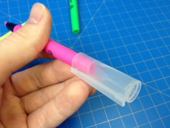
The main bodies of the pens are a matte plastic matching the color of the ink. They’re more ovular, rather then entirely cylindrical, and they taper down to the end more in one direction than the other, making their ends appear squished (or chewed on, like the ends of many pens I’ve seen). Underneath the cap is a shiny black plastic section that is slightly more slippery than the body but doesn’t really impede use. This tapers down slightly and from it protrudes a very angular, chisel-shaped felt highlighter tip. Inside this tip is a similarly shaped piece of clear plastic that both holds the tip in place and allows the user to see through it. The cap is made of a frosted plastic to allow one to see the special tip through it and the packaging, while being soft enough to not shatter easily (like many clear plastics would). It has an integrated clip and posts securely, but with a strangle wobbly feel from the “squished” rear.

photo 3-29photo 4-26

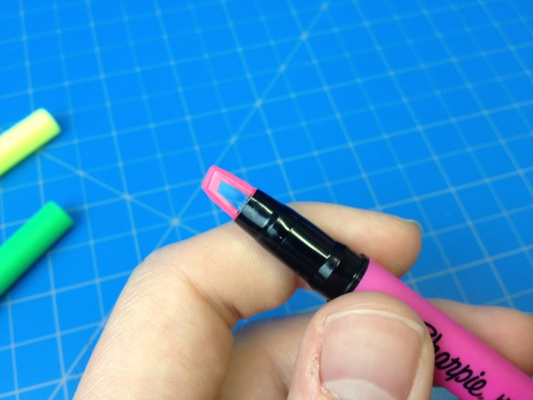
The three colors that come in the package are your standard highlighter colors: pink, yellow, and green. Each is quite bright and visible, but doesn’t block whatever is being highlighted. Green is the darkest, and is a color almost unusable in some highlighters, but here it is serviceable, if my least favorite because of the “shading” pools that tend to form at the start and end of a highlighted line. Pink is slightly better at this, and of course yellow trumps both in the visibility of words beneath it, its own visibility (in good light), and lack of shading. Sharpie’s smear guard is still working as good as ever and most inks can be highlighted without trouble (but some water-based inks are more unhappy about it than others). And then there’s the main feature. After using it, I don’t get it. It is technically possible to see through the highlighter so you know what you’re highlighting and when to stop. But if you didn’t know that going in what were you thinking? And the angle you have to hold the pen at to see well isn’t a very comfortable one. I mean, I can’t fault it for “not working”, but I just don’t understand how it’s supposed to be used. It doesn’t make anything easier or better, it’s just there.

photo 5-11

If you’re looking for a set of highlighters, these work, and if you find them at around the same price as normal highlighters (the price fluctuates) I’d say get them (it doesn’t hurt). But I wouldn’t go out of my way for them, or pay much more. I can’t see their gimmick as anything more than that, and it doesn’t work for me.

Advertisement

Review – Sharpie China Marker

A ‘china marker’ or ‘grease pencil’ is essentially a hard, fat crayon that is used mostly for temporarily marking nonporous surfaces like glass, plastic laminate, tile, etc. They are an item that used to be pretty popular but have since waned as newer products like dry erase markers for temporary work on board or laminate, and permanent markers for less temporary weather resistance have come on the scene. Yet they still can be very useful when working with glass or porcelain. This being the case I was not surprised to see some in the hardware store, but I was slightly surprised to see that they were ‘Sharpie’ brand. Do they hold up in comparison?

photo-184

The short answer would be “yes”. The Sharpie brand here is just an addition to an older, very standard design by Sanford. The body is just a version of their “Peel-Off” design. I have a fairly old (by surviving china marker standards, since using them destroys them) one that is almost identical in most ways. The body is tightly wrapped brown-ish paper that is sealed with a black, perforated coating. On this coating is all of the relevant information of the product, and beneath it is a small white string. Pulling on this string will create a tear in the coating that can then be used to tear off enough of the inside material to expose the tip if it is worn down. The tip begins exposed with a roughly conical spiral of the paper that provides a nice template when tearing off a bit later. While I do suppose that the item could be sharpened, it would be pretty wasteful and difficult which is why a system like this was developed.

photo-185

As for writing, I have a black version, and it behaves very similarly to a fat crayon. Line width and coverage are dependant highly on how much pressure is applied, but it almost never is a true “line” in that it doesn’t fill in the whole space when writing. It writes well on nonporous surfaces and often on porous ones, being again about as smooth as a crayon. For what it’s intended to write on it is relatively weather-and handle-proof (it can smear) but can be removed with a paper towel and some elbow grease. Nonporous surfaces are a bit more tricky, but in general there is a way to clean it off.

There are only two types of grease pencil/china markers: the mechanical version, and peel-off versions, this one being the latter. It is very hard to mess up a peel-off grease pencil, but it is also hard to innovate in that field. This shows neither. It was competently made, but not entirely ingenious. It lacks any innovation or improvement over the pervious generations, but it does mark what it was meant to mark (china) and more. The price and availability are also quite reasonable. If you desire to acquire a china marker, and don’t mind the fact that the “greasy” (waxy) tip is exposed, then this one will do everything you want it to.

Review – Sharpie Industrial

Sharpie makes permanent markers, but permanent never really means permanent. Of course there are ways to remove traditional Sharpie ink, especially since it, like many modern inks, is alcohol based. So, in order to keep up with their permanent image Sharpie came up with its “Industrial” version. How permanent is it compared to the regular version? Let’s see.

photo-154

The body is virtually identical to that of a regular Sharpie, except for the information printed on it, which has been changed to reflect the more permanent nature and is in red. As far as writing on regular paper goes, it is a bit warmer than standard Sharpie ink, but not really any less or more black. The difference is barely noticeable. Also, like a regular Sharpie, it will not write on wet surfaces.

photo-155

But on to the permanence. I tested the ink on a piece of galvanized steel by making a small mark, letting it dry, and then applying pretty much anything I could think of that might clean it off. It held up remarkably well, but it was mostly resistant, and not fully “anything-proof”. By the end of my test the mark was quite faded but still readable, and it had withstood: water, fire, isopropyl alcohol, bleach, WD-40, ammonia, acetone, De-Solv-It (citrus based gunk remover), Lysol, Gojo hand cleaner (for grease and tar), dry cleaning fluid (because I couldn’t throw the kitchen sink at it), lighter fluid, paint thinner (mineral spirits), and gasoline. So I checked online and in several reviews people said that in laboratory settings the alcohol used would take the marker right off. So I went and attacked it with some denatured alcohol, and sure enough it broke it down to the most pale of lines possible, but it still wasn’t gone. So I tested on some other materials and another piece of galvanized steel. On plastic, the denatured alcohol removed it with very little problem. On aluminum it was also met with little resistance. On a tuna can (which could be either tin, steel, aluminum or a mixture) it was a little tougher but almost all of it was removed eventually. But, finally, on a galvanized trashcan the alcohol met its match, reducing it to a very faded line but it was still unable to remove it entirely. So there is likely some chemical that bonds directly to or gets through the galvanization on such materials.

Barely visible mark after denatured alcohol was applied

Barely visible mark after denatured alcohol was applied

All of this stands to reason. Modern inks are mostly made from an alcohol-based dye solution. This makes them dry faster and essentially water resistant, unlike their former water-based fountain pen ink relatives. But they still fall short of pigment-based inks on permanence, especially when it comes to alcohol, which in many cases will clean up both ballpoint ink and (permanent) marker ink by reactivating it for a short amount of time. Virtually any ink (but not all) will smear, bleed, or be removed when its base is reintroduced. But that’s why we have different bases in the first place.

In specific settings where large amounts of chemicals are continuously applied to surfaces, especially alcohol, these markers won’t work. But there are specialty markers made for work like that. As a general purpose marker that is meant to be used in tasks that are more demanding than standard household ones it works quite well. It does outperform the regular Sharpie and would work sufficiently well for many workplace or “industrial” tasks, but testing may be required before using it on the job.

Review – Sharpie Mean Streak White

I have a pretty liberal definition of what an art supply is. Not quite as liberal as those who say everything is an art supply because (almost) everything you do is art of some kind. But I do think more qualifies as art supplies than the average person does. For instance I would say that everything meant to make a mark is an art supply. And that assumption will be tested here where I take a look at the Sharpie Mean Streak “permanent marking stick”, and see if it has any real art applications.

photo-151

The body is quite large, being about half an inch in diameter. It’s got a good amount of information on the side, but it gets a bit cluttered-looking. The back is a twist knob, like a glue stick. The cap has a slight taper with several ridges for grip. Inside is a pointy cone that can shape or dent the “marking stick” if you put it in slightly wrong. Inside around the “marking stick” (grease, wax, or whatever it is) is a sizable ridge that is quite uncommon on writing implements. There is also no grip section area.

photo-152

There are two ways I can describe this, either as a permanent (wetter) crayon, or a more slick grease pencil. Neither of those descriptions really tell you exactly what these things are. The inside substance comes in a pointy cone that is pretty useless. It’s very putty- or grease-like and when used the point becomes very flat very fast. It writes similarly to a crayon, in that it isn’t easy to control or sharpen. When the tip is flattened beyond a certain point, the base can be twisted to extend the point, but it can’t be retracted, so remember to not twist it too far out (that shouldn’t be a problem unless you’re an impatient reviewer like I am). The feeling it has is very slippery, and quite a bit of material comes off for not a lot of writing, but there seems to be quite a bit of it in the barrel, so running out should not be a major problem.

Performance is a bit disappointing. The white color doesn’t cover very well at all, meaning use in art as either correction or even to mix with other colors is very limited or would require re-application. It can be used as a covering to make things “hazy” but the coating is quite unpredictable. It likes to clump up in certain areas and barely cover others at all, meaning detail work also shouldn’t be done with it. As far a permanence goes, it is, but not wholly. I did testing (not just normal use) on metal and paper. Both were reasonably water-proof, on metal flame did nothing to it and on paper it did resist the flame but once the paper burned it did too (not that anything else would have happened). Then on the metal piece it stood up to WD-40, which has a knack for removing regular Sharpie, but was easily wiped away by isopropyl alcohol. I also suspect it could fairly easily be scraped off or crack easily on pliable surfaces. It does go on whether the surface is wet or dry as advertised and does dry in a fairly short amount of time for how tacky it is to begin with.

I would still consider this an art supply, and it can work well in mixed media, but really it is much more at home in the garage or the toolbox. The tip and lack of sharpening or controlling method means it works quite a bit better when marking large surfaces. It is “permanent” in that it’s hard to purposefully get off, but it doesn’t penetrate and won’t wear terribly well. It’s an interesting item, but certainly not a general use-one.

Review – Sharpie Mini

I really like Sharpies, and I have talked about them a few times before. There’s a reason they’re so popular, and as they continue to become more used they are diversifying their product range. One such product that came out a while ago is the Sharpie Mini, which is, as the name would imply, much shorter than the average Sharpie.

photo-149

It has the same starting and ending diameters as the regular sized Sharpie, with an extra part on the tip that snaps on with a lanyard “ring” (triangle). Both the cap and body have been reduced in size, but proportionally the cap is larger. The clip is very similar, but shorter, and works well enough but not fantastically. The necessary information is still printed on the side.

photo-150

The size is quite small, at 3 and 11/16ths inches capped, down from a standard Sharpie’s 5 and ½ inches. Most people would find the uncapped marker uncomfortable to hold without posting, and it’s still only tolerable when it is. The odd shape of the cap and grip make it strange to hold. The rest of the writing is all the same as a regular Sharpie, with a cool black line, very permanent but not perfect (archival) qualities, a nice tip, fast drying, and the ability to smoothly put down a ton of ink.

There’s not much more to say than that they’re smaller Sharpies. And if you like Sharpies but want a more portable option, here it is. The only downsides are they are somewhat awkward to hold, and have less ink. I personally didn’t like the lanyard ring, but that just pops right on and off, so it’s no problem. I have Sharpies around with me a lot because they’re so versatile, and this is a great little thing to decrease their needed carrying size with.

Review – Sharpie Highlighter

At times I feel like there is very little for me to say about certain things. And highlighters are one of those things. I use them, but not so much that I’ve extensively tested many of them to find the best. And I only use them for highlighting, and not some of the more creative applications like using them similarly to a blue pencil. Still, a product that does its job well deserves some of my time to talk about it.

photo-133

This Sharpie highlighter was a pack-in with several Sharpie pens, but I’ve seen it on the shelf by itself as well. The body is very simple, being a translucent yellow cylinder with a “cone-shaped” stopper on the end. The cap is a solid piece of plastic with an integrated clip that works well for what it is. The section is also a simple cylinder after a step down from the barrel, and then there is a slight taper and protrusion at the (chisel) tip. Sharpie is on both the cap and barrel in various forms with the only other information being a nontoxic seal and the words “smear guard”.

photo-132

When writing, the ink goes on smoothly, and is very bright. So if you want to draw attention to something, this will work. The ink also resists smearing both what it is being applied over, and itself when wet. While it does smear and spread some when dampened, it isn’t too terrible, and during my tests only fountain pen (liquid, dye-based) ink smeared even a bit. I haven’t tested the longer-term effects, but I’d like to think Sharpie has experience with these things.

It’s a highlighter. It’s a good, simple, bright highlighter. If you aren’t looking for anything special from your highlighter, but don’t want smearing, these will work.

Review – Sharpie Colors Part 5 Reds – Red, Pink, Pink Lemonade, and Magenta

We’re five parts in to my look at the various Sharpie pen colors I have. This time I will be looking at some of the various shades of red.

photo-96

Red – The red itself is a deep, dark color. It’s close enough to the color of a red rose, and surprisingly (or unsurprisingly if the dye for both is those red bugs) ketchup. It’s not very aggressive or eye-hurting, but it stands out and is good for marking and work-appropriate. It’s not the best or worst on the bleed-through side of things, but has almost no shading or feathering. It’s a good color, if a bit boring.

sharpie colors reds

Pink – The pink is also a bit like a rose, not getting quite to the obnoxious hot pink style, but still bright and visible. It’s not the most natural color, but it does separate things out from the crowd. Bleeding is again medium, feathering and shading are a bit more pronounced than on the regular red, though.

Pink Lemonade – Pink lemonade is indeed the color of pink lemonade, or of a pink crayon or candle (something wax). It’s not unpleasing, but it’s also not a color I would keep coming back to. It’s fairy flat and doesn’t really pop out, but is differentiatable. Bleed-through and feathering are pretty bad, and shading is noticeable, though not too much.

Magenta – And now for the final color I’m a bit dubious about. I think it’s magenta. It’s a very deep pinkish color (should I say again like a rose? Roses occur in so many colors) which I can’t find many natural parallels to, nor any really solid work applications. It does look pretty (I guess) but that’s about it. Bleed-though and feathering are terrible with this one, but no shading is evident.

And that’s the reds. They look like flowers, and don’t work well at the stereotypical workplace. They work for organizing, but have some pretty extreme properties. They’re certainly the most eye-catching of the bunch (other than yellow).

Next week I’ll look at the Oranges (and yellow)

Review – Sharpie Colors Part 4 Purples – Purple, Berry, Boysenberry, and Lilac

All right, now it’s time for part 4 of my look at many of the Sharpie Colors. This time it’ll be the purple-ish set I’m looking at, so let’s get to it.

photo-96

Purple – The standard purple color is a very dark purple that looks much like the stereotypical purple. It looks almost bright enough to be some of the darker purple flowers, or a very near-night sky. It doesn’t have many applications in most workplaces either, and its darkness could make it hard to read. It’s middle of the road on bleed, through, for Sharpies, and almost doesn’t feather or shade, making it a pretty good all around color to use around the house.

sharpie colors purples

Berry – Berry certainly lives up to its name and provides a very reddish purple that is very similar to berry juice. It doesn’t have many other natural applications, though. It is bright and visible, with minimal bleeding, shading, and feathering. It’s a very good organizational color even if it might not be that work-friendly.

Boysenberry – This color is an interesting one. It’s a lighter, reddish purple that is akin to the fruit from which it takes its name. It is a much more appealing purple color and is useful in many situations. It’s prone to bleeding, but feathering and shading are minimal. I like it a lot, but it isn’t the most useful color.

Lilac – Lilac is a light, bluish purple. It is very similar to the flower and many other natural shades. It is bright and easy to read, but a bit unprofessional. It’s not bleed- or feathering-prone, but it shades a bit. It’s a nice looking color, and artistically or organizationally useful, but not really for a work environment.

And those are the purples. I like the colors, but they tend to be less useful. It’s just hard to find applications other than organization. But they work very well. Next week I’ll be looking at the various red colors I have.

Review – Sharpie Colors Part 2 Blues – Blue, Navy, Turquoise, Sky Blue, and Blue Ice

Now in the second part of my Sharpie color reviews I’ll be talking about the blues, a nice and varied set of colors.

photo-96

Blue – Blue is a very classic color and it looks quite a bit like the standard blue we’ve come to expect from various markers and pens. This one is a bit darker, though. The ink is more wet than the other standard colors and bleeds a bit. It’s also too dark to be natural and almost too much to be organizational, it is a bit too close to black in dark conditions, but with good eyes it can work. Still, it is very blue.

sharpie colors blues

Navy – This color is very close to the classic navy color, a bit close to black in low light, but it looks like a lot of navy colors. It’s a very dry color and has very little bleed and feathering/spreading. It’s a nice-looking color, but not a very useful one.

Turquoise – Turquoise is a difficult color to get down in ink, and none of them look quite like the stone. This one’s a bit dark, but it does make a good blue-green tone. The ink is very wet, and bleeds easily, but has very minimal feathering. It’s a very natural and pleasant tone, great for organization and for artistic purposes.

Sky Blue – This blue, like most of the blues in this set, is darker than it really should be. It’s more of an evening sky blue, or a wispy-cloudy blue. It bleeds a bit more than the turquoise and the blue, and is just as feathery. It’s a very nice looking and easily identifiable color that many office and artistic uses can be found for.

Blue Ice (Possibly Mystery Blue) – This color is the most contentious of the colors in my current review lineup. The package of markers I received was not marked, and of the other blue colors I looked at this one seemed closest. If you believe I am wrong in my categorization, I encourage you to leave a comment. This blue is a cool blue that I would say has no direct natural counterpart (certainly not ice, as this is the least aptly named), but it could be used as a substitute in many cases. I prefer it to the sky blue as a light blue. It can be used in art if one is creative and is very distinguishable from other colors for organization.

Overall, I really like the blue Sharpie colors. They are a bit bleed-prone, but they have a variety of uses and in many cases are work-appropriate. The tones are very natural and appealing. They’re a good set to get, if one can.

Next time I’ll be looking at a few of the greens that Sharpie has to offer.

Review – Sharpie Colors Part 1 Neutrals – Black, Brown, Slate Gray

I’ve taken a look at several of Sharpie’s products in the past, from their regular markers to pens and liquid pencil. But their main product comes in a large variety of colors I have not yet covered. I received a gift of a set of 24 Sharpie pens some time ago, but haven’t looked at them until now due to the fact that I didn’t know what the colors actually were. Sharpie and several other well-known pen brands are notorious for not having their colors easy to identify, so this series took more research than usual. I will say that I might not have identified all of the colors correctly, so if you see something that seems like it has been misidentified here, please leave a comment and I will reevaluate it.

With that said, let’s get to the pens.

photo-96

The first set I’m going to look at is the neutrals. There are only a few, which makes sense. But these are some of the most useful: they show on many surfaces, are not an eyesore in general, and are workplace appropriate.

sharpie colors neutrals

Black – Black is the gold standard Sharpie color (except for the actual gold ones) and it is very good. It is quite dark and professional. It does have a tendency to shade as most dark inks do, but if gone over a second time there are no problems. It’s pretty waterproof (they all are so I won’t mention that again), has almost no spreading or feathering, and is tied for the least show/bleed-through with navy. It’s a great, well writing color, but it can be a bit dry.

Brown – Next is brown, a color that doesn’t seem that popular (but I’ve ended up with a few, take that as you will). It is a very dark brown, distinct from black in even poor lighting, but it looks more like a gray in that case. It is also fairly dry, and thus feather- and bleed-resistant, though not as much as the black. It’s good for sorting, but not for art, really.

Slate Gray – I don’t know where the trend of having “slate gray” be standard gray started, but it continues here. This is a “just over the dark line” gray. It’s not a very natural color, and isn’t even something you’d really see in a city. It is very wet and really does feather and bleed, meaning it’s not the greatest for use on thinner paper. It is almost the same on both sides in that case, and it even goes through card stock a bit. I’d say it holds the title as wettest, and is just a boring color.

And that’s the neutral colors. They’re good for office use, and for sorting things by color, but for art applications they are limited. Next time I’ll take a look at a few of the blues Sharpie offers.