Review – Pink, Orange, Turquoise, Burgundy, and Lime

And now for five more Pilot G2 colors! These are the the more “regular” colors, but just a bit different, so let’s go.

pilot pen comparison

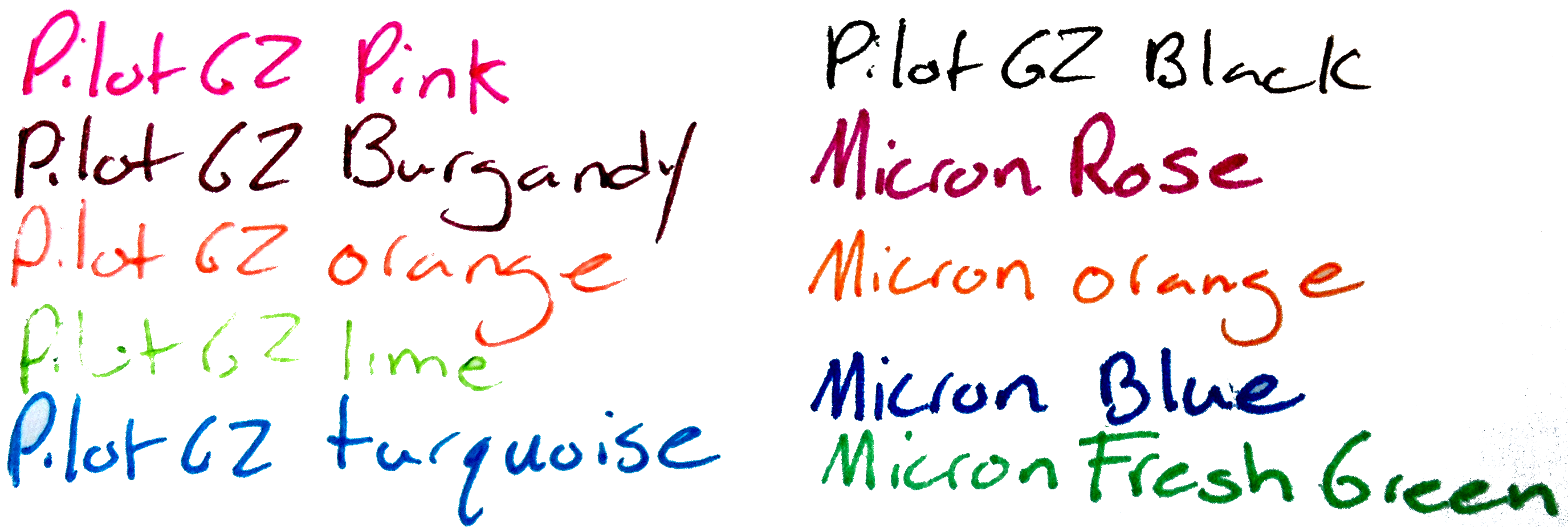
The first is pink, which is very pink. It’s probably the brightest and most visible color in the set, though it fortunately isn’t an eye-searing hot-pink. It runs fairly thick and as pinks go, is quite deep, closer to red than to rose.

The second is orange, which is fairly bright, the second hardest to read of the bunch. It is plainly orange though, and will be a stark contrast to any other color in the set. Like most of the other colors, though, it is done well, and is not painful to look at or too difficult to read.

Next we have turquoise, which is a greenish-blue color. Honestly, it just looks like turquoise, which is a very pleasant color. It’s appealing and subdued, it almost looks like sky or clear “caribbean” sea. It’s a fantastic color, especially if you want a bluish color, but a bit lighter and happier.

Fourth is burgundy, which is a deep, purplish red. It’s almost like a red-black. It is very readable on the page, but gives writing a bit of flair not seen in a red, black, or purple ink that would be close. The ink is a bit thick though, and has some starting problems, but that just means it should be used more often.

And lastly for this set is lime, which is obviously a very light green. It actually looks nothing like a lime (like most colors called lime). It is the hardest to read of the bunch, but still isn’t quite offensive to the eye, though I wouldn’t write with it. I think it’s still the worst here, though, as it doesn’t match the nice qualities of the rest of these inks, and it’s a bit dry on the page.

Next up are the more uncommon colors.

Review – Pilot G2 Colors – Black, Blue, Red, Green, and Purple

I don’t believe I have talked about G2 Pilot gel-pens before, I will do a full review later, but first I want to talk about most of the different colors that they come in. I have collected 15, and will split them into three groups, the first of which is the “normal” colors of black, blue, red, green, and purple.

ink tests

Starting with the black: it’s black, there is literally nothing special about it. It is a bit of a warm black, and it goes on smooth. It doesn’t have any magnificent qualities, it is just an all-around black.

Now for the blue, which is a fairly dark but basically standard blue, very similar to the black. It is probably one of the darkest standard blue pens available, and it is a fairly cool blue, like a deep lake. Again, though, it has nothing particularly special to offer.

The red is a medium red, which is a bit different. Most companies go for either an eye-bleedingly light red, or a deep red that is much more pleasant. As far as reds go this is in the middle, but it certainly isn’t neutral. It has no tint of pink, and is most definitively, starkly, red.

The green is surprisingly dark for a standard green. It’s almost a grassy color, and not the light, lime-ish color most other companies associate with green (it’s like the cherry flavor of pens). It is definitely green, but is unoffensive and pleasant. It sticks out, though, making it seem like one of those “replace red because it hurts people’s feelings on grades” pens (I’m no psychologist, so I know nothing about whether that is good or bad, it’s just what I thought of). I think it’s nice.

And finally the purple, which is the black sheep of the normal colors. It is a light, almost violet or deep rose color. It is warm and goes on a bit less smoothly than the other colors here. I really don’t like it, it’s just far too light, and it doesn’t go with the deep other colors at all. It really won’t stick out on a paper either, so it’s just kind of there, it has no natural color akin to it, so it has limited art utility as well.

Overall these are a very good set of office colors, and if you’re just looking for some smooth-writing different colors that aren’t too wacky, I’d look here first. But they do all have limited art potential, so you may want to delve further to get just the right color in that case.


Review – Sharpie Pen Colors

I have reviewed the Sharpie pen before. And the ink in that pen was a bit of a muted black. Now it’s time to look at some more of the Sharpie pen color palette: the blue, red, green, purple, and orange pens.

pen comparison sharpie 2

Colors not exact representations.

Starting off with the blue, which is a typical blue, if a bit washed-out looking. It is a subdued blue that would be appropriate in most work environments. They say that all of the colors are water-proof and smear resistant. I will say that is mostly true unless under extreme circumstances, but don’t expect them to be as all-around useful as their marker cousins. They also dry fairly fast and are supposed to be non-toxic, but I’m not checking that.

Now to the red, which is the most disappointing of the bunch. It is faded and looks almost pinkish. It’s hard to tell it’s really a red and it certainly lacks the intensity most look for in a red ink. That being said, it is subdued and will work better in a work or school environment where one would want a less aggressive color.

The green is, say it with me, subdued. It is undeniably green, and being as laid back as it is almost intensifies it. It’s the hardest to read out of the bunch and is almost eye hurting after a while. Strangely it is almost identical to Micron green.

The purple is flat, but deep. It is easily the darkest and most readable of the bunch. It is also fairly close to a Micron purple and provides a nice, neutral color, that is still quite different.

Now finally the orange. The orange is the only intense color out of the bunch, and even then for orange it is fairly flat. It does jump off the page and provide the kick one would expect from a nice orange. I’d say it’s probably the best color of the bunch.

So there are a few colors. Aside from looking almost identical to Micron colors I’d say they’re good. I haven’t the foggiest as to why that is but it is a bonus in my book. Anyway, if you like Sharpie pens, and want some nice, pleasant colors for work or some such, I’d take a closer look at these. And due to their subtlety they also look much more natural in drawings than standard, intense colors.

Review – Sharpie Liquid Pencil Black

Want the bold line of a pen, but the correct-ability of a pencil? Well, good for you! Erasable pens have moved up leaps and bounds, and Sharpie has one, called the erasable pencil.

20131218-000613.jpg

The barrel of the pen is a clear plastic with the branding on it. The grip is a light rubber, but it is more smooth than grippy. The tip is a cone that leads to the tip which is retraceable with a click mechanism. The entire back third of the pen(cil) is the click mechanism, with an eraser and flimsily little clip. Sharpie is written on the clip, but small and indented. The mechanism is cheap, it simply sits on the back and doesn’t fit into place on the back, it wobbles and bounces while one is writing. It makes the pen feel unnecessarily cheap and plastic-y.

20131218-000619.jpg

The ink is black, but it is a bit thin and grey, though not nearly as grey as say, a pencil. There is nothing else particularly spectacular about it. It is fairly permanent, but it is less fade- and water-resistant than most inks, because of course it can be erased. And it can be erased. Depending on the thickness of the line it goes away completely, or to such a faint line that it is unnoticeable. It is truly a liquid pencil.

So it doesn’t exactly have the boldness of a pen, but it is more bold than a pencil, and it is erasable like one too. So if you were looking for a happy medium between the two, then look no farther. But if cheap-feeling construction and not-so-bold lines put you off, then I’d suggest looking elsewhere.

Review – Zebra F-301 Ballpoint

Sometimes even the most pretentious artists or religious fountain pen users have to use a ballpoint pen. Now they could just use a ballpoint insert in a more expensive pen, but they might not want to do that. They also might not want to use a Bic ballpoint. So now we enter the level of not entirely expensive or cheap ballpoint pens. The first being the Zebra F-301 ballpoint pen.

20131211-002403.jpg

The pen is made of stainless steel with a round barrel with the model number on it. The (grip) section is a checkered plastic that is grippy and between comfortable and uncomfortable. It really does nothing for me. The cone near the tip is nothing spectacular. The clips is a simple stainless steel, with a plastic back and a metal button. The button does not lock down when depressed so it does shake when one is writing. Otherwise, the body is very study and light. Denting is hard; scratching is fairly easy, though.

20131211-002409.jpg

The point is very fine. It writes smoothly and the ink is standard ballpoint black. It is slightly grey and skippy unless one pushes down hard. It is not waterproof, but it doesn’t smudge after drying. I will say that the pen I have used is more prone to globs of ink off the tip than almost any other pen I’ve used.

So overall the additional expense of this pen (which isn’t very much, but still…) over a regular ballpoint is obviously its design. It will hold up better and is much more pleasant to hold than any other cheap ballpoint. The writing experience is about the same, which, to be fair, doesn’t get much better with the more expensive pens. It really is just a matter of taste and how much you want to spend on this one.

Review – Bic Disposable Fountain Pen Black

If you’re an artist or would like to become one you’ve probably heard that ballpoints are not a good art instrument. While this is not the case, there certainly are better ones. Fountain pens are generally accepted to give a better writing performance than ballpoints. And the Bic disposable fountain pen seeks to combine the smoothness of one with the convenience of the other.

20131204-001320.jpg

The body of the pen is a smooth torpedo in the classic fountain pen shape, though a little smaller. The cap has an easy-to-use clip attached solidly to the top that is both sturdy and tight. There is a partial ink window and logos along the otherwise silver-colored barrel, nothing else. Taking off the cap and looking at the (grip) section, the feed(er) is viewable though a clear tube. The section is much thicker than a ballpoint and easy to grip, though it may become slippery and has no lip at the end. The nib (tip) is steel and ground to a medium point. It is unspectacular looking.

20131204-001340.jpg

As for writing, it is very good. Most of the money you pay likely went into the nib and it shows. The pen writes smooth and effortlessly for the most part, but can be prone to feedback. The flow of the ink is good and it keeps up well. Speaking of the ink, it is surprisingly black, and unsurprisingly not waterproof. This ink will feather easily and take a moment to dry. I also don’t recommend using cheap paper, as the ink will bleed thorough, though not as bad as many bottled inks. There is a massive supply of the ink, though, so you won’t have to worry about this pen breaking your wallet particularly.

For a cheap pen ($2-4 a pen), this is a very nice one with a lot of okay ink. It writes well and draws the same. If you’re looking to experiment with fountain pens in your art or writing, and would prefer a slightly larger pen, this is certainly one to look up.

Comparison – Wite Out Vs. Liquid Paper

Sometimes you make mistakes, and sometimes those mistakes need to be corrected. There are a few ways to do this, and a few brands of correction fluids to buy. Today we’ll be comparing Liquid Paper and Wite Out.

20131113-004433.jpg

What do they have in common? They both have similar size bottles (~20ml) and a stick with a sponge-wedge applicator. They are about the same size in application. Those are the only cosmetic similarities. The bottles themselves are very different. The Liquid Paper one is a bit larger with grooves on the side for grippyness, while Wite Out is just in a slim, standard-looking bottle. The Liquid Paper bottle has ridges on the cap that are supposed to make it easy to open, but instead they are slippery and difficult. They also get in the way when applying. The ridges on the Wite Out are much easier and less intrusive.

But now on to the substance itself. And there is no noticeable difference in the application process, as they have about the same viscosity and go on smooth. The brush on the liquid paper feels a bit stiffer. When dry the best I can say is Wite Out is a warm white, and Liquid Paper is a cool white. The are both undeniably white, but neither are true white. You couldn’t say they have tints, they are just warm and cool. After drying the Wite Out is easier to write on, so that is the only other consideration.

It really depends on what paper you have when using these, warm or cool paper. Yellowish will prefer warm. And though Wite Out is easier afterwards, it isn’t too much easier. So it comes down to price if neither of those things matter, as I can say that they both work quite well at what they’re designed for.

Review – Signo Angelic White

Some colors of pens are rare, and white even more so. So if you need to highlight something in your art or maybe need a white-out pen that isn’t a white out pen you can try the Uni-ball Signo Angelic white gel pen.

20131108-000441.jpg

Starting with the pen itself: the barrel is octagonal near the back and becomes a weird grip shape near the front, though it is quite comfortable. The cap has a plastic clip that works I guess and securely clicks into place on both the front and back of the pen. A metal cone holds the tip and cartridge in place and can be easily unscrewed for refilling.

20131108-000447.jpg

The ink is white. Though not as white as one might hope, being a gel ink it is slightly transparent, and on darker colors would require several coats to cover completely. That being said it highlights very well and is very visible on colored paper, though it looks a bit grey on black paper. The ball is also very fine, leading to a line that can be very faint sometimes.

So overall it is good at highlighting and some writing, but if you’re looking for a pen that can precisely cover marks and don’t have the patience to use multiple coats you might not want to look at the Uniball Signo Angelic White.

Review – Le Pen 003 Technical Pen Black

How thin do you need your lines to be? Do you need them consistent as well? Are the conventional technical pens just not thin enough for you? Then you may want to try out the Le Pen technical pen in a mind-bogglingly small 003 tip.

20130918-004443.jpg

The body of the pen is white. All necessary information is printed in several languages on the side in black, it is raised which makes me thing it will rub off with a lot of use, but this hasn’t happened yet. It also has the size on top for easy reference during storage. The clip is a very flexible plastic covered with a metal strip, making it durable and flexible at the same time, though it is quite strange and bulky. The cap lines up flush with the body and almost flush with the end when it is posted. The body proper is flat, and slightly tapered to the front, with some grip from the raised writing. It is a bit fat which makes it uncomfortable for smaller hands or for long periods of time. The grip and point though are almost identical in size to the Micron.

20130918-004454.jpg

The nib however is very small, it feels entirely destroyable every time it is placed on paper. The ink is as resilient as micron ink. And I would say as black but the size of the nib makes it seem much grayer so I can’t tell. I almost think I’m writing with a pencil sometimes. Though because of it’s size the line isn’t the most consistent in the world, but it is the most consistent at this size. It does write incredibly smooth and remarkably comfortable for a short period of time.

So overall this is a great pen. It writes smooth, puts down ink well, and is one of the few pens you can get in this size. It is slightly less comfortable than a Micron in my opinion, and I would be tempted to say the ink is not as good. But it’s still a great value and a handy pen for some of those more detailed lines.

Review – Pilot Precise v7 Black

Smooth writing is something quite a few people desire, for both writing and sketching. Fountain pens are some of the smoothest writers available, but they have some convenience issues. And regular ballpoints require too much force for some people to write smoothly. Pilot’s Precise line of liquid ink roller balls are meant to fill this gap in the pen market. This is the V7 black version.

20130814-004318.jpg

The pen body itself is straight, nice on the fingers, not slippery, but polished. All necessary info is printed on a label on the side, along with an ink window so you can view your supply, of which there is a lot. There is quite an interesting, fountain-pen-like feed which is clearly visible under the grip. It keeps up well with the writing. From there, there are some strange ribs leading up to an extended point with a rolling ball.

The cap is simple: straight with a nice clip that works well and says “Pilot”, Though it does have some strange indents, it posts well.

20130814-004325.jpg

The V7 point is 7mm, which is shocking, I know. It is very smooth. It dispenses ink handily and never skips unless it is dry from not putting the cap on. I also find it is less prone to get away from you as some of the other rollerball pens with fine points I’ve used are. The ink itself is quite black. It dries quickly but not immediately. It does get grey after some wetting or smearing, but this isn’t much of an issue.

So overall this is a great “take everywhere” pen, for both artists and writers. Though I would recommend it more to artists because of the nature of the tip and liquid ink. I find that in sketching it pays to move fast, while in writing it doesn’t. Either way it’s a comfortable pen that writes super smooth and lays down a nice line of fairly black ink. It’s worth a look at least.