Review – Parker Jotter Stainless Steel

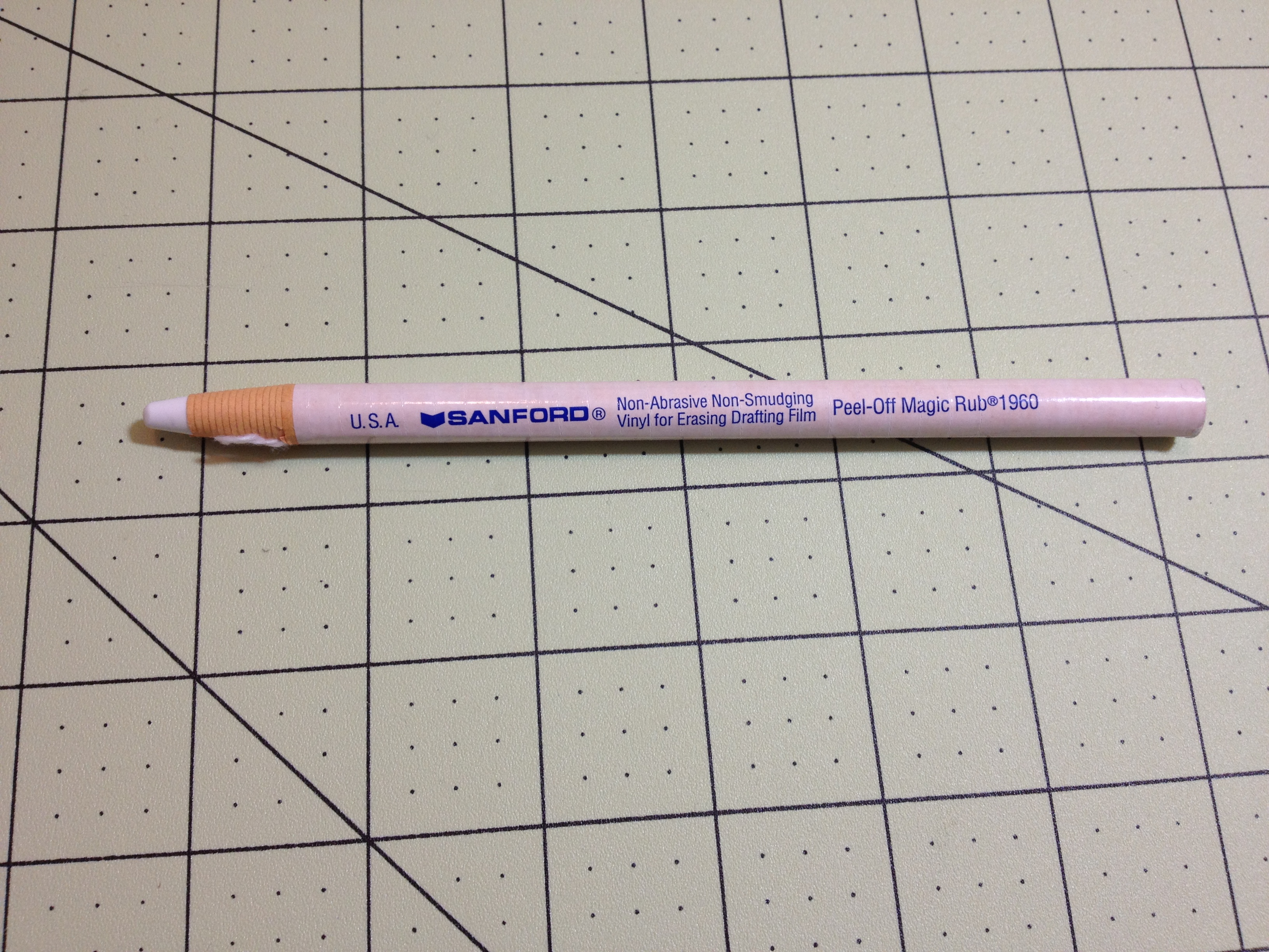
There are many pen brands out there, specializing in various things. Most Americans who know more than nothing about pens would recognize the Parker brand as a longtime quality maker. One of the least expensive, most accessible, and longest running products they make is the Jotter ballpoint/gel/rollerball pen that utilizes Parker’s own refill type. I have here the “all stainless steel” version, how does it hold up?

photo-113

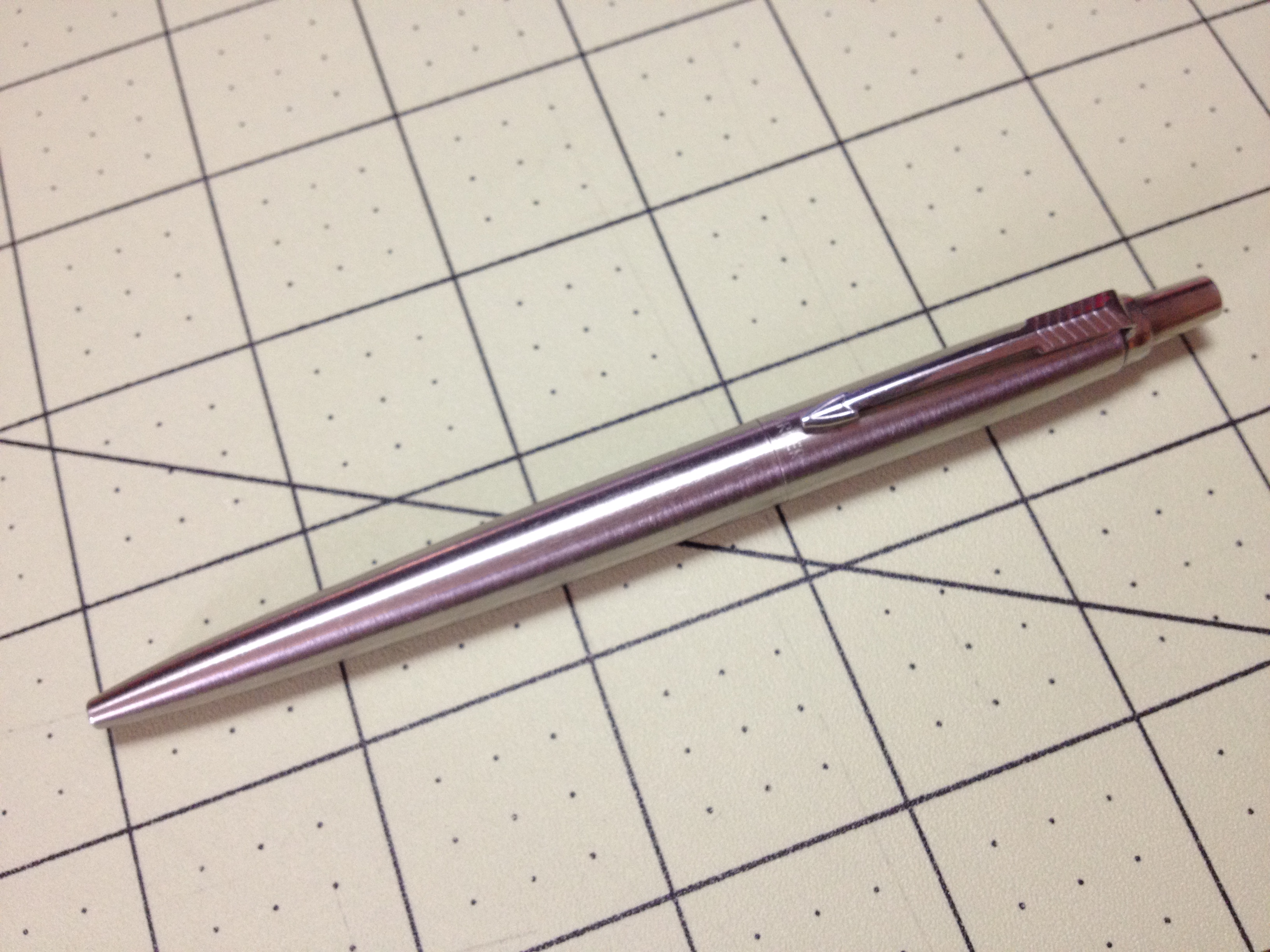
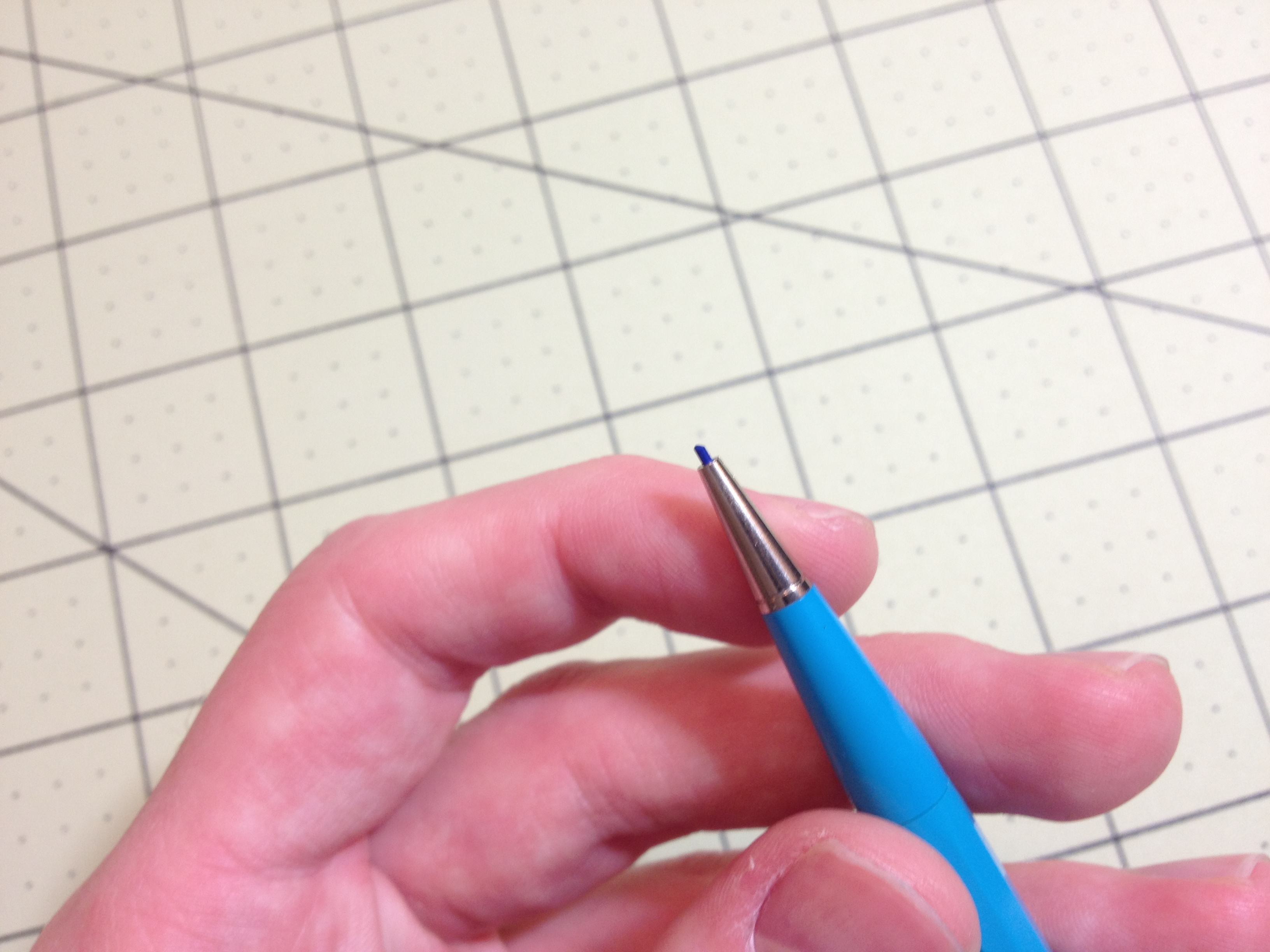
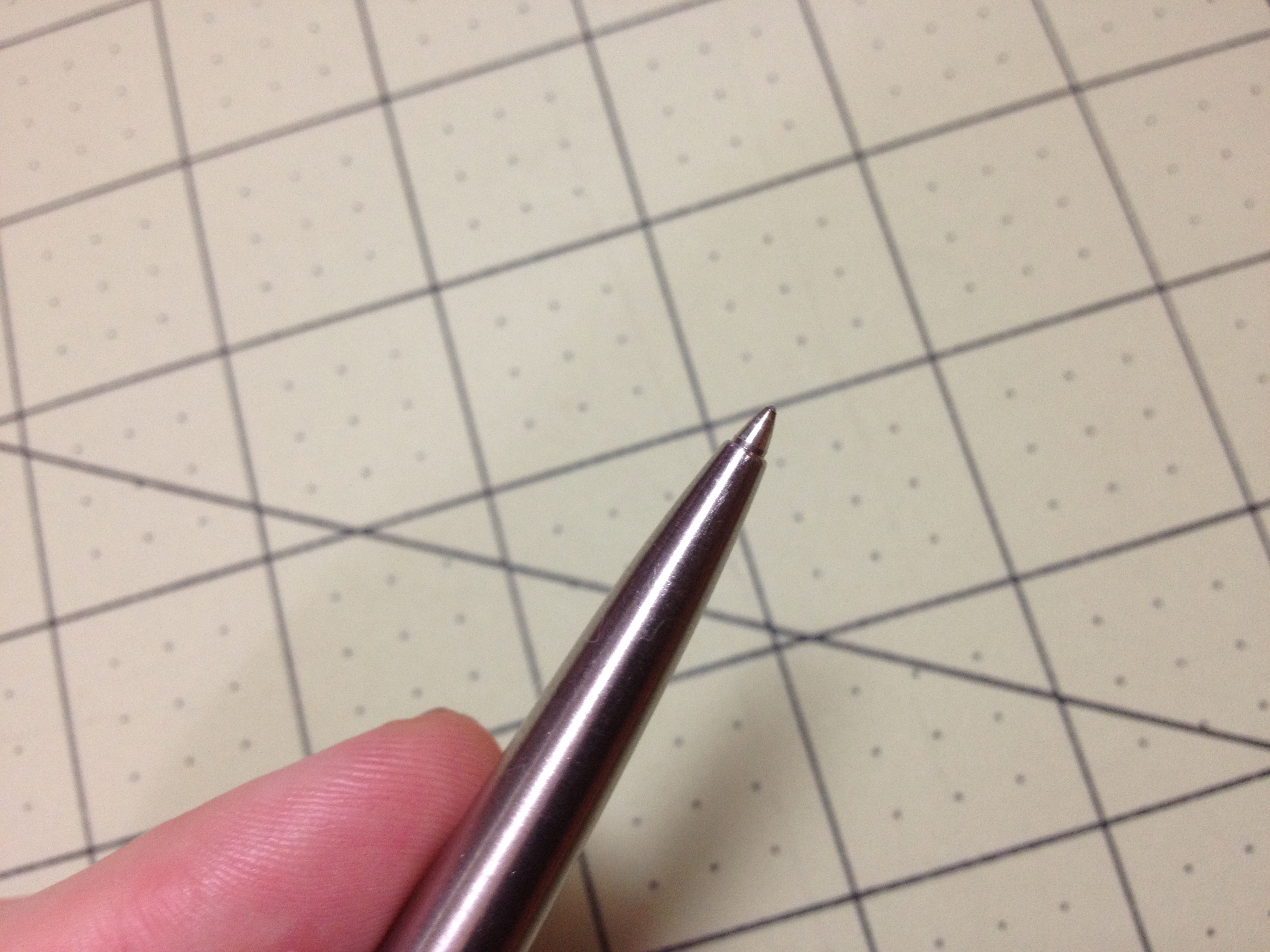
The pen itself is obviously all stainless steel. At the back is a very pleasantly tapered click button, followed immediately by the clip shaped as the famous Parker arrow. The pen from there slowly bulges and then tapers down to the end where it almost seamlessly meets with the pen’s point when it is not retracted, with only a slight seam 1/3 of the way down the pen where it is unscrewed to be refilled.

photo-112

Now I can’t speak to the Parker brand refill this pen came with as I don’t remember how it wrote and I currently have a Monteverde refill inside (that writes very well, as I said in my review). But I can talk about the feel and sturdiness, both of which are superb. The click mechanism is a bit different and it just feels not as advanced as some of the more modern pens, but it is very solid and satisfying. There’s nothing wrong with it, it just feels older (like using one of those drafting pencils that have been in production for 60 years). And the steel finish is very easy to grip, while beings stylish and well-wearing. Scratches and such barely show up, keeping the pen looking nice and professional for some time.

Overall it’s a great pen, and for the price (a little more expensive for the “all stainless” one) it is easily a great value as one pen could last a lifetime (though refills might not be cheap). It’s hardy, with a time tested, solid mechanism, and while it doesn’t look as nice or handle as well (or have as many expensive materials) as the more expensive ballpoints out there it still looks professional, fits in with both modern (stainless) and retro (colors) styling, and can take a rough and tumble life. It’s a tough little trooper.

Review – Sharpie Colors Part 6 – Orange, Peach, And Yellow

And now, it is time for the final (for now) part of my look into the various colors of Sharpie markers (that I own). This section isn’t quite a “nice” as the others as I didn’t have another place to put the yellow that seemed appropriate, and there aren’t many oranges. Nevertheless, let’s take a look.

photo-96

Orange – The standard orange is, like all standard Sharpie colors, quite dark. It doesn’t quite resemble the fruit enough for most renderings but is close enough. It’s not too bad on bleed-through, feathering, or shading. It’s well behaved, just not that useful.

sharpie colors oranges-yellows

Peach – Peach doesn’t quite look like a peach either. It’s more of a weird skin tone. But it is perhaps a bit more natural looking than the orange. It’s pretty bad on bleeding and feathering, with shading being noticeable. But it is pretty so if you like the look you might be able to find a use for it.

Yellow – And finally yellow. It isn’t something really spectacular. It is indeed stereotypically yellow, without much of a natural bent. It is hard to read in the dark and bordering on eye hurting in the light. It bleeds through, but feathering and shading are minimal. I would struggle to find a place for it due to its unnatural hard-to-read-ness but if yellow is your thing, it certainly gets it done.

And that’s the last set of the Sharpie colors that I have. It’s probably the most lackluster set (figuratively. Literally would be the neutrals). I would struggle to find a place either in art or at the office for them, but they do help round out any personal collections and would make eye-catching signs I guess.

Most of the Sharpie colors are more useful, though. The set I have would work both in the artistic and office realm. And it offers a large enough selection of colors to keep most people happy.

Review – Sharpie Colors Part 5 Reds – Red, Pink, Pink Lemonade, and Magenta

We’re five parts in to my look at the various Sharpie pen colors I have. This time I will be looking at some of the various shades of red.

photo-96

Red – The red itself is a deep, dark color. It’s close enough to the color of a red rose, and surprisingly (or unsurprisingly if the dye for both is those red bugs) ketchup. It’s not very aggressive or eye-hurting, but it stands out and is good for marking and work-appropriate. It’s not the best or worst on the bleed-through side of things, but has almost no shading or feathering. It’s a good color, if a bit boring.

sharpie colors reds

Pink – The pink is also a bit like a rose, not getting quite to the obnoxious hot pink style, but still bright and visible. It’s not the most natural color, but it does separate things out from the crowd. Bleeding is again medium, feathering and shading are a bit more pronounced than on the regular red, though.

Pink Lemonade – Pink lemonade is indeed the color of pink lemonade, or of a pink crayon or candle (something wax). It’s not unpleasing, but it’s also not a color I would keep coming back to. It’s fairy flat and doesn’t really pop out, but is differentiatable. Bleed-through and feathering are pretty bad, and shading is noticeable, though not too much.

Magenta – And now for the final color I’m a bit dubious about. I think it’s magenta. It’s a very deep pinkish color (should I say again like a rose? Roses occur in so many colors) which I can’t find many natural parallels to, nor any really solid work applications. It does look pretty (I guess) but that’s about it. Bleed-though and feathering are terrible with this one, but no shading is evident.

And that’s the reds. They look like flowers, and don’t work well at the stereotypical workplace. They work for organizing, but have some pretty extreme properties. They’re certainly the most eye-catching of the bunch (other than yellow).

Next week I’ll look at the Oranges (and yellow)

Review – Sharpie Colors Part 4 Purples – Purple, Berry, Boysenberry, and Lilac

All right, now it’s time for part 4 of my look at many of the Sharpie Colors. This time it’ll be the purple-ish set I’m looking at, so let’s get to it.

photo-96

Purple – The standard purple color is a very dark purple that looks much like the stereotypical purple. It looks almost bright enough to be some of the darker purple flowers, or a very near-night sky. It doesn’t have many applications in most workplaces either, and its darkness could make it hard to read. It’s middle of the road on bleed, through, for Sharpies, and almost doesn’t feather or shade, making it a pretty good all around color to use around the house.

sharpie colors purples

Berry – Berry certainly lives up to its name and provides a very reddish purple that is very similar to berry juice. It doesn’t have many other natural applications, though. It is bright and visible, with minimal bleeding, shading, and feathering. It’s a very good organizational color even if it might not be that work-friendly.

Boysenberry – This color is an interesting one. It’s a lighter, reddish purple that is akin to the fruit from which it takes its name. It is a much more appealing purple color and is useful in many situations. It’s prone to bleeding, but feathering and shading are minimal. I like it a lot, but it isn’t the most useful color.

Lilac – Lilac is a light, bluish purple. It is very similar to the flower and many other natural shades. It is bright and easy to read, but a bit unprofessional. It’s not bleed- or feathering-prone, but it shades a bit. It’s a nice looking color, and artistically or organizationally useful, but not really for a work environment.

And those are the purples. I like the colors, but they tend to be less useful. It’s just hard to find applications other than organization. But they work very well. Next week I’ll be looking at the various red colors I have.

Review – Sharpie Colors Part 3 Greens – Green, Lime Green, Mint, Aqua, and Argyle

Now I’m on the third part of my look at all of the Sharpie colors that I have. I’m not sure I need to introduce the color green to you, so I’ll just get into it.

photo-96

Green – This green is a very dark color, even more so than the standard green color most art supplies feature. It’s a deep, leafy green that is quite natural but does look generically dark in bad lighting. On copy paper, it can be hard to distinguish for people with bad eyes. It’s also quite bleed- and feathering-prone, but on less absorbent papers all three of the last points are minimized. It’s a good generic color, but far from my favorite of the selection.

sharpie colors greens

Lime Green – The lime green is a variety of lime that isn’t an eyesore and looks sufficiently like the fruit to justify the name. It’s bleed- and shade-prone, but isn’t too bad on feathering. It is a very visible, not too bright to read, not too dark, and not too close to the standard green, making it good for organizing. It’s finally a lime color I would use.

Mint – The mint is more akin to ‘mint flavored’ than to the plant. It’s a very frosty, light green. It is still not too light to read, and is very distinguishable from the other colors. It’s also a fairly natural shade, so it works for art as well as the office, though this might be a bit extreme for some offices. It’s less bleed- and shade-prone than most of the greens, but the most susceptible to shading.

Aqua – Aqua is a nice dark blue-green color. I’d say it leans more to the green side myself, while the turquoise leans more to the blue (which is the opposite of real life). Still it is a very natural shade for both water and land. It is a darker green, but not one that I think would be confused with any other color, but it might be a bit out there for office use. It also has the least shading, feathering, or bleeding of any of the greens.

Argyle Green – This is the second and final color that I am dubious of my identification of. If you think I’m wrong, feel free to correct me in the comments. Argyle is a medium green very similar to the lime color but a bit darker. It’s got some bleed-through and feathering problems, but minimal shading. Other than that, I’d say it mimics lime well on the page: it has similar organizational and artistic properties, and would be hard to distinguish at a glance. It’s just not very original.

And that’s my look at the green selection of Sharpies I have collected. They are all very good for organization and artistic efforts, but they may stick out or be frowned upon in the office. They behave all right in terms of properties, but they aren’t the best in that regard. But I think they might be my favorite set.

Next time I’ll take a look at a collection of purple pens.

Review – Sharpie Colors Part 1 Neutrals – Black, Brown, Slate Gray

I’ve taken a look at several of Sharpie’s products in the past, from their regular markers to pens and liquid pencil. But their main product comes in a large variety of colors I have not yet covered. I received a gift of a set of 24 Sharpie pens some time ago, but haven’t looked at them until now due to the fact that I didn’t know what the colors actually were. Sharpie and several other well-known pen brands are notorious for not having their colors easy to identify, so this series took more research than usual. I will say that I might not have identified all of the colors correctly, so if you see something that seems like it has been misidentified here, please leave a comment and I will reevaluate it.

With that said, let’s get to the pens.

photo-96

The first set I’m going to look at is the neutrals. There are only a few, which makes sense. But these are some of the most useful: they show on many surfaces, are not an eyesore in general, and are workplace appropriate.

sharpie colors neutrals

Black – Black is the gold standard Sharpie color (except for the actual gold ones) and it is very good. It is quite dark and professional. It does have a tendency to shade as most dark inks do, but if gone over a second time there are no problems. It’s pretty waterproof (they all are so I won’t mention that again), has almost no spreading or feathering, and is tied for the least show/bleed-through with navy. It’s a great, well writing color, but it can be a bit dry.

Brown – Next is brown, a color that doesn’t seem that popular (but I’ve ended up with a few, take that as you will). It is a very dark brown, distinct from black in even poor lighting, but it looks more like a gray in that case. It is also fairly dry, and thus feather- and bleed-resistant, though not as much as the black. It’s good for sorting, but not for art, really.

Slate Gray – I don’t know where the trend of having “slate gray” be standard gray started, but it continues here. This is a “just over the dark line” gray. It’s not a very natural color, and isn’t even something you’d really see in a city. It is very wet and really does feather and bleed, meaning it’s not the greatest for use on thinner paper. It is almost the same on both sides in that case, and it even goes through card stock a bit. I’d say it holds the title as wettest, and is just a boring color.

And that’s the neutral colors. They’re good for office use, and for sorting things by color, but for art applications they are limited. Next time I’ll take a look at a few of the blues Sharpie offers.

Review – Faber-Castell Pitt Artist Pen Brush Manga 6 Color Set

I’m not a Manga artist. And I usually don’t use color in my art. Mostly because it’s hard, like using brush pens is hard. What I’m trying to say is that my perspective on this particular set of art implements might not be the view of the average person who might find them very useful. With that said, let’s take a look at this set of Faber-Castell Pitt Artist Pens, the Manga 6 Color Brush set.

photo-90

The pens themselves are fairly plain. There is an indication of the size (“B” for brush, in this case) on the top of the cap. The cap has a set of groves running around it with a shiny finished top and clip. The clip is the same piece of plastic as the cap and does its job in an unspectacular way. The body is straight until the very end, which protrudes as a fluted section for posting, at which it’s effective. The body contains all of the needed information in several languages, which makes it seems a bit too crowded, but I can’t really complain. The section is slightly textured, which is wonderful; it isn’t slippery or uncomfortable. After that is a tapering section for the cap seal and the brush point itself. The cap seals and holds well onto this point.

photo-92

The brushes themselves aren’t of the bristle variety, but are more like a flexible porous point. This makes them much less finicky, and better for a disposable item like this one, as they would wear out faster than a bristle brush. Their flexibility is nice, going from a medium point to one several millimeters wide with relative ease, and they can be bent to some pretty severe angles without any long-term damage being done. The amount of ink they lay down is good. It increases with the pressure on the tip, and makes a full line. At times it skirts on “not enough”, and layering will definitely change the color significantly. Sharp turns with the lighter colors will leave a darker area on the corner. On office paper this amount of ink will bleed though, especially at the ends, but on cardstock there is barely show through.

photo-93

The six colors themselves are a decent selection, but not great: Dark Naples Ochre is a nice, natural looking yellow. Orange glaze is a bit pale and not really a color that is found in many places. Pink Carmine is a bit too dark and is hard to use. Purple Violet, besides having a redundant name, is dark and pleasant, but again not very natural. Phthalo Blue is a great looking lake or ocean blue, but is a bit dark for most uses, and Permanent Green Olive is quite dark and olive, which is more suited to deeply forested areas or jungle than to plains or some more common areas. Still, the colors interact with each other very well, and they dry fast, but do mix on the paper, meaning one can get interesting color combinations while still having their pens keep relatively clean.

photo-91

Overall, the set is a good set to introduce oneself to the Pitt artist brush pens. It has a nice simple selection of colors that allows for experimentation and can be used for the base of a larger set. But I certainly wouldn’t consider it a complete set for creating an art work. Many more colors would be needed, and more tailored to one’s specific purpose. For instance, there is very little here to make skin tones with, which would be very important in Manga. They’re very good pens, but the set is incomplete.

Addendum: I failed to mention the water/smear proofing of these pens when I first completed this post. Both of which are very good. When interacting with other inks or materials the lines generally stay solid, which is good for resilience but bad for blending. When hit with water the lines don’t move, but they do bleed a tiny bit of pigment.


Review – Autopoint All American

There are tons of pencils out there, but sometimes the old designs just call to me. And they still work very well. It’s hard to beat some of the most simple writing utensils in many cases. The Autopoint All American is not the simplest of pencils, but it is quite a classic and simple design that works very well.

photo-78

The top of the pencil is a hard, but functional, eraser held in by a metal sheath; removing this allows for access to the lead storage area. There is a metal collar that holds the clip just down from that, followed by the faceted barrel with 10 sides. This continues until the break for the twist mechanism, at which point the tip tapers down to the point of the lead. The only information is the lead size and brand on the clip, which is quite hard to read, and leaves me wishing the model name was somewhere.

photo-77

The mechanism is a simple wire-twist one that is a bit stiff to use. Once lead is inserted, one can twist to the right to advance the lead, or twist to the left and push on a hard surface to retract it. While stiff, the mechanism is quite solid, and the lead is held firmly in place. I have a .9 lead size version (in blue) and the lead is large enough that breaking isn’t very common anyway, and I haven’t found it to be a problem. The lead included is fairly standard in and of itself.

photo-76

It’s a good pencil with a classic design. The mechanism isn’t the easiest to use but it’s robust and sturdy. The pencil itself has a very utilitarian look and feel that I quite like. It feels like many of the classic pencils I have. So for those looking for a classic, rugged pencil design, this is one to look out for.

Review – Sanford Peel-off Magic Rub

These days most pencils have their own erasers, but some still don’t, especially older models that have been in production for years and are still very good at their jobs. And even many of the new pencils don’t have enough eraser for the life of the pencil. Separate erasers are still a large market. But what if the eraser came in a more convenient package? The Sanford Peel-off Magic Rub intends to solve that problem.

photo-75

The main body is simple: it’s a tube of paper that is continuously wrapped around itself and sealed with a sticker. On the sticker is the main information for the product. There is a string attacked to break the sticker seal and allow for the paper to be peeled back when the product is used. The paper and eraser tip can also be sharpened, but I wouldn’t recommend this. The core of the utensil is a tube of Magic Rub, which is a very good white eraser. Sanford’s Magic Rub erasers are easy to use, resist drying out, remove quite a bit of graphite, and aren’t as hard on the paper as some other erasers. They aren’t the best erasers out there, but they are very good ones.

photo-74

And that’s really it. The entire “pencil” is slightly thicker and shorter than a standard pencil. But it fits in most of the same places and works very well. If you have a lot to erase, and don’t like the potential of breaking mechanisms with a mechanical eraser, I’d give this one a shot.

Review – Zebra M-301 Mechanical Pencil

The Zebra F-301 is one of my favorite and most hardy ballpoint pens. I’ve used one for a long time, and they have a good record for staying together. But Zebra has several other writing utensils in their “301” line, one being the still-very-popular M-301 Mechanical pencil. Is it as good as its counterpart? Let’s see.

20150618-222426.jpg

The body of the pencil is the same as the pen, starting with a sturdy stainless steel click button, and going to a black plastic clip “holder” for a stainless steel clip that does its job if one doesn’t get turned upside down and shaken. The barrel is also a nice, plain stainless steel with the pencil’s information printed on it. The grip section is plastic with a bit of “knurling” that provides some grip and is unintrusive. The real difference between the two bodies is that after the section the pencil has a black plastic taper with a metal pipe for the lead. Unscrewing this will reveal the lead and make it breakable but otherwise not change the operation.

20150618-222447.jpg

The push cap operates smoothly, and can be removed to reveal an eraser that does its job, though it has no replacements in the package. Removing the eraser reveals the lead feed, which thankfully does come with more than one lead in the standard version. The lead feeds well, and writes as smooth as one would expect a standard HB to. It is a bit hard, and brittle at times; unlike many pens there is no shock absorber, so keep the lead as short as possible. The pipe and the lack of a shock absorber do make this pencil much more like a drafting pencil than the standard mechanical pencils, and it would work in that scenario in a pinch (or perhaps a bit longer). And its rugged steel exterior make it great for taking anywhere. One would just have to worry about the pipe getting bent or tearing something.

20150618-222453.jpg

It’s a great pencil, really, and it lives up to the expectations of its ballpoint relative. It isn’t perfect, but it’s a tough little thing that gets the job done, and for an inexpensive price, considering the materials and drafting-friendly capability. If one can find refills, they will have a pencil they can take anywhere for a very long time, even if it’s not their main utensil.