Review – Tombow Dual Brush Pens Grayscale Set

Ink-washing is a great way to improve the look of ink drawing, but diluting India ink and using traditional brushes can be messy and a hassle at times. Gray brush pens certainly do help and the Tombow Dual pens have both a brush and marker tip to make using grays easy.

20150615-082919.jpg

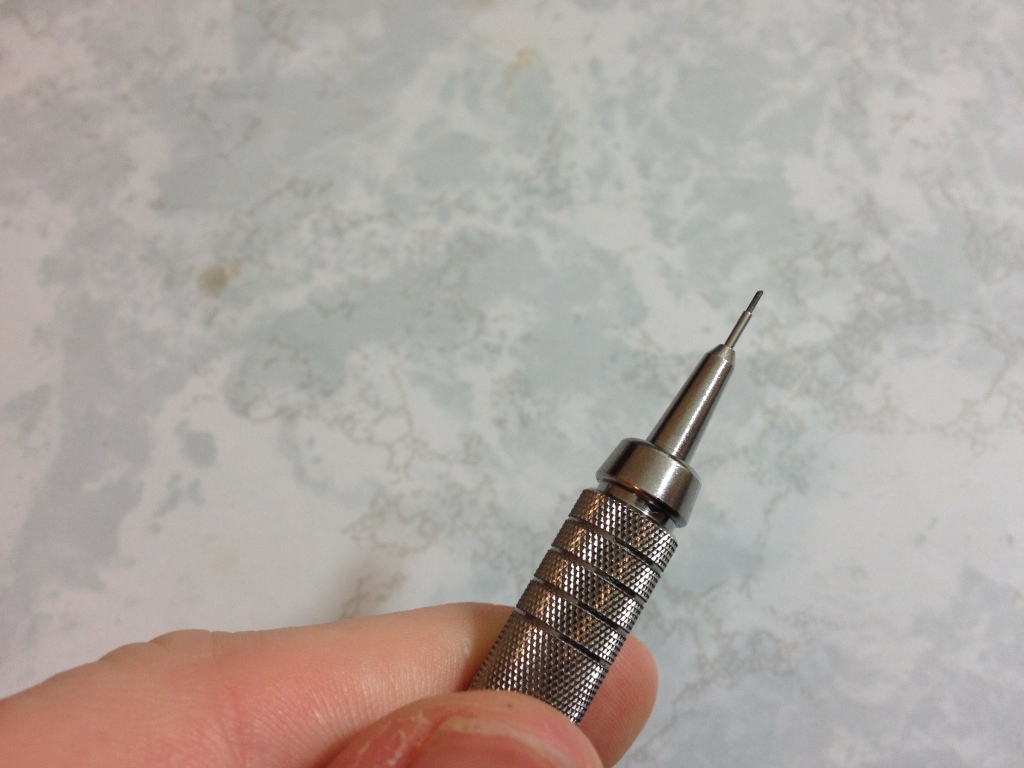
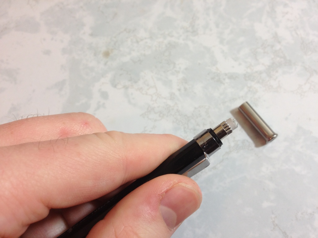
On either end of the marker there is a cap. One is quite a bit larger than the other, in both length and circumference. Both have ridges for easy removal, and small inner caps to prevent what they’re covering from drying out. The larger cap also has a fin to prevent it from rolling too far on a desk. The caps are made in such a way the that larger cap can “post” over the smaller one, and the smaller one can post into the larger one. They’re both sturdy and work well. The section for the larger brush side is nice and tapering. It’s long and easy to hold. However, the one for the marker side is quite stubby and holding on the body is almost necessary. The body itself is plain: a cylinder with text, Necessary information is there and it works.

20150615-082925.jpg

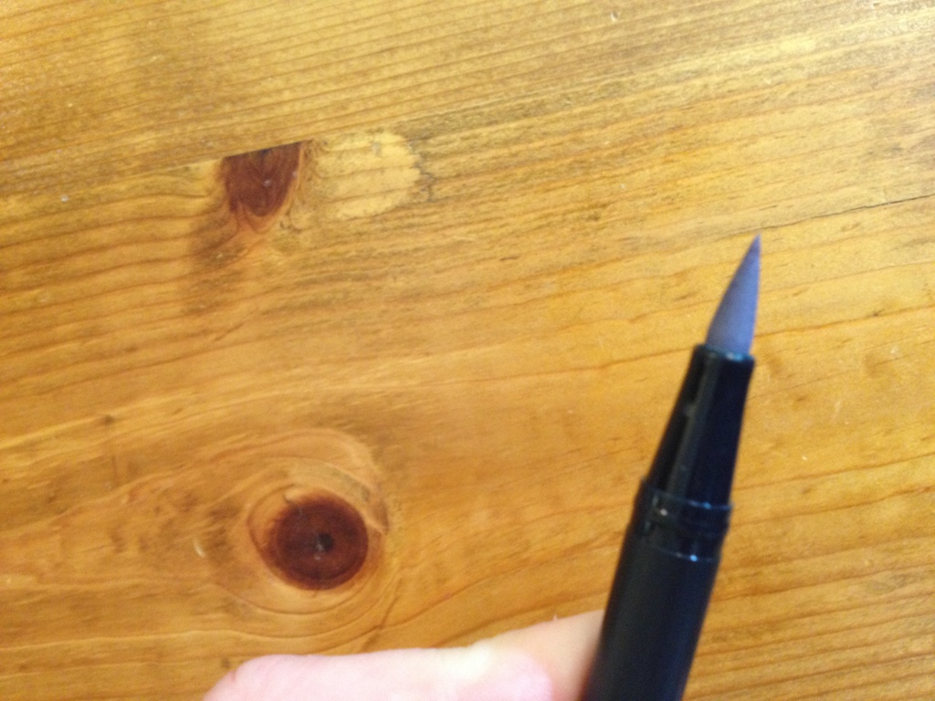
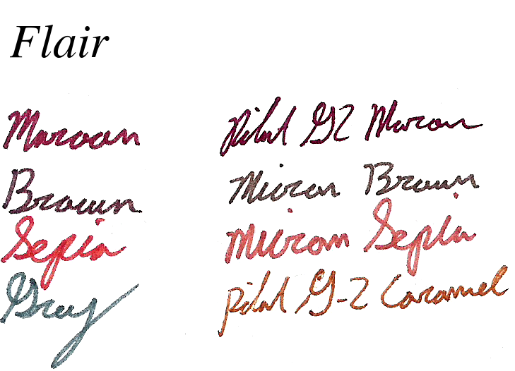
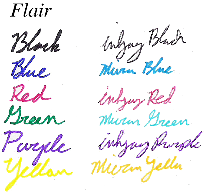
The pack I have is a pack of five grays and a black. The black is fairly understandable and a bit warm. The other grays purport to be “cool” but do vary from cool to warm, in my opinion. Several of them are also far too dark to really be distinguishable, but that also is just my opinion. The N95 and N60 are the most distinctive. Being very light and easy to work with, and very warm, turning to green after a while, respectively. The 45 and 55 are barely distinguishable and the 65 is about halfway between true white and true black, but all three get very dark very quickly and none of the five easily make a smooth edge, they are too varied in color to do so. The colors are all acid free, making them archival quality. And while they are water-based and claim to be blendable, I find that once they absorb into paper or card they are almost immovable. They go on smooth, the brush has quite a bit of variance but can be fragile (it is a sponge-like and not a bristle brush) and the marker is quite consistent and rigid. They can be used for several large projects or quite a few little ones, but can’t be expected to last longer than any other felt-based markers.

20150615-082930.jpg

In the end, they are great for someone who is just trying to get a feel for the grayscale washed look but is frustrated with, intimidated by, or doesn’t have to time for mixing up one’s own wash. Some other supplemental brush pens might be needed to get the full effect out of the shading, but these are a good start and the double-ended aspect makes them more useful than similar pens.

Review – PaperMate Flair Colors – Maroon, Brown, Caramel, and Grey

And now it is time for the final part of my look at the 20 colors of the Papermate Flair pen. This section only has 4 pens, and it’s special because I couldn’t find names for these colors from any official source. So the 4 names presented here are just what I think most represent the colors. Let’s get started and wrap this up.

Papermate flair colors part 4

Maroon – I love a good maroon shade, and this one does not disappoint. It’s easy enough to tell, even amongst other dark colors, what it is, and the tone is nice to look at. It might not be the most natural maroon I’ve seen, but it’s quite good, and sometimes it may even be work compliant. It doesn’t smear much but it’s not the best at resisting water, either.

Brown – The brown is a nice dark, UPS, brown. It doesn’t quite look like dirt, more like bark, and it barely smears. It’s easy on the eyes, blends in with dark colors, and could work in some office settings.

Caramel (error in image where this is labeled as Sepia and Micron Colors are switched) – Caramel is the color I’ve had the hardest time naming. I just don’t really get this light brown. It looks fairly standards, but it’s a bit off from the browns in Micron, Crayola, Pilot, and other such brands. It looks all right, but not the most natural, and most workspaces wouldn’t appreciate it. Although smearing is next to none.

Grey – And the final color is also one of the most boring. Grey is a color I love that isn’t featured in many color sets. And that’s because there isn’t much use for it. In nature I can only think of fog, and in an office only if you convince them it’s just your black pen running out. That being said, it’s a nice dark, even grey with very minimal smudging and feathering.

And there we are, the 20 current colors of the Papermate Flair. I do like them, and even some of the more garish colors are better in these sets than others. There’s a good mix of water resistance, workspace appropriateness, and personality in there. And I would recommend the set if you like tones of colors and like the Flair. But it’s a bit expensive and maybe one should consider the smaller sets if they want specific colors.

Review – PaperMate Flair Colors – Olive, Lilac, Navy, Plum, and Turquoise

And now for part 3 of my look at the 20 colors of Papermate Flair pens. This time I’ll be looking at five of the cooler colors in the lineup. I’ll just get started.

Papermate flair colors part 3

Olive – Olive is a nice green, forest-y color that looks quite natural and is very pleasant. It is quite conservative and laid back. One might be able to get away with using it at an office, but it’s unlikely. In poor lighting it almost blends in with dark blues and blacks, though. On the smearing side it’s one of the worst, easily smearing and becoming unreadable with contact with water.

Lilac – It’s a light purplish color that is smooth and quite easy to look at. It wouldn’t be appropriate in most offices, but in many a field of flowers there are similar colors. The color looks almost washed out before water is applied, but it smears and feathers probably the least out of the entire set.

Navy – Navy is a very dark, office-appropriate blue that goes well in most places. Artistically, it would be most at home in the dark, but there may be other applications. It does smear, but very little, and it is often readable afterwards. The main problem when water is applied is that there is so much pigment that it covers a wide area with a bluish tinge.

Plum – A bit off from most of the fruit I’ve seen, this plum is a dark, red-ish, purple color. It could pass for a plum still, just not one from a supermarket. It could also make its home in an office for a bit of fun, but not for everything. It bleeds, feathers, and smears pretty badly, but does stay mostly readable.

Turquoise – Turquoise is a nice color at points, but it shades quite a bit, and the color variation can at times be unpleasant. It’s a good sky, but doesn’t look like the stone, and going over it multiple times will turn it into more of an aquamarine. If your work doesn’t have a problem with blue, it should still work. With a wipe from water nothing changes, but if left for a few moments the color dissolves completely and is unreadable.

And that’s it for part 3. These colors are some of my favorites in the set, and much more usable than their warm counterparts. Next time I’ll be taking a look at the remaining 4 pens, which aren’t officially named anywhere I can find.

Review – PaperMate Flair Colors – Orange, Lime, Magenta, Marigold, and Pink

Now it’s time for part two of my look at the 20 colors of the Papermate Flair. This section of five is the “Warm” colors section. Mostly some normal colors here, but a few out-liars. Nothing too crazy.

Papermate flair colors part 2

This scan didn’t work the best


Orange – The orange is a deep, red-ish orange that is surprisingly natural looking. It’s very subdued, but noticeable, good for organization, but not for documents. It’s dark enough that it can be read at a glance. It fades significantly, but doesn’t really smear when wet.

Lime – The lime likely has the most variance in color, when written with fast it is a surprisingly standard bright lime color, but when taken slowly it is rather dark and subdued. It wouldn’t make a great office color but it is less harsh than a normal lime green, and the variances in tone make it good for art. Another plus is water hardly affects it.

Magenta – I find magenta colors had to classify, this one is pretty, nice to look at, and readable. It wouldn’t suit the office well but it does look like I could see it out my window. Heavy bleeding and smearing when wet with this one.

Marigold – At first glance this pen looks like another yellow, which it is, but much less harsh and more readable. It has a tinge of orange that is very pleasant and flower-like. There’s a lot of smearing, but almost no fading when exposed to water. Perhaps it could be used as an alternative to red to use when marking something important. Just as noticeable, but less aggressive.

Pink – I don’t like this color, it’s a hot-ish pink, not blinding, but not pleasant. It’s standard all things considered, it barely moves when wet and is inappropriate for anything but personal organizing. I’m not judging you if you like it, but I won’t be using if for anything.

And that’s part two. I like the warm colors, but I struggle to find uses for them. Next time I’ll take a look at five more, but this time “Cool” colors.

Review – PaperMate Flair Colors – Black, Blue, Red, Green, Purple, and Yellow

The Papermate Flair is a good porous-point pen; I’ve looked at both the black and red versions in the past. But they do come in a host of colors. I got the largest pack I could find, which seems to be exclusive to Sam’s Club, with 20 colors. And it’s so exclusive that I can’t find official color names for 4 of them. Those 4 will be in the last part of this series, the first 3 being Standard, Warm, then Cool. And now onto the colors.

Papermate flair colors part 1

Black – The black is a fairly standard black (most are): it’s deep and cool. It’s office-appropriate and moderately smear-resistant. While it does smear, it is readable after most spills.

Blue – A dark, office-type blue that is not a very natural color, but a pleasant one. It is legible and unintrusive. It lightens considerably and smudges when wet, but doesn’t erase.

Red – A dull (but still punchy) red, nice to look at, but a bit pinkish. It’s less glaring and hard on the eyes for grading and warnings than comparable pen reds, but similar to most marker reds. Is fairly smear resistant, but does lighten.

Green – A dark green, slightly darker than, say, a crayon green. It’s a deep, grassy, natural color. Noticeably different from the other, more common colors, but nothing that’ll jump out from across the room. It could be used in a liberal office. It smears and lightens quite a bit, though.

Purple – One of the more usual, pops-off-the-page purples. It is noticeable as a purple and isn’t the most natural-looking color. It stands out from dark blues, but could get lost in a page of dark inks. Almost no smudging on this one, though it does feather a lot when wet. It could be used in a similar office to the green one.

Yellow – A super-bright, stereotypical yellow. It’s almost illegible on white paper. It’s the most water-resistant after red and purple, but it all but disappears anyway. It hurts they eyes to look at for a long time (I’m not sure if it’s the brightness or the fact it’s hard to read) and isn’t a very natural-looking color. I wouldn’t recommend this one unless you’re coloring in books.

And that’s part 1 of my look at the 20 Papermate Flair colors. A good general assortment here, but nothing groundbreaking. Next week I’ll take a look at 5 of the more Warm colors in the set.

Review – Poquitos Part 2 – Monteverde Ballpoint/Stylus and Fountain Pen

I had the regular Yafa brand Poquitos for quite some time before ever even hearing about the brand Monteverde, which is one of the many brands of “inexpensive” luxury pens that Yafa owns. Monteverde mainly has their own line of pens that could be completely separated from Yafa, but recently I discovered Monteverde was releasing a set of pens under the same name and similarly styled to the Yafa Poquito. This, of course, confused me, until I found out the companies’ relationship. The two Monteverde Poquitos have both similarities and differences when compared to the regular Yafa versions. Let’s take a look.

20150121-234835.jpg

First up is the fountain pen, which is styled very similarly to the original Poquito, but because it is a fountain pen, it is slightly larger, a little longer, and about twice as thick. The tip of the cap has the same “stylus” as on the smaller pens, and the clip is almost identical. The pen is also made of brass, but seems to be painted better, and Poquito is written right on the cap.

Being a fountain pen, it accepts cartridges (of the standard international variety), but there are no converters designed for it. Some small converters can be finagled into working, but none are advertised as doing so. The nib (which is only available in medium) and feed are relatively dry, but that is the case with many pens with similar nib and feed types (plastic, iridium point, German made) and many inks are designed to work well with this type of pen. The section is stainless steel (I think) and gets slick upon prolonged use. And the pen is too short to hold comfortably without posting. But the pen is still super small, and is absolutely ideal for taking quick notes provided one finds an ink that works well with it.

20150121-234842.jpg

In addition to their release of the fountain pen, Monteverde also released a new version of the regular ballpoint Poquito, called the Poquito Stylus (and funnily enough, they also released the Poquito Stylus XL which is almost the size of the Largo). The pen has the same writing and mechanism end as the Yafa Poquito (which is the only part that the Poquitos share). But on the other end, a touch-screen stylus of average size replaces the old hard “stylus” point, which was really useless. This new stylus works quite well, though it can be a bit broad at times. The clip design has also changed. It works just as well, and looks a little nicer, in my opinion, but is more likely to damage the item it is clipped onto. The ballpoint itself is identical to the older pen, with refills being the same.

Overall, the Monteverde versions of the Poquito pens are quite small, and quite functional. They haven’t really fixed any of the problems with the standard Yafa versions, but the added benefits of a fountain pen and stylus (for the people that like to use them) are great. All of the Poquitos are hardy little pens that serve well, and can go almost anywhere. The Monteverde versions just add a little more style and a little more usage variation.


Review – Poquitos Part 1 – Yafa Ballpoint and Pencil

Some things are better small, and the Yafa Poquito, being one of the first pens I got, proved that to me. It was exceptional for my small hands at the time. But how does the set compare now?

20150113-225904.jpg

The Yafa Poquito pens have metal bodies that come in various colors. The top of the pen is a bit of a rounded-off cone, and the top of the pencil has a small steel button. The clips are tight and almost identical, with the pen’s being pointed, and the pencil’s being round. The bodies of both utensils taper from the middle to each end, with the center band being separate in the pen and attached to the mechanism in the pencil. The metal tip of the pencil is also part of the mechanism, whereas in the pen it is part of the body. The bodies are quite solid, but the paint will wear off with time and a bit of use. Consider getting a silver or brass one to fix that if you mind.

20150113-225910.jpg

The pencil takes .7mm lead, and what it comes with it fairly standard, sometimes broken in transit. The mechanism is easy to use and quite sturdy. It would stand up to a bit of abuse. There is no play once the lead has been extruded, it doesn’t have “shocks” as it were, but the mechanism is separate from the pen body, and this creates a squeak now and then.

The pen is a smooth-writing fine cartridge. It is a ballpoint so there are occasional globs and hard starts. If left out for some time, the pen will be quite hard to start, but in this case a while is so long a time that one would expect it to. When it does flow, it is very smooth, and has almost no issues. It is not quite black, and waterproof, as most ballpoint blacks are.

The Poquitos pack quite a bit of punch for their size, being less than 4 inches long (and they still manage to fit relatively comfortably in the hand). And while they do have some flaws, they are far from from deal-breaking for having a pen or pencil there when you really need it. They serve best as backups and are miles ahead of small pens that don’t allow one to comfortably hold them or have very little ink. I’d say that in that category, Poquitos are at least worth a look.

Review – Uni-Ball Kuru Toga Mechanical Pencil

When talking about mechanical pencils, as with many things, it’s hard to get away from the idea that there must be some way to improve upon past designs, and that the standard design we use today has enough flaws in it that seem easily fixable that they should be promptly corrected. The Uni-Ball Kuru Toga is a mechanical pencil that is designed to fix one of the long-standing problems with pencils: unevenness of the tip due to use. Let’s see how it works out.

20141126-005210.jpg

The body of the Kuru Toga is quite simple. The barrel is almost entirely featureless until getting close to the point, where there are a few ridges for “grip”, and then a small metal step-down to the lead point. Interestingly enough, unlike most mechanical pencils, this metal step-down is not integral to the design and the pencil will function fine without it. At the top is a small click-advance system, with a transparent eraser cover that is the accent color. The eraser is small, but works quite well, and most packs come with a few replacements. The cover makes a satisfying clicking noise as it moves into place. The clip has all the info you’ll get about the pencil, which is just enough, though not very much. The clip itself is functional, but not the best. The barrel is semi-transparent with a logo, giving the pencil overall a very interesting look.

20141126-005215.jpg

The lead is HB, and, according to the package, diamond-infused. It is harder than most other HB’s I’ve used, and I haven’t had a lead break on me yet, though that’s more because of the lead advance, which tends to give less instead of more, meaning I have less lead available to break. Overall, the lead is smooth enough and doesn’t write very bold or dark. The real feature of this pencil is the turning point, which acts with the pressure of writing and supposedly turns the lead to prevent breakage and to create a more even tip. I’m not sure if it works, or even if it is working, as I’ve never felt it when using the pencil, but I have also never had the lead break, so there’s that. I wouldn’t say it improves the writing experience by creating a sharper point, but it certainly doesn’t make it worse. Perhaps this feature for me is unnoticed since I naturally rotate the pencil around in my hand willy-nilly. That’s just how I write.

So overall, how well does this pencil do? Pretty good, I guess. I’m not a fan of the overall design, and the lack of any grip on the smooth plastic can make it hard to hold. Like I said, I can’t even tell if the feature is working, but I’ll go ahead and say that, at least through a combination of factors that went into the design of the pencil and lead, it is much less prone to breakage than other models. So if you have a problem with breaking your leads, I’d certainly have a look, but if you value the comfort in hand more than the lead quality, I might look elsewhere.


Review – Pilot Precise Colors, Green and Purple

I’ve taken a look at the Pilot Precise V5 pens before, and they’re pretty good pens in the standard compliment of black, red, and blue colors. But they also have a few other colors available, and in this little review I’ll take a look at the purple and green offerings.

Pilot precise green and purple

First the purple, which is much darker and a much truer purple than most, which are more a fuchsia. The color is deep, but not deep enough to be washed out. It could still conceivably be used in an office setting, but might be pushing it. And while there are rarely truer purples, it doesn’t have a very natural look to it. Perhaps it exists in some deeps shades of flowers, but otherwise it is far too dark. Startup with this color is easy, and while it does fade with water, it is still readable.

And second, the green, which again is much darker and much truer than other greens. It is unmistakably green, but darker than what one would usually think of green as being. It doesn’t get close to a forest or hunter, but certainly is far from a light or lime. I couldn’t think of any office uses, unless you’re a teacher who doesn’t want to use red. It is just light enough to stand out and not look professional. In art, though, it is a wonderfully natural color, and it shades a little bit for interesting effects. It has a bit of a startup problem (or a drying out problem) and is the less water-resistant of the two, but it is still adequate.

Is it worth moving over to Pilot Precise pens just to get these colors? Unlikely, but they are great colors that add to an already nice lineup. I enjoy them, and very similar colors are hard to find in disposable rollerballs or gel pens. They might be worth a look.

Review – Pentel GraphGear 500 Mechanical Pencil

Now, I’m a cartoonist, and when I am penciling and there is no wood pencil to be found (as there unfortunately often isn’t these days), I do use a mechanical pencil. But which one do I use? There are many “alright” and “good” mechanical pencils out there for very cheap prices. Well, I was looking for one a little better, and I found the Pentel GraphGear 500. Let’s check it out.

20140829-101239.jpg

The top of the pencil is rather bland, with a simple metal button and a clipped-on metal clip (interesting). Down from that there is a thin hexagonal black plastic barrel with all necessary information printed on it, and then printed again on a sticker that it will all rub off of. The sticker also has some other, less-necessary info and a barcode, and has the benefit of being removable. The grip section is a very interesting knurled metal that holds quite well in the hand, isn’t sharp, and doesn’t leave one’s fingers smelling like metal as some pen/pencils do. There is then a smooth step-down/tapering tip all the way down to the lead, which in this particular model is 0.5 HB (#2).

20140829-101245.jpg

The lead is standard HB and writes quite smoothly, it feels a bit harder than many other #2’s I’ve used, which may just be a feeling in my hand. The entire thing feels very sturdy in the hand and is great for both technical drawings and sketches. The lead is “hi-polymer”, whatever that means, but it is good, and since there is no shock absorber it has to be good at not breaking, which it also is.

20140829-101250.jpg

There are several packages, and the one that I got has no spare erasers and only one spare piece of lead, ensuring that I have to go back and get more.

Overall the pencil is great. It works very well and is very nice to hold. It’s sturdy and keeps up with minimal wear. It’s easy to hold, easy to write (or draw) with, and stays well in the pocket. It doesn’t have any fancy features, which one could get in the higher end models, but it does cover all of the basic features and does them really well. If you want a good pencil without all the bells and whistles, I’d definitely check out the Pentel GraphGear 500.