Review – Caran d’Ache Sketcher (Non-Photo Blue Pencil)

Pencils are a nigh-indispensable tool for the artist. But usually, especially with ink work, they need to be erased, and that can be a hassle. It’s a lot of work, it risks ruining the drawing (or paper), it takes time, and it becomes harder to correct later. But oftentimes the final work is either a duplicate of the original, or more work is done over inked lines, meaning that using a pencil that simply doesn’t show up in the reproductions saves time and work by not needing to be erased. Non-photo blue pencils were used for this purpose as many image replication processes (mainly cameras and photocopiers that were used to duplicate artwork for printers) have a hard time transferring it, and they still retain a place with modern scanners that will be able to pick the color up, but do so in a way that the image can be easily edited to omit it. But is it really worth it to get a new different pencil like the Sketcher from Caran d’Ache?

photo-264photo-258

The pencil is as basic as one can get: made of wood and hexagonally faceted to limit rolling, one end is sharpened the other has a metal ferrule connecting the body to an eraser. The body is a pleasant blue color mirroring the color of the lead and on one facet neatly stamped and inked in white is all of the relevant information. It looks and feels very much like a standard #2 pencil.

photo-266photo-267

The eraser is well done; it erases cleanly and is dense enough to not float away far faster than the rest of the pencil. The lead is hard to place in hardness; it feels softer than a standard HB but it has a more waxy quality (characteristic of colored pencils) that makes it give a much harder line. So it writes somewhere harder than HB and wears somewhere below. The line it produces can go from very light to surprisingly dark, but even at its most dark, it is barely visible in scans and can be easily isolated and removed. But it is only a tool for pure ink drawings, and its use is limited in other senses. If one were to, for instance, lay a wash over it, it would be harder to isolate and almost impossible to be rid of on scans, and it resists being covered by lighter washes. And if one were to erase before laying down a wash they would find that the ink laid on top of the pencil is cut down severely, with the entire line becoming grey and having several holes that are almost white, basically where the ink adhered to the pencil and not the paper (this effect is present, but much less severe, with standard graphite pencils). A similar set of problems would be encountered by someone wishing to put color down. So using a pencil like this would necessitate an additional step between inking and coloring/washing where the inked drawing is reproduced and tweaked to eliminate the blue (and potentially other errors).

photo-268

I’ve also had a bit of an issue with the lead being soft enough to break inside the pencil. It hasn’t been severe, but it’s worth noting.

photo-265

So am I converted to the blue pencil? Not quite. I really like it, and for a specific type of work-flow it is perfect, but that work-flow isn’t mine. I color/wash my original drawings, and I don’t see that stopping unless I get big enough that I can hand it off to someone else. So the pencil has very little use inside my work environment. I do use it now and again, but it also wears down quite quickly, and having to use a sharpener just drives me back to my mechanical pencils. That being said, it is a well-made pencil that does its intended job superbly. If you need to reproduce or scan in original inked artwork and don’t want the hassle of erasing, I would say this is right up your alley.

Review – INC Soft Scripts Mechanical Pencils

Pencils for the office, school, or just someone who loses their pencils a lot can get pricey, fortunately there are a lot of inexpensive options out there. But are they even worth it to try? Sure, there are a lot of inexpensive pencils, but if they don’t “pencil” there is no reason to even consider them. INC Soft Scripts are one such pencil on the less expensive side of the aisle. How well do they work?

photo-252

The design here is pretty stereotypical, with the barrel being a thin, featureless tube of black plastic that tapers at one end to a plastic lead pipe. Near this end is a rubber grip in one of a few (5 in my case) colors that is narrower in the middle and has ridges toward the end, both ostensibly to help with grip, and they succeed in being barely noticeable. On the back end is a colored plastic push-advance mechanism (that matches the grip) with integrated pocket clip and eraser holder. This bit can be removed to expose the lead-holding tube that contains 2 extra leads (for a total of 3 per pencil). The clip is nothing spectacular, with most of the necessary information on it, and fairly brittle. But I feel the entire end piece would fling off before it broke.

photo-253

Performance is what one would expect. The HB lead is middle-of-the-road, leaning toward soft, but there’s nothing particularly off about it. I personally don’t use a .7mm size but it is a fairly standard size and makes breaking less of a problem. The eraser is one of the little white ones that will get the erasing done pretty well, but will seem to disappear almost immediately. The clip is serviceable but I wouldn’t recommend using it. And, finally, the mechanism is quite solid and workable; pushing lead out and holding it in place when commanded to do so.

photo-254

They’re easily usable, but far from spectacular, pencils, with their main benefits being the rubber grip (if you happen to like those) and the fact that they are the ones at the store (if indeed they are the ones at the store). There’s nothing really there to recommend them on, but no reason to tell you to stay away, either. They will perform fine for office, school, car, or other tasks where pencils should be inexpensive because of the frequency with which they are broken or lost. In comparison to others at a similar, price it would really come down to personal preference.

Review – Cross Jotzone Notebook and Pen

Notebooks are quite handy things, but most of the common ones look a little unprofessional. If the standard spiral and composition books won’t work for you, and Moleskine just seems a little cliché, maybe Cross has the answer for you with its Jotzone series of notebooks.

photo-242

I feel I need to put a bit of a disclaimer here at the front. I usually carry a notebook around with me and try to get through about a quarter of the pages before I do a review on it (that’s why I’ve done so few notebook reviews: it takes time), but on this one I certainly didn’t get anywhere close to that, for reasons that will be explained in a moment.

photo-246

The cover of the book is a nice, smooth faux-leather, black save for a triangle on the lower right of the front where the color varies (mine’s blue). It covers the full 5.5” x 7” paper part of the book, with a ½” extra bit around the spine, which is hollow, creating a “tube” where pens can be stored (it also helpfully says “Cross Jotzone™” on the spine) . “Cross” is nicely but subtly stamped both on the back and the triangle in the corner. An elastic band is attached to the back in a novel way, so that when it is being used to hold the book closed it lines up with edge of the colored triangle. Inside there is nothing special behind the front cover, but inside the back is a small, simple cardboard and paper pocket. It is attached so it is accessed from the top, a decision that with its small size seems to have been made only to avoid comparisons with Moleskine.

photo-249

The paper is very good, a nice 100gsm (70lb) that is smooth, but not too smooth in my opinion (it certainly isn’t as smooth as the Clairefontaine paper fountain pen people love). It handles fountain pens and liquid roller balls quite well; with minimal feathering and show-through under normal usage conditions (I’ve done no test with flex pens or triple broads) and the dry time isn’t that bad, though far from instant. The pages themselves are nice and white with a ¼” grey ruling that stops before the page ends, and a stupid grey triangle in the corners right under where the triangle is on the cover. This area helpfully says “Cross Jotzone™” on every page, and it’s supposed to be where you put your quick summary notes or something so you can easily riffle through the pages and find what you’re looking for. I think this is dumb (and I hate pre-printed words on the pages of my notebooks) but nobody asked me and the paper is good enough that I could easily ignore that (and the ruling that is far too large for me).

photo-247

But now for the reason I haven’t used the book that much, and wouldn’t buy another one. I admit it’s quite petty but I use my notebooks a lot, and I want them to look good. That’s why I still use Moleskine classic hardbacks, it’s very hard to find a notebook that resists damage (page corners bending, cover denting/ripping/bending etc) better than those books. And this one is, cosmetically speaking (it feels easily strong enough to not fall apart structurally before being used up) is the worst I have encountered. After sitting for a day or two in my bag, with the only other items in the bag being non-spiral notebooks the cover became covered (no pun intended) with irreversible scratches and scrapes that are quite noticeable. Basically, if you want to maintain the “Cross” professional look, it’s a desk notebook, and I have reviewed it like a desk notebook. It’s a pretty good if gimmicky one, but I personally couldn’t stand to look at the satin faux-leather cover getting so beat up over time (and I wouldn’t recommend using the spine pen holder, as its made out of the same, easily damaged material). I feel like it wasn’t really thought out, and is more of an “executive gift” that no one is expected to really use, and that’s a shame because it comes with a great pen.

photo-248photo-250

The pen is a very simple chromed metal pen (I would say steel from the weight, it’s quite heavy for a pen of its size) with a smooth cylindrical non-tapering barrel. There is pointed-ish cap finial at the back and a cone at the front leading to the point. It’s retractable, with a twist action, and there is a clear mark and band signifying where the pieces come together (and it is the smoothest action I have ever felt in a pen). The adornment and the clip are minimal, probably to be inexpensive, and while it’s a little ugly, the simplicity makes it easy to overlook. The cartridge is a short version of the standard Cross cartridge in a medium point. It, like most Cross pens, is very smooth, in this case especially when writing cursive. It does have some startup problems, especially when left unused for a time, but that problem can be solved by using it more or getting a new cartridge.

photo-245

In the end it’s an alright notebook, and a good pen. I wouldn’t purchase them for myself, but it does make a very nice looking gift, and it’s functional, with good paper and a nice writing pen. It’s a desk notebook, and a heavy desk pen (but I like the weight) made of good quality materials, but essentially with a disregard for useabilty. I can recommend them as desk materials, but not as daily users.

Review – Western Family Mechanical Pencils

If you are ever in dire need of a mechanical pencil, and somehow find yourself at a shop that doesn’t sell Paper:Mate Sharpwriters at the price of whatever change you have in your pocket, or even at all, the Western Family mechanical pencils may be a cheaper, and click-advanceable, alternative. But are they actually useable?

photo-234photo-236

The body of the pencils is very simple; a smooth cylinder for the barrel with a tapering and fluted (for grip) cone leading to a plastic nub (lead pipe) at the front (this part is free spinning but doesn’t appear to detach). At the back is a nothing-special click mechanism with an integrated plastic clip (that does indeed clip to things and hold it in place, but is pretty flimsy) and a small white eraser on the back. Removing the eraser (which actually fits down inside almost all of the click mechanism) reveals the inner lead-holding tube, which comes stocked with one extra lead per pencil. The entire click mechanism can also be removed for more direct access.

photo-235

The performance is nothing to write home about. The HB 7mm lead is, as one would expect, fairly soft but not too soft, and a bit wide for people like me (I prefer 5mm, but I can live with 7). The eraser does indeed erase: it gets rid of most regular graphite marks but can be used up very quickly. The barrel of the pencil feels sturdy, but the ends are flimsy and plastic-y with tolerances that aren’t very tight.

photo-237

Overall the package is fairly bare-bones, but functional. I wouldn’t use them as my main pencils, but they’d work in a pinch. For only a few dollars you get 10 pencils (in 5 terribly boring colors) with 2 leads each and a body and eraser that will hold up probably no longer than it takes to use those 2 leads (the clip being the weakest link there). There is nothing particularly appealing aesthetically about them and no information (like lead size) other than “Western Family” printed on them. They’ll work for scattering about for use if you can’t find your normal pencil or for loaning to people who don’t care about the pencil (like at the office, or playing D&D) but I can’t recommend them for any other reason.

Review – Art & Parcel (September 2016)

Art & Parcel is a monthly subscription service for art supplies from H. Blyth & Co. It’s like a Lootcrate, but for art supplies; so it’s way better than a Lootcrate (my opinion). But with so many of these monthly-blind-subscription-service things around, what makes this one special enough to look at? (Answer: Art supplies) And is it worth it to get one?

photo-217

(Couple of notes here: I got this parcel for free {and even though I got to pick one, I didn’t get the one I picked, so the picking part won’t influence the review} for review, and I live in the US where the “subscription” part of this service is unavailable. From what I can tell that means that I would have to pay up front as a lump sum to get my parcels, instead of being able to pay by the month, this also means that shipping cost is terrible to get them here, £16 (About $20) is a steal for these products, and the shipping in the UK is a great deal too, even throughout the rest of Europe it doesn’t exceed the price of the items like it does coming to the US)

photo-226

The one I am going to be looking at today is September’s parcel, which is focused mainly on colored pencils, but first I’ll talk quickly about the packaging. Mine was shipped in a bubble envelope, inside of which was a very nice cardboard box that was very well sealed with brown tape. On the top the Art & Parcel logo is printed very plainly, and on the bottom in pencil there is the month. (My box was a bit dented, but this is likely from the post office as, due to my schedule, the box had to be sent through the post twice) Inside is a nice packing slip that explains everything that is in the box along with its regular retail price (if that’s anything to go on you save a pound or two from buying the items individually in this set). All of the materials are neatly and securely wrapped in a newsprint/tracing paper that is sealed with a sticker of the Art & Parcel logo. It is all very well executed and nothing got damaged.

photo-220

The first items in this box were four Faber-Castell Polychromos pencils. I am no stranger to these pencils (they were the subject of one of my first {and not as well written} reviews), though I don’t have these particular colors: Naples Yellow, Light Phthalo Blue, Chrome Oxide Green Fiery (wonderful name that), and Red-Violet. I think the choice of colors is a bit strange, but they are definitely useful, and give a better representation of the pencils abilities than a plain RGB or RYB would have. There’s not much more to say there since they are some of the best colored pencils around. One thing I do really like about them is the fact that they layer so that some colors can somewhat be on top of other colors, unlike the cheaper colored pencils where they’re pretty mutually exclusive.

photo-225

Next is the KOH-I-NOOR Hardtmuth Magic pencil, which is basically a fat colored pencil that has a “lead” made up of the 3 RYB colors. This means that as you write or color with the pencil it changes, and the colors mix together to create a nice gradient effect. In practice the yellow mixing with both the red and blue works great, but the purple almost looks black and rarely shows up, and getting a nice solid version of one of the primary colors is very difficult, so the gradient looks more green and orange than anything else. I would bet that with some practice and odorless mineral spirits with a blending stick that it could produce wonderful effects, but I would still have trouble finding a use for it.

photo-224

Third up is another Faber-Castell product; one of their Pitt Artist Brush Pens, another item I’ve looked at in the past, though this is a different version. It’s a “big brush” and the body of the pen is over a half inch in diameter, a bit chunky for me but still very easy to hold on to and surprisingly comfortable. The color is “Cold Grey IV” which seems to be in the middle of the grey family, and the brush is very fat, going from lines of about ½mm to almost 5mm. It’s also got all of the stuff you want out of an ink: waterproof, lightfast, and archival quality. But I’m not really sold on how it fits with the rest of the stuff here. It is a grey, which makes it more like a pencil when sketching, but going over the same place multiple times does make it darker. It’s just strange to me, but then again I have a very different style to most people, and playing around with a new brush pen is always fun.

photo-222 photo-223

And the final item included is a 10-sheet pad of watercolor paper. It’s made by Fabriano but has the Art & Parcel logo again on the front. It’s A5 size, which is about 6” x 8” and is a hefty 300gsm. It handily took everything I threw at it without flinching, bleeding, or feathering. Sharpies, calligraphy pens, and brush pens push most papers to the limit, but this stuff is truly meant for paint (watercolor at least), which I don’t have too much of lying around (in accessible areas, I did have some tempera and it handled that very well), but it seems easily capable of handling it. A liberal application of water will turn it in to one big slight buckle, but that’s about it. My only complaint is that there are only 10 sheets.

photo-218photo-219photo-221

Overall I’m very satisfied with this box. It’s well worth the money and provides several products that work in tandem, allowing you to start creating right out of the package without having to look for more materials. From what I can tell, this is true of the previous parcels as well, but each one comes based in a different medium. The subscription would be relatively inexpensive way to try out something that might not be in your comfort zone without having to do a lot of research or spend time picking out and ordering products. It was honestly really hard for me to try and pick out a parcel I wanted. The recent ones at least were all super cool (and they can be purchased even after the subscription goes out, so nobody needs to miss out like with other sub boxes) and I’d be signing up right now if shipping to the US didn’t more than double the price (damn the postal service(s)). I really like this box. It’s given me a bunch of cool stuff to play around with (and a Haribo candy to eat*) and if the idea of getting a bunch of high quality art goodies in the mail every month appeals to you I would recommend it.

photo-227

*I ate it; it was good (like a softer laffy-taffy).

Blog 10-30-16 – October Update

All right, I said I would be doing another blog before November, and here we are… with less to report than I had hoped, but nevertheless it is an exciting time.

First things first I will be participating in a few events: the second Big Bend Comic Con will be in Alpine Texas on November 5th, and I’ll have a table in the Artist’s Alley. And the 2016 Artwalk festival will also be in Alpine November 18th-19th where I will have a stand on the walk selling my books.

And speaking of books I have a couple new ones I’ve been working on that will be debuted at the Comic Con and then go on to be featured at Artwalk. These will be available soon from the Amazon store link as well. Here’s a photo of the proofs.

photo-216

There’s a new Walking the Roosters, Stamped, and a printed version of the Beta of RPG LTE.

On the more personal side of events, I have finally finished my move (which if you count that as the time from when I moved out of my last solo place to where I am now, took more than a year). I still have to finish unpacking (which I’m sure will be a wonderful experience) but I will be moving to a more stable schedule that means I will be able to produce more online content.

And I know I said that I would get more posted in September and October, and I do have many more things finished than I haven’t posted, but I run things by an editor before posting them and she has been very busy lately as well, making it hard to get new things through. But now that I am in a more stable place (and have finished the new books) I will be able to sit down and concentrate much more on what needs to be done on the site. I have my own personal goals for catching up on everything, but I won’t post them here because they will inevitably change. I do really enjoy doing the things I have been online and I hope to get back to it soon, and it shouldn’t be too long before I put up another post with more information about how things are going.

-Austin

Dragoncompany.org   Artsupplycritic.com   Dragonfunnies.com

Review – Bic Xtra-Fun Pencils

Sometimes I’m a sucker for buying new things for the novelty, and I think that’s what Bic is counting on (except I think their target market is children) with the Xtra-Fun series of pencils. At first (and second) glance they appear to be regular #2 pencils in wacky, fun colors. But are they usable?

photo-207photo-209photo-214

For the most part these pencils are pretty standard: a “wooden” hexagonal body with general information stamped and inked into one of the facets (each pencil also appears to have a unique number stamped but not inked into it; I am unsure of its significance). The most obvious differences between them and regular pencils is the bright-colored paint on the outside with the inside dyed a different (usually mismatched) color, and that the standard metal eraser holder has been replaced with a much larger diameter plastic one. The body looks and feels at first like a regular wood pencil, but after sharpening and handling it for a bit I would say that if it isn’t a type of plastic it is a “flaked and formed” wood that uses a different process than most pencils to give it more plasticity.

photo-210photo-213

The performance of the lead is as expected, on the soft side of middle-of the road. Not much precision is possible, nor shading; it’s good for scantrons and notes. The eraser is of the white variety, and actually very decent, erasing most typical writing lines without seeming to disappear before your very eyes. In fact, the most disappointing thing about this pencil is its structural integrity. It bends very easily, and much more so than a regular pencil. Simply handling it will result in finding out how easily it bends, which is worrisome in general, but added to by the fact that when I was using these pencils I began to sharpen one, and the tip broke off every time I was just getting to a point, down until there was no more pencil to put in the sharpener. Thus, one of my pencils was rendered entirely useless, and I hadn’t really played with the plasticity of that one, so I would definitely call it a defect, and one that makes it hard to recommend these pencils, especially for children.

photo-212 photo-211

I probably won’t be buying any pencils from this range again, but that would’ve still been the case had they been good pencils. But with such an easy to encounter (albeit not in the intended usage case) flaw that essentially ruins the pencil’s penciling ability, I have to say I wouldn’t be able to recommend them to anyone. The colors are also terrible but I suppose some have different (perhaps more X-treme) tastes than I, so I can’t particularly fault it there.

Review – Lihit Lab Pen(cil) Case

I might be a little bit late for the back-to-school season, but I do have a pencil case I wanted to talk about. Most pencil cases tend to be of the “dump everything in and fish it out” variety, even if the only hold a few pencils. The rarer breed is the organizational pencil case (that isn’t attached to some other “organizer”). One of the simplest, least expensive, and easiest to get a hold of versions of this is the Lihit Lab Pen Case (I can’t find a certain model name {maybe Teffa?} or number that seems to fit {maybe A7551-24?}). Is it worth it?

photo-201photo-205

The outside of the case looks pretty standard (mine’s black, but there are lots of available colors), the back is blank and the front has two almost-useless pockets with a small rubber “designed for arrangement” badge. The (double) zipper is roughly in the center of the bag (and it even has the same logo as the front badge on it) and it feels very sturdy and secure, though it has no “brand-name” on it. The hinge is made of a double layer of the same fabric as the rest of the case and shows no sign of wear from several months of use. The whole package comes in at about 8”x4½”.

photo-204photo-198

The inside is a brown version of the same color polyester fabric (regardless of outside color). On the inside of the front there are two roughly inch-wide bands to hold in pens, and on the back inside there is a simple mesh covering about half the area (to hold other items). There is also a center divider/organizational area that is strangely attached to the inside of the back half and not in the middle. I suppose that would have interfered with the hinge, but its placement near the back (really it just favoring one side) can be a problem at times. The front of this divider has another inch-wide band (higher up this time) and a thin pocket (not mesh) at the bottom, and the back has three mesh pockets, the top two being slightly larger than the bottom one.

photo-202

So the configuration of the whole case is to hold pens in the front and other art/office supply things in the back. This works pretty well, especially since the back can hold either. I have 24 pens or pen-like things in mine* and 10 (or so, paper clips are counted as one thing) other things including an eraser, Swiss Army Knife, stapler, pencil sharpener, notepad etc. It fits everything nicely and is very flexible with its organization. I was surprised with what I could fit in it (almost everything I wanted), and I’ve been carrying it around wherever I need pen(cil)s for months now and it shows no sign of stressing the material or really any wear whatsoever.

photo-199

My concluding thoughts could just be “it is the pencil case I use, and I don’t see that changing soon”. And that would be true, I really like this case, it is perfect for my exact usage scenario, but due to its popularity and the number of photos of it I see online, it looks like it could fit quite a few usage cases. It’s inexpensive relative to other cases its size (it probably helps that there is no packaging needed, but it does come with a cute little card that folds out as a representation of how to use the case), it’s durable, flexible (both in the physical and organizational sense), and it’s attractive. I’d definitely recommend it as an upgrade to the regular zipper bag most people use.

photo-233 photo-232 photo-231 photo-230


* Pencil Case Full Contents List

    • 2 Pentel Pocket Brushes
    • Pigma Brush
    • 2 Tombow Duos (N95, N60)
    • Liquid Accent Highlighter
    • Sharpie Twin Tip
    • Autopoint All American in Blue (Caran d’Ache Sketcher Non-Photo Blue Pencil)
    • Pigma Graphic 1
    • Pigma Micron Technical Pens (005, 01, 02, 03, 05, 08)
    • Le Pen 0.03 (003) Technical Pen
    • Tombow Mono Zero Eraser (Round 2.3, Rectangular 2.5×5)
    • Scotch Tape Roll
    • Pad of Generic Sticky Notes (3”x2”)
    • Twist Ties x2
    • Paper Clips x5 (Insulated)
    • 4 inch Ruler
    • Pentel .5 HB lead
    • Pentel Graphgear 500 .5
    • Swingline Tot 50 Mini Stapler
    • Staedtler Mars Plastic Eraser (With Plastic Case)
    • Victorinox Super Tinker**
    • Zebra F-301 (Black, Blue, Green, Red)
    • Paper:Mate Liquid Paper Correction Pen (Signo Angelic White Gel Pen)
    • Kum Pencil Sharpener

28785

Last two photos from Jetpens.com (http://www.jetpens.com/Lihit-Lab-Teffa-Pen-Case-Book-Style-Black/pd/7665) I just had to include a photo of the "booklet" and originally couldn't find mine.

Last two photos from Jetpens.com (http://www.jetpens.com/Lihit-Lab-Teffa-Pen-Case-Book-Style-Black/pd/7665) I just had to include a photo of the “booklet” and originally couldn’t find mine.

Blog 9-7-16 – September Update

So it’s September, and I said I would update y’all by the first week of the month, and here I am, proving again that I am not dead, and not much has changed in the way of the posting schedule.

I had no idea that the process of my moving would take more than a year, but, as many more productive people will tell you, when you can’t devote your full attention and effort to a single project, it will get done less efficiently. I definitely wasn’t able to get done what I had set out to do in a reasonable amount of time and I am sorry that in doing that I have severely diminished the amount of content that has been featured on this site (hopefully temporarily).

But, things are getting back on track, as hopefully the last few (and next) days of posts will prove. I didn’t do as many exciting things these two months as before, but here are a few photos from another art show “Clarity in Chaos” that I did with the new West Texas Collective (Facebook Instagram Twitter) in Alpine Texas. It was a really fun show, and I hope to do more like it in the future.

photo-196 photo-197

I won’t be fully up and running for a while longer now, but I’m getting close to being back in a position where I can do so. It’s more than likely I’ll have something working by the end of the year. I’ll post another update by November, and be on the look out for that one, because there are a few other really cool things that I’ll also be doing in November. So stay tuned and thank you for reading/watching.

-Austin

Dragoncompany.org   Artsupplycritic.com   Dragonfunnies.com

Review – Crayola Crayons (120 Crayon Box Part 2 – Purples, Blues, and Greens)

This is part 2 of my review of every single color in the Crayola 120 crayon box. I’m going to be taking a look at some purples, the blues, and some greens. In case anyone was wondering, the colors are roughly sorted so that they flow as smoothly as possible from one color to the next, although this is trumped by the wrapper color. So even if I think it’s more red, if it has a purple wrapper it went in the purple section. And now, let’s begin.

photo-175photo-174

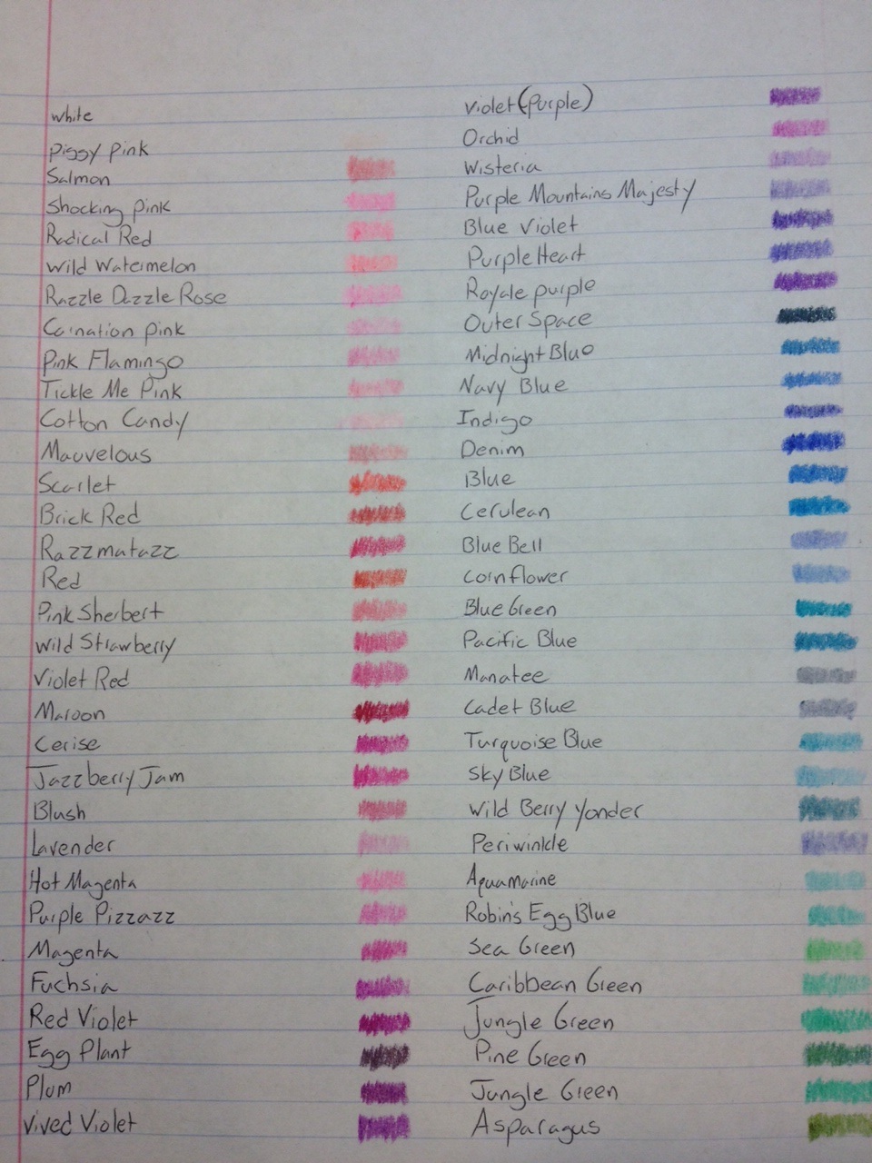
Plum – Plum is a nice, deep purple that evokes the fruit to an extent. It is a bit less red than the plums I’ve typically seen, and it isn’t as dark as others, but it is a recognizable version, suitable for royal robes and flowers, that covers quite nicely.

Vivid Violet – I’m not sure what makes this violet any more “vivid” than the others, but it is a nice, decent covering color, that is very similar to “plum” and has a similar enough use range to even be used as a highlighting color.

Violet (Purple) – It seems strange to me to have two names for this color and only this color, but it is a classic. It covers decently and is the classic purple color, suitable for most purple applications (not skin, as I learned when I was in kindergarten).

Orchid – As a type of flower that has many color variations, I would say that at least this color is similar to parts of various orchid flowers. It is a redish-blue-purple, if that makes sense. It’s lighter than other purples, but with streaks of blue seeming to come through and making the whole thing a cool, nice color suitable for use in most flowers.

Wisteria – Much more on the nose, wisteria does capture a much better picture of the flower it is emulating, as well as crayon could do. The color is a gentle light purple with visible streaks of blue running though it. It captures almost perfectly the look of many wisteria flowers, but unfortunately, even though it covers well, it wouldn’t be used for much else.

Purple Mountains Majesty – This crayon color may win my award for least favorite name. I have no idea what “purple mountains majesty” even is really, or how it would be represented in color form. I guess this would be it, and it is a pale, lilac-esque purple with alright coverage. I couldn’t think of an real uses beyond flowers, even mountains in the distance are typically different purple shades, but this could work.

Blue Violet – Is essentially a bluer version of red violet, or, I suppose more accurately, a bluer version of the regular violet color. It very much feels like the color with more blue added, making it darker and cooler. It’s fine at covering but has what appear to be streaks of darker and lighter color running though it, making it a very interesting color to look at, but not one with many uses.

Purple Heart – Doesn’t particularly look like the badge. But it is a nice dark-ish purple color. It’s quite on the blue side, making it very pleasant to look at but, like many, difficult to find a place to use. It also covers about as well as most other purples.

Royal Purple – The last true purple on the list, Royal Purple doesn’t disappoint. It’s a nice, deep, fairly well-covering purple, that I would take over the standard violet most any day. Sadly, its uses might be regulated to the adornment of Kings and Queens.

Outer Space – An interesting and close to-apt-color name. “Outer Space” is really a dark blue, a little darker and blacker than Prussian Blue. It has a black and purple space-like quality to it, and it covers well enough to be a good night sky. Most other uses would simply be a Prussian replacement.

Midnight Blue – I’m not quite sure, but I think this would have been a more apt name for “outer space”. As it stands, it is a nice blue, and a dark one, but it isn’t very dark, and certainly not a midnight-y color. I do like it, it covers pretty well and it looks like a nice denim color (a color that will be coming up soon) and it would have a wide variety of uses since it is so close to the color of jeans.

Navy Blue – I’ve seen better navy blues than this one, but it is pretty apt. It’s a darker, but less saturated blue. It doesn’t quite evoke the standard navy “deep sea” color, but it does a pretty good job for a crayon. It covers sporadically and seems to have stripes of lighter and darker color. Still it would make a good color for jeans, flowers, and water from pools to oceans.

Indigo – This color looks quite strange. In comparison to the other colors here this one seems to jump off of the page; it’s almost watercolor-like. It is a very smooth, well, indigo color, but it tends to have spots where the crayon stopped moving. It covers well, and is quite dark, lending it to lots of uses from flowers to bodies of water.

Denim – Denim is a very good name for this color. It looks like a pair of raw, unworn denim jeans. It covers well, and has a similar paint-like effect to “indigo”. It is not only perfect for jeans, but it could also easily match the basic dark blue color that many vehicles come in.

Blue – Another classic color, the blue here is pretty standard, though I suppose that’s to be expected from the color that basically set what ‘blue’ is for the world of elementary school. The color is nice, middle-of-the-road, and it covers well enough (though probably the worst out of the blues). It works well for anything from shirts to oceans to cartoon dogs.

Cerulean – Cerulean is one of the few colors that isn’t named after anything in particular (not even a town in Pokemon). Here it is depiceted as a thick, light blue, like the color of a Caribbean sea (or those pictures of clear freshwater lakes). It covers very well and is a great color to use in a situation where you want the blue to “pop” off the page.

Blue Bell – I’m not sure if this really qualifies as an ice cream color, but I’d like to think it is. Blue Bell is a nice, gentle, well-covering blue with a hint of a darker purple. It’s a good color for skies, clouds, mountain ranges, and foaming water.

Cornflower – I don’t think this color replicates its namesake as well as it could, but the radiance flowers display is hard to replicate. This is a light, well-covering blue that leans to the white side of things, making it good for skies, clouds, and of course, cornflowers.

Blue Green – A fitting, name, if not the best descriptor, “Blue Green” is a slightly greenish blue, as opposed to a bluish green suggested by the name. It’s a nice sea and tropical color, the kind that many summer items are made of. It covers decently but is a bit splotchy.

Pacific Blue – Having recently visited the Pacific Ocean, I can say that this is not the color I saw there. But the color of the ocean changes by the season, and this color fits the bill. It covers well enough, with only small granules of white space. And its darkish/slightly stormy look makes it perfect for oceans both in the summer and fall, as well as the stormy sky.

Manatee – The best way to describe this color is grey, with a blue tinge. It does resemble the skin of the animal, but not too a tee. It covers quite well, and is a fairly unintrusive hue. It can easily find a use for animals such as rhinos, elephants, and of course manatees; as well as sidewalk and swimming pool pavement.

Cadet Blue – Besides reminding me of a Modest Mouse song, “cadet blue” is a good color. It is quite grey, but not as grey as the previous manatee. It’s got a little more blue in it that shines though just enough. It covers very well, but has a bit of a splotchy-fibrous look to it. It would work great for a cadet’s uniform, faded jeans, or sea creatures.

Turquoise Blue – I don’t know why Crayola took their opportunity to create a turquoise and made it “turquoise blue”. It seems a bit of a waste, but it does look like a bluer, lighter version of the stone. It covers well, but it isn’t that spectacular. It would work for coloring turquoise-like stones, jade-like stones, greenish bodies of water, and clothing.

Sky Blue – Another very good color name, this blue is indeed a very close approximation of the color of the sky (or at least what color it looks like it is). It’s pretty much the stereotypical light blue color people think of as sky blue (very similar to Crayola’s other sky blue in pencil form). It covers well enough (and the non-covered areas blend in easily since it’s so light) and it would work well to color water in dishes, fighter jets, babies’ clothes, and of course the sky.

Wild Berry Yonder – An interesting take on a color name “wild berry over there” is only slightly better than “purple mountains majesty” in being a bad name. And I wouldn’t imagine the color this name represented being blue, but it is. A muddy sky blue as I would call it, it is a blue that has had grey rather than pure white mixed in. It does cover decently and would work for coloring dirty jeans, muddy water, or a dusty sky.

Periwinkle – Another one of those flower colors that because of the varying nature of flowers is unable to be 100% accurate, “periwinkle” is also a standard color, which the crayon does not deviate from. It’s a light blue with a touch of purple and yellow (which doesn’t really make sense but sure). It doesn’t cover as well as other blues but it works, and it’s a good ice, cloud, clothing, or flower color.

Aquamarine – Another nice blue color that covers very well. “Aquamarine” is a slightly green blue that looks like a warm tropical ocean or lake. It’s light and smooth in texture, giving it a pleasant look. It’s another fun summer color but unfortunately it doesn’t have many uses.

Robin’s Egg Blue – Looking like a slightly darker shade of the last color, this one is indeed very similar to the eggs of a robin (again, allowing for natural variation). It’s another well-covering, very pleasant looking, somewhat useless color. It is vibrant and wants to jump off the page, but it also looks more oily, like a pastel if that’s what you want.

Sea Green – While it might look like some sea, “sea green” does not represent a sea I would want to go near. This bluish green (or greenish blue, it’s kinda blurring the line) covers pretty good, but is lighter and harder to see (no pun intended). It works well for underwater foliage, plants in direct sunlight, and limes.

Caribbean Green – A similar motif, but not quite the same style, “Caribbean green” is slightly more blue than “sea green”, looking like a slightly greener and darker “aquamarine”. It’s a good water color, but its coverage isn’t as much as some of the others in this set. It would work well for underwater plants and tropical bodies of water.

And that’s part 2, looking at the second group of 30 colors from the 120 Crayola crayon box, next time it’ll be another 30.