Review – Sharpie Colors Part 5 Reds – Red, Pink, Pink Lemonade, and Magenta

We’re five parts in to my look at the various Sharpie pen colors I have. This time I will be looking at some of the various shades of red.

photo-96

Red – The red itself is a deep, dark color. It’s close enough to the color of a red rose, and surprisingly (or unsurprisingly if the dye for both is those red bugs) ketchup. It’s not very aggressive or eye-hurting, but it stands out and is good for marking and work-appropriate. It’s not the best or worst on the bleed-through side of things, but has almost no shading or feathering. It’s a good color, if a bit boring.

sharpie colors reds

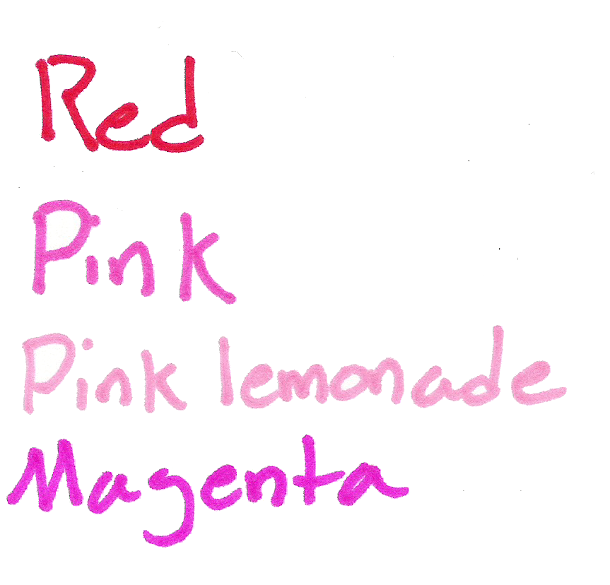
Pink – The pink is also a bit like a rose, not getting quite to the obnoxious hot pink style, but still bright and visible. It’s not the most natural color, but it does separate things out from the crowd. Bleeding is again medium, feathering and shading are a bit more pronounced than on the regular red, though.

Pink Lemonade – Pink lemonade is indeed the color of pink lemonade, or of a pink crayon or candle (something wax). It’s not unpleasing, but it’s also not a color I would keep coming back to. It’s fairy flat and doesn’t really pop out, but is differentiatable. Bleed-through and feathering are pretty bad, and shading is noticeable, though not too much.

Magenta – And now for the final color I’m a bit dubious about. I think it’s magenta. It’s a very deep pinkish color (should I say again like a rose? Roses occur in so many colors) which I can’t find many natural parallels to, nor any really solid work applications. It does look pretty (I guess) but that’s about it. Bleed-though and feathering are terrible with this one, but no shading is evident.

And that’s the reds. They look like flowers, and don’t work well at the stereotypical workplace. They work for organizing, but have some pretty extreme properties. They’re certainly the most eye-catching of the bunch (other than yellow).

Next week I’ll look at the Oranges (and yellow)

Review – Sharpie Colors Part 4 Purples – Purple, Berry, Boysenberry, and Lilac

All right, now it’s time for part 4 of my look at many of the Sharpie Colors. This time it’ll be the purple-ish set I’m looking at, so let’s get to it.

photo-96

Purple – The standard purple color is a very dark purple that looks much like the stereotypical purple. It looks almost bright enough to be some of the darker purple flowers, or a very near-night sky. It doesn’t have many applications in most workplaces either, and its darkness could make it hard to read. It’s middle of the road on bleed, through, for Sharpies, and almost doesn’t feather or shade, making it a pretty good all around color to use around the house.

sharpie colors purples

Berry – Berry certainly lives up to its name and provides a very reddish purple that is very similar to berry juice. It doesn’t have many other natural applications, though. It is bright and visible, with minimal bleeding, shading, and feathering. It’s a very good organizational color even if it might not be that work-friendly.

Boysenberry – This color is an interesting one. It’s a lighter, reddish purple that is akin to the fruit from which it takes its name. It is a much more appealing purple color and is useful in many situations. It’s prone to bleeding, but feathering and shading are minimal. I like it a lot, but it isn’t the most useful color.

Lilac – Lilac is a light, bluish purple. It is very similar to the flower and many other natural shades. It is bright and easy to read, but a bit unprofessional. It’s not bleed- or feathering-prone, but it shades a bit. It’s a nice looking color, and artistically or organizationally useful, but not really for a work environment.

And those are the purples. I like the colors, but they tend to be less useful. It’s just hard to find applications other than organization. But they work very well. Next week I’ll be looking at the various red colors I have.

Review – Sharpie Colors Part 1 Neutrals – Black, Brown, Slate Gray

I’ve taken a look at several of Sharpie’s products in the past, from their regular markers to pens and liquid pencil. But their main product comes in a large variety of colors I have not yet covered. I received a gift of a set of 24 Sharpie pens some time ago, but haven’t looked at them until now due to the fact that I didn’t know what the colors actually were. Sharpie and several other well-known pen brands are notorious for not having their colors easy to identify, so this series took more research than usual. I will say that I might not have identified all of the colors correctly, so if you see something that seems like it has been misidentified here, please leave a comment and I will reevaluate it.

With that said, let’s get to the pens.

photo-96

The first set I’m going to look at is the neutrals. There are only a few, which makes sense. But these are some of the most useful: they show on many surfaces, are not an eyesore in general, and are workplace appropriate.

sharpie colors neutrals

Black – Black is the gold standard Sharpie color (except for the actual gold ones) and it is very good. It is quite dark and professional. It does have a tendency to shade as most dark inks do, but if gone over a second time there are no problems. It’s pretty waterproof (they all are so I won’t mention that again), has almost no spreading or feathering, and is tied for the least show/bleed-through with navy. It’s a great, well writing color, but it can be a bit dry.

Brown – Next is brown, a color that doesn’t seem that popular (but I’ve ended up with a few, take that as you will). It is a very dark brown, distinct from black in even poor lighting, but it looks more like a gray in that case. It is also fairly dry, and thus feather- and bleed-resistant, though not as much as the black. It’s good for sorting, but not for art, really.

Slate Gray – I don’t know where the trend of having “slate gray” be standard gray started, but it continues here. This is a “just over the dark line” gray. It’s not a very natural color, and isn’t even something you’d really see in a city. It is very wet and really does feather and bleed, meaning it’s not the greatest for use on thinner paper. It is almost the same on both sides in that case, and it even goes through card stock a bit. I’d say it holds the title as wettest, and is just a boring color.

And that’s the neutral colors. They’re good for office use, and for sorting things by color, but for art applications they are limited. Next time I’ll take a look at a few of the blues Sharpie offers.

Review – Expo Ultra Fine Red, Green, and Blue

Last week I looked at the Ultra-Fine Expo markers as a whole, and the black color specifically. This week I’ll look at the more common colors in most dry-erase ranges in this size and brand, and see how they work.

photo-52

Red- The color red is a problem with many pens, and dry-erase markers are no exception. The red goes on smoothly enough, and is one of the thinner “sticking” inks. The lines it makes are solid, but the shading and their thin-ness is more pronounced. The color is also quite washed out and pink, which I’m not really a fan of, but seems to be a theme in reds.

Green- The green is one of the thicker and smoother colors. The lines are bold and solid. But the color, while pleasant, is also washed out. While it is definitely in the green spectrum, it’s more of a sea-green or something similar.

Blue- And finally the blue. In writing characteristics, it’s more of a mixture between the other two. The lines aren’t as bold or thick, and it’s not quite as smooth as green, but more so than red. The color is the most true and least shading of the bunch. It goes well with the black, and is easy to read even from far away, though it isn’t too dark.

The first set of colors is standard, and while lackluster, they get the job done. I can’t really complain as they weren’t created with art in mind, but rather for ease of use and low odor, which they have. Next week I’ll take a look at some of the less-standard colors available in the lineup.

Review – PaperMate Flair Colors – Maroon, Brown, Caramel, and Grey

And now it is time for the final part of my look at the 20 colors of the Papermate Flair pen. This section only has 4 pens, and it’s special because I couldn’t find names for these colors from any official source. So the 4 names presented here are just what I think most represent the colors. Let’s get started and wrap this up.

Papermate flair colors part 4

Maroon – I love a good maroon shade, and this one does not disappoint. It’s easy enough to tell, even amongst other dark colors, what it is, and the tone is nice to look at. It might not be the most natural maroon I’ve seen, but it’s quite good, and sometimes it may even be work compliant. It doesn’t smear much but it’s not the best at resisting water, either.

Brown – The brown is a nice dark, UPS, brown. It doesn’t quite look like dirt, more like bark, and it barely smears. It’s easy on the eyes, blends in with dark colors, and could work in some office settings.

Caramel (error in image where this is labeled as Sepia and Micron Colors are switched) – Caramel is the color I’ve had the hardest time naming. I just don’t really get this light brown. It looks fairly standards, but it’s a bit off from the browns in Micron, Crayola, Pilot, and other such brands. It looks all right, but not the most natural, and most workspaces wouldn’t appreciate it. Although smearing is next to none.

Grey – And the final color is also one of the most boring. Grey is a color I love that isn’t featured in many color sets. And that’s because there isn’t much use for it. In nature I can only think of fog, and in an office only if you convince them it’s just your black pen running out. That being said, it’s a nice dark, even grey with very minimal smudging and feathering.

And there we are, the 20 current colors of the Papermate Flair. I do like them, and even some of the more garish colors are better in these sets than others. There’s a good mix of water resistance, workspace appropriateness, and personality in there. And I would recommend the set if you like tones of colors and like the Flair. But it’s a bit expensive and maybe one should consider the smaller sets if they want specific colors.

Review – PaperMate Flair Colors – Olive, Lilac, Navy, Plum, and Turquoise

And now for part 3 of my look at the 20 colors of Papermate Flair pens. This time I’ll be looking at five of the cooler colors in the lineup. I’ll just get started.

Papermate flair colors part 3

Olive – Olive is a nice green, forest-y color that looks quite natural and is very pleasant. It is quite conservative and laid back. One might be able to get away with using it at an office, but it’s unlikely. In poor lighting it almost blends in with dark blues and blacks, though. On the smearing side it’s one of the worst, easily smearing and becoming unreadable with contact with water.

Lilac – It’s a light purplish color that is smooth and quite easy to look at. It wouldn’t be appropriate in most offices, but in many a field of flowers there are similar colors. The color looks almost washed out before water is applied, but it smears and feathers probably the least out of the entire set.

Navy – Navy is a very dark, office-appropriate blue that goes well in most places. Artistically, it would be most at home in the dark, but there may be other applications. It does smear, but very little, and it is often readable afterwards. The main problem when water is applied is that there is so much pigment that it covers a wide area with a bluish tinge.

Plum – A bit off from most of the fruit I’ve seen, this plum is a dark, red-ish, purple color. It could pass for a plum still, just not one from a supermarket. It could also make its home in an office for a bit of fun, but not for everything. It bleeds, feathers, and smears pretty badly, but does stay mostly readable.

Turquoise – Turquoise is a nice color at points, but it shades quite a bit, and the color variation can at times be unpleasant. It’s a good sky, but doesn’t look like the stone, and going over it multiple times will turn it into more of an aquamarine. If your work doesn’t have a problem with blue, it should still work. With a wipe from water nothing changes, but if left for a few moments the color dissolves completely and is unreadable.

And that’s it for part 3. These colors are some of my favorites in the set, and much more usable than their warm counterparts. Next time I’ll be taking a look at the remaining 4 pens, which aren’t officially named anywhere I can find.

Review – PaperMate Flair Colors – Orange, Lime, Magenta, Marigold, and Pink

Now it’s time for part two of my look at the 20 colors of the Papermate Flair. This section of five is the “Warm” colors section. Mostly some normal colors here, but a few out-liars. Nothing too crazy.

Papermate flair colors part 2

This scan didn’t work the best


Orange – The orange is a deep, red-ish orange that is surprisingly natural looking. It’s very subdued, but noticeable, good for organization, but not for documents. It’s dark enough that it can be read at a glance. It fades significantly, but doesn’t really smear when wet.

Lime – The lime likely has the most variance in color, when written with fast it is a surprisingly standard bright lime color, but when taken slowly it is rather dark and subdued. It wouldn’t make a great office color but it is less harsh than a normal lime green, and the variances in tone make it good for art. Another plus is water hardly affects it.

Magenta – I find magenta colors had to classify, this one is pretty, nice to look at, and readable. It wouldn’t suit the office well but it does look like I could see it out my window. Heavy bleeding and smearing when wet with this one.

Marigold – At first glance this pen looks like another yellow, which it is, but much less harsh and more readable. It has a tinge of orange that is very pleasant and flower-like. There’s a lot of smearing, but almost no fading when exposed to water. Perhaps it could be used as an alternative to red to use when marking something important. Just as noticeable, but less aggressive.

Pink – I don’t like this color, it’s a hot-ish pink, not blinding, but not pleasant. It’s standard all things considered, it barely moves when wet and is inappropriate for anything but personal organizing. I’m not judging you if you like it, but I won’t be using if for anything.

And that’s part two. I like the warm colors, but I struggle to find uses for them. Next time I’ll take a look at five more, but this time “Cool” colors.

Review – Zebra Sarasa Colors – Hunter, Fuchsia, Cobalt, Light Green, and Violet

After the first five colors in the ten-color pack of Zebra Sarasa pens, the colors get a bit less conventional and a bit more extreme. Let’s look at the Zebra colors Hunter, Fuchsia, Cobalt, Light Green, and Violet.

zebra sarasa colors 2

First Hunter, which is a dark bluish-green, a bit more blue than usual hunter greens, which seem a bit warmer. The color is very deep, and in some places could easily be work-friendly. It is a very natural color and could easily fit an artist’s needs for a deep green. It lifts the most when exposed to water, but like the rest of the colors here, it doesn’t really budge to smear once it dries.

Next Fuchsia, which I’d call rose, but that’s just me. It sits on the fence for me between a deep pink and a light purple. I can’t really tell which it is. As far as either one goes, though, it is a very appealing color that, unlike other pinks or light purples, doesn’t hurt the eyes. It’s more of a flower color than anything else.

Third is Cobalt, which is a very grey blue, though I’m almost tempted to say it’s the other way around. It’s a dark and dim color that gives off a wintery feeling. Artists could find a use for it in many winter themes and its color is just subdued enough that it would likely be a good office companion and still let you stick out.

Fourth Light Green, which is almost lime. It hurts the eyes a little, but it isn’t terrible. I’ve certainly seen worse. It doesn’t look very natural, and it’s slightly hard to read. It might make a good color for marking mistakes, but otherwise its uses are limited.

And finally, Violet, which is bright and indisputably purple. It’s a flowery purple and that’s the only really natural parallel that I can think of. It also might not be work-appropriate because of its brightness. But it is superb in readability, not dark enough to blend in in low light, and not light enough to disappear on the paper. For casual writing, this one would be a keeper.

And that’s it for the ten pack of Zebra Sarasa Gel pens, I think they’re great little things, with an interesting color set in which some aren’t often seen, let alone this common. They’re nice inks, and I’d go for them if you like the pen.

Review – Zebra Sarasa Colors Black, Blue, Red, Navy, Mahogany

I’ve talked about the Zebra Sarasa before, and it’s an alright gel pen. The saving grace of many gel pens is that most come in a variety of colors at least partially unique to them, and the Sarasa is no exception there. Let’s take a look at a few of the colors.

The colors are always a bit off in the digital space

The colors are always a bit off in the digital space

First, Black. It’s a cool black that covers well. It works in an office setting and generally doesn’t get lighter even with minimal pressure. I’d say it’s black almost as soon as it gets on the page. The drying time is moderate and it’s water smudge-able.

Next, Blue.  The blue is quite dark, darker than most office-type blue colors. This makes it easier to read and more professional. It’s also natural looking, more like a deep sea-blue than an in-between blue that doesn’t really exist in nature. It’s the least smudge-prone of the bunch, but that won’t entirely stop it from lifting off the page.

Third, Red. It is a bland red, with no real pop to it. Though it is brighter than some of the competition, it isn’t really eye hurting. It’s quite noticeable and quite red but has no character — and no real flaws, either. It’s the color that fades the most when exposed to water.

Now, Navy.  Navy is a very deep, dark blue. It’s really almost black. You’d need a good light on to tell which one is which, though you could tell that black and navy are different colors with minimal light. It’s a wonderful dark color that is almost soothing and quite free flowing.

Finally (for this set), Mahogany.  It is really more like maroon. It’s a slightly purplish red which is also very dark and quite nice. It is much more noticeable than the navy, and still quite natural, giving an almost brown appearance from far away. It’s probably my favorite of the five, though the one with the fewest applications, and while you might get away with it at the office, it could be a hard sell. Unless you work for Texas A&M University.

That’s the five colors for this week. Next time I’ll be looking at the other five colors in the standard ten color pack.

Review – Bic Stic Colors Pink, Purple, Lime, and Light Blue

The Bic Round Stic is an iconic pen. Not so much as the Bic Cristal, but still quite well known. It is a fairly robust pen, but usually one of few colors. The pen usually comes in the four standard colors: black and RGB. With some hunting, though, one can find more exotic colors, like the ones I will be talking about today: the pink, lime, purple, and sky blue colors.

20140924-022123.jpg

First up is the pink, which is a nice color. It certainly isn’t hot pink, which I despise. It covers well and writes smoothly. It’s fairly dark but still quite pink, though not a very natural pink. It’s the kind that could really only be seen from an ink like this and not anywhere else.

Next is the light (sky) blue, which writes smoothly, but has many little imperfections in the line. It just doesn’t cover well. The color is fantastic, though. It can be a bit hard to see at times but it’s quite pleasant to look at and not particularly eye straining. It is most like the colors at the edges of a clear body of water or the sky closer to the sun, so rare, but not unheard of in nature.

A bit altered in editing

A bit altered in editing, but a good representation

On to the lime, which is by far the hardest to read of the group. And it has some startup and writing problems, though when you get it working it does write smoothly. On the paper, the green is so light as to be unreadable in many cases and can cause eye strain. Though I call it lime, it really is much lighter and closer to… well, nothing that I can think of.

And finally, the purple, which is the best in terms of pen quality. It has no startup issues, writes smoothly, and covers well. It is darker than the blue but not by much, and still would require a second glance to read from far away. That being said, it is a very pleasant color to look at and is great for use when a more standard office color is not necessary. The color would be a rare one to find in the wild, though.

Overall, for writing these pens are hit and miss, and for art they are also hit and miss. The purple and blue are the best. I wouldn’t even try to use the lime. If you’re looking for some way to make your writing more unique, there are other Bic sets out there for that (like an entire box of the purple) and the same goes for any type of art that you might be making, unless it requires some very specific colors