Review – Kikkerland Retro Ballpoint and Stylus

A while ago, I reviewed the Bic Tech Ballpoint and Stylus pen. That was one of the first pen/stylus combinations I encountered that were actually purchasable for me (I live in the middle of nowhere). Recently another of the same type of pen was given to me: the Kikkerland Retro Ballpoint and Stylus. And I like these types of pens, so let’s see how this one preforms.

20140729-234916.jpg

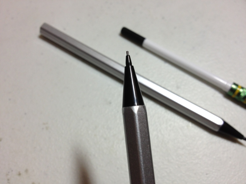
The style of the pen is “retro” and it comes in three color combinations, two of which I wouldn’t consider using, while I think the third, red and grey, looks quite nice. The pen is fairly torpedo shaped, with both ends tapering down and the widest point being in the center, where there is a small center ring that divides the two body colors and metal sections. There is an almost unusably tight clip that says Kikkerland near the top, followed by a small ring with the smallish stylus point on top. Beyond that, there is no information or other markings on the pen. The paint is plain and smooth, slick enough that it almost slides out of the hand at times, but durable.

20140729-234922.jpg

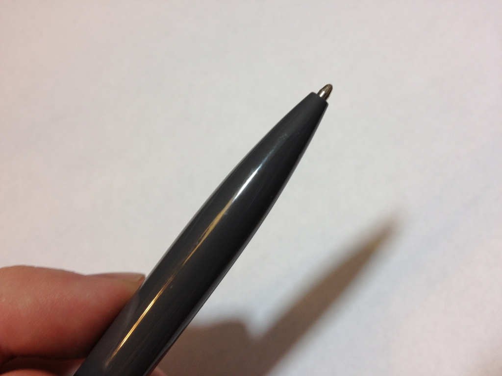
The mechanism is a twist one. It is quite smooth, almost too smooth, as pushing too hard on the pen may reverse the action. The default refill is a Cross type in medium, I’d likely buy Cross refills myself. The pen writes rather smoothly and has little in the way of startup problems, but a bit in the way of blobbing problems. It is good for short notes, but for longer writing likes to smudge and blob. It is, like most ballpoint inks, fairly water resistant.

20140729-234927.jpg

Flipping the pen around gets you to the stylus which is a bit smaller and more precise than the Bic one mentioned earlier. It is still slightly mushy and I think these smaller styluses need work before I will thoroughly enjoy using one, but this is the most responsive one I’ve tried. Again, there are a few problems, but I have no difficulties using this to operate my phone, and carrying it around to jot down ideas in Adobe Ideas.

Overall, the pen is on par and the stylus is slightly above-average. I’d make sure the colors and styles work for you before getting it, and replace the cartridge with a Cross refill. After that, it should easily serve well. The metal in the body is sturdy and the paint resists chipping, though it does chip near the tip. It isn’t the greatest pen ever, and it won’t last forever, but it is certainly better than much of the competition for not a bad price.

Review – Ticonderoga Sensematic

Have you ever been using a mechanical pencil and thought it was too much of a hassle to push the button before writing more? If so (Dixon) Ticonderoga claims to have you covered, with the Ticonderoga Sensematic self-advancing pencil.

20140716-000810.jpg

The body of the pencil looks like a standard pencil, but is a bit shorter. It has hexagonal sides, and a standard eraser with a metal attachment point, which screws out and contains extra lead to refill the pencil with. The tip is conical, and contains the self-advancing mechanism, from which the lead sticks out a bit.

20140716-000815.jpg

The lead is a standard HB (#2) and is nothing really special, so I won’t say much more other than it works. The real thing to talk about is the mechanism, which the box says one can simply “just write” with and the lead will advance automatically. And, in my experience so far, this is true. I haven’t had to change anything in my writing to make it work: it just does, making it quite a handy little thing. Now it doesn’t have a very long advance, so there isn’t much lead to work with, but for writing and some sketching that isn’t a problem at all. The mechanism works by having what is essentially a click-advance near the top of the exposed lead, and when it is pushed back more lead is exposed and then locked into place. This means that there could be instances where writing stops, but this could be easily solved by rotating the pencil.

Overall, this is a great idea with good execution. I quite like it but since the erasers aren’t replaceable and the mechanism feels a bit plastic-y I’d say they won’t last forever. But they will last at least as long as a regular pencil, with much less of a hassle, so I’d say it’s a win.

Review – Bic Atlantis Ballpoint and 0.7mm Pencil

Bic is one of the most prominent manufacturers of cheap pens and pencils (and other necessary cheap plastic things). They have several lines of pens and pencils, some as expensive as a dime and some a bit more. The Bic Atlantis is a set of pencils and pens in various colors, which happen to be called the same thing. Today I’ll be taking a look at the Blue ballpoint and the 0.7mm mechanical pencil.

20140716-000746.jpg

Despite sharing a name, the pen and pencil don’t share bodies. They do have similar styling that can be described in the same way, with the pencil being slightly thicker and a bit longer. Starting from the tip, there is a small cone, metal on the pencil, plastic on the pen. This is followed by a thin, hard rubber grip which is all right, but might as well not be there, in my opinion. Within the grip it is a clear plastic wave in the pen, while the wave is impressed into the grip of the pencil. The barrel is relatively smooth and has all necessary information. Neither have a way to twist open the barrel, but around the clip both can be opened and the insides removed (the pen is glued). Above that is the clip, which is quite different on each. The pen is a very firm, stiff piece of metal, while the pencil is much more loose and is wrapped over into the plastic body. On the top is a clicking mechanism. The pen is surprisingly quiet and unsatisfying. You’d never know it clicked if you closed your eyes, but it works well. The pencil has an eraser and a cap on it, the eraser can be removed to allow the pencil to be refilled, and the clicking works well. So both are quite different, but they are similar enough to be in the same category.

20140716-000752.jpg

The pen gives a very fine line, which is quite smooth. However like most “smooth” ballpoints it tends to blob often and pick up paper fibers. The color is also, like most ballpoints, quite waterproof, meaning it won’t run without being completely and utterly soaked. The pens can technically be refilled, but they aren’t supposed to be. The pencil is standard 0.7 and HB, meaning it is smooth but not too smooth. They also have a retractable metal tip to prevent the inside of pockets and bags from being torn, and there is a spring which prevents the lead from breaking due to excessive pressure. I honestly think that HB (#2) is a bit too soft, but for most writing and sketching purposes it does quite well.

20140716-000800.jpg

Overall the Bic Atlantis set is very lopsided. The pen is standard fare and not really worth much. It doesn’t do anything better than anything else in the price range, though they are quite cheap. The pencils are twice as expensive, at least, but are much more worth it. They come with extra lead and erasers, and the spring and cover mechanisms for saving the eraser and lead are almost unique for the price. It’s a great little thing that I quite enjoy using. And it might become a sketching mainstay.

Review – Pentel Quicker Clicker 0.5mm Mechanical Pencil

Two weeks ago I reviewed the Pentel Champ mechanical pencil. Maybe that’s great and works for you, but let’s take a look at something a bit upgraded: the Pentel Quicker Clicker mechanical pencils.

20140708-230846.jpg

Starting from the back of the pencil, there is a small piece of plastic with a few breathing holes to cover the eraser, which is a fairly standard, white, mechanical pencil eraser. Following that is the metal clip, which is really clip-y and will make sure this thing stays put without ripping your shirt when you take it out. Engraved at the top of this clip is all the pen’s information. It’s a little less information than I would like, but it is all the necessary stuff. Past that is a slightly smoky tube which is quite thick, and contains all of the remaining leads and has them easily visible. The grip is next, which is a hard-type rubber with small wave-ridges, making quite a comfortable grip. Inlaid in this grip is a small side-advance lever that is made of plastic but feels very solid. The front of the pencil is a small plastic cone that is slightly smoky like the barrel, with a small, thin metal tube the lead will feed through. There is, unfortunately, no method of preventing the lead from breaking.

20140708-230853.jpg

The lead is 0.5mm and comes standard in HB. This hardness is the same as a No. 2 pencil. There really isn’t much to say about it: it is a high quality lead that resists breaking to some degree and goes on the paper smoothly. It is a little bit soft for me, and I feel that the line variations caused by varying pressure on the pencil happen a little too quickly for me to enjoy it as a daily writer, but as a sketcher it is great, depending on what you prefer. It definitely isn’t as soft as some would like, or quite as hard as some others (me) would like, but it gets the job done well.

Overall, the Pentel Quicker Clicker is a nice little mechanical pencil for a low-medium price. The side-advancing feed is great for not accidentally advancing the feed while erasing, and makes it more efficient to advance the lead and write faster. The lead, clip, and eraser are all serviceable, making the slim metal tip that allows lead to be easily broken the only detractor from the overall package.

Review – Sharpie Twin Tip Fine/Ultra Fine

I like permanent markers, and Sharpies are some of the best. But there are many situations where the tip of a fine Sharpie is simply much to broad. Carrying around a second sharpie in extra-fine seems like a hassle, or vise-versa depending on which size one uses more. The people at Sharpie (Sanford (Rubbermaid)) must have figured this out at some point and so they now have multiple point Sharpies. Let’s take a look at the Fine/Ultra Fine version.

20140702-004910.jpg

The body of the pen is quite like a regular fine-point Sharpie. The cap is slick with a flimsily little plastic clip built in. The body is made out of a similar material and has the necessary information printed on it. Where there would usually be a rounded-off end on a normal Sharpie, there is instead a tiny cap that has a set of spines, and is much easier to grip than the other end. Pulling either cap off reveals a slick section that is nearly identical to regular Sharpie Fines and Ultra Fines. These sections are not quite slippery enough to have the pen fall out of one’s hands during normal usage. The larger cap posts very easily on the smaller one, but in a very well-thought-out design choice, the larger cap has several small studs that allow the smaller cap to in effect be posted. This doesn’t hold the cap in the most secure manner possible, but is better than the alternative of nothing.

20140702-004916.jpg

The tips are fairly standard. The Fine is slightly larger than a Micron 08 or about 1mm, the Ultra Fine is about 1/2 mm or about the size of a Micron 05. Both of these are large for standard writing, but for writing on boxes, other large spaces, or some drawing they are superb. The ink is standard Sharpie fare: a cold, deep black (when the marker runs dry it becomes a much warmer color) that covers well, but not the best. It is permanent and run-resistant, it stains clothes and is unpleasant on the skin. It is non-toxic for normal use, but heavily sniffing or eating would be cause for concern. Just be normal with your normal usage.

Is it worth it to get a pen with two tips? Yes, if you find a need for both. I’d suggest going with the fine more often, as the ultra fine tends to dry up faster with its smaller cap. But there is still a good amount of utility there. The thing is easy to use, and works really well. Moving, signing, warehousing, and large art pieces are where these will find their homes. And really, for a nice black permanent marker, there are few that match and none that are better.

Review – Pentel Champ 0.5mm

I haven’t touched mechanical pencils much, just because I don’t use them very much. But mechanical pencils can obviously be quite handy, and their very consistent line makes them ideal for several styles of drawing. This time I’ll be looking at one of the cheapest offerings, the Pentel Champ in 0.5mm.

20140624-231744.jpg

The body of the Champ is a simple, translucent plastic of various colors. It’s cylindrical, save for the cone leading to the point, and a rather large rubber grip. The back is a reversed cone with a clip that’s alright, and an eraser. Obviously, this part clicks down in quite a smooth action, though lead is not dispensed with every stroke: sometimes a few beats are missed. At the very end is an eraser, which works quite well, as much as one would expect. It’s not perfect, but it removes enough lead to be worthwhile to use. On the side of the barrel is all relevant information, though it seems that it would wear off easily. The lengthy grip is noteworthy on some models, like the one I have, in that is is made of many tiny fins, which are much more comfortable and accommodating in my opinion than standard solid rubber grips, and no less grippy. It holds better in the hand than any other gripped utensil I’ve used, but I’m not really a fan of grips anyway.

20140624-231751.jpg


The lead provided is HB, so standard number 2, but it feels a bit soft (my package also came with 24 lead refills). It is still quite hard and writes wonderfully. I like a mid-range pencil, maybe a bit on the hard side, and this delivers. Like I said, it feels a bit softer than I usually deal with, but that might just be the mechanical pencil thing. Writing is smooth with very few hiccups or scratches. The lead isn’t too prone to breaking but breaking is unavoidable in this type of pencil. And, as previously mentioned, sometimes the mechanism doesn’t want to function.

Overall, the Pentel Champ is quite a champ for what it is: a tiny mechanical pencil more suited for school and office work. But it performs quite well in all situations. A good starting pencil in both 0.5 and 0.7mm, though I prefer 0.5mm.

Review – Uni-Ball Vision Elite Bold Black, Blue, and Red

When looking at the Pilot Precise two weeks ago, it occurred to me that there might be people who don’t have Pilot pens available, or don’t like them, so I looked into a different set of pens that have similar features. And I found the Uni-Ball Vision Elite Bold, in Black, Red, and Blue.

20140618-005609.jpg

The body and cap are simple and smooth, with a nice white-to-grey fade, a conical top, and a rounded bottom. The clip is metal with a few divots and is very tight. The top of the cap has the color of the ink and there are a few windows below to allow you to see the feed. On the barrel, the brand is stated twice and the model once, but there is no size information. Removing the cap exposes a transparent yet grip-covered feed, and the conical tip to a standard metal roller-ball point.

20140618-005616.jpg

The three inks aren’t too special in properties. The black is a thick, nice color. It is a warm black, fairly formal, etc. The bold line on all of these pens is enough to bleed through on cheaper copier paper, but the ink dries surprisingly fast. The blue is a dark blue, again fairly formal. It’s almost a navy or a blue-black color and it works well in most situations. I’d say it’d even work well for some artistic endeavors. The red is fairly bright and red, but it isn’t eye-hurting. It is a very deep, nice color, but it could still be considered aggressive. It is also good enough to have some artistic potential.

20140618-005621.jpg

The point is nice, and it writes smoothly, especially in the bold I have here. There is a lot of line variation, though, meaning drawing is a bit harder (or easier, depending on how you look at it). Like I said, there is some bleed-through, but not much. The writing is dry almost instantly from when I pick up the pen, which is amazing and leads to a much smoother writing experience.

Overall, the Uni-Ball Vision Elite is a great little roller-ball with quite a few office applications. The colors are nice without being overbearing, and the writing experience is fast and clean. Artistically they are limited, having little line consistency, but on the color side they have potential. They’re a nice set of pens.


Comparison – Pilot Varsity Old vs New

If you’re looking for a fountain pen but don’t want to purchase something expensive or something you have to fiddle with, then a disposable fountain pen might be the way for you to go. And If you’ve tried before with the most common disposable fountain pen, the Pilot Varsity, and are looking to get another one, you may have seen the slight changes they’ve made to the design. Are these changes that big a deal? Well, let’s find out.

20140613-003203.jpg

The Pilot Varsity has a simple cylindrical barrel and cap, with nice, simply rounded finials. Printed on the barrel is “Pilot Varsity” and a design, but no further information. Both pens have this printed on them. While the old design is straight lines on a tasteful silver with a tiny ink window, the newer version features a multi-tone diamond pattern with a worked in, barley visible, ink window. The cap has a cheap plastic clip with a ball on the end that does tolerably, but is far from the best. Just don’t turn yourself upside down with this pen in your pocket. Taking off the cap reveals the clear section and the plastic feed. One can see if there is ink in the feed, but not in the barrel except through quasi-ink-windows printed in the design. The feed is simple, and has a wick, which allows for better ink flow, but would not be ideal for cleaning (which you wouldn’t be doing anyway if you were just going to throw it away.)

20140613-003210.jpg

The nib at the end of the pen is again simple. It is stamped “Pilot <M>” (medium) and has no further ornamentation, not even a breather hole. It is stainless steel, and offers no flexibility in the tines. Now, one might think that since they’re both stamped medium, that both pens would have roughly the same line width; and this would strangely be wrong. At least on the example I have, the older Varsity has a line more akin to a fat medium, or a particularly skinny broad, while the newer example is more of a fat fine, or a sorta skinny medium. If this is indeed a purposeful change that was made, I’m guessing it was for the American market to prevent bleed-through on the extra-crappy paper here, which it does do. This size difference definitely doesn’t affect the nib performance, though. Both nibs are buttery smooth, have no startup issues, and write under no pressure. The ink is the standard Pilot black, and there is nothing different between the two pens that I can discern (and neither are at all waterproof).

So, which one should you get? Well, it really doesn’t matter. If you really want a fat medium nib disposable (well, kinda, you can look up how to refill it online) you can hunt down some of the old ones, which I personally like better due to purely aesthetic reasons. The new one is a bit more loud and silly, and a bit finer in line, but you’d be really hard-pressed to tell that unless you were looking like I was.

Review – Pilot Precise v5 Black, Blue, and Red

Times are tough if one wants to write smoothly and precisely on a budget. Technical pens wear out fast, and fountain pens cost money and time to maintain. I use both, but sometimes I just want to write easily and precisely without all of the maintenance and hassle. This is where the Pilot Precise series of pens come in. Today I’ll be looking at the v5 set in black, red, and blue.

20140603-232945.jpg

The cap and barrel are simple and straight. The cap has nothing on it but a simple metal clip that does its job well but can bend easily. The barrel has the necessary info about the product and an ink window so that if ink starts to run low you can get a general idea. Removing the cap shows a transparent section and feed system, which is more for being cool looking than any sort of functionality regarding ink level. At the end of the section is a series of plastic step downs that lead to a metal rolling ball tip. At the bottom of the section is a small clear plastic window that allows one to easily see if there is little or no ink left in the pen. The transparent section and barrel are both a slick plastic, but provide enough surface area that slipping off or letting go of the pen is not an issue.

20140603-232950.jpg

The tips of the pens write fairly smoothly. Older ones get a bit stiffer, but even on the extra-fine v5 they are never scratchy. The rolling ball delivers a nice “precise” line to the paper. Although it does have more variation than a technical pen in width, it has less than a standard ballpoint does, and it doesn’t blob. Like I said, writing is smooth: almost as smooth as a fountain pen, but not quite there. I’d say they are wonderful for writing (especially if ballpoints cramp one’s hands) but are not as good for drawing. Still better than a ballpoint, though.

20140603-232940.jpg

The three colors I have are Black, Blue, and Red: fairly standard colors with a fairly standard execution. The black is a warm black (this is an older pen, and Pilot may have changed formulas. The other two are brand new.) and noticeably less saturated than the thicker v7. The blue is quite dark, darker than most other Pilot inks, and quite work-appropriate. It’s almost a deep water blue, but not quite as dark as, say, Bic blue. The red is bright, bright to the point of being aggressive. Don’t grade papers with it unless you really want to say they’re wrong. It shows up almost from across the room and is quite a contrast to the deep red body of the pen. I’d say it has the fewest practical applications of the bunch. All of these inks are liquid-based and soak into the paper, meaning that they take a bit of moisture to run, but when they do they never stop. The red is the worst in this case.

In the end I’d say simply that these pens are great for writing, and all right for drawing. They aren’t the best but are great and ubiquitous for what they are.


Review – Plaid 10 Detail Brush Set

Well, while perusing my archives, I found a review of Testor’s plastic cement. And that is when I realized I have a whole set of Modeling stuff that I would count as art supplies. So today I’ll be looking at some of those, starting with one of the cheapest and most universal things, a Plaid 10-piece detail brush set.

20140527-232159.jpg
This will be general and cover only the quality of the brushes and not the individual brushes themselves, which might be covered in future installments. First off, the bodies are made of cheap wood that is poorly painted with quite good lettering telling you what everything is. There is a brass-colored section near the end, and some very ugly orange bristles pointing out of it. The section and body are quite sturdy for their thickness and not at all slippery, but not too nice in the hand either.

20140527-232204.jpg
The bristles themselves are all right. As previously stated, they are an ugly orange, which doesn’t really matter too much. They are synthetic and have a bit of pop to them, which I like, but others might not. At first they are quite soft and strong, but they may easily become frayed and bent. This is more of a problem with individual bristles and not the brush as a whole. This makes it difficult to get a good edge when you paint, until you cut the offending bristle out of the brush. The brush’s life is likely shorter than most brushes (considering they are sold in Wal-Mart), but, honestly, for the price they work very well. They get floppy pretty quick (which some people might prefer) and they do wear out shortly after that. But they have a lifespan the I’d expect for the price, and getting a 10-brush set this cheap is incredible. They’re even relatively hard to stain.

Overall, if you need only limited detailing done on paintings, or are looking to start painting models and miniatures, this is a great starter brush set. One might want to upgrade to a well-know brush brand later, or even to hair brushes, but for a starter set these are excellent.