Review – Leuchtturm 1917 Pocket Notebook

Notebooks again. Is Moleskine your style but you find the paper a little lacking? Well Leuchtturm claims to have you covered with the 1917 line of notebooks. Specifically I’m reviewing the black pocket (dot) hardcover version.

tumblr_mqsc926InY1rrdkoco1_500

Starting with the outside, the dimensions are nearly the same width- and thickness-wise as the Molsekine, but about half an inch taller. As the Field Notes and Clairefontaine pocket books are the same size (lacking thickness) you could compare it to them as well. The cover is in the black Moleskine style and is almost indistinguishable. It is also fairly flexible, something entirely absent in the Moleskine. It has an elastic band that feels slightly cheaper, but nonetheless works well. The most disappointing thing is the spine, which constantly creases, cracks and groans. The problems appears the be that the cover on the joints is separate from the binding. The binding does feel solid, so I don’t believe it will fail, but the spine will definitely encounter cosmetic damage with prolonged use.

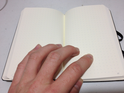
Inside there is a standard back pocket, an address and name blank, and several table of contents pages, helpful little things if I do say so. Also the last few (six) sheets can be torn out and are as such perforated. Each page is numbered and of course there’s a bookmark ribbon. It has about the same sheet count, and same page color as the Moleskine, but with better paper. The Leuchtturm has 80 gram paper that is supposedly ink resistant. I can say it is, I didn’t even get bleed-through with a flex pen. That being said, everything shows through to the point of being annoying, even a ballpoint pen. Only pencil makes for a clean, two-sided drawing experience. Though the paper, unfortunately, is not very smooth at all, especially not as much so as the Molsekine or Clairefontaine books. You’ll get a lot of feedback on this one. The rulings are all standard and nothing to write home about.

tumblr_mqsc9pB2EJ1rrdkoco1_500

So, how does the Leuchtturm perform? Well. It performs well. It’s cheaper than the completion and better in some ways. Most of these things are up to personal preference. I would say the binding is a little weak on this one, but other than that it’s up to par.

Review – Micron Rose, Brown, and Sepia Colors

So now we get to the final group of the Micron colors that came in the 8 pack of Micron colors. These are the weird or non-standard colors, in my opinion.

The first is Rose, which is a pink: they just call it Rose to make it fancy. It’s a very deep, pleasant, pink color, not like the very vibrant, in-your-face pinks that dominate what is considered pink these days. It doesn’t really approach purple, but it is darker than most roses I’ve ever seen. It’s surprisingly nature-y for a pink, though. It does have some problems with bleed-through on thin paper, but not a lot.

Next we have Brown, which I would call light brown. I would say it’s sort of a fertile, soft, earth color. Again, for a light color it’s fairly subdued, not like a Crayola pencil or anything. Again, it’s surprisingly real looking. It has no problems with bleed-through at all really, and goes well in a landscape.

Finally we have Sepia, which I call dark brown. It’s very mud-like. Another deep, saturated color. It can get very saturated though, and end up looking like black in the final product, so it does take careful application. It also tends to pool, resulting in spots of darker color. Some skill is required to get it to look right. Surprisingly, though, it has very little bleed-through even on thin paper.

micron color test 2.0

These ‘non-standard’ colors are very nice overall. If one is looking to do nature sketches, landscapes, etc. these are quite nice. They are very subdued and blend in nicely. I find them much more pleasant than the bright reds and blues of the other Microns. If you just want standard colors for organizing or technical things, these are not the pens you need.  However, if you’re drawing a lot of the outside, or in cool colors, these are fantastic.

Review – Micron Red, Blue, Purple, and Green colors

I have reviewed several Micron pens in the past. But in case you were wondering if they could add a little more color to your life, here are some Micron Colors in .05.

It is an eight-pen set of colors from Micron that I’m looking at. It includes black so that’s out. The first four colors I will look at are what I call the ‘standard’ colors. They are red, blue, green, and purple.

I have already talked about the blue and the red so I’ll cover those quickly first. These pens are larger than the ones I reviewed previously so the ink is a bit more saturated. They aren’t as glaringly red and blue as before, but they are still some of the brightest and most vibrant of their colors on the market, aside from the awful nano-liner. Getting this large also makes them more prone to bleed-through, of which there is a slight hint in the blue.

Next we have the purple, which, in the Micron style, is a very aggressive purple. It is very deep, and in low lighting could be mistaken for black. It is very highly saturated, and changes little to none when applying pressure for some time to just tapping it on the paper. Amazingly at this darkness it isn’t very prone to bleed-through.

Finally the green. This is, surprisingly, a fairly sedate green, falling in the middle of forest and lime. It is unmistakably green, but rather unremarkable. It doesn’t jump like the other inks in this set. It just sits there, making it rather like greens in real life which you have to look closely to appreciate. Again, surprisingly enough this color is the most prone to bleed-through in the entire set, even writing fairly fast it leaves dots on the other side of fairly thin paper.

micron color test 1.1

So overall the ‘standard’ colors in this Micron package are great. They’re not really the best for sketches of nature or the outside world, but for labeling and organizing they are great. For example, different color parts in a schematic. It’s nice to have colored pens around and these hold up the Micron standard. I can definitely find a use for them.

Review – Clairefontaine Staple Bound Pocket 3.5″ x 5.5″

There is a new contender in the pocket notebook category. Well, not new, but new to me. The Clairefontaine staple bound 9 X 14 cm pocket book. This is not really very comparable to the other two pocket books I’ve reviewed as it is much thicker, but it is still around the same size, so here we go. The book is twice as thick as a Field Notes book and about a millimeter wider, and the rounding on the corners is about the same.

20130709-235523.jpg

The cover is a fairly thick but flimsy card stock. There is a website URL, paper weight, dimensions, and page count listed on the back cover, and no other information save the logo. The inside cover is a simple white, while the outside is the standard Clairefontaine cover, which I consider to be fairly ugly. The cover also has a blank space which I assume is a subject line or a name space.

20130709-235529.jpg

Inside is 48 sheets of 90 gram Clairefontaine paper, which is superb. This is one of the few notebooks where the page count, rather than the sheet count, matters, as you can write on both sides, even with a fountain pen. The paper is lined with a 7mm ruling, a small margin at the top, and an infinitesimal margin at the bottom. The lines are a very pale purple and not at all intrusive. As far as I know they only come in a lined version at this size. Writing-wise, the paper is buttery smooth. Very easy to write on, but ink resistant enough to have little to no bleed through, except for the nano-liner which can bleed through tables it seems. The paper is also heavy, it takes effort to bend it along the spine to write with it, and once you have bent it, it stays there.

20130709-235534.jpg

Finally the binding: it’s bent over and squared with two staples each about a quarter of the way in. It seems far from the sturdiest binding, but it can take a fair amount of flex before buckling. Though with no support at the edges they do tend to get a little banged up. Because of its interesting folding style and large page count, the binding does seem a bit weak, in mine the staples aren’t even fully stapled, so pulling this book apart intentionally would be easy. But unintentionally it seems to hold up fine, more due to the paper than the binding. It will buckle and get bunged up at the edges, though. I’m skeptical about it’s ability to take some hard wear and tear for all 96 of its pages to be used.

20130709-235539.jpg

Overall this is a great little pocket book. I personally won’t use them as much as some other books because of the terrible, intrusive cover designs and its thickness. But for writing or drawing with fountain pens, dip pens, or ink brushes, this thing can’t be beat. It’s a great, sturdy little notebook with especially good paper.


Review – Noodler’s Nib Creeper Flex Pen

Fountain pens don’t particularly lend themselves to art. That’s more in the realm of brush and dip pens. But for the more artistically inclined fountain pen users, there are flex pens. Though most examples are ludicrously expensive, Noodler’s Ink brand has several flex pens at a reasonable price. Let’s see how the Noodler’s Nib Creeper Flex holds up to scrutiny.

20130704-232129.jpg

The one I personally have at hand is a plain black one. They come in all sorts of wonderful colors and you should really look into them if you’re thinking about buying one. The black itself is quite nice, though shiny enough that scratches are noticeable. The trim is a nice metal, not sure on the specifics but also shiny. The clip says “Noodler’s Ink” and rotates on the cap; it also does a very good job of holding the pen in a pocket. In the middle of the pen there are a few semi-transparent windows with which you can view your ink volume, though they are not the most accurate things. The cap unscrews to reveal more of the same design to the nib. Both the body and the cap are made of a nice plastic, which feels a little too light and smells a bit. But it is quite sturdy and the smell does subside.

The pen fills nicely by twisting the back all the way out and then down several times (to eliminate as much air as possible) while the nib is immersed in ink. The plunger mechanism unfortunately doesn’t come out like several other Noodler’s pens, or at least not easily. But the nib and feed can be removed simply by gripping them in the mid-section and pulling them out as they are friction fit into the pen. This allows for easy customization of the ink flow. It also allows for easier cleaning when changing inks.

Now to the nib and the actual writing. On paper the nib is wonderfully smooth. Not as smooth as a nice Cross or something similar, but up there. It flexes when pushed down, though not very easily. It does require some force, and at times feels like it may have problems, though these have never materialized for me. The thickness of the line varies depending on the nib and feed configuration. I would say it goes from about a Micron 01 (005 if you go really, really light) to just over a Micron 08 or about the size of the Micron Brush. After that it starts to railroad (split into two lines) even in the wettest of configurations. It also tends to write fairly dry, having a faster ink drying time and less bleed-though than other pens. But this is only minimal.

20130704-232148.jpg

Overall this is a very nice pen. If you’re looking for a sturdy brush replacement or just something to add some variation to drawings it may be the thing for you. For me it strains my had a little, and I prefer less variation in my line, which limits my use for it. But it is still a superb little pen, and a very good value. It can also double as a fancy signing pen, and a note pen. Just something to carry around. It’s great, and if you’re looking for a flex pen it’s definitely the place to start.


Notebook Showdown – Moleskine Cahier Vs Field Notes

So another notebook competition today, huh? This time I’ll be comparing the higher end of the pocket book spectrum. It’s time for Field Notes to go head to head with Moleskine Cahiers.

20130628-000028.jpg

Starting with the covers the Moleskine is a very heavy, single color, piece of cardboard with an imprinted logo on the back. It’s got a flap on the back that folds in and serves as the famous Moleskine pocket. This pocket is not very well secured by the glue and tears out easily, it also causes the back to be prone to creasing rather than flexing. The Field Notes book has a thin “packing brown wrap” cover with a logo on the front and some identifiers. It also has a little on the back, but on the inside is where it really shines. It’s got name, coordinents, date, and return to blanks right in the front, and the back contains may useful reference items, including a list of uses, and all the materials used in the book. It’s still fairly flimsy, though, and when it bends it stays bent rather than easily popping back into place.

20130628-000040.jpg

Size-wise, both books are almost identical, despite the Moleskine having 12 more sheets. The rounding on the corners is also a bit less on the Moleskine. The paper inside the Moleskine is the standard archival quality, but fairly weak, off-white paper the comes with all Moleskines. In the Field Notes is a smooth, bright white paper. The actual type of paper is listed both on the website and in the book for easy reference. Both books come in: blank, ruled, and squared or graphed paper. But some special edition Field Notes have all sorts of different rulings. There is little variation in the ruling size wise, the only major ones being the Field Notes have a wide top margin and slightly lighter lines for the ruling. They’re brownish compared to Moleskine’s grey. One feature of the Moleskine that the Field Notes lack is that the latter half of the pages are perforated for easy removal, meaning you can tear them out without destroying the binding.

20130628-000049.jpg

Speaking of the binding, that’s where the really major difference between these books kicks in. The Field Notes are saddle stitched with three staples. The Moleskines however are stitched with 21 signatures. I believe they are also hand bound though I could be wrong on that. The Moleskine binding and cover makes it (like other Moleskines) like a rock. It is much harder to bend, but bends and creases terribly when it does so. The Field notes is a bit more lenient, bending more, but the staples provide great pivot points for bending and creasing as well. The Field Notes binding, while sturdy, can have the book come apart on it, though this rarely happens because of their limited page count. The binding on the Moleskine is much more likely to come undone itself and leave the book behind, though again this rarely happens.

20130628-000106.jpg

Really it all depends on what you want. They’re both about the same price so do you want: a better cover, more pages, perforation, and a pocket, or: better paper, better binding, and some useful information? In the end that’s what it comes done to. Also the looks a little bit. Personally I prefer the look of the Moleskine, but the quality of the Field Notes, so I use both. Try ’em and find out for yourself, it’s only like twenty dollars for three of each (at the time of writing).

Review – Pilot B2P Ballpoint Pen

I’ve come across quite a few interesting or novel pens. I’ve tested out most pens I can get my hands on and have determined my taste accordingly. But a pen caught my eye recently with a gimmick I’d never seen before. It was a Pilot B2P pen, made out of recycled bottles. I’d seen pencils made out of recycled denim, but never a recycled pen. I don’t usually pick up Pilot pens but I decided to give this one a try, if only for the novelty.

20130619-000122.jpg

I’ll start with the writing performance, because on this pen that’s less interesting. It’s a ballpoint, and for a ballpoint it writes amazingly smooth, even smoother than most Gel pens I’ve used. The ink is black and fairly dark. The line is thin, well, at least thinner than most ballpoints. It usually writes on the first go with no skipping, a problem I usually have with Gel pens. It’s fairly impressive, though I think it may run out of ink rather quickly.

20130619-000142.jpg

Onto the body, which is a fairly pleasing blue color. It’s got a fairly useless grippy-grip near the tip and a mid-way between sturdy and flimsy pocket clip on the back. The blue is dark but transparent on the back, mimicking a bottle, and to further the effect it has ridges and troughs to look and feel like a crumpled up bottle, making it feel quite nice in the hand in my opinion. There is an easily worn off label around the center of the pen that contains all useful information, though the more pertinent information is also on the clip.

The retractable mechanism works quite well and doesn’t seem break-prone, it’s nice and solid (though if they hadn’t perfected this tech by now they never would). It also disassembles easily and well into parts for replacement and refilling, though I doubt you’ll ever do either of those.

20130619-000133.jpg

So yes, it’s a nice ballpoint, not the nicest ballpoint, but a nice one. For the price it’s good and novel. And the feel is quite nice. Its uses are that of all ball pens and this one doesn’t stand out terribly. But it is good, and a very interesting idea. And it’s a better conversation starter than the standard click-y ballpoint.

Mini Composition Showdown

A while back I reviewed the Dolgen Inspira mini composition book. I have quite a few books like this and instead of reviewing them all I decided to just compare them all together. So here’s the mini composition showdown. Mead vs. Inspira vs. Top Flight.

First off, covers and binding. All the covers are the standard composition marble pattern, with the Inspira being the most crowded followed by the Mead and then the Top Flight. The binding on the Top Flight is a sturdy fold stitch with eight signatures, while the Mead and Inspira are weak, simple glue binding. All notebooks lie flay fairly well, though the Top Flight takes more breaking in. Cover durability again goes to the Top Flight with the other two tied. The cover corners are straight on some of the Mead, clipped on the Top Flight, and rounded on the Inspira, meaning the Mead with the square corners will most likely tear up quickest. Other Mead notebooks have rounded corners.  If you want color the Mead and the Top Flight are the way to go.

20130614-235313.jpg

Their dimensions are about the same, with Inspira being slightly taller and Mead being slightly wider. The Mead and Top Flight both have eighty pages, while the thinner Inspira has sixty. The smoothest paper belongs to the Mead, the roughest to the Inspira, and the Top Flight is very akin to newsprint, unfortunately, not very high quality. All are not archival quality paper and fade rather quickly on the shelf, though they are bright white out of the package. None are very good at holding ink, but the Inspira is best without bleeding, followed by Mead and Top Flight.

What will really make or break these books, though, is their large price difference. The Inspira are three for one dollar (U.S.) the Top Flight are five for three dollars, and the Mead are one to two apiece.

So if you can organize all that and determine the best for you you’ll end up with a very nice pocket book. Each one is suited subtly to a different task so the main challenge is finding out what is best for you. They are certainly not the best memo books by any means, but they’ll certainly work, especially in a pinch.

Review – Micron 02 Red and Blue Technical Pens

Image

I’ve talked about Microns in the past. They are basically THE technical pen. But those are just the black ones. Are the colors any good? Do they hold up to the standard and more importantly are the colors usable in any real way? How will these red and blue 02s stack up?

20130607-010852.jpg

The bodies are standard Micron bodies. Slick but still grippy. With hard to rub off, easy to read information in convenient places on them and a number on the lid. The color of the base of the pen where the cap clicks in and the ink on the top has been changed to the pen’s color for easy find-ability.

20130607-010919.jpg

The particular pen I’m using here is an 02, so it’s far from both the stiffest and weakest nibs, though it’s closer to the weaker side. It does bend a little while writing. It’s not large enough to provide much variation, either in line weight or color density. The ink is good, standard Pigma ink, archival, stands up to almost anything. It rarely bleeds and the nib seems to give off just the right amount of ink to have a fast dry time.

But on to the color. They are unmistakably blue and red. They are bright and vibrant, even on a fairly off-white paper, such as Moleskine notebooks and the like. It is brighter than any other pen or marker I have used previously. Almost unusably bright, unfortunately, as I can find no drawing scenario where it would be useful. They are good for organization, though, especially on the aforementioned off-white paper where they don’t look so jarring. They can make handy divider writings and are good for color coded text.

20130607-010911.jpg

Overall these are superb pens with little purpose. They work great, are incredibly sturdy and last quite a while, though I can find no way to work them into any drawing. Notes and technical sketches are the best place for these. Or, if you just want to have a nice pen in an interesting color.

Review – Helix Architects Triangular Scale

Rulers. Well, we all need them at some point. Whether you need to draw a straight line or know the distance between two points, they come in real handy. But sometime the information you need is just not on your ordinary ruler. So you get an architect’s triangular scale. But which one? Let’s look at one of the cheapest: the Helix Architects Triangular Scale.

20130521-102106.jpg

First off, the plastic this thing is made out of is very brittle and sharp. Little burrs and notches line the sides. There are no rounded corners, and you can easily stab yourself on the triangle points. However, there seems to be no fear of shattering or snapping in the piece, it is quite sturdy.

The information is printed in a nice, readable black over the very-slightly off-white plastic. From what I can tell (truth be told I’m not entirely sure about what all the sides are for) they are accurate. I have compared them with several other units I have. The ink used is resilient, but also raised and will rub off with prolonged use as will most rulers and the like.

20130521-102112.jpg

Overall, for it being fairly cheap, it is a nice piece. It does its job well and will probably serve for several years before needing replacement with proper care, though there are many more comfortable or longer lasting alternatives out there.