Review – Uni Kuru Toga Roulette

I’ve previously looked at one of the most liked (and according the to the Wirecutter the best) recent mechanical pencils, the UniBall Kuru Toga; I was under whelmed. Recently I was able to get a hold of the upgraded version, the Roulette. Is it worth the upgrade? Should you skip the regular model and get this one? Let’s take a look.

20150428-233220.jpg

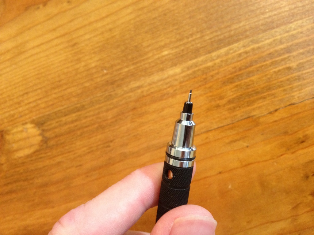
The back end of the pencil is a plastic and metal lead advancer; it works and doesn’t dig into the skin. There is a rubberized ring around it for reasons I don’t quite understand. Removing the advancer reveals a super tiny eraser that won’t last long but does indeed erase. Below that is a clip, which is fit onto the barrel in a way that would allow removal, but with difficulty. Japan is stamped into the side of the clip, and the name and size of the pencil is written on the barrel just beneath the clip. The barrel is plain until one gets to the section, which is metal and extended, the bottom half is knurled, but not aggressively so; it provides a good grip. There is a small hole in the grip that allows one to see the fact that the pencils mechanism is turning (but no the mechanism itself). Down from that is a tip very similar to the regular Kuru Toga, but extended is some ways. On this model this oddly designed step down cap is still not necessary, but covers up an otherwise ugly portion.

20150428-233226.jpg

Now on to the part everybody loves, the mechanism. I mentioned that I was under-whelmed by this previously, and I still am, but I know why now. The window in the grip section allowed me to see clearly when the mechanism was turning and when it wasn’t. And while it was possible to do this in the cheaper versions I was a bit harder to see. The mechanism itself by the way, as far as I can tell, is identical in both pencils, but there is no way to open them and find out exactly without possibly rendering them inoperable. But the answer to when the mechanism was turning when I was writing with the pencil was… never. I tested it, the mechanism works, it just never moves when “I” write with it. My writing, and drawing, are much too light to get it to rotate the lead, and thus I never see the affects. The packaging (for the inexpensive one, my roulette came in all Japanese packaging) says that the mechanism helps with the point of the pencil, and to prevent breakage. I really have never had a problem with either of these things, partly because I flail the pencil around compulsively when writing and drawing, and that rotates it such that my lead is always at a point. Now I guess I know that I write far too lightly to have a problem with breakage. But man, if I write lightly, some people must really press down on the things. So yes, it works flawlessly, but if you write like I do it isn’t really a selling point. And finally I wouldn’t worry about the mechanism wearing out, it is extremely well made and there have been no complaints about such a thing occurring, so if it does by that time you’d be able to just get a new one, it’s popularity means it likely isn’t going anywhere.

So, it is a good pencil? Yes. Is it worth the money for the upgraded version? Yes, even without the mechanism. The pencil is solid, well made, and solves the comfort issues I had with the less expensive version. The weight is good, the feel is good, the metal gives one a good grip and the writing is nice and fine. And if one does press hard enough to activate the mechanism I’ve heard nothing but good things. I wouldn’t take it over my Graphgear, but that’s just personal preference. I like the thinner body a little better on that one. So if you write with a lot of pressure, the Kuru Toga is the pencil for you, if you don’t you have other equally good options within the price range in my opinion. Even then it’s definitely worth a look.

Review – Daler Rowney 11×14″ Canvas Panels

Painting is fun, but stretching one’s own canvas can be difficult without experience, and even pre-stretched canvases can take up more space than wanted if one is simply practicing. Or, maybe you’re using mixed media or just drawing, and a stretched canvas isn’t right for you. Canvas panels are a good, sturdy alternative in these cases, and I’ll be taking a look at some fairly inexpensive ones by Daler Rowney.

20150421-221920.jpg

There are three canvases in the package. All are functionally identical. They’re 11×14” almost on the nose, and very sturdy, both in binding and in strength. The have a bit of flex, and have a slight bend if left unattended, but would be very hard to snap or fold. They’re essentially primed and can be painted on directly, but one might want to go ahead and prime them beforehand. The cotton canvas is acid-free to prevent decay, and the grain is not large enough to be intrusive. Paint, pencil, glue, etc. all stick well without any major problems. I’ve had one painting not like to dry on the stuff, but since all of my others have, I’d be willing to say the problem was with the old paint I was using.

20150421-221926.jpg

In short, the panels are quite good and inexpensive. They won’t replace a full canvas, but they won’t hinder the painter (artist). The slight warp they have is an easily corrected downside, and the only major one I can see.

Review – Master’s Touch Palette Knife

I’ve been painting recently, and have a new appreciation for palette knives (foolishly I never used them before), both for controlling paint on a palette, and for painting. Unfortunately I’ve found no real resource that says if there are consistent sizes and shapes for palette knives, and I don’t believe there really is. So instead of this being a review of a specific size or shape of knife, this will be a general look at the quality of the Master’s Touch brand of inexpensive and easily accessible palette knives.

20150414-225713.jpg

The particular knife style here is slightly unconventional, and appears in the least amount of photos I see online, though it is the shape used by Bob Ross, so it’s got that going for it. The handle is a light, okay finished wood with a lanyard hole and the Master’s Touch logo imprinted on it. It’s sturdy enough and it works. Following that is what appears to be a “brass” “section” ring that is dented and losing its finish. It holds the blade in place, fairly sturdily, but also not centered. The blade is stainless steel, quite flexible and tapers down to a very usable edge. It is finished well enough, and doesn’t get thin enough to cut easily, but I suppose if one really tried they could make it dangerous. In some places the brushed finish isn’t nearly as well done, but these places don’t really matter in the scheme of things.

Overall it’s a nice introductory tool. It obviously has some quality control issues, but they aren’t major and don’t prevent the tool from functioning or make it dangerous. It’s inexpensive, and I would recommend it to anyone who isn’t sure if they really want to paint and are just trying to get into it, upgrading in the future is always possible and still isn’t a lot of money. And even if one doesn’t this tool will likely be able to last a painting lifetime.

Review – PaperMate Flair Colors – Maroon, Brown, Caramel, and Grey

And now it is time for the final part of my look at the 20 colors of the Papermate Flair pen. This section only has 4 pens, and it’s special because I couldn’t find names for these colors from any official source. So the 4 names presented here are just what I think most represent the colors. Let’s get started and wrap this up.

Papermate flair colors part 4

Maroon – I love a good maroon shade, and this one does not disappoint. It’s easy enough to tell, even amongst other dark colors, what it is, and the tone is nice to look at. It might not be the most natural maroon I’ve seen, but it’s quite good, and sometimes it may even be work compliant. It doesn’t smear much but it’s not the best at resisting water, either.

Brown – The brown is a nice dark, UPS, brown. It doesn’t quite look like dirt, more like bark, and it barely smears. It’s easy on the eyes, blends in with dark colors, and could work in some office settings.

Caramel (error in image where this is labeled as Sepia and Micron Colors are switched) – Caramel is the color I’ve had the hardest time naming. I just don’t really get this light brown. It looks fairly standards, but it’s a bit off from the browns in Micron, Crayola, Pilot, and other such brands. It looks all right, but not the most natural, and most workspaces wouldn’t appreciate it. Although smearing is next to none.

Grey – And the final color is also one of the most boring. Grey is a color I love that isn’t featured in many color sets. And that’s because there isn’t much use for it. In nature I can only think of fog, and in an office only if you convince them it’s just your black pen running out. That being said, it’s a nice dark, even grey with very minimal smudging and feathering.

And there we are, the 20 current colors of the Papermate Flair. I do like them, and even some of the more garish colors are better in these sets than others. There’s a good mix of water resistance, workspace appropriateness, and personality in there. And I would recommend the set if you like tones of colors and like the Flair. But it’s a bit expensive and maybe one should consider the smaller sets if they want specific colors.

Review – PaperMate Flair Colors – Olive, Lilac, Navy, Plum, and Turquoise

And now for part 3 of my look at the 20 colors of Papermate Flair pens. This time I’ll be looking at five of the cooler colors in the lineup. I’ll just get started.

Papermate flair colors part 3

Olive – Olive is a nice green, forest-y color that looks quite natural and is very pleasant. It is quite conservative and laid back. One might be able to get away with using it at an office, but it’s unlikely. In poor lighting it almost blends in with dark blues and blacks, though. On the smearing side it’s one of the worst, easily smearing and becoming unreadable with contact with water.

Lilac – It’s a light purplish color that is smooth and quite easy to look at. It wouldn’t be appropriate in most offices, but in many a field of flowers there are similar colors. The color looks almost washed out before water is applied, but it smears and feathers probably the least out of the entire set.

Navy – Navy is a very dark, office-appropriate blue that goes well in most places. Artistically, it would be most at home in the dark, but there may be other applications. It does smear, but very little, and it is often readable afterwards. The main problem when water is applied is that there is so much pigment that it covers a wide area with a bluish tinge.

Plum – A bit off from most of the fruit I’ve seen, this plum is a dark, red-ish, purple color. It could pass for a plum still, just not one from a supermarket. It could also make its home in an office for a bit of fun, but not for everything. It bleeds, feathers, and smears pretty badly, but does stay mostly readable.

Turquoise – Turquoise is a nice color at points, but it shades quite a bit, and the color variation can at times be unpleasant. It’s a good sky, but doesn’t look like the stone, and going over it multiple times will turn it into more of an aquamarine. If your work doesn’t have a problem with blue, it should still work. With a wipe from water nothing changes, but if left for a few moments the color dissolves completely and is unreadable.

And that’s it for part 3. These colors are some of my favorites in the set, and much more usable than their warm counterparts. Next time I’ll be taking a look at the remaining 4 pens, which aren’t officially named anywhere I can find.

Review – PaperMate Flair Colors – Orange, Lime, Magenta, Marigold, and Pink

Now it’s time for part two of my look at the 20 colors of the Papermate Flair. This section of five is the “Warm” colors section. Mostly some normal colors here, but a few out-liars. Nothing too crazy.

Papermate flair colors part 2

This scan didn’t work the best


Orange – The orange is a deep, red-ish orange that is surprisingly natural looking. It’s very subdued, but noticeable, good for organization, but not for documents. It’s dark enough that it can be read at a glance. It fades significantly, but doesn’t really smear when wet.

Lime – The lime likely has the most variance in color, when written with fast it is a surprisingly standard bright lime color, but when taken slowly it is rather dark and subdued. It wouldn’t make a great office color but it is less harsh than a normal lime green, and the variances in tone make it good for art. Another plus is water hardly affects it.

Magenta – I find magenta colors had to classify, this one is pretty, nice to look at, and readable. It wouldn’t suit the office well but it does look like I could see it out my window. Heavy bleeding and smearing when wet with this one.

Marigold – At first glance this pen looks like another yellow, which it is, but much less harsh and more readable. It has a tinge of orange that is very pleasant and flower-like. There’s a lot of smearing, but almost no fading when exposed to water. Perhaps it could be used as an alternative to red to use when marking something important. Just as noticeable, but less aggressive.

Pink – I don’t like this color, it’s a hot-ish pink, not blinding, but not pleasant. It’s standard all things considered, it barely moves when wet and is inappropriate for anything but personal organizing. I’m not judging you if you like it, but I won’t be using if for anything.

And that’s part two. I like the warm colors, but I struggle to find uses for them. Next time I’ll take a look at five more, but this time “Cool” colors.

Review – PaperMate Flair Colors – Black, Blue, Red, Green, Purple, and Yellow

The Papermate Flair is a good porous-point pen; I’ve looked at both the black and red versions in the past. But they do come in a host of colors. I got the largest pack I could find, which seems to be exclusive to Sam’s Club, with 20 colors. And it’s so exclusive that I can’t find official color names for 4 of them. Those 4 will be in the last part of this series, the first 3 being Standard, Warm, then Cool. And now onto the colors.

Papermate flair colors part 1

Black – The black is a fairly standard black (most are): it’s deep and cool. It’s office-appropriate and moderately smear-resistant. While it does smear, it is readable after most spills.

Blue – A dark, office-type blue that is not a very natural color, but a pleasant one. It is legible and unintrusive. It lightens considerably and smudges when wet, but doesn’t erase.

Red – A dull (but still punchy) red, nice to look at, but a bit pinkish. It’s less glaring and hard on the eyes for grading and warnings than comparable pen reds, but similar to most marker reds. Is fairly smear resistant, but does lighten.

Green – A dark green, slightly darker than, say, a crayon green. It’s a deep, grassy, natural color. Noticeably different from the other, more common colors, but nothing that’ll jump out from across the room. It could be used in a liberal office. It smears and lightens quite a bit, though.

Purple – One of the more usual, pops-off-the-page purples. It is noticeable as a purple and isn’t the most natural-looking color. It stands out from dark blues, but could get lost in a page of dark inks. Almost no smudging on this one, though it does feather a lot when wet. It could be used in a similar office to the green one.

Yellow – A super-bright, stereotypical yellow. It’s almost illegible on white paper. It’s the most water-resistant after red and purple, but it all but disappears anyway. It hurts they eyes to look at for a long time (I’m not sure if it’s the brightness or the fact it’s hard to read) and isn’t a very natural-looking color. I wouldn’t recommend this one unless you’re coloring in books.

And that’s part 1 of my look at the 20 Papermate Flair colors. A good general assortment here, but nothing groundbreaking. Next week I’ll take a look at 5 of the more Warm colors in the set.

Review – Masterpiece Odorless Paint Thinner

When looking for something as simple as paint thinner (mineral spirits), it can be tempting to go for the cheapest option in a given item’s range. And for odorless mineral spirits at my local store, Masterpiece was the cheapest brand there. Should I have gone with the more expensive option? Let’s see.

20150304-104550.jpg

The container is fairly standard for a quart size bottle. The front label doesn’t have much art but gives enough information, and the back label gives enough “if you destroy property or yourself with this it isn’t our fault” warnings that you get the point. I’m not here to give safety advice but it should be said this stuff is very flammable and could do damage to you if used in a non-ventilated area.

There is a handle on the container for east carry that works fine. The only problem I have with it is the seal and handle conspire to make pouring difficult. It tends to “glug” which is something I’d be wary of.

The thinner itself works very well. When used on colored pencils (a trick I just found out about recently), it dissolves the wax and allows for easy blending. When used with paint, it does indeed thin oil-based paint quickly and is good for cleaning brushes and facilitating mixing. In regards to it being odorless it is, basically, though you will be able to tell if you’re in a room with an open container of the stuff, which is good to prevent too much inhalation.

Overall, it works, and I don’t regret going with the least-expensive option. I like it, and it’s far superior to turpentine (which is the stuff of the devil). It might not be the purest form of mineral spirits, and some are likely better. But for a beginner it certainly is effective at what it is advertised to do.

Review – Poquitos Part 2 – Monteverde Ballpoint/Stylus and Fountain Pen

I had the regular Yafa brand Poquitos for quite some time before ever even hearing about the brand Monteverde, which is one of the many brands of “inexpensive” luxury pens that Yafa owns. Monteverde mainly has their own line of pens that could be completely separated from Yafa, but recently I discovered Monteverde was releasing a set of pens under the same name and similarly styled to the Yafa Poquito. This, of course, confused me, until I found out the companies’ relationship. The two Monteverde Poquitos have both similarities and differences when compared to the regular Yafa versions. Let’s take a look.

20150121-234835.jpg

First up is the fountain pen, which is styled very similarly to the original Poquito, but because it is a fountain pen, it is slightly larger, a little longer, and about twice as thick. The tip of the cap has the same “stylus” as on the smaller pens, and the clip is almost identical. The pen is also made of brass, but seems to be painted better, and Poquito is written right on the cap.

Being a fountain pen, it accepts cartridges (of the standard international variety), but there are no converters designed for it. Some small converters can be finagled into working, but none are advertised as doing so. The nib (which is only available in medium) and feed are relatively dry, but that is the case with many pens with similar nib and feed types (plastic, iridium point, German made) and many inks are designed to work well with this type of pen. The section is stainless steel (I think) and gets slick upon prolonged use. And the pen is too short to hold comfortably without posting. But the pen is still super small, and is absolutely ideal for taking quick notes provided one finds an ink that works well with it.

20150121-234842.jpg

In addition to their release of the fountain pen, Monteverde also released a new version of the regular ballpoint Poquito, called the Poquito Stylus (and funnily enough, they also released the Poquito Stylus XL which is almost the size of the Largo). The pen has the same writing and mechanism end as the Yafa Poquito (which is the only part that the Poquitos share). But on the other end, a touch-screen stylus of average size replaces the old hard “stylus” point, which was really useless. This new stylus works quite well, though it can be a bit broad at times. The clip design has also changed. It works just as well, and looks a little nicer, in my opinion, but is more likely to damage the item it is clipped onto. The ballpoint itself is identical to the older pen, with refills being the same.

Overall, the Monteverde versions of the Poquito pens are quite small, and quite functional. They haven’t really fixed any of the problems with the standard Yafa versions, but the added benefits of a fountain pen and stylus (for the people that like to use them) are great. All of the Poquitos are hardy little pens that serve well, and can go almost anywhere. The Monteverde versions just add a little more style and a little more usage variation.


Review – Poquitos Part 1 – Yafa Ballpoint and Pencil

Some things are better small, and the Yafa Poquito, being one of the first pens I got, proved that to me. It was exceptional for my small hands at the time. But how does the set compare now?

20150113-225904.jpg

The Yafa Poquito pens have metal bodies that come in various colors. The top of the pen is a bit of a rounded-off cone, and the top of the pencil has a small steel button. The clips are tight and almost identical, with the pen’s being pointed, and the pencil’s being round. The bodies of both utensils taper from the middle to each end, with the center band being separate in the pen and attached to the mechanism in the pencil. The metal tip of the pencil is also part of the mechanism, whereas in the pen it is part of the body. The bodies are quite solid, but the paint will wear off with time and a bit of use. Consider getting a silver or brass one to fix that if you mind.

20150113-225910.jpg

The pencil takes .7mm lead, and what it comes with it fairly standard, sometimes broken in transit. The mechanism is easy to use and quite sturdy. It would stand up to a bit of abuse. There is no play once the lead has been extruded, it doesn’t have “shocks” as it were, but the mechanism is separate from the pen body, and this creates a squeak now and then.

The pen is a smooth-writing fine cartridge. It is a ballpoint so there are occasional globs and hard starts. If left out for some time, the pen will be quite hard to start, but in this case a while is so long a time that one would expect it to. When it does flow, it is very smooth, and has almost no issues. It is not quite black, and waterproof, as most ballpoint blacks are.

The Poquitos pack quite a bit of punch for their size, being less than 4 inches long (and they still manage to fit relatively comfortably in the hand). And while they do have some flaws, they are far from from deal-breaking for having a pen or pencil there when you really need it. They serve best as backups and are miles ahead of small pens that don’t allow one to comfortably hold them or have very little ink. I’d say that in that category, Poquitos are at least worth a look.