Review – Sharpie Colors Part 6 – Orange, Peach, And Yellow

And now, it is time for the final (for now) part of my look into the various colors of Sharpie markers (that I own). This section isn’t quite a “nice” as the others as I didn’t have another place to put the yellow that seemed appropriate, and there aren’t many oranges. Nevertheless, let’s take a look.

photo-96

Orange – The standard orange is, like all standard Sharpie colors, quite dark. It doesn’t quite resemble the fruit enough for most renderings but is close enough. It’s not too bad on bleed-through, feathering, or shading. It’s well behaved, just not that useful.

sharpie colors oranges-yellows

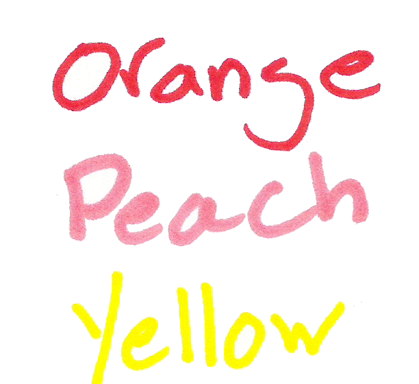
Peach – Peach doesn’t quite look like a peach either. It’s more of a weird skin tone. But it is perhaps a bit more natural looking than the orange. It’s pretty bad on bleeding and feathering, with shading being noticeable. But it is pretty so if you like the look you might be able to find a use for it.

Yellow – And finally yellow. It isn’t something really spectacular. It is indeed stereotypically yellow, without much of a natural bent. It is hard to read in the dark and bordering on eye hurting in the light. It bleeds through, but feathering and shading are minimal. I would struggle to find a place for it due to its unnatural hard-to-read-ness but if yellow is your thing, it certainly gets it done.

And that’s the last set of the Sharpie colors that I have. It’s probably the most lackluster set (figuratively. Literally would be the neutrals). I would struggle to find a place either in art or at the office for them, but they do help round out any personal collections and would make eye-catching signs I guess.

Most of the Sharpie colors are more useful, though. The set I have would work both in the artistic and office realm. And it offers a large enough selection of colors to keep most people happy.

Review – Sharpie Colors Part 4 Purples – Purple, Berry, Boysenberry, and Lilac

All right, now it’s time for part 4 of my look at many of the Sharpie Colors. This time it’ll be the purple-ish set I’m looking at, so let’s get to it.

photo-96

Purple – The standard purple color is a very dark purple that looks much like the stereotypical purple. It looks almost bright enough to be some of the darker purple flowers, or a very near-night sky. It doesn’t have many applications in most workplaces either, and its darkness could make it hard to read. It’s middle of the road on bleed, through, for Sharpies, and almost doesn’t feather or shade, making it a pretty good all around color to use around the house.

sharpie colors purples

Berry – Berry certainly lives up to its name and provides a very reddish purple that is very similar to berry juice. It doesn’t have many other natural applications, though. It is bright and visible, with minimal bleeding, shading, and feathering. It’s a very good organizational color even if it might not be that work-friendly.

Boysenberry – This color is an interesting one. It’s a lighter, reddish purple that is akin to the fruit from which it takes its name. It is a much more appealing purple color and is useful in many situations. It’s prone to bleeding, but feathering and shading are minimal. I like it a lot, but it isn’t the most useful color.

Lilac – Lilac is a light, bluish purple. It is very similar to the flower and many other natural shades. It is bright and easy to read, but a bit unprofessional. It’s not bleed- or feathering-prone, but it shades a bit. It’s a nice looking color, and artistically or organizationally useful, but not really for a work environment.

And those are the purples. I like the colors, but they tend to be less useful. It’s just hard to find applications other than organization. But they work very well. Next week I’ll be looking at the various red colors I have.

Review – Sharpie Colors Part 3 Greens – Green, Lime Green, Mint, Aqua, and Argyle

Now I’m on the third part of my look at all of the Sharpie colors that I have. I’m not sure I need to introduce the color green to you, so I’ll just get into it.

photo-96

Green – This green is a very dark color, even more so than the standard green color most art supplies feature. It’s a deep, leafy green that is quite natural but does look generically dark in bad lighting. On copy paper, it can be hard to distinguish for people with bad eyes. It’s also quite bleed- and feathering-prone, but on less absorbent papers all three of the last points are minimized. It’s a good generic color, but far from my favorite of the selection.

sharpie colors greens

Lime Green – The lime green is a variety of lime that isn’t an eyesore and looks sufficiently like the fruit to justify the name. It’s bleed- and shade-prone, but isn’t too bad on feathering. It is a very visible, not too bright to read, not too dark, and not too close to the standard green, making it good for organizing. It’s finally a lime color I would use.

Mint – The mint is more akin to ‘mint flavored’ than to the plant. It’s a very frosty, light green. It is still not too light to read, and is very distinguishable from the other colors. It’s also a fairly natural shade, so it works for art as well as the office, though this might be a bit extreme for some offices. It’s less bleed- and shade-prone than most of the greens, but the most susceptible to shading.

Aqua – Aqua is a nice dark blue-green color. I’d say it leans more to the green side myself, while the turquoise leans more to the blue (which is the opposite of real life). Still it is a very natural shade for both water and land. It is a darker green, but not one that I think would be confused with any other color, but it might be a bit out there for office use. It also has the least shading, feathering, or bleeding of any of the greens.

Argyle Green – This is the second and final color that I am dubious of my identification of. If you think I’m wrong, feel free to correct me in the comments. Argyle is a medium green very similar to the lime color but a bit darker. It’s got some bleed-through and feathering problems, but minimal shading. Other than that, I’d say it mimics lime well on the page: it has similar organizational and artistic properties, and would be hard to distinguish at a glance. It’s just not very original.

And that’s my look at the green selection of Sharpies I have collected. They are all very good for organization and artistic efforts, but they may stick out or be frowned upon in the office. They behave all right in terms of properties, but they aren’t the best in that regard. But I think they might be my favorite set.

Next time I’ll take a look at a collection of purple pens.

Review – Sharpie Colors Part 2 Blues – Blue, Navy, Turquoise, Sky Blue, and Blue Ice

Now in the second part of my Sharpie color reviews I’ll be talking about the blues, a nice and varied set of colors.

photo-96

Blue – Blue is a very classic color and it looks quite a bit like the standard blue we’ve come to expect from various markers and pens. This one is a bit darker, though. The ink is more wet than the other standard colors and bleeds a bit. It’s also too dark to be natural and almost too much to be organizational, it is a bit too close to black in dark conditions, but with good eyes it can work. Still, it is very blue.

sharpie colors blues

Navy – This color is very close to the classic navy color, a bit close to black in low light, but it looks like a lot of navy colors. It’s a very dry color and has very little bleed and feathering/spreading. It’s a nice-looking color, but not a very useful one.

Turquoise – Turquoise is a difficult color to get down in ink, and none of them look quite like the stone. This one’s a bit dark, but it does make a good blue-green tone. The ink is very wet, and bleeds easily, but has very minimal feathering. It’s a very natural and pleasant tone, great for organization and for artistic purposes.

Sky Blue – This blue, like most of the blues in this set, is darker than it really should be. It’s more of an evening sky blue, or a wispy-cloudy blue. It bleeds a bit more than the turquoise and the blue, and is just as feathery. It’s a very nice looking and easily identifiable color that many office and artistic uses can be found for.

Blue Ice (Possibly Mystery Blue) – This color is the most contentious of the colors in my current review lineup. The package of markers I received was not marked, and of the other blue colors I looked at this one seemed closest. If you believe I am wrong in my categorization, I encourage you to leave a comment. This blue is a cool blue that I would say has no direct natural counterpart (certainly not ice, as this is the least aptly named), but it could be used as a substitute in many cases. I prefer it to the sky blue as a light blue. It can be used in art if one is creative and is very distinguishable from other colors for organization.

Overall, I really like the blue Sharpie colors. They are a bit bleed-prone, but they have a variety of uses and in many cases are work-appropriate. The tones are very natural and appealing. They’re a good set to get, if one can.

Next time I’ll be looking at a few of the greens that Sharpie has to offer.

Review – Bull & Stash Notebook Travel Stash

Bull & Stash was a kickstarter for a notebook company that I only found out about because my brother was excited about it. The particular product he was looking at still hasn’t entered regular production, but I figured I’d test out one and see if they were any good in general.

photo-72

The basic idea is that the notebooks have removable pages. This way, different types of paper can be used, and notes can be organized after they’re written, both inside and outside the notebook. This is accomplished by having two posts on the back of the notebook that have removable screws to allow paper to be put in an out.

photo-70

The cover is a simple slab of supple leather with two holes in the back, and a logo stamped on the front. I’ve seen some complaints that the logo is stamped unevenly, and while it is on mine this doesn’t bother me. The cover did have an unsightly curl when I first received it (the back and front didn’t match up) but this has gone away with use. On the inside, the hardware is simple, and it screws down a flimsy cardboard piece with a place for basic lost and found information. Inside this is the paper. Around 40-45 pages can fit in at a time, but I’d recommend fewer. The cardboard and leather cover do provide enough stability to write on in most situations, but I wouldn’t be taking long notes or more than a few without a stable writing surface. The cardboard is also prone to bending, decreasing the stability over time.

photo-73

The paper is all right. It is fairly bleed resistant, but prone to feathering inks. The graph and lined refills are only printed on one side, which is fine by me because I only use one, but others might find it annoying. It would be difficult to use both sides in this book, though, because the hardware makes flipping through pages difficult. I’d remove the first few pages regularly to prevent them from being destroyed, and I can say that writing on the back of a page is almost impossible. The hardware also cramps the writing space. If things were a little smaller I’d be more happy.

photo-71photo-69

In the end, it’s a solid first attempt. It seems more like a portfolio builder, though, and I don’t know how supported the books will be. There are little inconsistencies and design problems that make me shy away from recommending the books. It’s not worth the current asking price to me if the cardboard and stamp quality aren’t fixed. And the edges of the notebook aren’t finished very well, leading to a very strange appearance. It definitely will last a long time: the leather and steel hardware aren’t going anywhere. But it just seems like the designers dropped the ball a little bit. It’s almost too simple and feels like it’s slapped together from existing items. Maybe my problems with the hardware are solved in the larger version, but I doubt it. Until a more usable and better finished version is released, I’d hold off.

Review – Sanford Peel-off Magic Rub

These days most pencils have their own erasers, but some still don’t, especially older models that have been in production for years and are still very good at their jobs. And even many of the new pencils don’t have enough eraser for the life of the pencil. Separate erasers are still a large market. But what if the eraser came in a more convenient package? The Sanford Peel-off Magic Rub intends to solve that problem.

photo-75

The main body is simple: it’s a tube of paper that is continuously wrapped around itself and sealed with a sticker. On the sticker is the main information for the product. There is a string attacked to break the sticker seal and allow for the paper to be peeled back when the product is used. The paper and eraser tip can also be sharpened, but I wouldn’t recommend this. The core of the utensil is a tube of Magic Rub, which is a very good white eraser. Sanford’s Magic Rub erasers are easy to use, resist drying out, remove quite a bit of graphite, and aren’t as hard on the paper as some other erasers. They aren’t the best erasers out there, but they are very good ones.

photo-74

And that’s really it. The entire “pencil” is slightly thicker and shorter than a standard pencil. But it fits in most of the same places and works very well. If you have a lot to erase, and don’t like the potential of breaking mechanisms with a mechanical eraser, I’d give this one a shot.

Review – Staedtler AllXwrite

I’ve looked at a few all-graphite pencils in the past, but they were only sold in art supply stores and were thicker than the average pencil. The Staedlter AllXwrite is a #2 all-graphite pencil that is much more widely available. How does it hold up?

photo-80

The body of the pencil is unsurprisingly plain. It’s a standard hexagonal pencil design, all grey with silver lettering. The information printed on it is enough to get by. At the end of the pencil there is a standard metal eraser holder, and a fairly standard white eraser that works well.

photo-79

The graphite is quite hard, but still writes with the same pressure as a normal pencil. There is a coating on the outside to prevent major marks, but it is still possible to mark with it. Sharpening is easy, but wasteful, and if one adjusts their writing or drawing in such a way as to re-sharpen the pencil as they write with it, it requires none and will last for a very long time, far outstripping the eraser. Other than that, it’s a standard HB, suitable for taking tests or notes, and making lists and art.

photo-84

I like this pencil a lot. They’ll last forever and write well. I’ve flattened the ends of one of mine to make it easier to shade large areas. This, coupled with a few others at varying degrees of flatness leads to a ton of artistic options. While these pencils are a bit more fragile than wooden ones, I think that with normal use they will hold up just fine for someone interested in getting a long-lasting or quirky writing implement.

Review – Expo Ultra-Fine Point Dry-Erase Markers

When it comes to dry erase markers, Expo is almost the only brand people recognize out there. Their chisel-tip markers are almost ubiquitous in any place that requires a white board, and are generally what people replace the cheap in-package markers from home magnetic boards with. And while I like the markers and always have, I do have a problem with their tip size. Even the fine point markers are large enough to be hard to use for people who like to write fine lines, like I do. Fortunately, there are slightly-less-popular, but still easily available Expo markers with an “ultra-fine” tip. Are they much better?

photo-51

The body design is almost identical to the fine tip versions, with a slight taper from the middle to the ends. There is a step-down on the rear to allow for easy posting. There is also a step-down from where the cap is removed to the section. The cap and all of the writing on the pen is loosely in the color of the ink. The section can be a bit slippery, but it’s never a problem. It ends in a small cone with the point that is indeed very fine for a dry-erase marker. The information presented on the side is standard and useful enough.

photo-53

The tip is very fine when compared to a regular fine marker. It gets down to a medium/broad on a regular ball or fountain pen. The ink flows smoothly and erases easily, as one would expect from the Expo brand. The black is the standard Expo black, and does the job. It doesn’t start to wash out at this size and is perfectly readable.

photo-52

For anyone who needs to mark something with a bit of a finer point (like on a map), wants to write regularly on a dry-erase board, or for those who are artistically inclined and were frustrated when they couldn’t get the various line sizes they needed out of the more standard Expo markers, these work very well. They are of the same quality as the other markers in the line (which is to say as good or better than competitors) and offer a much smaller and more manageable line.

Comparison – Simply Tacky vs. Scotch Mounting Putty

When looking for some sticky tack to put that poster up on the wall without using push-pins, one usually looks for the Scotch brand. After all, they do know how to make things sticky. But one may also find Simply Tacky a (terribly named) product that does the same thing. Is it worth it to search for the right brand?

20150618-222538.jpg 20150618-222544.jpg

To start off with, both items come with very close to the same amount of product. The Scotch packaging is slightly smaller, and more packed with use information and diagrams. Both are cut into four similarly-sized bars. The Scotch is the only one with a weight limit (of 1lb). Both are quite white, and are easy to pull apart and shape to stick onto a surface. Both are very grippy, with the simply tacky being a little more malleable and aggressive. It breaks into pieces more easily, though.

20150618-230521.jpg

As for what they can hold I’d say it’s about equal. The Scotch says it’s up to a pound, but they don’t tell you how much product to use. With a tiny, equally-sized bit of each product (weighing less than a gram) I was able to hold 70 grams (2.4 oz) easily, and I’ve held up to half a pound products stably up with enough (It will do up to a pound, but only in certain configurations of putty and object). Putting that same small piece of product up with a 7oz (198g) item, both failed fairly quickly with the Scotch maybe a little faster, but I’d chalk that up to my tests being not completely scientific.

20150618-222550.jpg

Overall, I’d say both products are really the same on the user’s end. Their uses are the same, price can be more or less in favor of each brand depending on where one shops, and they hold almost equally well. If you’ve got a choice in the aisle, then I’d say take the cheaper one, but it’s not worth another trip to get the right brand.

Review – Zebra Sarasa Colors Black, Blue, Red, Navy, Mahogany

I’ve talked about the Zebra Sarasa before, and it’s an alright gel pen. The saving grace of many gel pens is that most come in a variety of colors at least partially unique to them, and the Sarasa is no exception there. Let’s take a look at a few of the colors.

The colors are always a bit off in the digital space

The colors are always a bit off in the digital space

First, Black. It’s a cool black that covers well. It works in an office setting and generally doesn’t get lighter even with minimal pressure. I’d say it’s black almost as soon as it gets on the page. The drying time is moderate and it’s water smudge-able.

Next, Blue.  The blue is quite dark, darker than most office-type blue colors. This makes it easier to read and more professional. It’s also natural looking, more like a deep sea-blue than an in-between blue that doesn’t really exist in nature. It’s the least smudge-prone of the bunch, but that won’t entirely stop it from lifting off the page.

Third, Red. It is a bland red, with no real pop to it. Though it is brighter than some of the competition, it isn’t really eye hurting. It’s quite noticeable and quite red but has no character — and no real flaws, either. It’s the color that fades the most when exposed to water.

Now, Navy.  Navy is a very deep, dark blue. It’s really almost black. You’d need a good light on to tell which one is which, though you could tell that black and navy are different colors with minimal light. It’s a wonderful dark color that is almost soothing and quite free flowing.

Finally (for this set), Mahogany.  It is really more like maroon. It’s a slightly purplish red which is also very dark and quite nice. It is much more noticeable than the navy, and still quite natural, giving an almost brown appearance from far away. It’s probably my favorite of the five, though the one with the fewest applications, and while you might get away with it at the office, it could be a hard sell. Unless you work for Texas A&M University.

That’s the five colors for this week. Next time I’ll be looking at the other five colors in the standard ten color pack.