Review – Poppin Fineliners

Poppin is a company that I don’t know much about, but their pens definitely catch the eye. When I saw this set of fineliners (felt tip pens) from them, I knew I had to pick a set up. The packaging and the feeling of the pens themselves appears quality, but do they live up to their first impressions?

photo-118

The outsides themselves are very nice looking. At the bottom is a small inset for posting the cap, which connects via a visible seam to a very smooth and featureless barrel. Underneath the cap are a series of step downs that are quite short and would be uncomfortable to hold, leading quickly to a standard-looking felt tip point, making it more comfortable to hold the pen by the barrel when writing. The cap, when on, has a slight step up from the barrel but is equally pleasantly smooth, and its only features are a dimple in the top and a rather unique u-like clip that looks like a Lamy wire clip that has been flattened.

photo-117

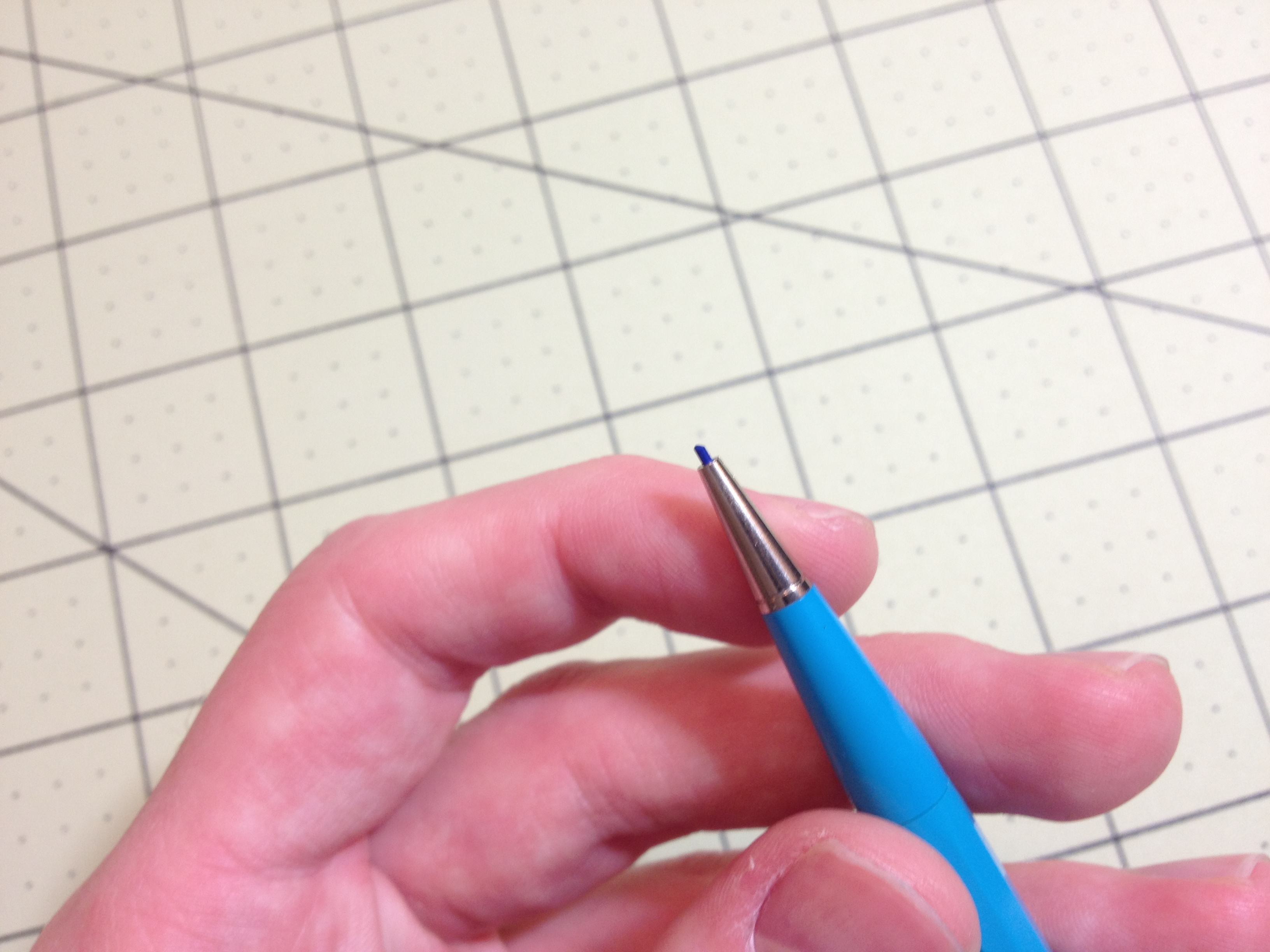
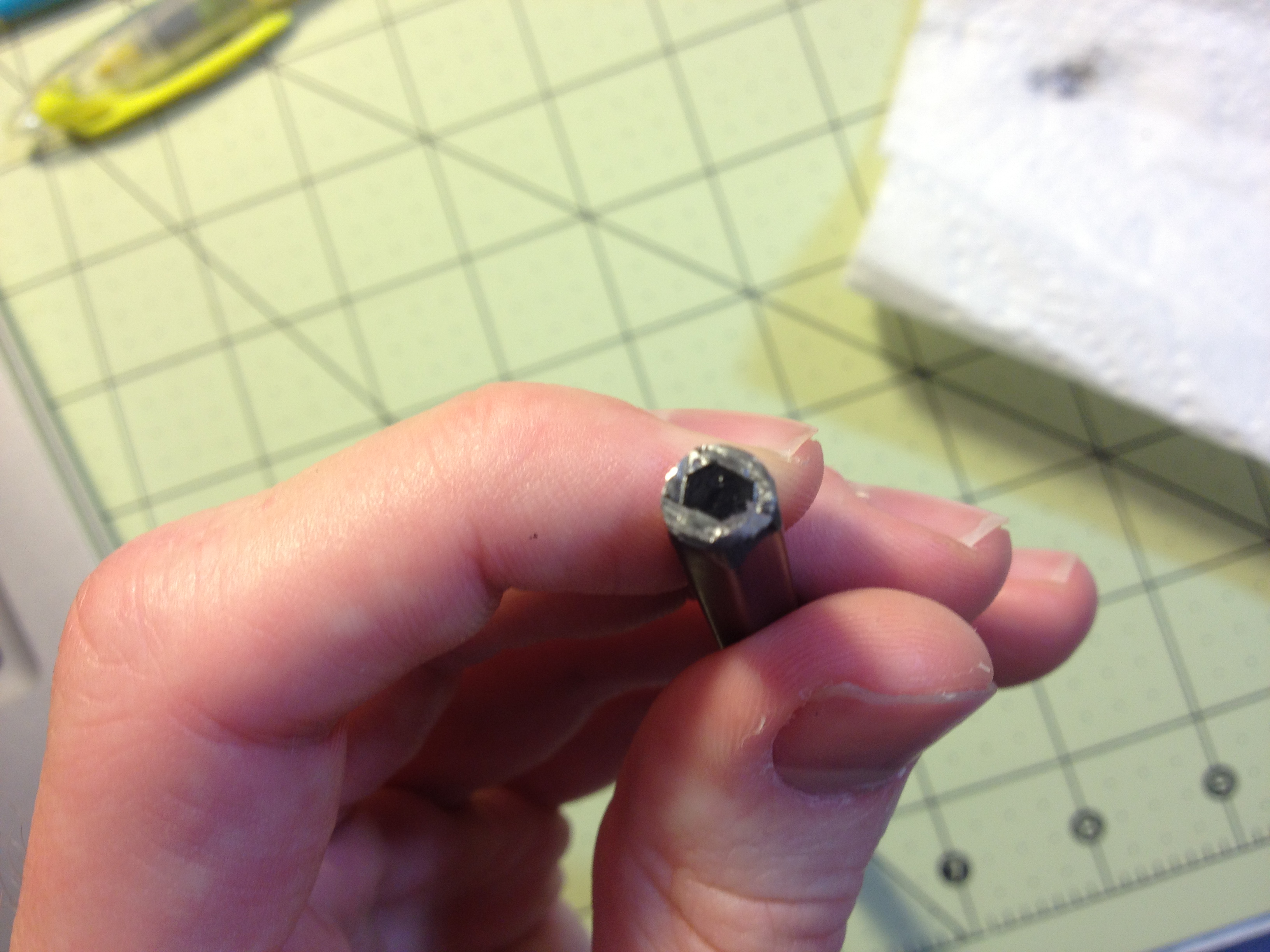
Functionally, the clip is about useless. It doesn’t have any dimple with which to grip, and is spaced farther from the cap than the width of most fabrics, meaning friction won’t be holding it in. The tips themselves aren’t that great, either. Like most fineliners, they do write with minimal pressure, but unlike most they do not give a consistent line. Dots very quickly form when writing or drawing due to having a very fluid ink not well controlled, and when writing fast at times skips can even develop, though this is rare.

photo-119

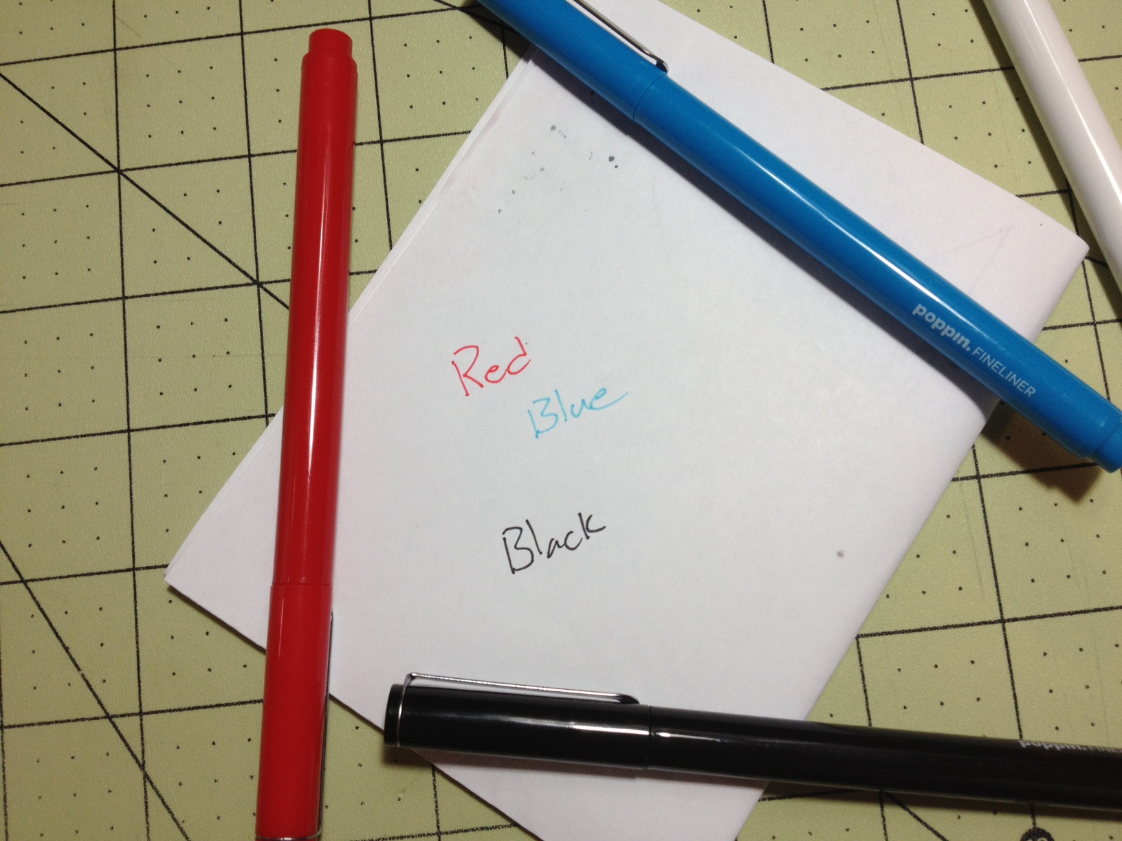
The colors of black, blue, and red are very standard, but the two extra colors are very washed out, blue especially. The blue is very pleasant sky blue when controlled well, but becomes darker quickly. But it still sticks out compared to other office blues. Red is nice and vibrant, though its tone is closer to that of a pink. It’s the least prone to problems as the ink is a bit thinner and less likely to dot. The black is fortunately a black and not a very deep purple or gray as some are. It is slightly on the cool side, which is unusual. The colors do match their corresponding pen bodies fairly well, but the inclusion of a 4th pen that has a white body, but also black ink, is slightly confusing. They unfortunately do bleed through the paper, but have minimal shading and resist water (while they do spread slightly when wet, they remain easily readable).

Overall I think the pens aren’t really up to par with what one can get for their office. They are sturdy and the ink works well, but without functional clips, they must remain at the desk or in a case, and their writing performance leaves much to be desired. The user just ends up with a pen that feels slightly rough and dry. If style and durability are your main concerns (and potentially ease of writing as the ink almost jumps from pen to page on contact) these might work for you. But for those looking for the superior, super-smooth and comfortable writing experience, or a portable reliable writer, these can be easily passed up.

Review – Office Depot Ballpoint Pens

Most stores have generic in-store brands or store branded products for various merchandise. That is the case here, with these Office Depot branded ballpoint pens. I don’t know what they cost originally, but they were marked down twice to 50 cents and then 3 packages for $1. Which means I picked up 30 for a $1. There are very few things I wouldn’t say are a good value for that price (I’d probably say stale gum was worth 30 pieces for $1) so it would be hard for these things to let me down. So let’s see how they perform.

photo-114

The bodies of the pens are super simple. They are round and straight with a cap on the end to hold the ink cartridge in on the back, and a slight bump (to hold the cap on) followed by a taper and then the point of the front. The cap is fairly generic with an integrated clip that works but isn’t great. They are all made of translucent plastic that matches the ink and have “Office Depot” printed on the side.

photo-115

Writing is surprisingly smooth, especially for mediums (they’re a bit broader than normal mediums I would say) and at times they can write with minimal pressure. The packages say “No skip guarantee” which isn’t true, but it wouldn’t be for any pen. It blobs after a certain amount of writing time but I don’t know a pen that wouldn’t, and it’s less than expected. They do tend to have (sometimes severe) startup issues though, especially the longer they are left capped, as do most cheap ballpoint pens.

photo-116

The colors are fairly standard office colors, nothing at all natural looking. The black is just off-black and slightly warm. The red is deep and doesn’t shade much, but still very noticeable. And the blue is quite dark, but still differentiate-able from the black except in the lowest of lights. All are essentially waterproof and dry quickly.

Overall, I’d say the pens are probably worth it. They have no frills, and likely a high margin of error. Any problems, though, and the pen can simply be tossed. They do come with wax-sealed tips, meaning they will last longer in storage, but after that they need to be used fast before they dry up. The bodies are sufficiently hardy to last easily for the life expectancy of a pen like this. The cap seals, the clip holds, and the tip writes. Everything’s functional and unspectacular. If you’re running a business where pens are needed frequently by customers or employees, or you’re just forgetful and lose your pen, these are cheap and they work until they disappear. But they won’t be impressing anyone.

Review – Slant Collections Mini Journals Preppy Stripe

I’m not exactly the type of person to be found in Tuesday Morning (the store) but I did find myself in there one day, and there was quite a bit of interesting stuff. And being someone who has been drawn to the stationery aisle since I was little I found myself in the stationery section, where I found a set of Slant Collections mini journals, this particular set in the discontinued “preppy stripe” (it was Tuesday Morning, after all). Let’s take a look.

photo-107

The books themselves are 3¼ x 5¼ inches, just smaller than a Moleskine pocket book. The cover feels like plastic-coated cardboard and in this version has a very simple design that comes in 3 colors. It is a single piece bent around and stitch-bound onto the 70 inside pages. These pages are lined with a thin 7mm ruling that is the same color as the main cover color, printed on a very white background.

photo-108

The paper itself is quite thick and a medium roughness. It is very bleed-and feathering-resistant despite this. Fountain and other liquid ink pens are handled well, and with most other writing utensils both sides of the paper can be used, though at this size I wouldn’t recommend that. The cover and binding are very well done and hold up (the stitching looks very slightly unsightly at times) and the corners are nicely rounded to prevent the corner bending that some books get. On the table the book lies adequately flat and while the cover does bend out of shape it bends back just as easily.

In the end I have been surprised by these little notebooks. They are hardy, easy to carry, great writing things. It has taken me some time to review them as they weren’t good enough to replace any of the books in my normal rotation (but that’s more because I prize consistency, a book would have to be head and shoulders above to get met to move something out of my rotation). I enjoyed using them very much (even the pink one) and if all of the Slant collection journals are as good as these were I’d consider more in the future.

Review – Rhodia Pads

I’ve been using Rhodia products for years now, and the way that I was introduced to them was their famous pad-style books. I got one as a gift and used it almost every day in school (only almost because I wasn’t taking notes with it but writing down ideas). And I’ve had a few around ever since. Let’s take a look at what made them so widely used and praised.

photo-104

The pads themselves are simple, and have very few differences between the sizes. They are an orange rectangle, with one or two heavy-duty staples in the top and 3 creases on the cover to allow it to be folded over the spine easily and cleanly. Both the front and back have the Rhodia tree logo, with the back one being smaller and above some of the book’s specifications (in metric and imperial) and usually a price tag/bar code. Inside there are perforations on the top of each page, and with the thickness of the paper and the quality of the perforations, tearing out pages is easy, but they do not tend to fall out with hard use.

photo-105

The size of the paper in each book varies, and it comes in line or graph versions (dot in the premium editions, and unfortunately no blank). The ink used is a light blue-ish purple that doesn’t interfere with ink or pencil, the line paper is a bit darker. The paper is vellum and very ink resistant, meaning long dry times but little feathering, bleed through, and page crinkling. Show through can still be a problem, but most ballpoints and fountain pens write very well on the paper with almost no side effects. Paints and markers such as Sharpies are where the paper starts to not hold up as well, but the minimal crinkling, and the lack of bleed-through is still a very good performance. The coating on the paper also allows for very smooth writing, but one might have to press down hard with less wet pens.

photo-106

I might have already given away my opinion of the books in the first paragraph, but they are lovely. The writing experience is super smooth and pleasant; the worry that one might have with other papers when writing with liquid ink pens in non-existent. The binding is hardy and the cover wears very well with minimal things to be problematic. I’m generally not a fan of covers that fold over the top of the book, but I make an exception here. They make great traveling journals, school notebooks, coffee shop list makers, etc. And they can survive both fountain pens and being tossed around in a backpack. If the styling was a bit more my speed I would carry one around all the time. Still they are very versatile, and for the smaller ones, fairly inexpensive.

Review – Bull & Stash Notebook Travel Stash

Bull & Stash was a kickstarter for a notebook company that I only found out about because my brother was excited about it. The particular product he was looking at still hasn’t entered regular production, but I figured I’d test out one and see if they were any good in general.

photo-72

The basic idea is that the notebooks have removable pages. This way, different types of paper can be used, and notes can be organized after they’re written, both inside and outside the notebook. This is accomplished by having two posts on the back of the notebook that have removable screws to allow paper to be put in an out.

photo-70

The cover is a simple slab of supple leather with two holes in the back, and a logo stamped on the front. I’ve seen some complaints that the logo is stamped unevenly, and while it is on mine this doesn’t bother me. The cover did have an unsightly curl when I first received it (the back and front didn’t match up) but this has gone away with use. On the inside, the hardware is simple, and it screws down a flimsy cardboard piece with a place for basic lost and found information. Inside this is the paper. Around 40-45 pages can fit in at a time, but I’d recommend fewer. The cardboard and leather cover do provide enough stability to write on in most situations, but I wouldn’t be taking long notes or more than a few without a stable writing surface. The cardboard is also prone to bending, decreasing the stability over time.

photo-73

The paper is all right. It is fairly bleed resistant, but prone to feathering inks. The graph and lined refills are only printed on one side, which is fine by me because I only use one, but others might find it annoying. It would be difficult to use both sides in this book, though, because the hardware makes flipping through pages difficult. I’d remove the first few pages regularly to prevent them from being destroyed, and I can say that writing on the back of a page is almost impossible. The hardware also cramps the writing space. If things were a little smaller I’d be more happy.

photo-71photo-69

In the end, it’s a solid first attempt. It seems more like a portfolio builder, though, and I don’t know how supported the books will be. There are little inconsistencies and design problems that make me shy away from recommending the books. It’s not worth the current asking price to me if the cardboard and stamp quality aren’t fixed. And the edges of the notebook aren’t finished very well, leading to a very strange appearance. It definitely will last a long time: the leather and steel hardware aren’t going anywhere. But it just seems like the designers dropped the ball a little bit. It’s almost too simple and feels like it’s slapped together from existing items. Maybe my problems with the hardware are solved in the larger version, but I doubt it. Until a more usable and better finished version is released, I’d hold off.

Review – Autopoint All American

There are tons of pencils out there, but sometimes the old designs just call to me. And they still work very well. It’s hard to beat some of the most simple writing utensils in many cases. The Autopoint All American is not the simplest of pencils, but it is quite a classic and simple design that works very well.

photo-78

The top of the pencil is a hard, but functional, eraser held in by a metal sheath; removing this allows for access to the lead storage area. There is a metal collar that holds the clip just down from that, followed by the faceted barrel with 10 sides. This continues until the break for the twist mechanism, at which point the tip tapers down to the point of the lead. The only information is the lead size and brand on the clip, which is quite hard to read, and leaves me wishing the model name was somewhere.

photo-77

The mechanism is a simple wire-twist one that is a bit stiff to use. Once lead is inserted, one can twist to the right to advance the lead, or twist to the left and push on a hard surface to retract it. While stiff, the mechanism is quite solid, and the lead is held firmly in place. I have a .9 lead size version (in blue) and the lead is large enough that breaking isn’t very common anyway, and I haven’t found it to be a problem. The lead included is fairly standard in and of itself.

photo-76

It’s a good pencil with a classic design. The mechanism isn’t the easiest to use but it’s robust and sturdy. The pencil itself has a very utilitarian look and feel that I quite like. It feels like many of the classic pencils I have. So for those looking for a classic, rugged pencil design, this is one to look out for.

Review – Sanford Peel-off Magic Rub

These days most pencils have their own erasers, but some still don’t, especially older models that have been in production for years and are still very good at their jobs. And even many of the new pencils don’t have enough eraser for the life of the pencil. Separate erasers are still a large market. But what if the eraser came in a more convenient package? The Sanford Peel-off Magic Rub intends to solve that problem.

photo-75

The main body is simple: it’s a tube of paper that is continuously wrapped around itself and sealed with a sticker. On the sticker is the main information for the product. There is a string attacked to break the sticker seal and allow for the paper to be peeled back when the product is used. The paper and eraser tip can also be sharpened, but I wouldn’t recommend this. The core of the utensil is a tube of Magic Rub, which is a very good white eraser. Sanford’s Magic Rub erasers are easy to use, resist drying out, remove quite a bit of graphite, and aren’t as hard on the paper as some other erasers. They aren’t the best erasers out there, but they are very good ones.

photo-74

And that’s really it. The entire “pencil” is slightly thicker and shorter than a standard pencil. But it fits in most of the same places and works very well. If you have a lot to erase, and don’t like the potential of breaking mechanisms with a mechanical eraser, I’d give this one a shot.

Review – Staedtler AllXwrite

I’ve looked at a few all-graphite pencils in the past, but they were only sold in art supply stores and were thicker than the average pencil. The Staedlter AllXwrite is a #2 all-graphite pencil that is much more widely available. How does it hold up?

photo-80

The body of the pencil is unsurprisingly plain. It’s a standard hexagonal pencil design, all grey with silver lettering. The information printed on it is enough to get by. At the end of the pencil there is a standard metal eraser holder, and a fairly standard white eraser that works well.

photo-79

The graphite is quite hard, but still writes with the same pressure as a normal pencil. There is a coating on the outside to prevent major marks, but it is still possible to mark with it. Sharpening is easy, but wasteful, and if one adjusts their writing or drawing in such a way as to re-sharpen the pencil as they write with it, it requires none and will last for a very long time, far outstripping the eraser. Other than that, it’s a standard HB, suitable for taking tests or notes, and making lists and art.

photo-84

I like this pencil a lot. They’ll last forever and write well. I’ve flattened the ends of one of mine to make it easier to shade large areas. This, coupled with a few others at varying degrees of flatness leads to a ton of artistic options. While these pencils are a bit more fragile than wooden ones, I think that with normal use they will hold up just fine for someone interested in getting a long-lasting or quirky writing implement.

Review – Liquid Accent Highlighter

Highlighters are a useful tool, mainly for their intended purpose of highlighting text. But they can also be used to “sketch” drawings before inking them and not be picked up by a scanner (similar to drawing with a blue {non-photo} pencil). Still, many highlighters are the same, and I hesitate to review them, but let’s take a quick look at the Liquid Accent highlighter that is my main choice for this type of product.

photo-82

The design of the body is fairly standard for this type of stuff. The cap is a smooth, domed shape with a “futuristic” clip based in and protruding from it. This snaps onto a barrel that is again one sloping shape, with a “lanyard” hole at the end (I assume that’s what it is). The body is transparent, so the ink supply and feed can be seen from the outside. The section is almost slippery, but not quite, and the chisel tip of the marker is quite hard and works well. The information printed on is the bare minimum, and I wish there was a bit more (like manufacturer’s name) to identify it.

photo-81

There isn’t much to say about how it writes: it’s smooth, it’s bold, and isn’t too wet (it doesn’t bleed). The ink stays where you put it, generally. I haven’t tested it in the sun, but it does smear a little bit under water, and it also smears any of the less permanent or non-dried inks it highlights.

It’s a good highlighter, but it’s hard to have a bad one. It highlights stuff, it holds well, and it has a ton of ink. (I’m having trouble finding my exact brand online, there are highlighters that seem very similar produced by Sharpie and Paper:Mate {Both owned by Sanford, which is owned by Rubbermaid}, but if it’s a cheap one when it is found, that’s another plus) I don’t really have much to recommend it over any other highlighter, but if you do find it, it’s not a dud.

Review – Expo Ultra Fine Pink, Purple, Orange, and Brown

I’ve looked at the 4 most common Expo marker colors (specifically in the Ultra-Fine tip) in the last few weeks, and this week I’ll look at 4 of the lesser-seen colors: pink, purple, orange, and brown.

photo-52

Pink- to start with, the pink is a nice, dark pink that looks much more pleasant than the common pinks found in writing utensils. It’s rosy, and very consistent; the line width is medium, though.

Purple- next, the purple is a very bold writer, it goes on smoothly and with a lot of ink, but there is more variance in the color when dry. It is a nice, dark purple, and unmistakably so. It might be confused with black from far away, but is generally distinguishable.

Orange- the orange is very thin, both in line and in color. It’s sometimes hard to tell it’s there at all, and there is a wide color variance within it. I’m not a particularly big fan of it.

Brown- and finally the brown, which is another wide-writer. It writes smoothly, with the only color variance being in the tips. It’s a dark enough brown to be easily read, and still distinguishable from the other dark colors.

Overall, these 4 are a nice addition, though they aren’t my favorites, either in performance or in looks. I like them, but if I were just getting these for a class I would skip them. For organization, note-taking, and art, these colors have a better purpose, but those aren’t the main purpose of dry-erase markers.