Review – Piccadilly Sketch Book

There are quite a few sketchbooks out there, and it can be hard to choose. If one isn’t the “pick one and stick with it forever”, or the “grab the nearest one off the shelf when a new one is needed” type of person, it can be overwhelming. Which ones on the shelf are worth it? Piccadilly is a brand of notebooks that has been making inexpensive Moleskine-type books for some time. Are their sketchbooks any good?

photo-36

The books have a super-plain brown cardboard cover with only the word sketch thinly lettered on the front. This cover is more of a wrapping, as it’s only attached at one point on the back, wrapping around and folding in the front like a dust jacket would. The binding is a series of small, sewn signatures glued together on the spine. It’s similar to most other binding methods; the spine cover just isn’t glued to the actual spine. At 120 sheets it’s a nice length, and isn’t too bulky or heavy. The construction, while sturdy, wouldn’t, I suspect, hold up to more than its complete page count if heavily used, and the cover-cover might even fall off or be rendered unusable before then. For a non-spiral it’s good, but it won’t last forever.

photo-37

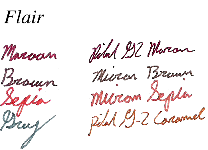
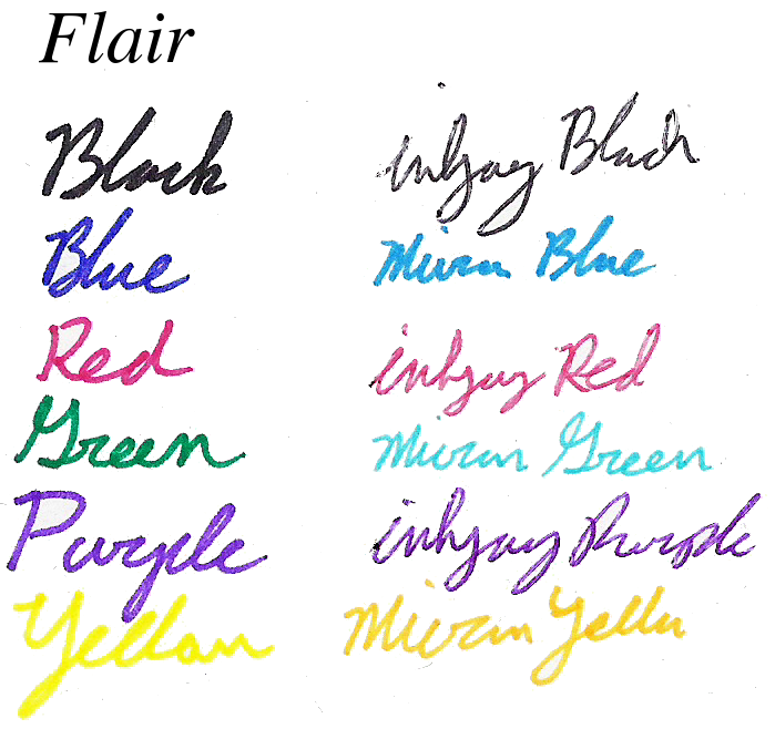
The paper is blank 100gsm, textured and acid-free. It’s quite thick, almost seeming like card stock, but this provides a stable writing service even deep into the book. The texture isn’t great, in my opinion, but isn’t intrusive either. It holds graphite and pigmented ink well. If one is using wet, dye-based inks, though, feathering can be quite severe. The thickness leads to very little bleed-through (although it couldn’t stand, say, sharpies) and almost no show-through in most cases. It’s very well behaved and makes writing and drawing a pleasure, especially with pencil.

photo-38

It’s a good sketchbook, quite a good one, if you’re not going to put it in extreme conditions. It’s on the lower price side of average sketchbooks and does the part. Most people won’t have a problem with it and I certainly haven’t. If you’re looking for something to beat up, a different book might be needed. But if you’re looking for a minimal, handsome medium-use sketchbook, I’d have a look.

Review – Bic Velocity Mechanical Pencil

Bic makes a lot of writing products, and sometimes it’s hard for me to keep them straight. I’ve never really been sure what one is supposed to do over the other. Nevertheless, the Bic Velocity is a solid mechanical pencil and I’ll be looking at it today.

20150510-220506.jpg

The back of the pencil is unremarkable; a clear plastic cap covers a small, white, barely functional eraser (it works about as well as most mechanical pencil erasers). This assembly can be pushed down to activate the lead advance mechanism. Just down from this is a plastic clip, functionally all right, with the pencil’s information written on it. Down from there, the body is clear and straight until it get to the rubberized grip section where it bulges then hourglasses, creating a nice place to rest your fingers. The little cap cone after this is clear, and has the metal tip floating inside so that is retracts when the lead is retracted, preventing the tip from getting caught on anything.

20150510-220540.jpg

Writing is fine. The lead is standard. It doesn’t break much, goes on smoothly enough and dark enough for school or office work. There is no advanced shock absorber or lead turning to prevent any damage, though, but at the price, that’s teetering on the edge of reason. The grip is comfortable enough to get one through writing or drawing without too much trouble. It doesn’t slip and isn’t too narrow. The overall construction is solid, and it feels like it won’t break in your hand.

Overall, the Velocity is fine. It isn’t the best mechanical pencil ever, and it has no real features, but it’s solidly and relatively comfortably built. It is fairly inexpensive and comes with enough refills of erasers and lead to last the user for some time. As far as inexpensive options go for mechanical pencils, it’s a good one, but there’s nothing special about it.

Review – Paper:Mate Sharpwriter

Papermate has been making pencils for a long time, and one of the simplest and least expensive mechanical pencils available is one that they make. These pencils are some of the cheapest on the market from a name brand, and always come in packages containing a large number. They are almost universally recognized as one of the lousiest pencils to use, but is that reputation deserved?

20150503-225627.jpg

Starting at the back, it’s got a small, pink eraser that does indeed erase (quite well, actually,) but, like most erasers at the back of pencils, it won’t last very long. Moving down from that, we have a basically straight and plain body, with a terrible “clip” near the eraser (it doesn’t actually clip on most things the thickness of shirt pockets). The basic information about the pencil is physically molded in the side, with no other features on the barrel. It looks slightly slippery but does grip with no problems.

20150503-225632.jpg

At the front of the pencil is the lead-advancing mechanism, which one must twist both to extend and retract the lead. This is inconvenient, but not more so than a top click. This twist mechanism is flimsy and easy to break if one goes too far, but not too noticeable when writing. The lead is technically refillable, but the pencil is almost treated as disposable, so it isn’t worth it.  The lead that comes with the pencil is fine: it’s a #2 and it works fine for most purposes, even erasing well with the eraser. There is also a “shock absorber” in the pencil (I believe it isn’t a special thing but inherent in the design) and it works!  You can press down quite hard and the lead will simply retract a few mm instead of breaking, but writing like this would be fatiguing and still cause the lead to break, since the spring is only absorbing force in one direction.

Is it a great pencil? No. Is it a bad pencil that will explode when you take it out? No. It works.  It’s a bit finicky at times, and I feel like I could break it with my bare hands and minimal effort, but under normal use conditions this isn’t a problem. The clip is the worst part, and if you need a good one I’d steer clear of the Sharpwriter. If you’re looking for the one pencil to have forever this is also far removed. But it is quite versatile and quite inexpensive. (Adam Savage of Mythbusters likes them: https://youtu.be/uN6vptYpo5I?t=2m15s) And if you lose pencils often, or are getting them for an office, I’d at least consider it.


Review – Uni Kuru Toga Roulette

I’ve previously looked at one of the most liked (and according the to the Wirecutter the best) recent mechanical pencils, the UniBall Kuru Toga; I was under whelmed. Recently I was able to get a hold of the upgraded version, the Roulette. Is it worth the upgrade? Should you skip the regular model and get this one? Let’s take a look.

20150428-233220.jpg

The back end of the pencil is a plastic and metal lead advancer; it works and doesn’t dig into the skin. There is a rubberized ring around it for reasons I don’t quite understand. Removing the advancer reveals a super tiny eraser that won’t last long but does indeed erase. Below that is a clip, which is fit onto the barrel in a way that would allow removal, but with difficulty. Japan is stamped into the side of the clip, and the name and size of the pencil is written on the barrel just beneath the clip. The barrel is plain until one gets to the section, which is metal and extended, the bottom half is knurled, but not aggressively so; it provides a good grip. There is a small hole in the grip that allows one to see the fact that the pencils mechanism is turning (but no the mechanism itself). Down from that is a tip very similar to the regular Kuru Toga, but extended is some ways. On this model this oddly designed step down cap is still not necessary, but covers up an otherwise ugly portion.

20150428-233226.jpg

Now on to the part everybody loves, the mechanism. I mentioned that I was under-whelmed by this previously, and I still am, but I know why now. The window in the grip section allowed me to see clearly when the mechanism was turning and when it wasn’t. And while it was possible to do this in the cheaper versions I was a bit harder to see. The mechanism itself by the way, as far as I can tell, is identical in both pencils, but there is no way to open them and find out exactly without possibly rendering them inoperable. But the answer to when the mechanism was turning when I was writing with the pencil was… never. I tested it, the mechanism works, it just never moves when “I” write with it. My writing, and drawing, are much too light to get it to rotate the lead, and thus I never see the affects. The packaging (for the inexpensive one, my roulette came in all Japanese packaging) says that the mechanism helps with the point of the pencil, and to prevent breakage. I really have never had a problem with either of these things, partly because I flail the pencil around compulsively when writing and drawing, and that rotates it such that my lead is always at a point. Now I guess I know that I write far too lightly to have a problem with breakage. But man, if I write lightly, some people must really press down on the things. So yes, it works flawlessly, but if you write like I do it isn’t really a selling point. And finally I wouldn’t worry about the mechanism wearing out, it is extremely well made and there have been no complaints about such a thing occurring, so if it does by that time you’d be able to just get a new one, it’s popularity means it likely isn’t going anywhere.

So, it is a good pencil? Yes. Is it worth the money for the upgraded version? Yes, even without the mechanism. The pencil is solid, well made, and solves the comfort issues I had with the less expensive version. The weight is good, the feel is good, the metal gives one a good grip and the writing is nice and fine. And if one does press hard enough to activate the mechanism I’ve heard nothing but good things. I wouldn’t take it over my Graphgear, but that’s just personal preference. I like the thinner body a little better on that one. So if you write with a lot of pressure, the Kuru Toga is the pencil for you, if you don’t you have other equally good options within the price range in my opinion. Even then it’s definitely worth a look.

Review – Daler Rowney 11×14″ Canvas Panels

Painting is fun, but stretching one’s own canvas can be difficult without experience, and even pre-stretched canvases can take up more space than wanted if one is simply practicing. Or, maybe you’re using mixed media or just drawing, and a stretched canvas isn’t right for you. Canvas panels are a good, sturdy alternative in these cases, and I’ll be taking a look at some fairly inexpensive ones by Daler Rowney.

20150421-221920.jpg

There are three canvases in the package. All are functionally identical. They’re 11×14” almost on the nose, and very sturdy, both in binding and in strength. The have a bit of flex, and have a slight bend if left unattended, but would be very hard to snap or fold. They’re essentially primed and can be painted on directly, but one might want to go ahead and prime them beforehand. The cotton canvas is acid-free to prevent decay, and the grain is not large enough to be intrusive. Paint, pencil, glue, etc. all stick well without any major problems. I’ve had one painting not like to dry on the stuff, but since all of my others have, I’d be willing to say the problem was with the old paint I was using.

20150421-221926.jpg

In short, the panels are quite good and inexpensive. They won’t replace a full canvas, but they won’t hinder the painter (artist). The slight warp they have is an easily corrected downside, and the only major one I can see.

Review – Master’s Touch Palette Knife

I’ve been painting recently, and have a new appreciation for palette knives (foolishly I never used them before), both for controlling paint on a palette, and for painting. Unfortunately I’ve found no real resource that says if there are consistent sizes and shapes for palette knives, and I don’t believe there really is. So instead of this being a review of a specific size or shape of knife, this will be a general look at the quality of the Master’s Touch brand of inexpensive and easily accessible palette knives.

20150414-225713.jpg

The particular knife style here is slightly unconventional, and appears in the least amount of photos I see online, though it is the shape used by Bob Ross, so it’s got that going for it. The handle is a light, okay finished wood with a lanyard hole and the Master’s Touch logo imprinted on it. It’s sturdy enough and it works. Following that is what appears to be a “brass” “section” ring that is dented and losing its finish. It holds the blade in place, fairly sturdily, but also not centered. The blade is stainless steel, quite flexible and tapers down to a very usable edge. It is finished well enough, and doesn’t get thin enough to cut easily, but I suppose if one really tried they could make it dangerous. In some places the brushed finish isn’t nearly as well done, but these places don’t really matter in the scheme of things.

Overall it’s a nice introductory tool. It obviously has some quality control issues, but they aren’t major and don’t prevent the tool from functioning or make it dangerous. It’s inexpensive, and I would recommend it to anyone who isn’t sure if they really want to paint and are just trying to get into it, upgrading in the future is always possible and still isn’t a lot of money. And even if one doesn’t this tool will likely be able to last a painting lifetime.

Review – PaperMate Flair Colors – Maroon, Brown, Caramel, and Grey

And now it is time for the final part of my look at the 20 colors of the Papermate Flair pen. This section only has 4 pens, and it’s special because I couldn’t find names for these colors from any official source. So the 4 names presented here are just what I think most represent the colors. Let’s get started and wrap this up.

Papermate flair colors part 4

Maroon – I love a good maroon shade, and this one does not disappoint. It’s easy enough to tell, even amongst other dark colors, what it is, and the tone is nice to look at. It might not be the most natural maroon I’ve seen, but it’s quite good, and sometimes it may even be work compliant. It doesn’t smear much but it’s not the best at resisting water, either.

Brown – The brown is a nice dark, UPS, brown. It doesn’t quite look like dirt, more like bark, and it barely smears. It’s easy on the eyes, blends in with dark colors, and could work in some office settings.

Caramel (error in image where this is labeled as Sepia and Micron Colors are switched) – Caramel is the color I’ve had the hardest time naming. I just don’t really get this light brown. It looks fairly standards, but it’s a bit off from the browns in Micron, Crayola, Pilot, and other such brands. It looks all right, but not the most natural, and most workspaces wouldn’t appreciate it. Although smearing is next to none.

Grey – And the final color is also one of the most boring. Grey is a color I love that isn’t featured in many color sets. And that’s because there isn’t much use for it. In nature I can only think of fog, and in an office only if you convince them it’s just your black pen running out. That being said, it’s a nice dark, even grey with very minimal smudging and feathering.

And there we are, the 20 current colors of the Papermate Flair. I do like them, and even some of the more garish colors are better in these sets than others. There’s a good mix of water resistance, workspace appropriateness, and personality in there. And I would recommend the set if you like tones of colors and like the Flair. But it’s a bit expensive and maybe one should consider the smaller sets if they want specific colors.

Review – PaperMate Flair Colors – Olive, Lilac, Navy, Plum, and Turquoise

And now for part 3 of my look at the 20 colors of Papermate Flair pens. This time I’ll be looking at five of the cooler colors in the lineup. I’ll just get started.

Papermate flair colors part 3

Olive – Olive is a nice green, forest-y color that looks quite natural and is very pleasant. It is quite conservative and laid back. One might be able to get away with using it at an office, but it’s unlikely. In poor lighting it almost blends in with dark blues and blacks, though. On the smearing side it’s one of the worst, easily smearing and becoming unreadable with contact with water.

Lilac – It’s a light purplish color that is smooth and quite easy to look at. It wouldn’t be appropriate in most offices, but in many a field of flowers there are similar colors. The color looks almost washed out before water is applied, but it smears and feathers probably the least out of the entire set.

Navy – Navy is a very dark, office-appropriate blue that goes well in most places. Artistically, it would be most at home in the dark, but there may be other applications. It does smear, but very little, and it is often readable afterwards. The main problem when water is applied is that there is so much pigment that it covers a wide area with a bluish tinge.

Plum – A bit off from most of the fruit I’ve seen, this plum is a dark, red-ish, purple color. It could pass for a plum still, just not one from a supermarket. It could also make its home in an office for a bit of fun, but not for everything. It bleeds, feathers, and smears pretty badly, but does stay mostly readable.

Turquoise – Turquoise is a nice color at points, but it shades quite a bit, and the color variation can at times be unpleasant. It’s a good sky, but doesn’t look like the stone, and going over it multiple times will turn it into more of an aquamarine. If your work doesn’t have a problem with blue, it should still work. With a wipe from water nothing changes, but if left for a few moments the color dissolves completely and is unreadable.

And that’s it for part 3. These colors are some of my favorites in the set, and much more usable than their warm counterparts. Next time I’ll be taking a look at the remaining 4 pens, which aren’t officially named anywhere I can find.

Review – PaperMate Flair Colors – Black, Blue, Red, Green, Purple, and Yellow

The Papermate Flair is a good porous-point pen; I’ve looked at both the black and red versions in the past. But they do come in a host of colors. I got the largest pack I could find, which seems to be exclusive to Sam’s Club, with 20 colors. And it’s so exclusive that I can’t find official color names for 4 of them. Those 4 will be in the last part of this series, the first 3 being Standard, Warm, then Cool. And now onto the colors.

Papermate flair colors part 1

Black – The black is a fairly standard black (most are): it’s deep and cool. It’s office-appropriate and moderately smear-resistant. While it does smear, it is readable after most spills.

Blue – A dark, office-type blue that is not a very natural color, but a pleasant one. It is legible and unintrusive. It lightens considerably and smudges when wet, but doesn’t erase.

Red – A dull (but still punchy) red, nice to look at, but a bit pinkish. It’s less glaring and hard on the eyes for grading and warnings than comparable pen reds, but similar to most marker reds. Is fairly smear resistant, but does lighten.

Green – A dark green, slightly darker than, say, a crayon green. It’s a deep, grassy, natural color. Noticeably different from the other, more common colors, but nothing that’ll jump out from across the room. It could be used in a liberal office. It smears and lightens quite a bit, though.

Purple – One of the more usual, pops-off-the-page purples. It is noticeable as a purple and isn’t the most natural-looking color. It stands out from dark blues, but could get lost in a page of dark inks. Almost no smudging on this one, though it does feather a lot when wet. It could be used in a similar office to the green one.

Yellow – A super-bright, stereotypical yellow. It’s almost illegible on white paper. It’s the most water-resistant after red and purple, but it all but disappears anyway. It hurts they eyes to look at for a long time (I’m not sure if it’s the brightness or the fact it’s hard to read) and isn’t a very natural-looking color. I wouldn’t recommend this one unless you’re coloring in books.

And that’s part 1 of my look at the 20 Papermate Flair colors. A good general assortment here, but nothing groundbreaking. Next week I’ll take a look at 5 of the more Warm colors in the set.

Review – Uni-ball Jetstream Bold

Some people search for the best of something. I never really looked at my collecting in that way. I just like using a variety of things, and for me I know that there’s no one perfect thing. But that doesn’t stop me from liking sites like TheWireCutter.com, which finds the best product in a given category for the average consumer. I was recently featured in their article about the best mechanical pencil (along with several other, well-known reviewers), and while I was talking to them, I thought I’d try out their recommendation for best ballpoint pen: the Uni-Ball Jetstream. If you read their mechanical pencil article, and my review of their pick the Uni Kuru Toga, this might seem familiar. I do understand why people like the pen, but I don’t like it so much, and here’s what I think of it.

20150311-220545.jpg

My particular Jetstream is the bold 1.0, and starting at the top it has a nice, beefy, chrome click button that is very satisfying to use. Down from that is the logo, size, and a solid clip that does its job. The majority of the barrel is rubberized, with the Jetstream logo in the top half in a hard-to-read, reflective plastic. There are slight divots on the section for grip, which actually flares out, instead of tapering in, making it quite large in the hand, and then an interesting-looking chrome cone that leads to the point. This cone does screw off and the pen is easily refillable.

20150311-220550.jpg

The ink itself is a nice, cool black that slides onto the page easily. There is an ever-so-slight amount of dry time, after which the ink is quite waterproof. While the ball does roll nicely and the ink flows smoothly, I still get blobs and stuttering, blobs being less frequent than with comparable pens, and stuttering much more frequent. This slight stuttering is hardly noticeable when writing, but is virtually the only feedback the pen gives. It is most definitely the smoothest ballpoint I’ve ever written with but I don’t feel like I’m in control of it when I’m writing. The stuttering is easy enough to overlook when the writing is done, though.

Overall it’s a well-designed, sturdy pen that I don’t want to write with. The point slides out from under me, and the thick grip cramps my hand after a while. It’s also extremely light, which makes me want to hold it tighter so as to not lose it. Still, the fit and finish are great, it’s very satisfying to hold, and if you want an “inexpensive” smooth ballpoint, it really can’t be beaten