Review – Sharpie Pen Colors

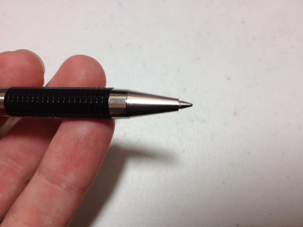
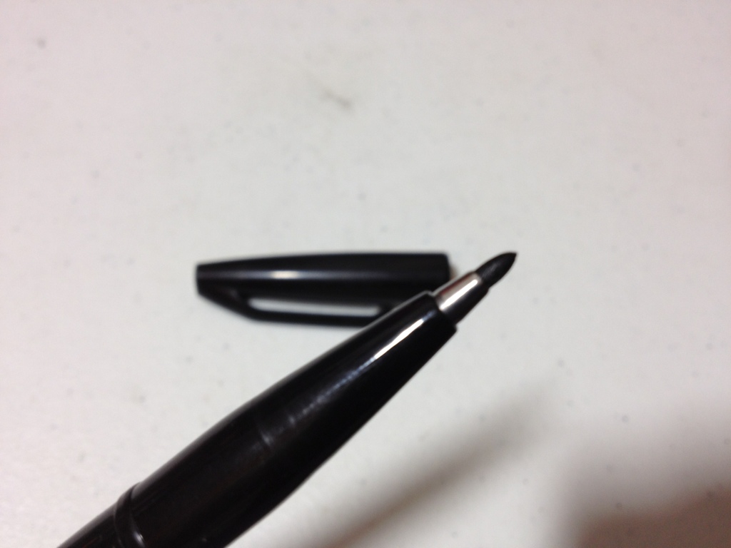
I have reviewed the Sharpie pen before. And the ink in that pen was a bit of a muted black. Now it’s time to look at some more of the Sharpie pen color palette: the blue, red, green, purple, and orange pens.

pen comparison sharpie 2

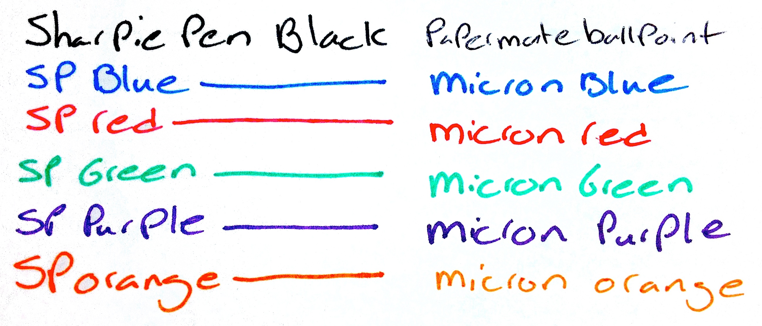
Colors not exact representations.

Starting off with the blue, which is a typical blue, if a bit washed-out looking. It is a subdued blue that would be appropriate in most work environments. They say that all of the colors are water-proof and smear resistant. I will say that is mostly true unless under extreme circumstances, but don’t expect them to be as all-around useful as their marker cousins. They also dry fairly fast and are supposed to be non-toxic, but I’m not checking that.

Now to the red, which is the most disappointing of the bunch. It is faded and looks almost pinkish. It’s hard to tell it’s really a red and it certainly lacks the intensity most look for in a red ink. That being said, it is subdued and will work better in a work or school environment where one would want a less aggressive color.

The green is, say it with me, subdued. It is undeniably green, and being as laid back as it is almost intensifies it. It’s the hardest to read out of the bunch and is almost eye hurting after a while. Strangely it is almost identical to Micron green.

The purple is flat, but deep. It is easily the darkest and most readable of the bunch. It is also fairly close to a Micron purple and provides a nice, neutral color, that is still quite different.

Now finally the orange. The orange is the only intense color out of the bunch, and even then for orange it is fairly flat. It does jump off the page and provide the kick one would expect from a nice orange. I’d say it’s probably the best color of the bunch.

So there are a few colors. Aside from looking almost identical to Micron colors I’d say they’re good. I haven’t the foggiest as to why that is but it is a bonus in my book. Anyway, if you like Sharpie pens, and want some nice, pleasant colors for work or some such, I’d take a closer look at these. And due to their subtlety they also look much more natural in drawings than standard, intense colors.

Review – Sharpie Liquid Pencil Black

Want the bold line of a pen, but the correct-ability of a pencil? Well, good for you! Erasable pens have moved up leaps and bounds, and Sharpie has one, called the erasable pencil.

20131218-000613.jpg

The barrel of the pen is a clear plastic with the branding on it. The grip is a light rubber, but it is more smooth than grippy. The tip is a cone that leads to the tip which is retraceable with a click mechanism. The entire back third of the pen(cil) is the click mechanism, with an eraser and flimsily little clip. Sharpie is written on the clip, but small and indented. The mechanism is cheap, it simply sits on the back and doesn’t fit into place on the back, it wobbles and bounces while one is writing. It makes the pen feel unnecessarily cheap and plastic-y.

20131218-000619.jpg

The ink is black, but it is a bit thin and grey, though not nearly as grey as say, a pencil. There is nothing else particularly spectacular about it. It is fairly permanent, but it is less fade- and water-resistant than most inks, because of course it can be erased. And it can be erased. Depending on the thickness of the line it goes away completely, or to such a faint line that it is unnoticeable. It is truly a liquid pencil.

So it doesn’t exactly have the boldness of a pen, but it is more bold than a pencil, and it is erasable like one too. So if you were looking for a happy medium between the two, then look no farther. But if cheap-feeling construction and not-so-bold lines put you off, then I’d suggest looking elsewhere.

Review – Zebra F-301 Ballpoint

Sometimes even the most pretentious artists or religious fountain pen users have to use a ballpoint pen. Now they could just use a ballpoint insert in a more expensive pen, but they might not want to do that. They also might not want to use a Bic ballpoint. So now we enter the level of not entirely expensive or cheap ballpoint pens. The first being the Zebra F-301 ballpoint pen.

20131211-002403.jpg

The pen is made of stainless steel with a round barrel with the model number on it. The (grip) section is a checkered plastic that is grippy and between comfortable and uncomfortable. It really does nothing for me. The cone near the tip is nothing spectacular. The clips is a simple stainless steel, with a plastic back and a metal button. The button does not lock down when depressed so it does shake when one is writing. Otherwise, the body is very study and light. Denting is hard; scratching is fairly easy, though.

20131211-002409.jpg

The point is very fine. It writes smoothly and the ink is standard ballpoint black. It is slightly grey and skippy unless one pushes down hard. It is not waterproof, but it doesn’t smudge after drying. I will say that the pen I have used is more prone to globs of ink off the tip than almost any other pen I’ve used.

So overall the additional expense of this pen (which isn’t very much, but still…) over a regular ballpoint is obviously its design. It will hold up better and is much more pleasant to hold than any other cheap ballpoint. The writing experience is about the same, which, to be fair, doesn’t get much better with the more expensive pens. It really is just a matter of taste and how much you want to spend on this one.

Review – Bic Disposable Fountain Pen Black

If you’re an artist or would like to become one you’ve probably heard that ballpoints are not a good art instrument. While this is not the case, there certainly are better ones. Fountain pens are generally accepted to give a better writing performance than ballpoints. And the Bic disposable fountain pen seeks to combine the smoothness of one with the convenience of the other.

20131204-001320.jpg

The body of the pen is a smooth torpedo in the classic fountain pen shape, though a little smaller. The cap has an easy-to-use clip attached solidly to the top that is both sturdy and tight. There is a partial ink window and logos along the otherwise silver-colored barrel, nothing else. Taking off the cap and looking at the (grip) section, the feed(er) is viewable though a clear tube. The section is much thicker than a ballpoint and easy to grip, though it may become slippery and has no lip at the end. The nib (tip) is steel and ground to a medium point. It is unspectacular looking.

20131204-001340.jpg

As for writing, it is very good. Most of the money you pay likely went into the nib and it shows. The pen writes smooth and effortlessly for the most part, but can be prone to feedback. The flow of the ink is good and it keeps up well. Speaking of the ink, it is surprisingly black, and unsurprisingly not waterproof. This ink will feather easily and take a moment to dry. I also don’t recommend using cheap paper, as the ink will bleed thorough, though not as bad as many bottled inks. There is a massive supply of the ink, though, so you won’t have to worry about this pen breaking your wallet particularly.

For a cheap pen ($2-4 a pen), this is a very nice one with a lot of okay ink. It writes well and draws the same. If you’re looking to experiment with fountain pens in your art or writing, and would prefer a slightly larger pen, this is certainly one to look up.

Review – Speedball Super Black Ink

Let’s get to inks. If you’re drawing you might want to try out some India inks. I’ve already taken a look at Higgins India inks, but today I’ll be looking at Speedball Super Black. The ink comes in a plastic half-cone container, that is fine for dipping as it is very wide. It is very full though and can be easily spilled at first, so be careful. The cap has a foil lining that isn’t very good and ink gets on the rim and underneath it constantly, so be careful when opening and closing as there may be ink where it isn’t supposed to be.

20131129-004435.jpg

Now on to the ink itself. It is black, and when I say black I mean black. It has virtually no greying even when applied in the finest or broadest of nibs or brushes. It goes on black, and it dries black. Though it is a warm black with a hint of yellow brown when applied very thin. It does dry fairly quickly, though not the fastest, and it doesn’t feather on any paper I’ve used, even in large amounts. It doesn’t bleed through the page, but it does have some show through and page buckling in larger dollops, so it should only be applied in one coat. It is quite water-proof as in it doesn’t even move when water is applied to it, though that is because it contains shellac which can clog up pens and brushes if not washed out properly. They recommend ammonia for that but soapy water applied right after use should do the trick if nothing else. It can also be diluted for washes etc, but because it is heavily pigmented this is not the optimal ink for the purpose as it could go bad quickly.

20131129-004443.jpg

Overall if you want a BLACK drawing ink and can handle the problems pigmented ink presents this is a fairly cheap ink that may just be exactly what you’re looking for.


Comparison – Wite Out Vs. Liquid Paper

Sometimes you make mistakes, and sometimes those mistakes need to be corrected. There are a few ways to do this, and a few brands of correction fluids to buy. Today we’ll be comparing Liquid Paper and Wite Out.

20131113-004433.jpg

What do they have in common? They both have similar size bottles (~20ml) and a stick with a sponge-wedge applicator. They are about the same size in application. Those are the only cosmetic similarities. The bottles themselves are very different. The Liquid Paper one is a bit larger with grooves on the side for grippyness, while Wite Out is just in a slim, standard-looking bottle. The Liquid Paper bottle has ridges on the cap that are supposed to make it easy to open, but instead they are slippery and difficult. They also get in the way when applying. The ridges on the Wite Out are much easier and less intrusive.

But now on to the substance itself. And there is no noticeable difference in the application process, as they have about the same viscosity and go on smooth. The brush on the liquid paper feels a bit stiffer. When dry the best I can say is Wite Out is a warm white, and Liquid Paper is a cool white. The are both undeniably white, but neither are true white. You couldn’t say they have tints, they are just warm and cool. After drying the Wite Out is easier to write on, so that is the only other consideration.

It really depends on what paper you have when using these, warm or cool paper. Yellowish will prefer warm. And though Wite Out is easier afterwards, it isn’t too much easier. So it comes down to price if neither of those things matter, as I can say that they both work quite well at what they’re designed for.

Review – Signo Angelic White

Some colors of pens are rare, and white even more so. So if you need to highlight something in your art or maybe need a white-out pen that isn’t a white out pen you can try the Uni-ball Signo Angelic white gel pen.

20131108-000441.jpg

Starting with the pen itself: the barrel is octagonal near the back and becomes a weird grip shape near the front, though it is quite comfortable. The cap has a plastic clip that works I guess and securely clicks into place on both the front and back of the pen. A metal cone holds the tip and cartridge in place and can be easily unscrewed for refilling.

20131108-000447.jpg

The ink is white. Though not as white as one might hope, being a gel ink it is slightly transparent, and on darker colors would require several coats to cover completely. That being said it highlights very well and is very visible on colored paper, though it looks a bit grey on black paper. The ball is also very fine, leading to a line that can be very faint sometimes.

So overall it is good at highlighting and some writing, but if you’re looking for a pen that can precisely cover marks and don’t have the patience to use multiple coats you might not want to look at the Uniball Signo Angelic White.

Review – Moleskine Pocket Softcover Notebook

I’ve already reviewed the Moleskine pocket notebook in hardback, but I’ve also used the softback version, and since there are a few key differences besides the obvious, I though I’d highlight them. So this is only half a review, if you want to know about the paper you can look up my other Moleskine pocket review.

20131030-010203.jpg

So the cover is obviously soft. It is a lot thinner and as such you can see the binding through it, especially on the back where you can see the attachment points for the elastic band. They are a bit intrusive and noticeable. The cover is blank aside from the name Moleskine stamped rather deeply into the back cover. The look is a bit like the regular Moleskine, but the pages are cut the the same length as the cover, and it looks a bit more shiny. The front cover can roll up on itself and then bounce back, but it never fully regains its former shape. The back is much less flexible due to the back pocket that comes Moleskine standard. The cover also feels almost moist and rubbery, and any minor scratches and such simply bounce out unlike the Rhodia Webnotebook. The softness does mean that the elastic band leaves very noticeable marks on the cover and sometimes the paper. The spine in contrast to the hardcover feels much more durable and able to stand up to long, continued use.

20131030-010210.jpg

Which style of cover is better is a decision you have to make. This one is flexible, easily fits in a pocket, and is harder the permanently damage than the hard cover, but it offers less page protection and stability for writing, so it’s give and take.

Review – Layflat Dot Grid Composition

Sometimes lines don’t look right on drawings and grids are too intrusive. Dots can be easier to draw around and can give the general guidance that is necessary. If you want the added bonus of having a book that lays flat on your table or lap you might want to try out the Layflat Sketchbook Dot Grid Composition notebook.

20131023-014028.jpg

The cover has a static looking black and white style and and a black spine. There is a space to write a name and subject as well. The cover is very thin cardboard, the inside being plain white with a plastic coating on the outside. It is rather thin, and has a problem with the pointy corners getting dinged up easily. The spine does lay flat with a little prodding, though not as flat as a saddle-stitched binding, but flatter than any other types of composition books, and most other note books.

20131023-014034.jpg

The pages are thin as well, white with tiny grey dots at regular intervals. There are quite a few of the dots on a single page, though I don’t know how many. The paper shows through with almost every ink, though it does take a heavy amount to bleed through. Even a few fountain pens work. The corners get dinged up like the cover, and the individual pages are a lot easier to damage. The grid they form is easier to write with than many others and is fairly straight. Though many of the pages are not printed the same, so the dots are inconsistent. Each dot is made of several small dots so they are un-intrusive.

Overall it’s a good notebook for designs and sketches requiring general guidance. It doesn’t work well with larger fountain or brush pens, or heavier liquid ink pens. It can get dinged up easily, but it does lay flat. In the end it is a cheap and nice notebook. Though it has faults, it is reliable and of good quality. It’s good for students or casual designers.

Review – Pentel Sign Pen

A felt tip marker can be a useful art supply. If you want to use a high quality marker pen from a well established brand, and don’t need a particularly thick line, the Pentel Sign Pen may be the thing you’re looking for.

20131018-003651.jpg

The pen itself is black, fairly flat, combining the worst of matte and shiny blacks. The base has a small tan disk. It’s got a slightly hexagonal design, and both ends taper down to a cylinder. The cap is in the same design. The clip is a long piece of plastic, and it ends in a slightly sharp, shirt tearing, tip. The grip section tapers down to a metal holder and a thin felt tip.

20131018-003657.jpg

The ink is a nice black, and it is very black. The tip doesn’t seem to have much line variation. It looks about the same no matter the pressure. Using enough pressure to give variation would damage the tip. Tilting the tip can cause some variation. The ink is mildly waterproof. It does turn grey and does smudge heavily, though it doesn’t fully disappear and can in most cases be read.

So if you need a fine-to-medium point, water-resistant black marker, which sounds specific but really isn’t, this could be the pen for you. In my opinion it is more comfortable than a sharpie, and is a bit smaller, which is nice. It is a very good pen for line art especially on larger works.