Review – Sharpie Colors Part 2 Blues – Blue, Navy, Turquoise, Sky Blue, and Blue Ice

Now in the second part of my Sharpie color reviews I’ll be talking about the blues, a nice and varied set of colors.

photo-96

Blue – Blue is a very classic color and it looks quite a bit like the standard blue we’ve come to expect from various markers and pens. This one is a bit darker, though. The ink is more wet than the other standard colors and bleeds a bit. It’s also too dark to be natural and almost too much to be organizational, it is a bit too close to black in dark conditions, but with good eyes it can work. Still, it is very blue.

sharpie colors blues

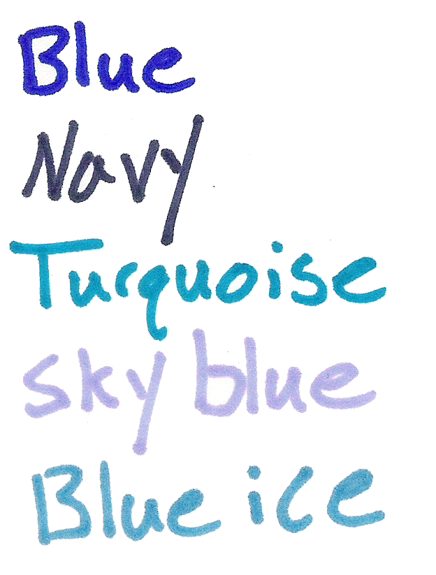
Navy – This color is very close to the classic navy color, a bit close to black in low light, but it looks like a lot of navy colors. It’s a very dry color and has very little bleed and feathering/spreading. It’s a nice-looking color, but not a very useful one.

Turquoise – Turquoise is a difficult color to get down in ink, and none of them look quite like the stone. This one’s a bit dark, but it does make a good blue-green tone. The ink is very wet, and bleeds easily, but has very minimal feathering. It’s a very natural and pleasant tone, great for organization and for artistic purposes.

Sky Blue – This blue, like most of the blues in this set, is darker than it really should be. It’s more of an evening sky blue, or a wispy-cloudy blue. It bleeds a bit more than the turquoise and the blue, and is just as feathery. It’s a very nice looking and easily identifiable color that many office and artistic uses can be found for.

Blue Ice (Possibly Mystery Blue) – This color is the most contentious of the colors in my current review lineup. The package of markers I received was not marked, and of the other blue colors I looked at this one seemed closest. If you believe I am wrong in my categorization, I encourage you to leave a comment. This blue is a cool blue that I would say has no direct natural counterpart (certainly not ice, as this is the least aptly named), but it could be used as a substitute in many cases. I prefer it to the sky blue as a light blue. It can be used in art if one is creative and is very distinguishable from other colors for organization.

Overall, I really like the blue Sharpie colors. They are a bit bleed-prone, but they have a variety of uses and in many cases are work-appropriate. The tones are very natural and appealing. They’re a good set to get, if one can.

Next time I’ll be looking at a few of the greens that Sharpie has to offer.

Review – Staedtler AllXwrite

I’ve looked at a few all-graphite pencils in the past, but they were only sold in art supply stores and were thicker than the average pencil. The Staedlter AllXwrite is a #2 all-graphite pencil that is much more widely available. How does it hold up?

photo-80

The body of the pencil is unsurprisingly plain. It’s a standard hexagonal pencil design, all grey with silver lettering. The information printed on it is enough to get by. At the end of the pencil there is a standard metal eraser holder, and a fairly standard white eraser that works well.

photo-79

The graphite is quite hard, but still writes with the same pressure as a normal pencil. There is a coating on the outside to prevent major marks, but it is still possible to mark with it. Sharpening is easy, but wasteful, and if one adjusts their writing or drawing in such a way as to re-sharpen the pencil as they write with it, it requires none and will last for a very long time, far outstripping the eraser. Other than that, it’s a standard HB, suitable for taking tests or notes, and making lists and art.

photo-84

I like this pencil a lot. They’ll last forever and write well. I’ve flattened the ends of one of mine to make it easier to shade large areas. This, coupled with a few others at varying degrees of flatness leads to a ton of artistic options. While these pencils are a bit more fragile than wooden ones, I think that with normal use they will hold up just fine for someone interested in getting a long-lasting or quirky writing implement.

Review – Liquid Accent Highlighter

Highlighters are a useful tool, mainly for their intended purpose of highlighting text. But they can also be used to “sketch” drawings before inking them and not be picked up by a scanner (similar to drawing with a blue {non-photo} pencil). Still, many highlighters are the same, and I hesitate to review them, but let’s take a quick look at the Liquid Accent highlighter that is my main choice for this type of product.

photo-82

The design of the body is fairly standard for this type of stuff. The cap is a smooth, domed shape with a “futuristic” clip based in and protruding from it. This snaps onto a barrel that is again one sloping shape, with a “lanyard” hole at the end (I assume that’s what it is). The body is transparent, so the ink supply and feed can be seen from the outside. The section is almost slippery, but not quite, and the chisel tip of the marker is quite hard and works well. The information printed on is the bare minimum, and I wish there was a bit more (like manufacturer’s name) to identify it.

photo-81

There isn’t much to say about how it writes: it’s smooth, it’s bold, and isn’t too wet (it doesn’t bleed). The ink stays where you put it, generally. I haven’t tested it in the sun, but it does smear a little bit under water, and it also smears any of the less permanent or non-dried inks it highlights.

It’s a good highlighter, but it’s hard to have a bad one. It highlights stuff, it holds well, and it has a ton of ink. (I’m having trouble finding my exact brand online, there are highlighters that seem very similar produced by Sharpie and Paper:Mate {Both owned by Sanford, which is owned by Rubbermaid}, but if it’s a cheap one when it is found, that’s another plus) I don’t really have much to recommend it over any other highlighter, but if you do find it, it’s not a dud.

Review – Expo Ultra Fine Pink, Purple, Orange, and Brown

I’ve looked at the 4 most common Expo marker colors (specifically in the Ultra-Fine tip) in the last few weeks, and this week I’ll look at 4 of the lesser-seen colors: pink, purple, orange, and brown.

photo-52

Pink- to start with, the pink is a nice, dark pink that looks much more pleasant than the common pinks found in writing utensils. It’s rosy, and very consistent; the line width is medium, though.

Purple- next, the purple is a very bold writer, it goes on smoothly and with a lot of ink, but there is more variance in the color when dry. It is a nice, dark purple, and unmistakably so. It might be confused with black from far away, but is generally distinguishable.

Orange- the orange is very thin, both in line and in color. It’s sometimes hard to tell it’s there at all, and there is a wide color variance within it. I’m not a particularly big fan of it.

Brown- and finally the brown, which is another wide-writer. It writes smoothly, with the only color variance being in the tips. It’s a dark enough brown to be easily read, and still distinguishable from the other dark colors.

Overall, these 4 are a nice addition, though they aren’t my favorites, either in performance or in looks. I like them, but if I were just getting these for a class I would skip them. For organization, note-taking, and art, these colors have a better purpose, but those aren’t the main purpose of dry-erase markers.

Review – Expo Ultra Fine Red, Green, and Blue

Last week I looked at the Ultra-Fine Expo markers as a whole, and the black color specifically. This week I’ll look at the more common colors in most dry-erase ranges in this size and brand, and see how they work.

photo-52

Red- The color red is a problem with many pens, and dry-erase markers are no exception. The red goes on smoothly enough, and is one of the thinner “sticking” inks. The lines it makes are solid, but the shading and their thin-ness is more pronounced. The color is also quite washed out and pink, which I’m not really a fan of, but seems to be a theme in reds.

Green- The green is one of the thicker and smoother colors. The lines are bold and solid. But the color, while pleasant, is also washed out. While it is definitely in the green spectrum, it’s more of a sea-green or something similar.

Blue- And finally the blue. In writing characteristics, it’s more of a mixture between the other two. The lines aren’t as bold or thick, and it’s not quite as smooth as green, but more so than red. The color is the most true and least shading of the bunch. It goes well with the black, and is easy to read even from far away, though it isn’t too dark.

The first set of colors is standard, and while lackluster, they get the job done. I can’t really complain as they weren’t created with art in mind, but rather for ease of use and low odor, which they have. Next week I’ll take a look at some of the less-standard colors available in the lineup.

Review – Expo Ultra-Fine Point Dry-Erase Markers

When it comes to dry erase markers, Expo is almost the only brand people recognize out there. Their chisel-tip markers are almost ubiquitous in any place that requires a white board, and are generally what people replace the cheap in-package markers from home magnetic boards with. And while I like the markers and always have, I do have a problem with their tip size. Even the fine point markers are large enough to be hard to use for people who like to write fine lines, like I do. Fortunately, there are slightly-less-popular, but still easily available Expo markers with an “ultra-fine” tip. Are they much better?

photo-51

The body design is almost identical to the fine tip versions, with a slight taper from the middle to the ends. There is a step-down on the rear to allow for easy posting. There is also a step-down from where the cap is removed to the section. The cap and all of the writing on the pen is loosely in the color of the ink. The section can be a bit slippery, but it’s never a problem. It ends in a small cone with the point that is indeed very fine for a dry-erase marker. The information presented on the side is standard and useful enough.

photo-53

The tip is very fine when compared to a regular fine marker. It gets down to a medium/broad on a regular ball or fountain pen. The ink flows smoothly and erases easily, as one would expect from the Expo brand. The black is the standard Expo black, and does the job. It doesn’t start to wash out at this size and is perfectly readable.

photo-52

For anyone who needs to mark something with a bit of a finer point (like on a map), wants to write regularly on a dry-erase board, or for those who are artistically inclined and were frustrated when they couldn’t get the various line sizes they needed out of the more standard Expo markers, these work very well. They are of the same quality as the other markers in the line (which is to say as good or better than competitors) and offer a much smaller and more manageable line.

Review – Excel #11 Hobby Knife Blades

X-Acto knives with #11 blades are an art, crafting, and modeling staple. But is the brand name worth it? Will a pack of Excel blades do just as well, or should you just buy the no-name brand from eBay if you want to save money?

photo-40

To start off with, the Excel brand 5-pack that you buy in hobby stores has a tube to store the blades in. It’s nothing special, but it gets the job done, is clear so you can see your supply, and is flexible so it doesn’t shatter.

photo-41

The blades fit securely in all hobby knife and scalpel handles that I tested, and should fit in all (unless there’s a proprietary system I don’t know about). The blades come sharp enough to cut paper, and hold their edge through cutting plastic. They dull and bend at about the same rate as X-Acto blades and can easily make it through several projects before dulling or being nicked. I’ve had no rusting yet (they come oiled), but I do keep them fairly moisture-free. The tip is “flexible” in that it doesn’t shatter and has some play (bouncing back when bent), but the point and the blade are hard enough that a single blade could take weeks of daily use (depending on the use, as plastic and metal are obviously harder than paper and cardstock).

Overall, these blades are less expensive and at least as good, if not better, than the name brand competition. They cut well, hold an edge, and resist breaking. They’re a reliable blade that is at least worth a look.


Review – Bic Velocity Mechanical Pencil

Bic makes a lot of writing products, and sometimes it’s hard for me to keep them straight. I’ve never really been sure what one is supposed to do over the other. Nevertheless, the Bic Velocity is a solid mechanical pencil and I’ll be looking at it today.

20150510-220506.jpg

The back of the pencil is unremarkable; a clear plastic cap covers a small, white, barely functional eraser (it works about as well as most mechanical pencil erasers). This assembly can be pushed down to activate the lead advance mechanism. Just down from this is a plastic clip, functionally all right, with the pencil’s information written on it. Down from there, the body is clear and straight until it get to the rubberized grip section where it bulges then hourglasses, creating a nice place to rest your fingers. The little cap cone after this is clear, and has the metal tip floating inside so that is retracts when the lead is retracted, preventing the tip from getting caught on anything.

20150510-220540.jpg

Writing is fine. The lead is standard. It doesn’t break much, goes on smoothly enough and dark enough for school or office work. There is no advanced shock absorber or lead turning to prevent any damage, though, but at the price, that’s teetering on the edge of reason. The grip is comfortable enough to get one through writing or drawing without too much trouble. It doesn’t slip and isn’t too narrow. The overall construction is solid, and it feels like it won’t break in your hand.

Overall, the Velocity is fine. It isn’t the best mechanical pencil ever, and it has no real features, but it’s solidly and relatively comfortably built. It is fairly inexpensive and comes with enough refills of erasers and lead to last the user for some time. As far as inexpensive options go for mechanical pencils, it’s a good one, but there’s nothing special about it.

Review – Paper:Mate Sharpwriter

Papermate has been making pencils for a long time, and one of the simplest and least expensive mechanical pencils available is one that they make. These pencils are some of the cheapest on the market from a name brand, and always come in packages containing a large number. They are almost universally recognized as one of the lousiest pencils to use, but is that reputation deserved?

20150503-225627.jpg

Starting at the back, it’s got a small, pink eraser that does indeed erase (quite well, actually,) but, like most erasers at the back of pencils, it won’t last very long. Moving down from that, we have a basically straight and plain body, with a terrible “clip” near the eraser (it doesn’t actually clip on most things the thickness of shirt pockets). The basic information about the pencil is physically molded in the side, with no other features on the barrel. It looks slightly slippery but does grip with no problems.

20150503-225632.jpg

At the front of the pencil is the lead-advancing mechanism, which one must twist both to extend and retract the lead. This is inconvenient, but not more so than a top click. This twist mechanism is flimsy and easy to break if one goes too far, but not too noticeable when writing. The lead is technically refillable, but the pencil is almost treated as disposable, so it isn’t worth it.  The lead that comes with the pencil is fine: it’s a #2 and it works fine for most purposes, even erasing well with the eraser. There is also a “shock absorber” in the pencil (I believe it isn’t a special thing but inherent in the design) and it works!  You can press down quite hard and the lead will simply retract a few mm instead of breaking, but writing like this would be fatiguing and still cause the lead to break, since the spring is only absorbing force in one direction.

Is it a great pencil? No. Is it a bad pencil that will explode when you take it out? No. It works.  It’s a bit finicky at times, and I feel like I could break it with my bare hands and minimal effort, but under normal use conditions this isn’t a problem. The clip is the worst part, and if you need a good one I’d steer clear of the Sharpwriter. If you’re looking for the one pencil to have forever this is also far removed. But it is quite versatile and quite inexpensive. (Adam Savage of Mythbusters likes them: https://youtu.be/uN6vptYpo5I?t=2m15s) And if you lose pencils often, or are getting them for an office, I’d at least consider it.


Review – Uni-ball Jetstream Bold

Some people search for the best of something. I never really looked at my collecting in that way. I just like using a variety of things, and for me I know that there’s no one perfect thing. But that doesn’t stop me from liking sites like TheWireCutter.com, which finds the best product in a given category for the average consumer. I was recently featured in their article about the best mechanical pencil (along with several other, well-known reviewers), and while I was talking to them, I thought I’d try out their recommendation for best ballpoint pen: the Uni-Ball Jetstream. If you read their mechanical pencil article, and my review of their pick the Uni Kuru Toga, this might seem familiar. I do understand why people like the pen, but I don’t like it so much, and here’s what I think of it.

20150311-220545.jpg

My particular Jetstream is the bold 1.0, and starting at the top it has a nice, beefy, chrome click button that is very satisfying to use. Down from that is the logo, size, and a solid clip that does its job. The majority of the barrel is rubberized, with the Jetstream logo in the top half in a hard-to-read, reflective plastic. There are slight divots on the section for grip, which actually flares out, instead of tapering in, making it quite large in the hand, and then an interesting-looking chrome cone that leads to the point. This cone does screw off and the pen is easily refillable.

20150311-220550.jpg

The ink itself is a nice, cool black that slides onto the page easily. There is an ever-so-slight amount of dry time, after which the ink is quite waterproof. While the ball does roll nicely and the ink flows smoothly, I still get blobs and stuttering, blobs being less frequent than with comparable pens, and stuttering much more frequent. This slight stuttering is hardly noticeable when writing, but is virtually the only feedback the pen gives. It is most definitely the smoothest ballpoint I’ve ever written with but I don’t feel like I’m in control of it when I’m writing. The stuttering is easy enough to overlook when the writing is done, though.

Overall it’s a well-designed, sturdy pen that I don’t want to write with. The point slides out from under me, and the thick grip cramps my hand after a while. It’s also extremely light, which makes me want to hold it tighter so as to not lose it. Still, the fit and finish are great, it’s very satisfying to hold, and if you want an “inexpensive” smooth ballpoint, it really can’t be beaten