Review – Crayola Crayons (120 Crayon Box Part 4 – Oranges, Browns, Metals, and Greys + Sharpener)

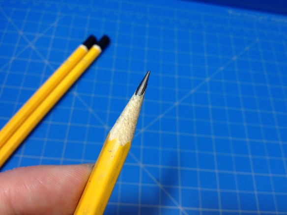
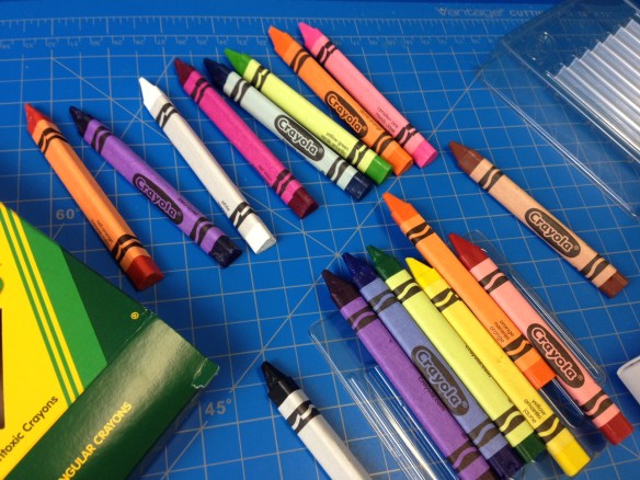
Well, this series has taken me much longer to get out than I anticipated, but we’re in the final stretch with the last 30 colors (and the sharpener). Let’s take a look.

photo 1-42Crayola 120 page 2

Yellow Orange – Indeed, a slightly lighter and unpleasantly toned orange, this color is like a more saturated “Macaroni and Cheese”, with coverage being fine, but spots of unevenness. It could in some cases be used for citrus fruit, but I think its best use would be for fossilized amber.

Vivid Tangerine – A light, almost neon, Orange, Vivid Tangerine looks slightly like the fruit it’s named after, and might be nice for things such as mangos or apricots. It does cover pretty well, but has a lot of variation in the color.

Orange – One of the last classic colors, orange is a nice deep… orange that is a bit off for the fruit but works well for most man-made items that are orange. It’s got nice, even coverage and is generally pleasant to look at.

Mango Tango – Closer to a pinkish-red than to anything related to mangos this color is similar to that of many fruity drinks and some artificially flavored candies. And it’s got decent coverage with a bit of splotchyness.

Red Orange – Aptly named Red Orange is a very reddish orange color (in fact, mostly red) that has okay coverage with some intensity variation. It’s a bit dull but probably a more apt representation of the many red things we have like fire trucks and extinguishers.

Sunset Orange – A little brighter than Red Orange, this color shares many of the same attributes as that color, but, as the name suggests, it might be more applicable for sunsets and hot embers.

Burnt Orange – The most stark on the page of any of the crayons, this color looks almost like an oil sienna, and covers very well but with a lot of color variation. It makes a nice UT (University of Texas) Longhorn and can give a lot of variety to trees or other wooden objects. (It also just kinda feels… sticky.)

Tan – Well-named, but a bit darker than one would expect, Tan is a pleasant lighter brown that covers well and is fairly even. It’s a good rock or dirt color, and can give variety in wood color when mixed with other browns.

Peach – While not looking much like a peach, this very light, orangeish brown does look like the peach we associate with skin or peach ice cream. It’s got pretty good coverage and is one of the few acceptable skin tones in the whole lineup.

Melon – This very faint color has hints of brown and red, but could pass for the color of a watermelon if you squint. It wouldn’t be the most apt representation in the set, though. Coverage is less than average, and there isn’t much variation. It works as a good highlighter color to mix in with reds or browns, and might make a good color for Martian dust.

Apricot – Looking more like an apricot than Peach looks like peaches, Apricot still doesn’t resemble its namesake very much, but is also a good skin tone. It’s quite faint and the coverage is sub-par, but it does looks quit realistic (for “white” skin) and it can serve as a nice highlight color.

Tumbleweed – As a person who grew up around tumbleweeds I can’t really sat this color is accurate, but it is a nice dusty brown with a hint of “gold”. The coverage isn’t the best but that adds to a dirty aesthetic and means the color works very well for dust, dirt, and dried plants.

Desert Sand – Being a very light and pale brown that doesn’t cover perfectly and has a little bit of variation means that this color does indeed look very much like (dry) sand and it would do equally well as dust in the wind.

Burnt Sienna – I don’t really see the comparison to the name here, it just doesn’t “pop” enough, or feel really “burnt”. It’s just a light-ish brown with the tiniest hint of red that doesn’t cover too well and is mostly useful as an additional wood color.

Raw Sienna – More sepia than sienna, this color is a washed-out brown that covers nicely and would be good for old-timey photographs or dirt that’s on the dryer side.

Bittersweet – I don’t think they really nailed the name here, as I can see a few other colors evoking a “bittersweet” feeling, but not this one. This reddish brown covers decently, and has a little bit of variation in there. It’s pretty close to a true brick or clay color, and might work for a candy of some kind as the name implies. (And it’s about as much like the flower as any other flower-based color here.)

Mahogany – Similar enough to the wood to get a pass from me, Mahogany is a deep reddish brown with decent coverage. It works great for old, faded barns and bricks, while sometimes being useful for variations in wood tones.

Fuzzy Wuzzy – If Fuzzy Wuzzy was a purplish brown bear then this color’s name would be accurate. It’s almost like the color of the teddy bear from Toy Story after it’s been through a few too many washes. It covers well-enough and can be used wherever you need a dirty, faded purple.

Chestnut – A deep brown with a touch of purple, Chestnut isn’t quite like the nut or the wood, but it does make a good color to add into a set of woods, or perhaps as a very dark wine. The coverage might be a little lacking for that, though.

Beaver – A dark grey with a subtle hint of brown, the name of Beaver here is irrelevant, but this is a very good color for asphalt or faded tire rubber. It’s helped here by the good coverage, with some variation in there.

Brown – Getting close to the end of the classic colors, Brown is just brown, though a slightly lighter one. It’s got good coverage and is there for all your dirt, tree, and brunette needs. (And it might pass as a skin color, but not really.)

Sepia – Much darker and more traditionally “brown” than I usually expect, this Sepia has some good coverage but because of how dark it is it shows up much more than other colors. It makes a good wood or dirt color, but probably isn’t the right choice for old photographs.

Antique Brass – Closer in my mind to dull copper, this brown is slightly metallic and covers decently enough, but looks very flat. Unfortunately it would probably work best as a dirt or bark color, and not as a metal object.

Copper – Surprisingly, even though it’s metallic, this is the only brown color in the set I’d really consider close to a skin tone. It’s a lightish brown with some very good coverage and some nice variation. It could work as a metal, but I’d stick to skin or wood with it.

Gold – Always a hard color to make, this Gold looks like a worn and scuffed version of the metal. And it’s got good coverage, but it doesn’t quite make it. It’s not the best representation, and it’s more akin to less-copper brass, but it’ll do for that and not much else.

Silver – A shiny lighter grey, silver has good coverage, a lot of variation, and plays the part of a generic metal quite well, though I wouldn’t say it’s very good for silver, it’s closer to steel.

Timberwolf – I like the name, and this pale, warm grey does resemble some types of wolves (some times). It’s not got the best coverage, but some variation in there makes it good for fog or sleet.

Grey – On the darker (and cooler) side of grey there is… Grey, which has decent coverage and decent tone. It works quite well for concrete, ashes, or shadow.

Shadow – On the other hand, Shadow doesn’t work well for shadows. This warm, mid-tone grey is a very strange color that I really can’t place. It’s almost like it has a bit of green in it too. The coverage is fine but the variation makes things a bit stripy and weird.

Black – And now for the final of the classic 8 colors, Black isn’t as dark as I remember it being, and it does have problems with coverage that I do remember, but it is the darkest crayon here, and it works well for nighttime, shadows, writing, and just being an antithesis for white.

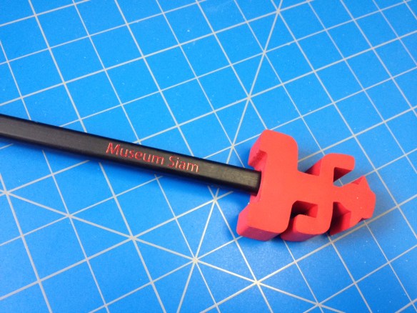
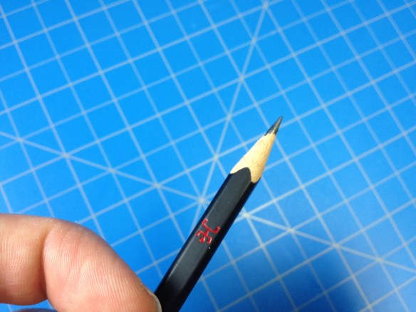
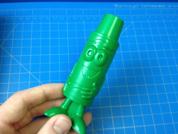
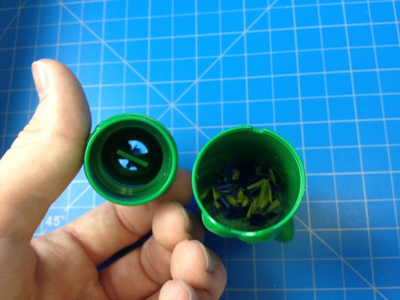
Sharpener – The Sharpener that was included in my package is a fascinating little (it’s not very little, actually) thing. It’s a 4 ½” tall statue of the character “Tip”, who is an anthropomorphic crayon. The tip of the crayon here is the sharpener, which is all plastic. The given hole is much larger than the crayons provided, but the “blades” do sort of self-index toward the center as you insert the crayon. Rotating the crayon with a little pressure does effectively shave off the sides of the crayon until there is a cone of about the same length as the factory crayons, and an equally blunt tip. It works easily and smoothly, and all the shavings are stored inside until you remove the top bit (just above the character’s eyes) and dump them out.

photo 4-35photo 5-14

And there we have it, the 120 crayon Crayola box. Is it worth it? For the price, sure, it’s quite inexpensive, but the colors leave much to be desired. And while I do think a child’s bragging rights are worth something, as far as making art goes, this set is unnecessary. Crayons (of the school variety) are imperfect tools that are hard to make art with already, and many of these colors are useless on their own while being unable to really mix with any of the other colors. It just doesn’t really help that much, and kids can easily become overwhelmed with choices (they’ll basically either just use the same crayons they would get in smaller packs until they’re gone or use any “green” as green). The sharpener is neat, and having a bunch of crayons around is “cool” (I think it’s cool… maybe “fun”), but I don’t see a significant upgrade here from the 48 or 96, especially since there are a few manufacturing defects regarding the paper wrap, holes in the crayons, and receiving duplicate colors. But also it’s like $7 and I can’t tell you how to live your life.

Review – Parker Classic Pen and Pencil Set (GT)

Have your eyes ever glanced over something where you “knew” what it was but had to double take because something was just “wrong” about it? That’s what happened to me when I first came across the Parker Classic pens. I thought they were Jotters, Parker’s very popular, least expensive pen, but something was just… “off”. And indeed it was, after purchasing it and comparing it to my Jotter at home I discovered that it is a bit different (mainly in thickness), but does that improve anything?

photo 1-37

My version (the GT, which I think stands for “gold trim”) is a super simple design. The barrel is a cylindrical piece of stainless steel that screws together in the center. The front third tapers down to a hole, through which the nib protrudes when activated (on the pencil there is a small lead pipe here, extending the length slightly). And the back section of the pen ever so slightly tapers down to the click mechanism. Both the top clicker and the arrow-shaped clip are done in a gold-colored, chrome-like finish, and “Parker – Made in U.S.A.” is very minimally engraved at the separation (on the back half).

photo 2-34

The clip does a very good job, being more detailed but just as strong as the clip on the Jotter, and actually affixed to the metal and not on its own separate (if unremovable) band. The clicks on both the pen and pencil are quite satisfying, the pencil more so because it is slightly shorter (thus having less traveling distance) and more firm (it also has rings near the top to help distinguish between the two in the pocket). Because of its length, the pen one does seem a bit floaty. The pencil’s click button also pulls off to reveal a usable pink eraser (it’s nothing special), and when that is removed, the lead reservoir (for .5mm leads). The design of the pencil here means that the mechanism is fully attached to the front part of the pencil, and unscrewing the back does nothing to hinder the operation (other than making it less comfortable) or allow for any maintenance.

photo 4-30photo 3-33

I haven’t mentioned the ink/lead yet because there isn’t really much to talk about. The black, fine cartridge (standard Parker type) and HB .5mm lead the two come with is exactly as you’d expect. Relatively smooth, almost dark, and mostly break-and-water-resistant. The main difference in handling comes from the size. They are a bit longer than the Jotter, at 5¼” (pen) and 5 3/8” (pencil) long, but it’s really the diameter that makes the difference, being 1/8” smaller at their widest of ¼”. This doesn’t make them much lighter, but it does make them nicer to use for someone like me who likes smaller barrels on their pens, or is trying to store things more efficiently.

photo 5-12

It is an upgrade from the area of 3rd tier pens (like the Jotter, which is above semi-disposable pens, which are above fully disposable pens). It has more refined, nicer feeling, and is just as durable. But it isn’t too much of an upgrade unless you really like the slim dimensions (like me). The fact that it’s apparently been discontinued is a hint at whether or not people really thought it was worth upgrading, but I’m a fan, and at a decent price I think they are serious competition for the Jotter in the pencil case. I’m keeping mine around, and it’ll probably last me a lifetime.

Review – Sharpie Clear View Stick Highlighter

I would imagine that somewhere within the companies that produce writing implements there is an R&D department or team, whose task it is to come up with new products that will sell and grab market attention. I would also imagine that this job is fairly difficult at this point. Not only are physical writing implements perceived as being on the way out, but those that are around have been honed for decades to be exactly what the markets are looking for. In other words, I’m not entirely sure the motivation behind “improving” highlighters with the Sharpie Clear View highlighter was actually an intention to make the product better. But maybe it does. Let’s take a look.

photo 1-33photo 2-30

The main bodies of the pens are a matte plastic matching the color of the ink. They’re more ovular, rather then entirely cylindrical, and they taper down to the end more in one direction than the other, making their ends appear squished (or chewed on, like the ends of many pens I’ve seen). Underneath the cap is a shiny black plastic section that is slightly more slippery than the body but doesn’t really impede use. This tapers down slightly and from it protrudes a very angular, chisel-shaped felt highlighter tip. Inside this tip is a similarly shaped piece of clear plastic that both holds the tip in place and allows the user to see through it. The cap is made of a frosted plastic to allow one to see the special tip through it and the packaging, while being soft enough to not shatter easily (like many clear plastics would). It has an integrated clip and posts securely, but with a strangle wobbly feel from the “squished” rear.

photo 3-29photo 4-26

The three colors that come in the package are your standard highlighter colors: pink, yellow, and green. Each is quite bright and visible, but doesn’t block whatever is being highlighted. Green is the darkest, and is a color almost unusable in some highlighters, but here it is serviceable, if my least favorite because of the “shading” pools that tend to form at the start and end of a highlighted line. Pink is slightly better at this, and of course yellow trumps both in the visibility of words beneath it, its own visibility (in good light), and lack of shading. Sharpie’s smear guard is still working as good as ever and most inks can be highlighted without trouble (but some water-based inks are more unhappy about it than others). And then there’s the main feature. After using it, I don’t get it. It is technically possible to see through the highlighter so you know what you’re highlighting and when to stop. But if you didn’t know that going in what were you thinking? And the angle you have to hold the pen at to see well isn’t a very comfortable one. I mean, I can’t fault it for “not working”, but I just don’t understand how it’s supposed to be used. It doesn’t make anything easier or better, it’s just there.

photo 5-11

If you’re looking for a set of highlighters, these work, and if you find them at around the same price as normal highlighters (the price fluctuates) I’d say get them (it doesn’t hurt). But I wouldn’t go out of my way for them, or pay much more. I can’t see their gimmick as anything more than that, and it doesn’t work for me.

Review – Bic 4 Color Original Pen

For as much as they are almost “looked down” upon in the world of writing implements, and for as cheap a product as they are, Bic pens are very sturdy and reliable line-making machines, with newer ink formulations making them smoother than any pen in the price range seems to deserve to be. Their simple and effective designs have endured the tests of time, making the Cristal ubiquitous, and others, like the 4 color pen, an oddity many have toyed with and some people swear by. Is combining 4 pens into one really necessary? Probably not. But does it have convenient uses for those who still write thing down? Let’s take a look.

photo 1-29photo 2-26

The body of the pen is quite simple, with a retro vibe that probably comes from the design being relatively unchanged from its introduction decades ago. The main barrel is a light blue (or orange for the fine version) cylinder making up 2/3 of the length that begins to taper as it gets closer to the writing end. On top of this is a black band, which connects to the white top. This top section has a very “angular” molded-in plastic clip, a lanyard hole/rotary telephone dialer on top (rather intrusively), and 4 slots in which 4 plungers of different colors sit. When one of the plungers is depressed, a pen tip of a corresponding color pokes out of the front. Unscrewing the blue portion reveals that the mechanism here is quite simple: the 4 ink tubes (with tips) are situated equally distanced from each other inside the barrel. When one pushes the plunger, an ink tube is moved forward and bent via the barrel taper to come out the hole in the center, and a catch holds the plunger down until depressing another one causes it to spring back up. Unfortunately, the way things are constructed, the ink tubes are not replaceable, so if you run out, you’re stuck. The only other thing on the body is the Bic logo and “made in France” molded into the side of the white upper portion. It’s nice that it won’t rub off, but it doesn’t give you very much information to go on.

photo 3-25photo 4-22

The performance is decent. The inks are quite smooth for a ballpoint, and don’t cramp the hand too much, but there is more blobbing than I would like and some of the lesser-used colors (like green) often have startup problems from dried ink on the tip. Despite being a shiny plastic, the pen holds well in the hand. Being a bit larger than your average pen to accommodate 4 ink tubes, it has more surface area to hold on to and it isn’t slippery. It might not fit in some smaller pencil holders, though. I’ve taken a look at the more common Bic colors before, and they aren’t changed here. All are a bit more wimpy than I would like, especially the green, followed by the red, but they go down well and are recognizable while having the standard ballpoint advantages like being water-fast. The clip is pretty bad if you ask me, having almost no flex, but it will probably do its job.

photo 5-10

For art, this pen probably isn’t worth considering unless you’re challenging yourself. But for those that like stay organized with different colors in their planners, need a red pen and don’t want to keep track of 2 pens, or don’t want to run out of ink on the fly, this is a pretty good option. It’s got a nice retro feel if you’re into that sort of thing (understanding that it’s a little unprofessional) and even through it’s disposable, the materials are quality enough it won’t fall apart on you. For someone like me, who carries around 4 pens in 4 colors this might be a lifesaver. It’s not the end-all pen, but it’s a nice office-weight pen, designed to be inexpensive and get things done, which it does quite well at.

Mini Review – Peruvian 2B Pencils

At this point, I’ve gotten through the reviews of most of the non-U.S. purchased products I’ve received. But down at the bottom of that list are these simple little nameless pencils that came from Peru in what I understand was a larger bundle. And I’d like to take a quick look at them before moving too far beyond.

photo 1-26

The body is your standard yellow, hexagonal fare, without a ferrule or eraser at the back, replaced with a white band and then a black “cap” of paint. The only other adornment is “2B” stamped in a gold color. They come pre-sharpened, and thus a little shorter than your average pencil, being around 7”.

photo 2-23

The lead is a 2B, so it’s a little softer than your #2 HB’s, but it’s far from too soft, and the difference is really hard to tell. That probably stems from it not being a very well refined graphite, making it more toothy and gritty than one would generally expect from this hardness of pencil.

photo 3-22

The build quality is work-able, with the wooden body being quite sturdy, and the absence of an eraser making things easy. There is some variance in how well the lead is centered, though, making sharpening sometimes difficult. In the end they’re what you’d expect from a cheap no-name pencil, but they get the job done.

Review – Crayola Triangular Crayons

Are regular crayons too small for your hands or prone to rolling off your table and getting all over the floor? Don’t worry, Crayola has your back with triangular crayons that “promote proper writing grip” and are “anti-roll®” (that registered sign isn’t a joke by me, it’s actually on the box). They are available in your standard pack of 8, or, as in my case, 16 (and maybe larger packs, but I can’t find any), and I’ve been seeing them pop up in stores recently*. But are they the right fit for you?

photo 1-22

From what I can tell, the colors here are exactly the same as in all other Crayola crayons so I won’t be going over them here (ColorsReview). The pack comes in a standard cardboard box (a little rough around the edges) with a cardboard tray inside and two plastic dividers to hold the crayons in place. It’s a pretty sturdy system and none of my crayons were broken or significantly worn.

photo 2-19photo 3-18

The bodies of the crayons themselves are quite a bit larger than your average crayon, being triangular in shape (with rounded corners) with each face being just shy of a half an inch wide. They’re wrapped with a craft-paper-esque standard Crayola wrapper and have a step down about a half-inch from the front followed by a triangular point. From the box they are super comfortable, resting nicely in the hand with the paper being both warm-feeling and giving enough friction to prevent the hands from slipping. They work well both for children without fine motor skills and adults with larger hands (though the grip is actually surprisingly small). And they perform just as well as any other Crayola crayons (that is to say, very consistently and pretty good for a wax crayon, but not much use for blending or layering).

photo 4-16photo 5-9

I’d say the gimmick works, if you (or whoever you’re buying them for) were having problems with regular crayons being uncomfortable, held wrong, or in a constant state of rolling off the table. They are a fairly inexpensive solution, though that shows: imperfections in the wax mixture and paper application are readily apparent (with several noticeable chunks of crayon missing in some places). Maybe that’s just my pack, maybe Crayola’s manufacturing standards are going down, or maybe they were always like that and I didn’t notice. In any case, they are effective in design for both children and adults, and probably worth the little extra cost in crayon mass alone.


*Despite the fact that I peruse office/art supply aisle frequently I miss things just as frequently, so they might have been there before.

Mini Review – Museum Siam Pencil

I’ve looked at quite a few triangular-shaped pencils recently; they seem to be a trend attempting to make writing more comfortable. While they are obscure, I had heard about them and they make sense. Trending in the opposite direction I have here a pencil from the Museum Siam that is square (with rounded edges). One would think that would be uncomfortable, and maybe that’s why it’s a much less readily available design. Let’s take a look.

photo 1-21

The body of the pencil is super simple. It’s a rounded off 5mm rectangular prism with a nice matte black paint. On the side, stamped, in nice red letters are “Museum Siam” and a pictograph of a worker. The back of the pencil is capped with a red material but this is covered with a quite large eraser that is also in the shape of the logo/worker dude.

photo 2-18

This pencil is obviously a novelty or keepsake, and while it writes like a fairly normal #2, being a bit toothy and on the soft side, it probably wasn’t meant to be written with very much and most of the normal information you’d find on a pencil is absent. The body of the pencil is surprisingly easy to hold, and allows for a good grip without much cramping, though it will dig in a little more than more standard pencil shapes. The biggest problem is the eraser, which makes the pencil massively back-heavy and almost unusable when attached. I didn’t test its performance because I didn’t want to damage its aesthetics but I suspect, like most shaped erasers, it would perform poorly.

photo 3-17

It’s a pretty neat little gift shop item if you’re a fan of weirder pencils, and there isn’t much else to say about it really.

Review – Pilot Opt (.5mm)

It’s always surprising how many innovations there can be for something as (seemingly) old, tried, and true as a mechanical pencil. The Pilot Opt is a fairy traditional and comfortably chunky mechanical pencil save for its unique advance mechanism. While a standard click-mechanism is available and quite usable (and necessary for retracting), there is also a sliding weight inside that allows the pencil to be shaken to advance the lead. But is this shake advance mechanism (that I don’t fully understand) a real improvement over the standard, or just a gimmick?

photo 1-17

The body of the pencil is fatter than the average mechanical pencil and relatively torpedo-shaped, with the thickest part being around two-thirds of the way toward the front and tapering down from there. Forward of this hump there is a (removable) rubber grip section and a metal cone, attached to which is a smaller metal cone that serves as a lead pipe. As far as I can tell, the farthest this pencil can be taken down by the user is removing these two bits, which gets you nowhere. Behind the grip section is a clear piece of plastic with a colored checker pattern (which is black, trying to mimic a “carbon fiber” look. Other syles come in other colors) below this, you can see the black tube containing the advance mechanism. Behind that is a correspondingly colored opaque plastic bit that contains just enough printed information about the pen and holds the attached spring-clip on a pivot. At the very end of the pencil is a(nother) correspondingly colored translucent plastic eraser cover, under which is a small white eraser that can be removed to access the lead tube.

photo 4-13photo 3-13

The lead and eraser are what you would expect from Pilot: that is, quite serviceable. The lead is a fine .5 and the one included feels like an HB. It’s a medium hardness and quite smooth, nothing to write home about but nothing wrong. The eraser gets the job done but like many mechanical pencil erasers is entirely too small (in my opinion). This is offset slightly by it not being they type that disappears easily. The push click mechanism is usable and gets thing done, but is a little underwhelming. And the clip is great, being smooth enough to not damage items but strong enough to hold on firmly, while the spring mechanism makes it easier to use and harder to break. But obviously the main attraction is the shake advance mechanism, which works as advertised. A good shake will advance enough lead for one to be able to write, though it might take two to get to a length most people are comfortable with. The advance per “shake” is comparable to the advance per “click” with minor length differences depending on some ethereal power (likely gravity and the external forces you apply). And the weight inside needs to reach both extremes in a short period of time with some force in order to advance the lead, this means that accidental advancement is a rare occurrence, but when intentionally done can be a surprisingly subtle gesture (though it’s still violent enough that people might give you strange looks). I haven’t had it advance in my bag, yet it’s always done so easily when I was using it.

photo 2-14

Without its gimmick this is still a solid pencil, though one could argue that its ¥200 (≈$1.75) price tag isn’t worth it without the shake advance (the same for its increased US price of $3.00-3.50) but even then it’s right on the line for the quality (though I wouldn’t get it without the mechanism because of its thickness). But with the mechanism it becomes a fascinating and usable utensil. The grip is comfortable, if wide, the lead and eraser are of quality, the clip is a step up, and the mechanisms work wonderfully. If you’ve been looking for a more convenient advance mechanism and other options like side advance aren’t doing it for you this is certainly something to look at. And while I probably wouldn’t have bought one for myself (it was a gift from my brother when he went to Japan), and indeed I won’t be keeping it in my daily use pencil bag, I had a fun time with it all throughout my testing.

Review – Kokuyo PS-FP102 Mechanical Pencil (.7mm) (DM)

In a time where a lot of companies are trying to re-invent the wheel with their pencils, Kokuyo from Japan has made a relatively inexpensive, minimalistic, and comfortable mechanical pencil. The PS-FP102 (Pencil Sharp {my guess from the website}) omits several things that could be thought of as standard, and uses that effort on a sturdy and comfortable design (that is, from what I understand, ostensibly for children in school). Is the trade-off worth it?

photo 5-7

The body is one of the simplest to be found on a mechanical pencil, being mainly a vaguely triangular-ized (at least the “frosted” versions are triangular) cylinder with a rubbery coating for the 4 ½” body. Sticking out a quarter of an inch on the back is the click-advance button, and five eighths on the front is a plastic cone, from which a smaller metal “lead-pipe” can emerge bringing the total length of the cone to three quarter inches. Printed (maybe stamped or adhered) on one of the facets is all of the information about the pencil (which seems like it will rub off in the future but has withstood use so far).

photo 2-12

The body can be unscrewed at the cone, revealing that the rubberized triangular barrel is just a sheath, and the cone mechanism can be pulled from the front. As far as I can tell no further takedown can be done and neither of these operation provide any real benefit that I can see beyond checking how much lead is in the pencil (through a convenient window {the view on my frosted black version from the outside is blocked}) and perhaps clearing out the front mechanism.

photo 5-4

Writing performance is good; the lead is a .7mm and presumably HB (there are also .9 and 1.2mm versions). It’s a bit too thick for what I usually like to write with (.5mm) but it is fairly break-resistant and smooth, which would be good qualities for a school pencil, and from what I understand that is what it was originally designed for. There is no eraser or clip (though there is a version of the pencil that comes with a stand-alone eraser and friction-fit clip) and instead of having to remove a back piece to insert lead there is simply a hole just big enough to fit the lead through that lead can be fed into. Once it has been pushed all the way in, it enters into a larger reservoir and will not likely find the correct angle with sufficient force to come back out of the hole. It’s honestly a pretty elegant lead-feeding system if one doesn’t care about having an eraser.

photo 3-11photo 4-11

The click-advance mechanism is very smooth and workable, but unsatisfying. The metal “nib”/lead-pipe at the front does retract and advance with the lead, neatly preventing any damage that it would cause but being a bit fiddly (it’s easily possible to retract the lead and not the metal piece, which is a bit of a strange situation). And the rubberized, triangularized grip is very easy to hold, not slippery at all, and quite comfortable (though not my preference), especially for hands just learning to write (it keeps fingers in the proper orientation). I must say, though, that it only barely resists rolling off the table more than its round counterparts.

photo 1-15

So instead of an eraser or clip, this pencil provides an elegant lead-feeding system, comfortable and chucky triangular grip, and a stow-away point. All of which make it a good fiddly-bit-free pencil for students, and with a slide-over clip and external eraser (the integrated ones are never enough) it might also be a preferable one for artists or in the office. For the mostly reasonable price of ¥180 (≈$1.55) it’s a solidly designed, well built little pencil that seems like it would last under a bit of stress and is certainly worth checking out if you want a triangular grip or to forgo the standard integrated eraser for greater lead convenience.

Review – Faber-Castell Grip 2020 Ballpoint

Sometimes the basic problems of a cheap ballpoint pen can just get to you. Many ballpoints have a round or hexagonal design that can lead to hand cramping or slipping while trying to write with thick, uncooperative ink. You see additions like silicone rubber grips occasionally as a remedy in the US, but apparently in places like Peru they have attempted to remedy these problems directly in the design of the pen. The Faber-Castell Grip 2020 boasts an ergonomic triangular design, with as studded grip and “smooth writing” ink. But how well does that improve performance?

photo 1-7

The body is a simple, translucent, subtly triangular-ized cylinder with 150 small rounded “studs” for grip evenly positioned on the faces. The cap is round, with an integrated clip, and it has the relatively unique feature of sliding “under” the barrel rather than over it with the required step down being about the last quarter of the cap. Underneath the lip holding the cap in place there is a slightly tapered cone, friction fit over the ink tube; this cone can be removed, allowing the ink tube to be replaced. At the back there’s a stopper that steps down near the end, forming a space between it and the body where the cap can be posted. Over this stopper, on two sides of the triangle, there is written material: stamped in silver lettering is “Faber-Castell” and printed on a label is the barcode, model number, ink (and pen) color, and “Made in Peru”. I’m a bit disappointed by that, since, even though it’s on the back, labels on writing instruments have a tendency to get damaged and if that happened you wouldn’t know the model to get a replacement.

photo 2-5photo 5

Functionality is quite good. The cap both caps and posts securely while maintaining the “lines” of the pen (the pen flares out ever so slightly in the back so it doesn’t match up as well there, leaving a step down instead of a {relatively} smooth transition). The clip is fine but isn’t very tight and it slips on thin material (its attachment point and the plastic it’s made of are surprisingly rock-solid, though). The ink is smooth as promised, coming out of a very medium tip (broader than I like, to be honest). For all intents and purposes it is the same as the other Faber-Castell made-in-Peru pens, maybe a little bit darker, and with blobbing being present, but not nearly as frequent as the other models I’ve looked at (counter-intuitively {usually wider tips on ballpoints leads to more blobbing}).

photo 4-5photo 3-5

It’s a very nice little pen. For my personal daily use I prefer something shorter and with a finer tip, but this pen is comfortable, easy to hold, smooth writing, and doesn’t slip. I also really like the cap and how it doesn’t expand the circumference of the pen (save for the clip) and is probably less prone to crushing or cracking. If they managed to make the clip a little better, and offered the top in a fine I would seriously be looking to import some to use all the time. So if you’re looking for a simple, relatively inexpensive, comfortable, and durable (the plastic is very solid feeling) pen, and don’t mind importing, I’d certainly give this one a try.